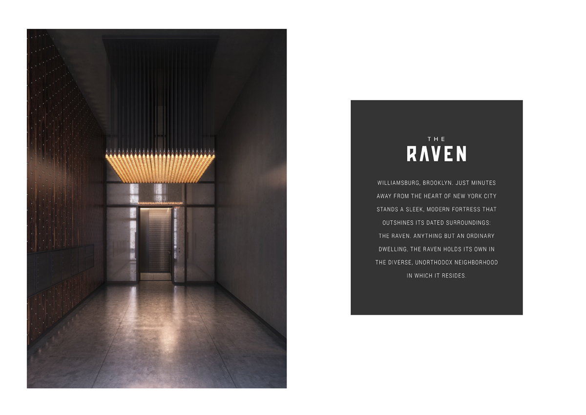
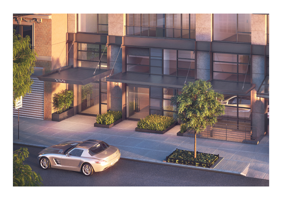
Located in the avant-garde neighborhood of Williamsburg, Brooklyn, The Raven is a luxury condominium currently under development by B+B Capital.
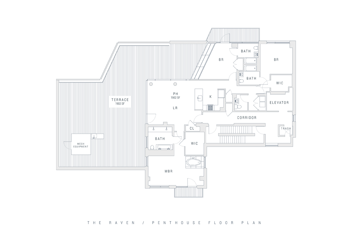
A modern, one-of-a-kind residential space featuring a nonprofit art gallery on the first floors, The Raven is the first mid-size condominium to be developed in the area, with surrounding competitors that are either very small or very large. The building is comprised of 30 residential units spread across six floors, each with a completely different and unique layout.
B+B Capital commissioned Squat New York with building the brand for this new development from the ground up, in addition to creating a new website, marketing materials, stationary and open house promotional items. After extensively researching the South Williamsburg neighborhood, the condominium’s target demographic and its interior and exterior structure, we realized our best strategy was to highlight the building’s modernity, sophistication and unique design in its branding and all deliverables.
In conceiving a name for the development, we wanted something bold and tenacious that would resonate with
our audience, yet something that also conveyed its luxuriousness.
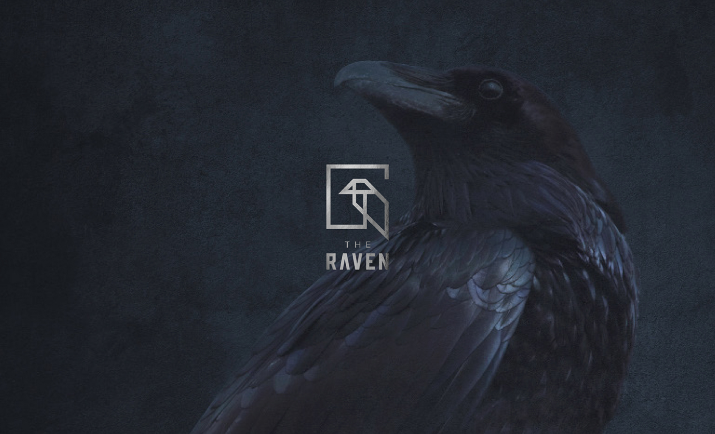
After many considerations, we chose the name “The Raven," which perfectly fulfills our criteria and captures the essence of
the building. Not only does the name reflect the strength and industrial feel of the condominium, but it also confers its mysteriousness. Ravens are widely known for having black feathers, but many often don’t realize or notice that when light reflects off their feathers, they radiate a dark, bluish tint. Similarly, the building has a dark, typically designed exterior that
doesn’t particularly stand out, but upon inspection of the interior one will find some of the most unique apartment layouts in
New York City.
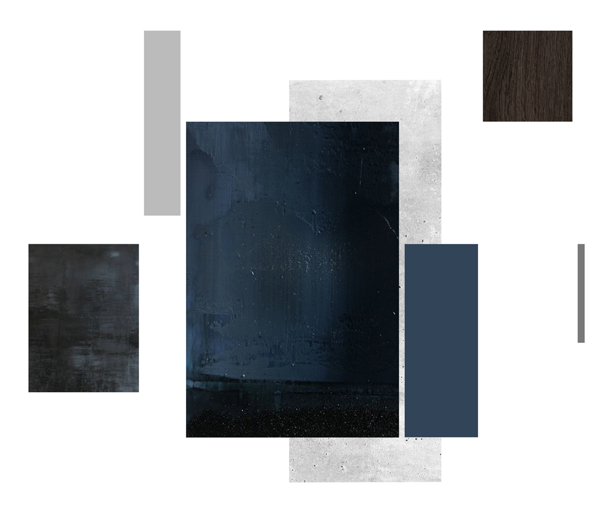

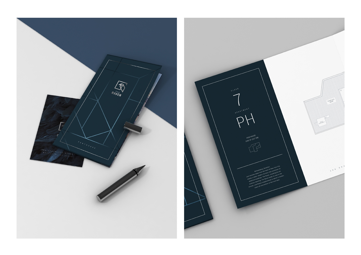
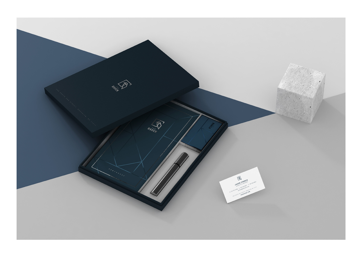
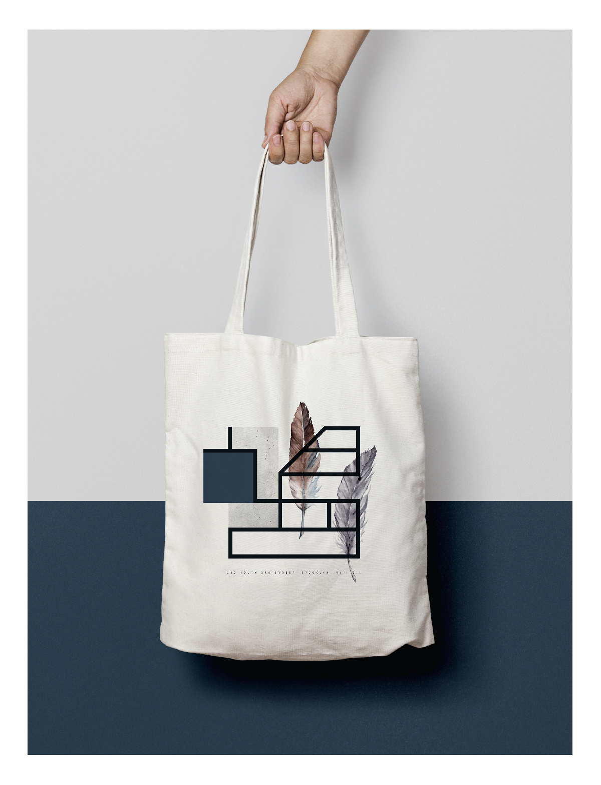
Adhering to the dark, mysterious and rare identity we established for The Raven, we chose a color palette of dark blues and charcoal grey for all deliverables.
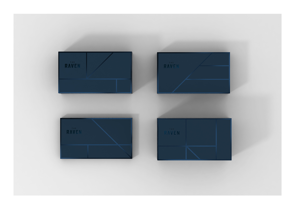
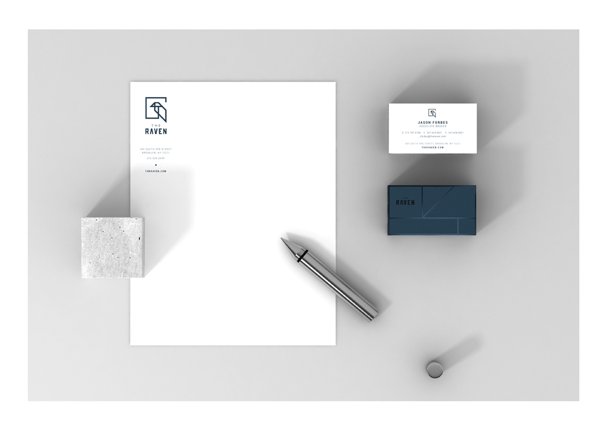
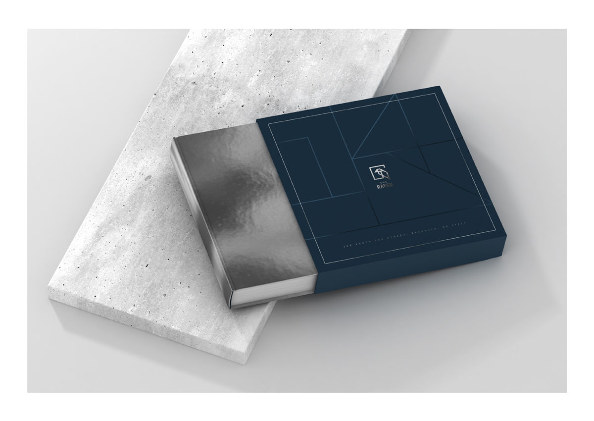
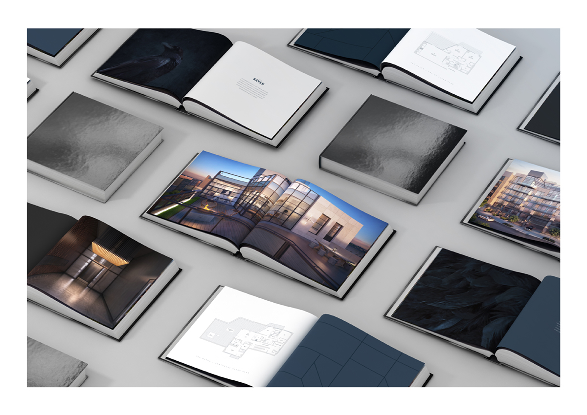
The logo we crafted, a minimalistic sketch of a raven perched in a window comprised only of straight lines, reflects the building’s industrial feel and the strength of its solid steel columns and bricks. Stationery items such as business cards, folders and book covers each feature a unique, embossed portion of the logo in glossy foil atop a matte backdrop for a sophisticated, polished and luxurious look and feel. Additional items such as pitch packages, tote bags and gallery books capture the essence and uniqueness of the condominium.
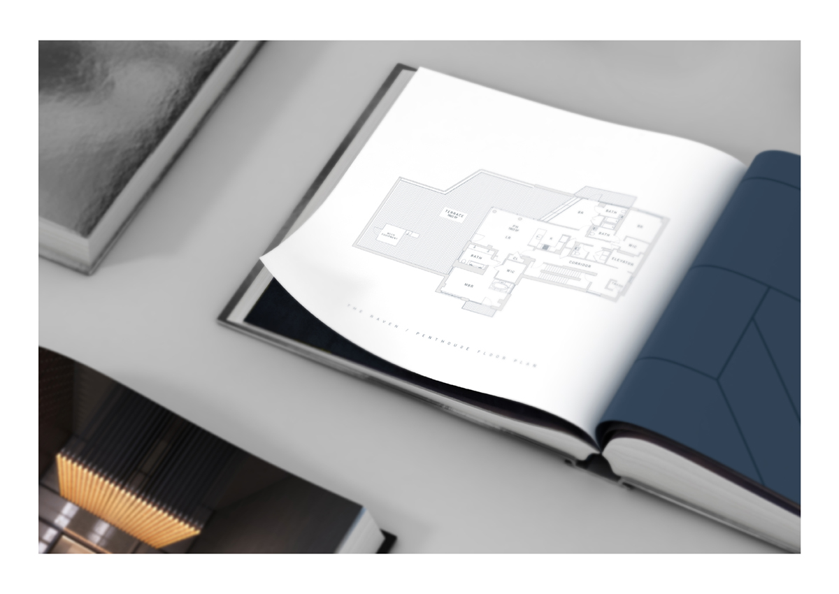
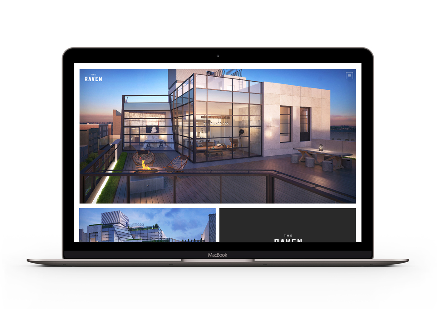
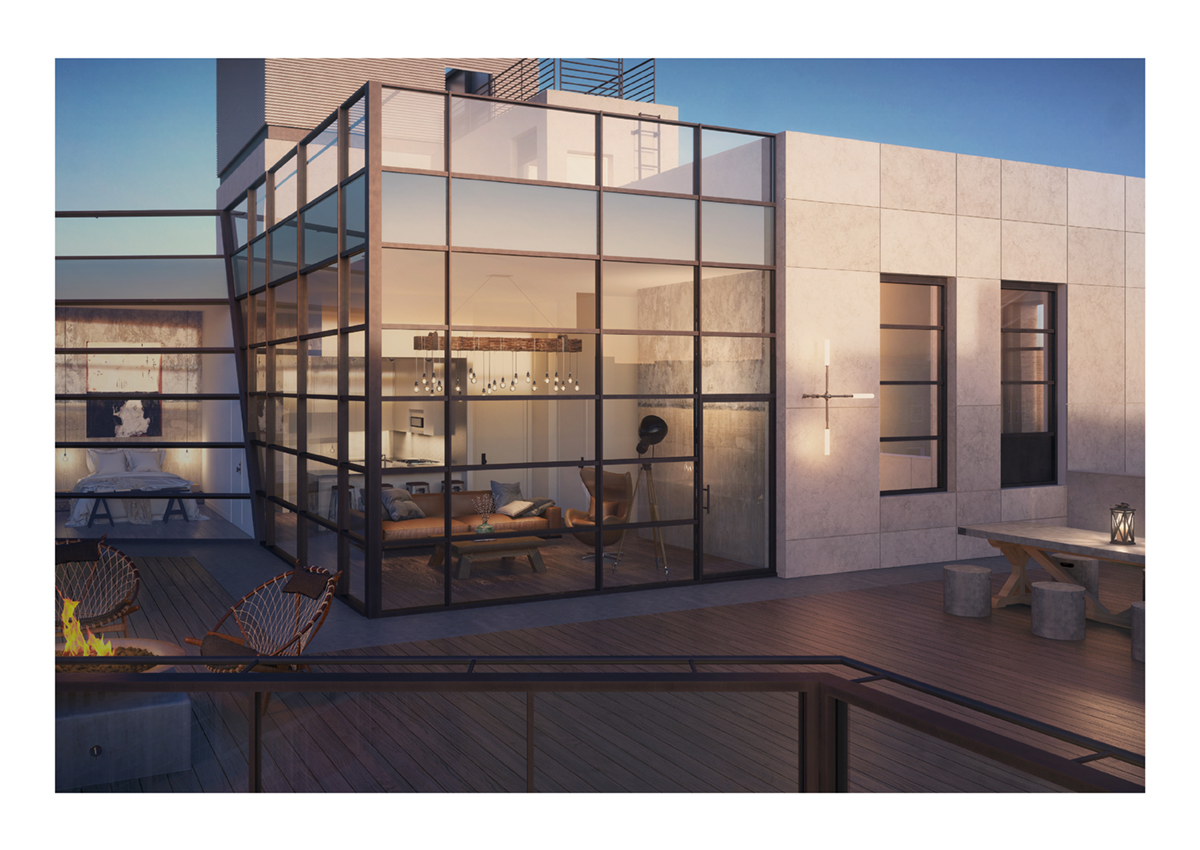
Following The Raven’s branding, we then set out to design a sleek, modern and easy-to-use website that would appeal to potential renters and buyers.
Along with sharp, high-quality renderings of the condominium’s interior and exterior, as well as informational copy about its layouts and amenities, we included a map and photos of nearby places of interest. As we knew the South Williamsburg neighborhood would be a significant selling point, we felt that a visual representation of the nearest bars, art galleries and museums would be even more effective in attracting our target audience, as opposed to simply describing the neighborhood.

The result of our creative endeavors was a cohesive and magnetic brand identity destined to attract potential residents and establish The Raven as the premier condominium in Brooklyn.
See more projects on our website Squat New York
Like us on Facebook
Follow us on Instagram & Twitter
Like us on Facebook
Follow us on Instagram & Twitter


