Elise Erikson Barrett is a local musician in Indianapolis. She was preparing to record her second album—a collection of hymns with an acoustic, front porch sound—and approached me to design the album’s packaging and promotional materials.
Goals
To evoke a sincere, approachable, trustworthy message or, “space,” appropriate for “the kind of songs that accompany you through your daily life,” with consideration for a primary audience of mothers in their 30s and 40s, and those who have experienced hardship and difficult circumstances in life.
“Ben is a creative, dedicated artist, but he’s more than that. He served as a creative partner and guide, listening deeply and helping draw out insights and vision for my album—intentions I hadn’t yet articulated. And the final project he delivered communicated the heart of the album’s story more beautifully than I could have imagined.”
—Elise Erikson Barrett
Research & Exploration
Elise wanted the songs on the album to be something that her audience could carry with them as a source of comfort in hardship. The idea of “everyday hardship” came out as an important concept in our discovery conversations, and lead me to start my research by asking the question, “What does everyday hardship look like for mothers?”
A key insight into this question came from a study on how motherhood has changed in recent years:
"Despite the availability of [online] networks and more immediate support in the family and community, many mothers feel socially isolated, especially those aged between 35 and 44.
The research brought me along to the idea that, for mothers in Elise’s target audience, everyday hardship meant feeling isolated."
One of the goals of the design was to use the album packaging to create an inviting space. I used three questions in my research to help guide decisions that would accomplish this, and began finding answers by looking at ideas from interior design, and observing what Elise’s target audience considered to be inviting or comforting.
What color is that inviting space?
Warm, neutral colors with natural light.
Warm, neutral colors with natural light.
What shape is that space?
Open, but with a point of focus.
Open, but with a point of focus.
What textures make it up?
Soft textures, like felt.
Soft textures, like felt.
Along with those insights, I also wanted some direct answers from the target audience, so I put together a survey to ask some more specific questions.

Most of the information verified what I already understood from other sources, but I also asked the respondents to, “Describe an environment or space that would be comforting and inviting to you at the end of a long, difficult day.” The responses included things like quiet, solitude, and viewing or being in nature. All this information together was a good place to begin working from.
Elise and I also talked about the way people grow, and the role that hardship plays in that. She had divided the hymns on the album into three sets, each focusing on a stage of growth: fresh, new joy; a valley of trials or suffering; rich, renewed joy after the valley. It wasn’t an explicit goal to try and get this entire idea across, but since it was a theme in Elise’s thoughts about the hymns themselves, I kept it in mind and did end up finding some ways to weave it in with the larger goals.
After all the research, I decided to approach a connection with the audience, and creating an inviting space, by designing the packaging as a narrative that moves from sorrow and isolation, to comfort and closeness. Using a six-panel, folding case provided a great opportunity for this approach, since it would have three stages to work with as it’s unfolded.
From early in the project, it was clear that photography would play a major role. I partnered with Cait Morgan for her excellent quality, and extensive experience with the target audience. Cait was a fantastic creative partner. She soaked up the research, meaningfully engaged with the ideas driving the directions I wanted to explore, and made them richer with her approach and execution. The photography supported the ideas behind the album wonderfully, and were beautiful and effective materials for crafting the final concept.
Final Concept
Album Art
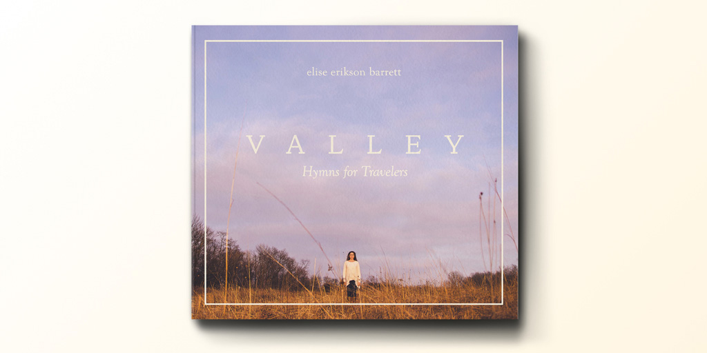
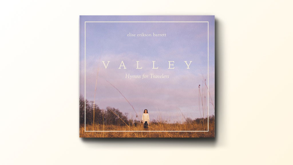
The type is classical, like you’d find in a hymnal. The colors are contemporary, and calming, while the visual scale helps emphasize a feeling of isolation. The presence of another person’s gaze, and the doorway or window created by the border is an invitation that brings the viewer in.
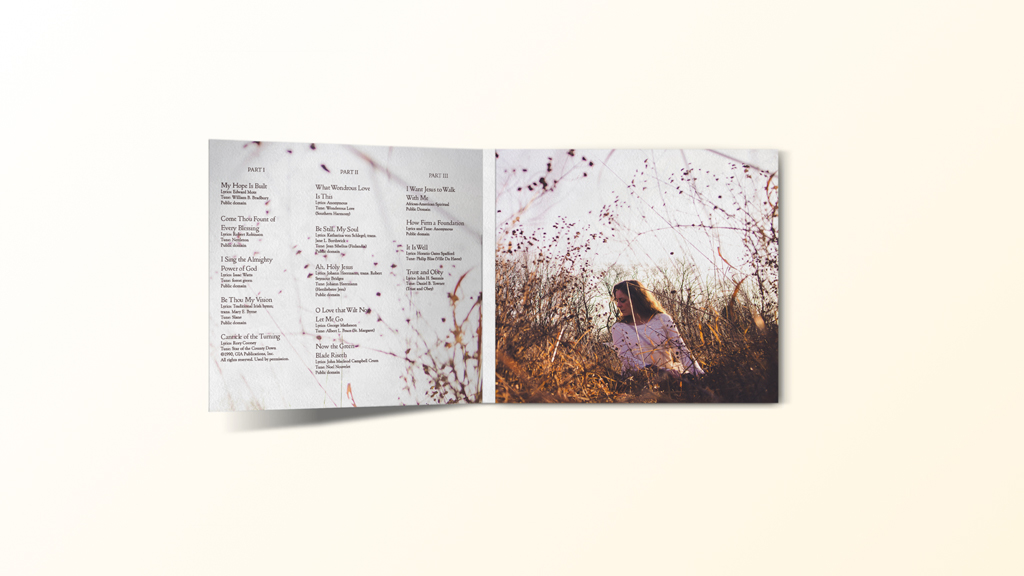
The center panel is always considered to be analogous of being in “the valley”. Here, the environment obscures the view, and Elise is shown positioned low, and in shadow. The portrait shot is closer in, but doesn’t have a direct gaze like on the cover, so it’s a movement toward closeness, but not quite there yet. Her eyes look left, which helps move the viewer over to the song listing, and further into the narrative.
The panels on the interior are analogous of fresh, new joy, a valley of trials or suffering, and rich, renewed joy and growth after the valley. The final portrait is close, personal, and comforting, represented literally by the cozy quilt blanket, along with a feeling of approachability, and a sincere, trustworthy, inviting gaze. The disc is the same color as the red on the quilt, representing comfort and the hope of Jesus’ blood and righteousness, as sung in the album’s opening hymn.
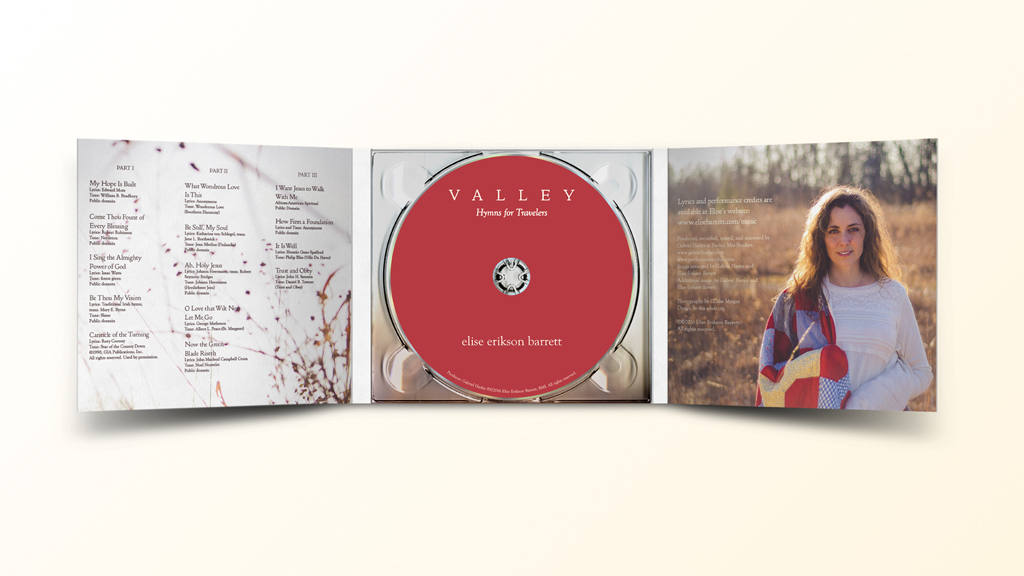
The back is a quiet postlude, and the other side of the entryway on the front; the end of the narrative.

Poster
The poster includes space to fill in concert or promotional information, and is sized to print at either 11×17 or 8.5×11, when printed without the bottom area.

Social Media
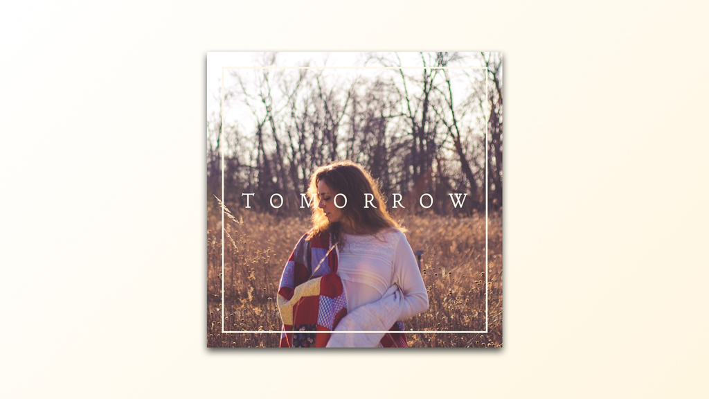
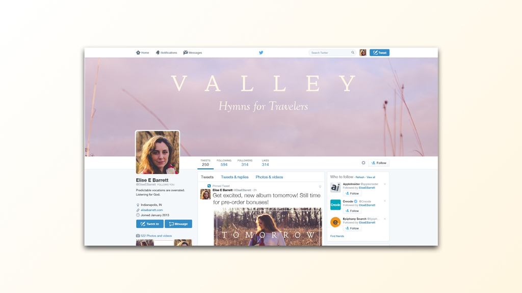
The social media images were designed to help build anticipation and promote awareness of the album release on Facebook, Twitter, and Instagram. They included images for posts, and for profiles.
