


PREACHER | Entertainment Weekly
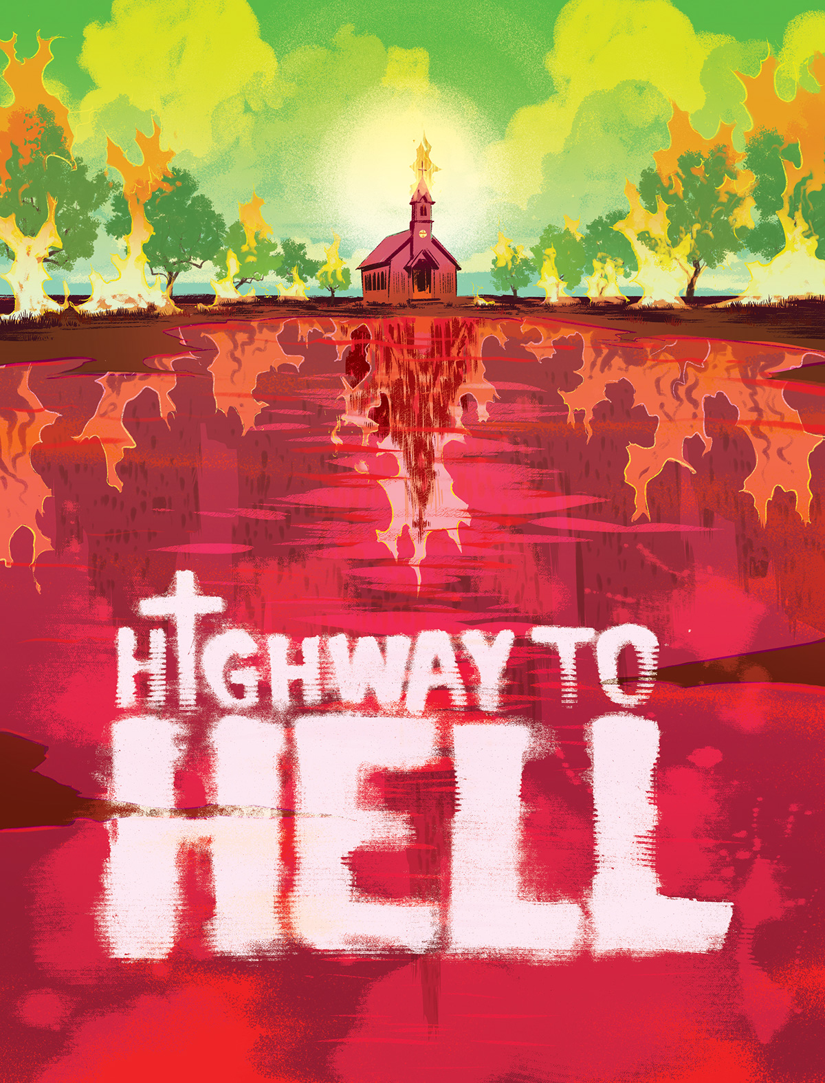
I was asked by Jennie Chang at Entertainment Weekly to concept and pitch an opener that would work with photo/illo combo opener as above as well as turn-page spots and a possible illustrated drop-cap. The TV show is based off the comic book so the editor and AD were looking for an approach that would take note of the print and live-action versions in a creative way.
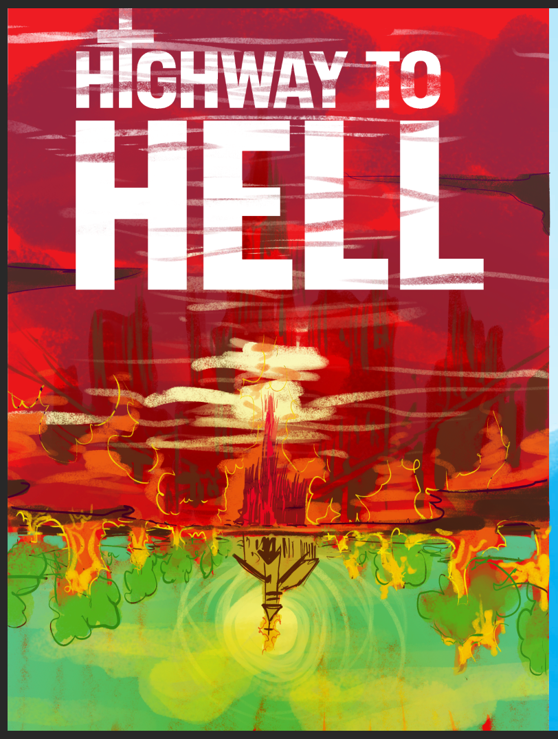
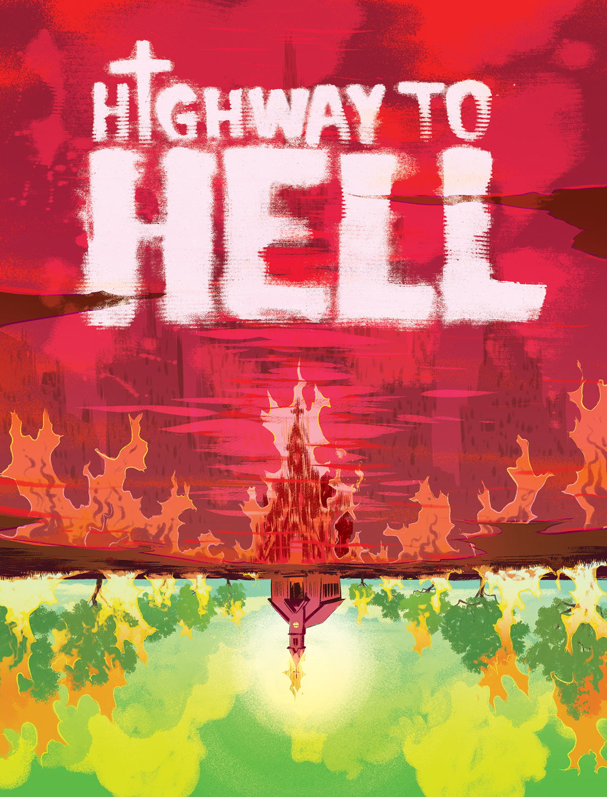
The original layout design had the illo on the right side and the church upside down and the type at the top. THe final design and layout was printed as you see above. I took a shot at the type treatement for the package in total since an illustrated drop cap was initially equested. For the type treatment I sent in a few type designs inked on cotton undershirts and colorized to have blood soaked letttering with "ink bleed" effects on the endges - They were well received but did not make it to print.
Samples and screen-grabs of all pieces and variations in play below to show process.
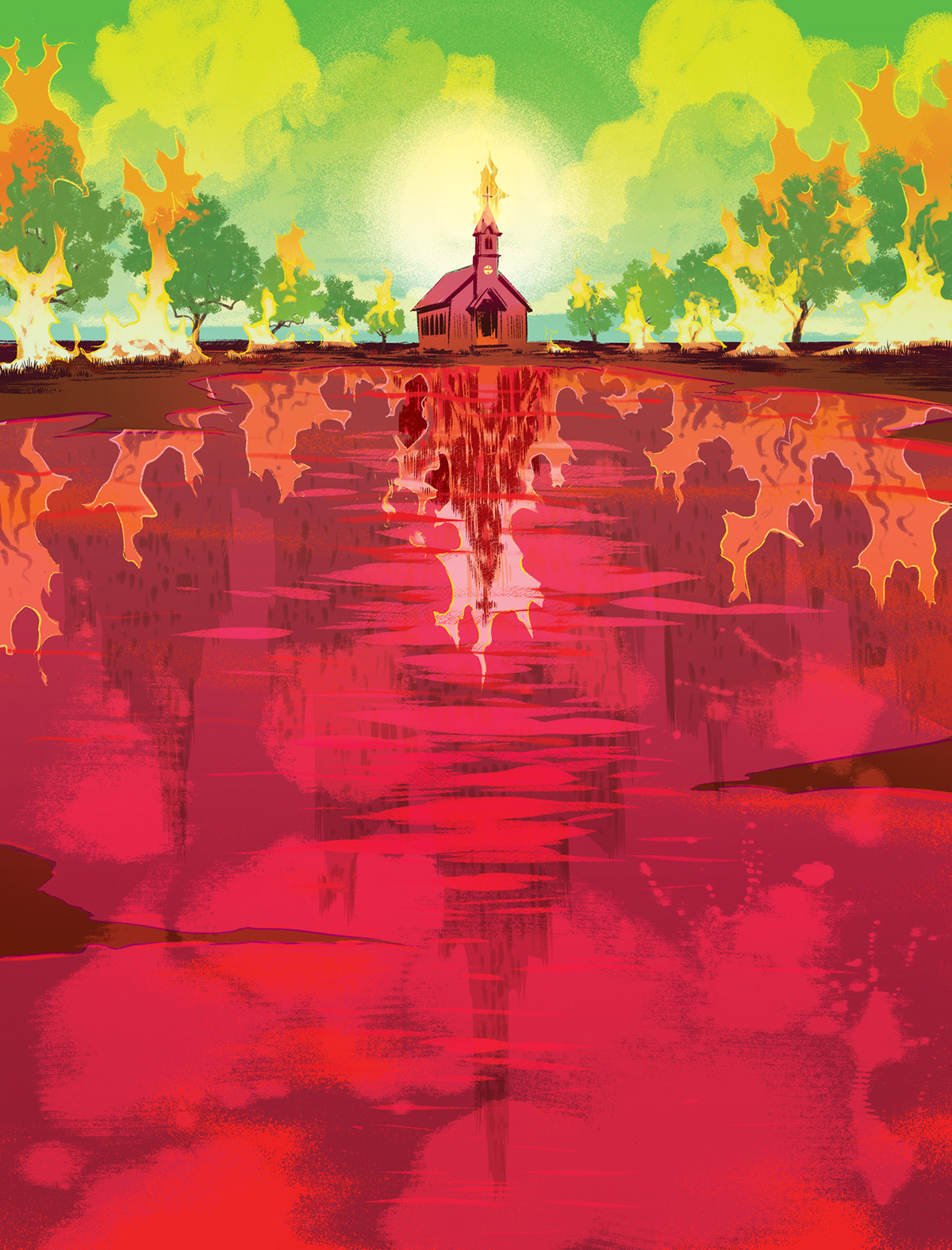
Original opener sketch
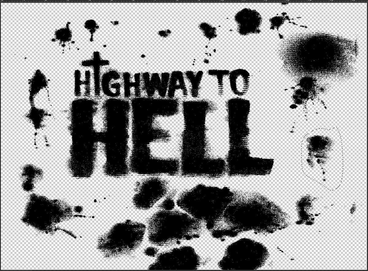
Type design done with ink on cotton undershirt for blood/soaked shirt effect.
Original final art submission for layout

"S" created from type design pieces above


