

The project’s goal was to create a new design system for an existing festival. A new poster, ticket and program design was to be developed and could be expanded into new festival ephemera, wayfinding systems and digital components. Research was an essential part of the process as the newly designed system would have to successfully capture the essence of the festival.
Bass Coast was my chosen festival because I was intrigued by it’s unique take on the electronic music festival movement. Bass Coast is a three day electronic music and arts festival based in Merritt, BC. It’s an immersive and engaging multimedia experience that is made only accessible to a small intimate group of 3000 people. Bass Coast features a variety of artists, workshops, performances and art installations immersed right in the forests of Nicola Valley and is built and around the values of community, musical innovation and respect for the environment.
Bass Coast’s values became the inspiration for my concept of rhythm, the idea that rhythm uniquely defines Bass Coast, it was the rhythm created by the people, the landscape and the music. Inspiration was especially taken from the undulating forms of topographic maps which mimic both mechanical forms, like sound waves, and organic forms like water ripples. More information about Bass Coast can be seen at http://basscoast.ca/.

Poster: This illustrative approach begun as hand drawings that resembled the undulating forms seen in topographic maps. These drawings were created by hand and scanned to create slight distortions to the pattern to bring out a more ‘digital’ look. The drawings were then vectorized to become the new defining ‘mark’ of Bass Coast. Spliced and warped type was incorporated to show the concept of rhythm while a combination of solid, and outlined forms and exaggerated colours, reminiscent of of nature worked together to create a sense of energy and depth within the poster.

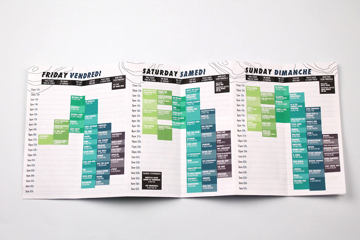
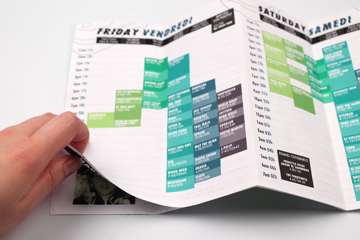
Program: A double sided accordion style program was designed for compactness and ease of access to information. Pulled out, the front displays the festival schedule over 3 days, on the reverse is secondary information such as the festival description and a self scheduler so attendees can keep track of their preferred set times. Once fully opened, the inside displays the festival map with new icons created to identify key locations on the ground. Additional information on this side includes blurbs about some main headliners and harm reduction tips regarding, consent, hydration and foot protection.


Motion: The new festival mark was further explored through motion graphics. Elements such as the undulating form, colours and spliced type treatments were carried throughout the piece to maintain consistency between the components. The motion piece acts as a promotional/teaser for Bass Coast displaying information about the festival and also featuring names of select artists from the lineup. Keeping with the concept of rhythm, the type moves to the rhythm of the track, ‘100%’ by Bass Coast artists, BNW or Blondtron and Waspy.

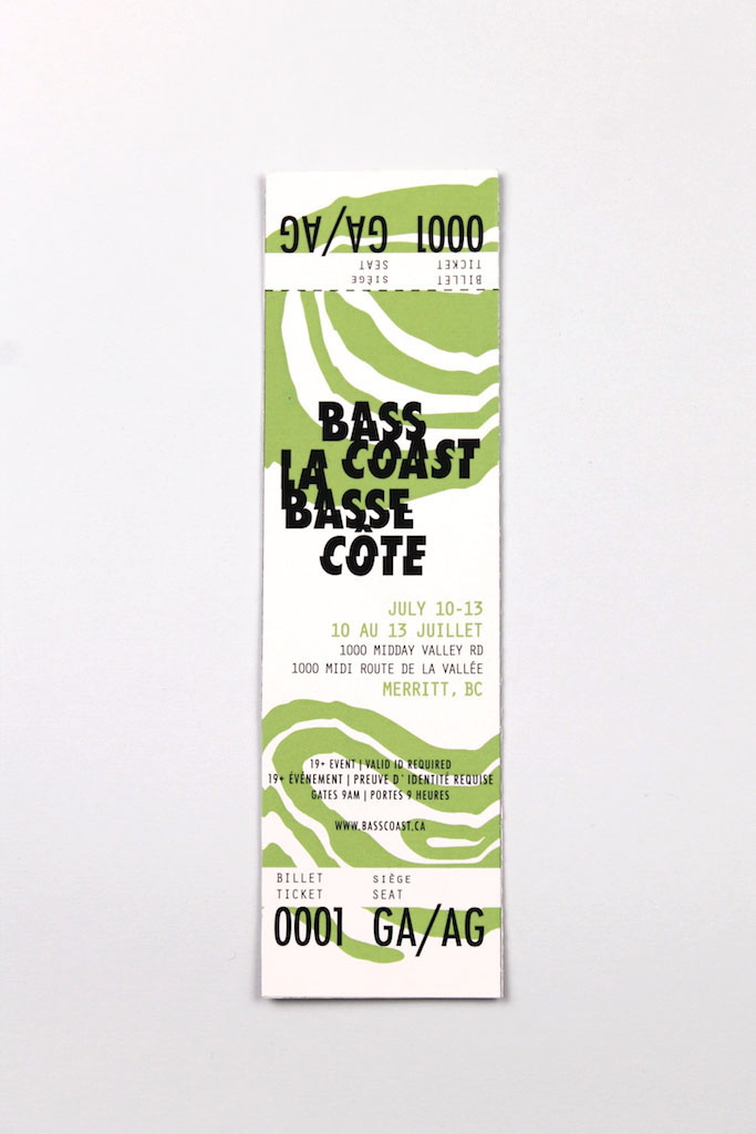
Ticket: The ticket incorporated the new festival mark, spliced text and a more simplified colour palette. Pulling away some elements seen in the poster allowed for a more legible ticket and made the ticket feel as apart of the same system yet it’s own individual component. The front of the ticket was limited to white and green and information regarding the festival dates, times and location, while the back featured a darker colour palette featuring select artists on the Bass Coast lineup.


