Graphic Studio 2
Project 1C:
Orchidea, The Red Gin (Singapore Sling)
Orchidea, The Red Gin (Singapore Sling)
Orchidea derived from Singapore’s breed of national flower that is; the Orchid. Established in 1915, the Original Recipe of SIngapore Sling aims to represent Singapore through the aesthetics of this gin-based cock- tail. Since the sling consists of mainly cherry, pineapple & gin I figured the new ready-pre-mixed recipe should be a little floral in sense of taste and image. I call it The Red Gin, in literal fact that it is a bright red drink.
The colour red also most certainly reflects the one other colour of our national flag too. I came up with a few different variations during the process of developing this logo, which when this final logo appealed best to me as the new image for Singapore Sling.
The typeface used is; Centabel Book and it looks right for this branding. It has a special curve at the end of its foot/stroke and that keeps this serif font looking simple yet special. The circular wave represents the fluidity & sophistication of Singapore’s drinking culture and the rooted historic tradition that came around this red gin.

Logo Drafts

Logo Drafts 2
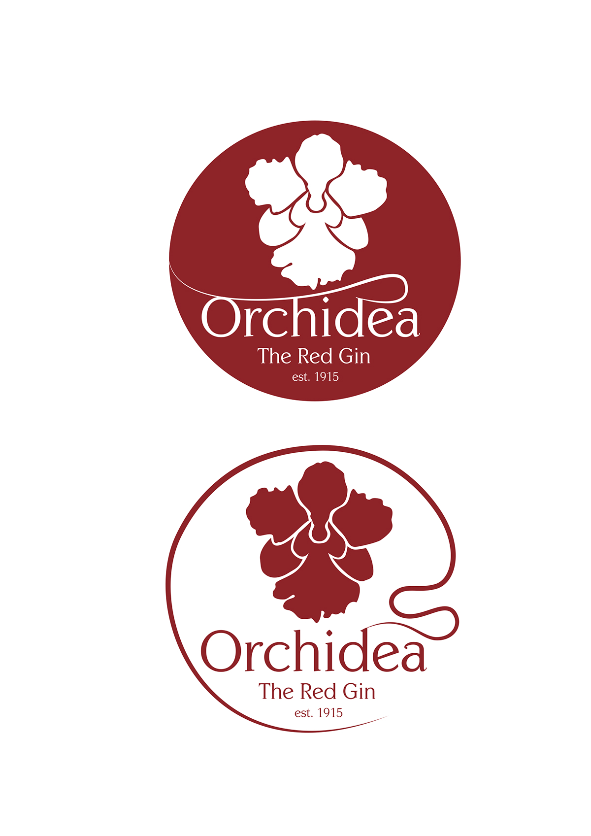
Final Logos
