Graphic Studio 2
Project 1B:
Singapore Heartland Enterprise Seminar 2016
Singapore Heartland Enterprise Seminar 2016
This year in 2016, the Singapore Heartland Enter- prise Seminar has adopted a new logo. One that is a fresh look from its previous design.
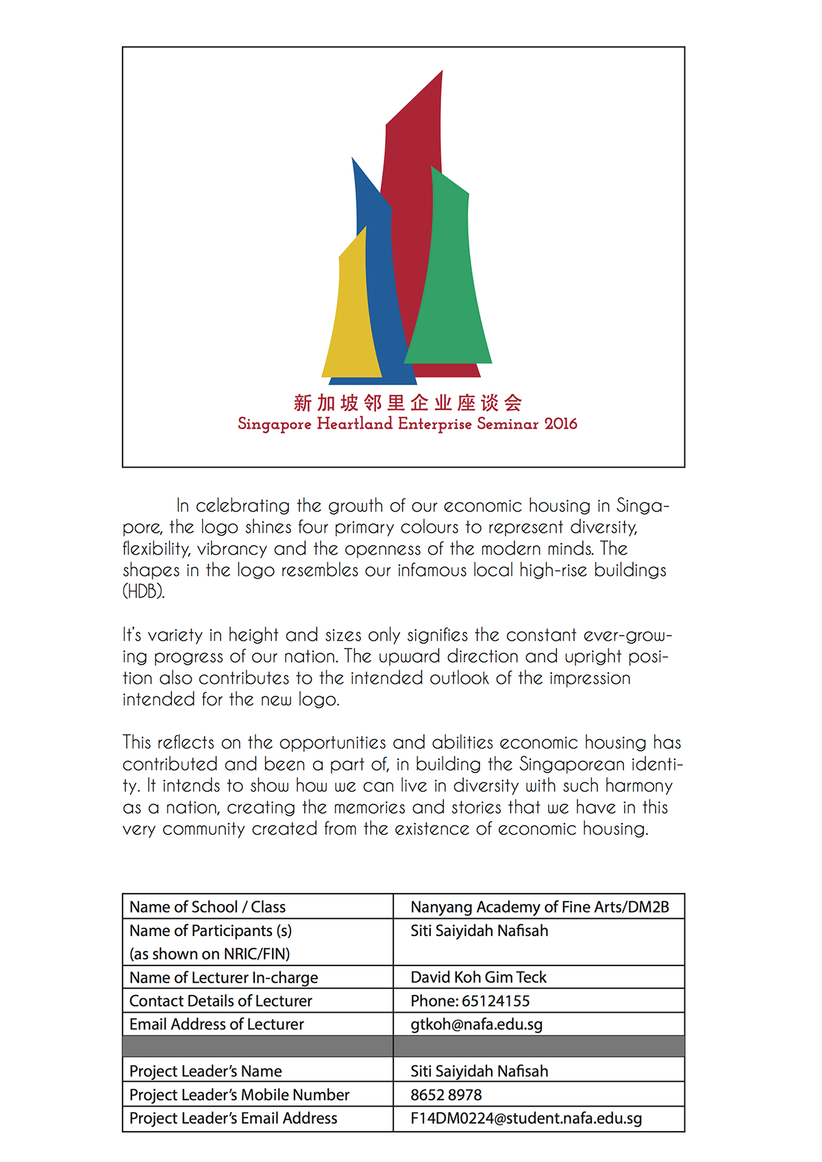
In celebrating the growth of our economic housing in Singapore, the logo shines four primary colours to represent diversity, flexibility, vibrancy and the openness of the modern minds. The shapes in the logo resembles our high-rise buildings.
Its variety in height and sizes only signifies the constant ever-growing progress of our nation. The upward direction and upright position also contributes to the intended outlook of the seminar.
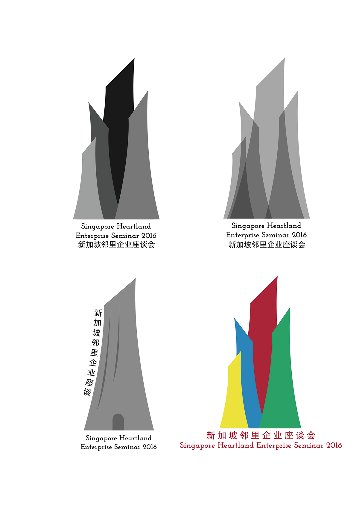
Logo Drafts
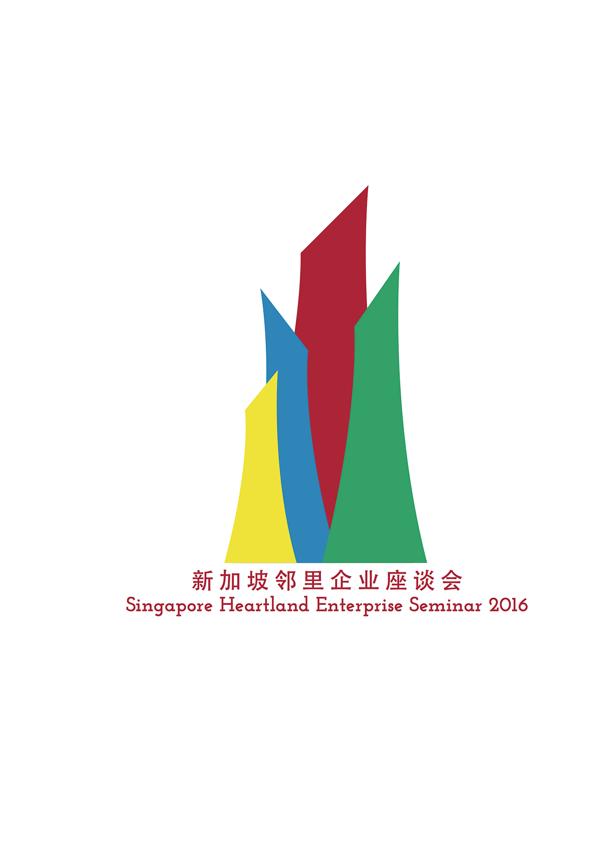
Final Logo
Competition
