OASIQ
Outdoor furniture brand and showroom
Outdoor furniture brand and showroom
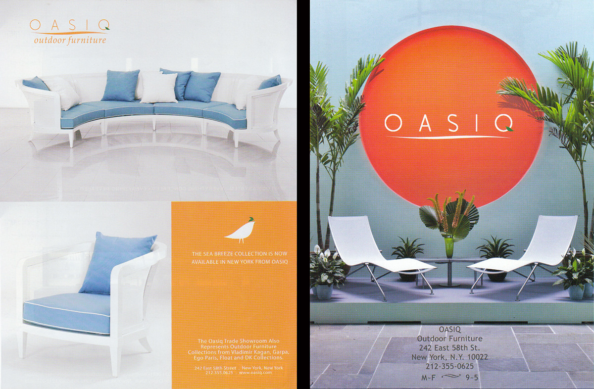
The task is to revitalized the brand to reflects it commitment in revolutionary design and the solution is to simplified the logotype into geometric shapes and even give it a more subdue tone of gray instead of the corporate color "orange". This treatment will let the furniture stand out and reinforce the role of the brand as a purveyor of contemporary design.

Previous Advertising and Logotype
Improved advertising layout and Logotype


Handout before design

Trade show graphics


