THRIVE
A city park designed for the City of Charlotte, North Carolina with the triple bottom line (people + profit + planet) in mind.
___________________________
A city park designed for the City of Charlotte, North Carolina with the triple bottom line (people + profit + planet) in mind.
___________________________
Concept
The name “Thrive” represents the ultimate goal of the park: to create positive growth and success for the residents, economy, and environment of Charlotte. The park name was established with the word “Thrive” alone, as opposed to “Thrive Park”, in order to place clear emphasis on succeeding while, also, acting as a gentle reminder to park-goers that they come to the park to thrive.
Outcome
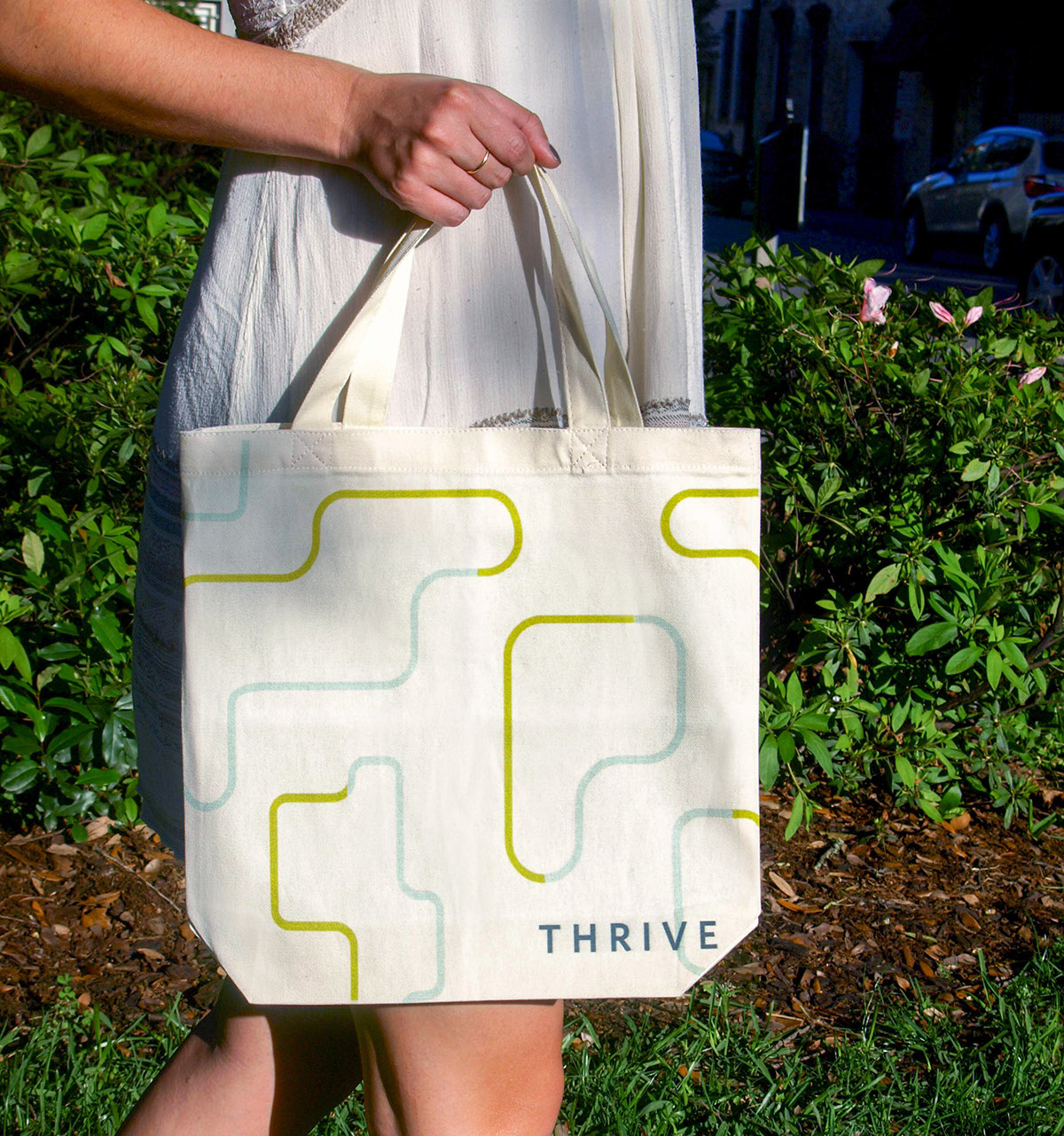
The identity program utilizes a reoccurring theme of blue and green outlines coming together in the logo and various brand elements. This was done to represent everything coming together in the park: residents come to collaborate and build community, while economic success meets green sustainability. The symbol in the logo is a “P”, which depicts the “P” in park and the physical park map. The word “Thrive” cuts through the “P” so that the line of "P" and the "I" in “Thrive” line up. This was intentionally done to subtly allude to the idea of "I thrive when I go to the park" —the way park-goers should feel. The logo never fully says "I thrive" or "Thrive Park", but rather, the idea is expressed in a non-obtrusive way.
___________________________
Design Includes
Logo / Identity System
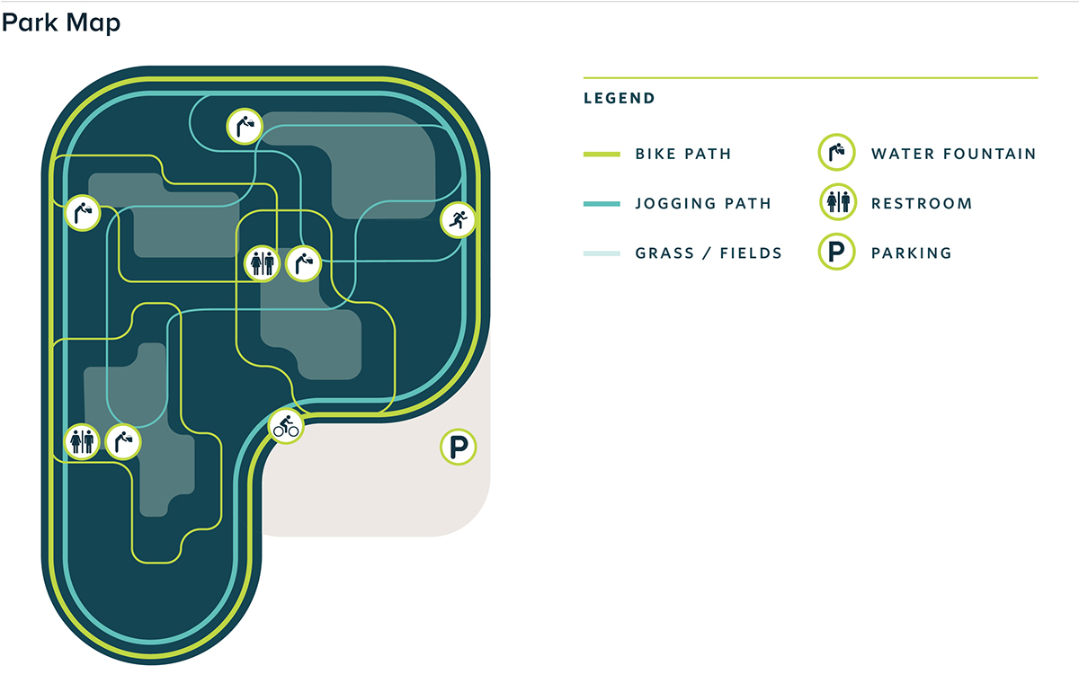
Park Map
Logo / Identity System
Park Map
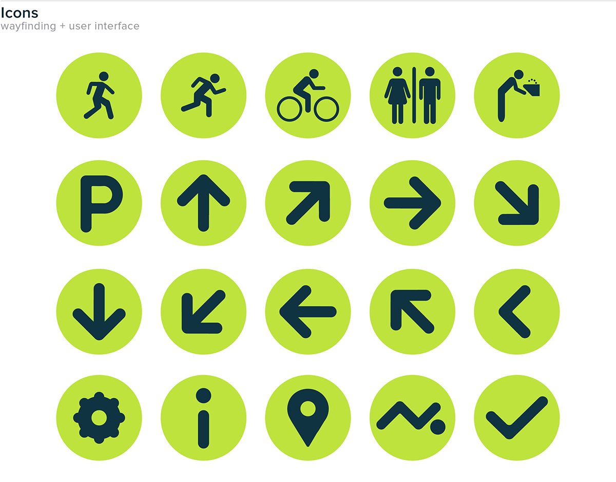
Icons (wayfinding + user interface)
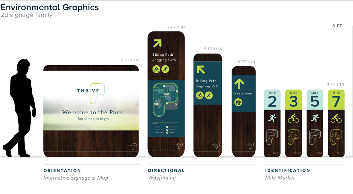
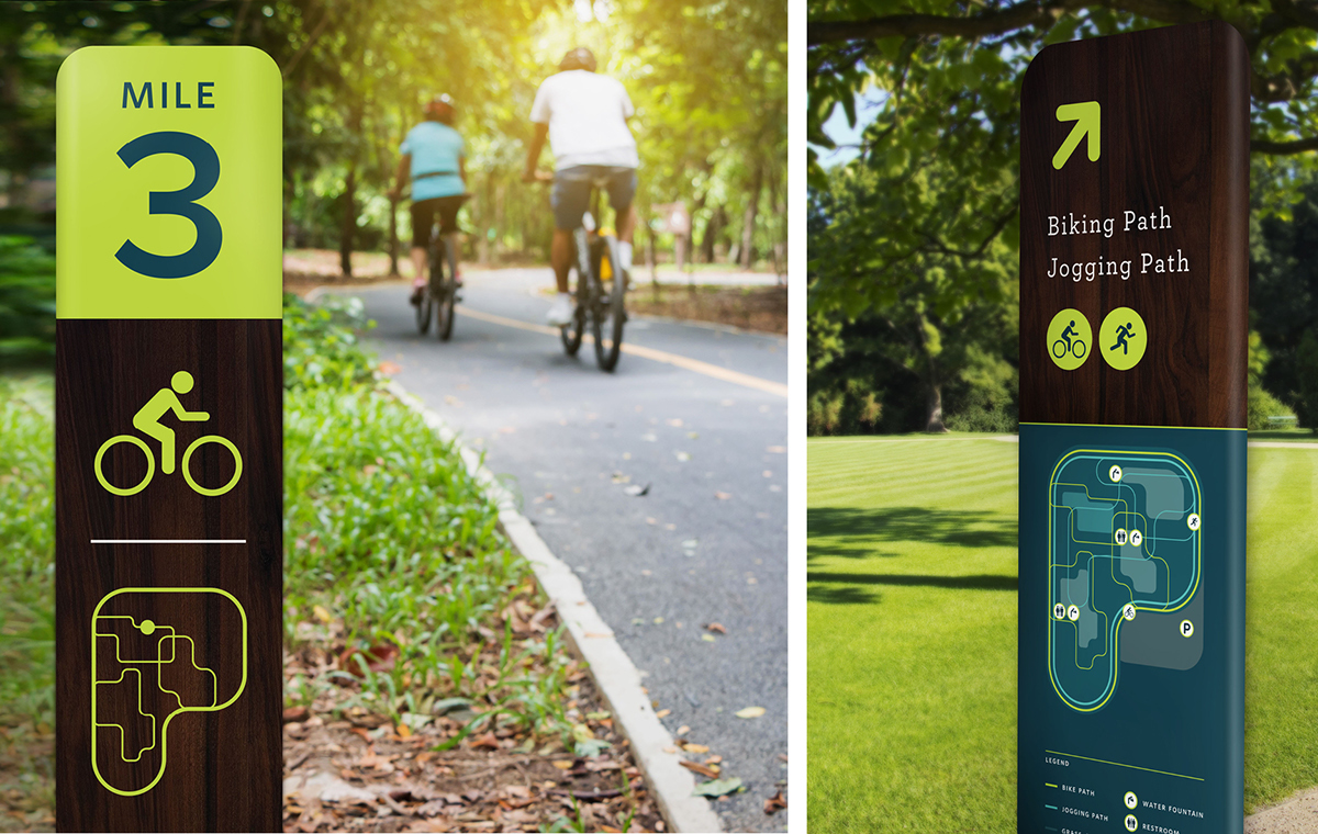
Environmental Graphics (static + interactive)
Mobile App
Memorabilia (t-shirts + canvas totes)
___________________________
___________________________
Semifinalist Adobe Design Achievement Awards May 2016
Winner Applied Arts Magazine Awards July 2016
CLICK HERE for process work.