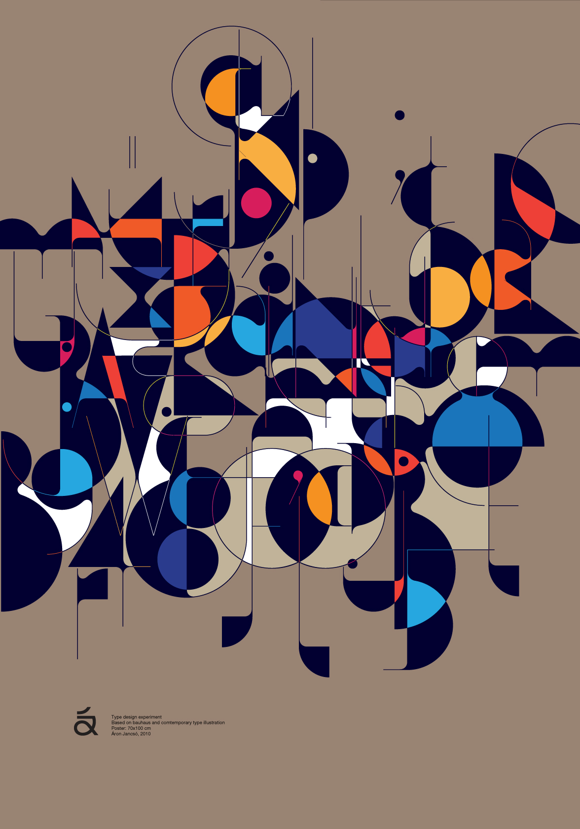
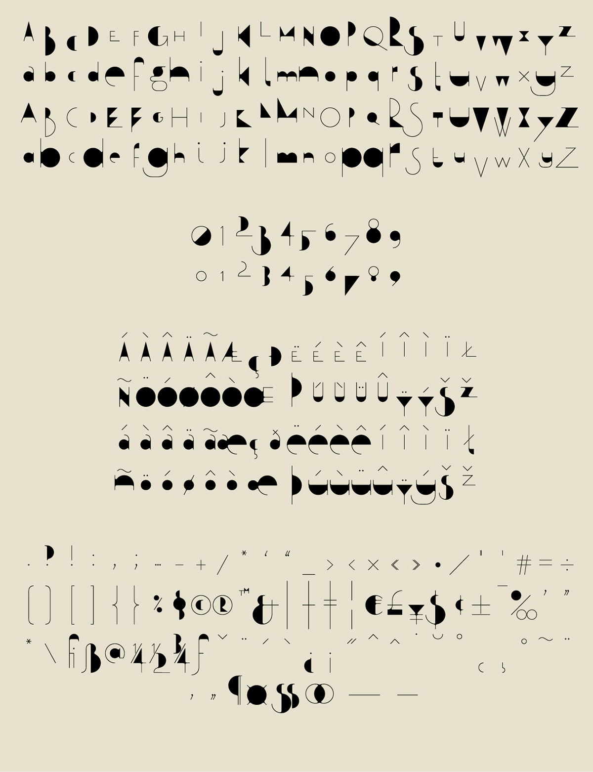
Qalto flows and leaps like freestyle jazz. Suited as a strong title or headline font, the letters and ligatures are composed of very thin hairlines and very thick elements. This high contrast conveys a stunning visual effect and a unique optical rhythm. Early on, Aron Jancso realized that "some words have good rhythm and others don't," and added stylistic alternatives for every lowercase and uppercase letter. If that’s not enough, there are four different weights, so users can use different sizes with the same hairline thickness, which allows for artistic freedom in arrangement and composition.