For a graphic designer, it is a fundamental step to use guidelines in order to create harmonious and balanced designs.
Ok, so, what are the grids? Let’s try and understand it together.
Specifically speaking, grids are bidimensional structures made of vertical, horizontal and/or diagonal lines and curves used to better structure the content, and they become the rational reference for text and image organization. In other words, grids are those structures aiming at establishing the exact measures, proportions and distances among graphic elements.
Why shall we use grids to design a logo?
When approaching logo design, you can start by using a various number of grids: as well as the golden ration, it is often used the rule of thirds, very common in photography, or just a column and gutter grid. Otherwise, in order to expand the creative potential, you can build personalised grids made of geometric figures and curves.
The use of grids is an infallible method to create harmonious shapes in the process of logo creation.
Thanks to the use of grids, as a matter of fact, you can achieve the following advantages:
Better organization of the space in the design phase, with the consequence of easily creating a balanced and harmonious logo;
Higher likelihood of creating a timeless and classic logo, with simple shapes;
A good base to create a versatile logo, that can be visible and clear even in reduced dimensions.
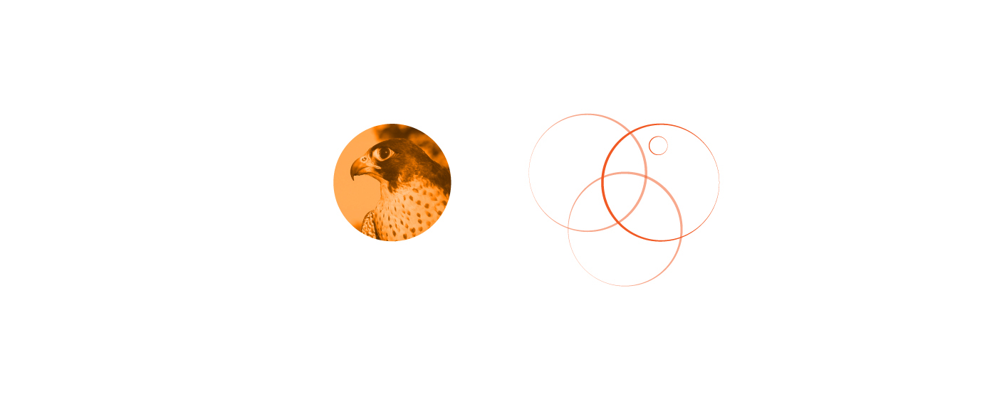
Why shall we use circular grids?
It is known that people’ subconscious react in a different way to any kind of logo: the human eye, indeed, is stimulated by the shape and colour of the image it sees, and this affects the way that image is perceived inside.
The circle, as well as being a perfect figure, tends to convey a positive and balanced message. As a consequence, a logo built on a circular grid offers the viewer a feeling of positivity, completeness and protection.
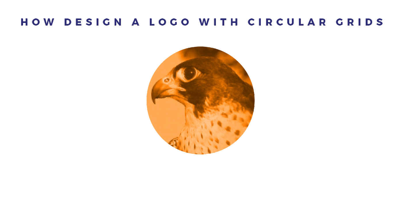
PROJECT
As for the creation of any logo, it is necessary to start from a brief. Leaving the sketching out, that is anyway fundamental for every typology of logo, let’s pick a picture and try to create a logo on this basis.
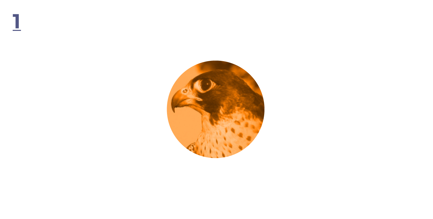
By analysing the image we can already image the logo we want to reproduce. Again, let’s go straight to the phase of vectorial elaboration omitting the sketching phase and let’s rebuild the image with some circular shapes (preferably circles, it is better to limit the use of oval forms).
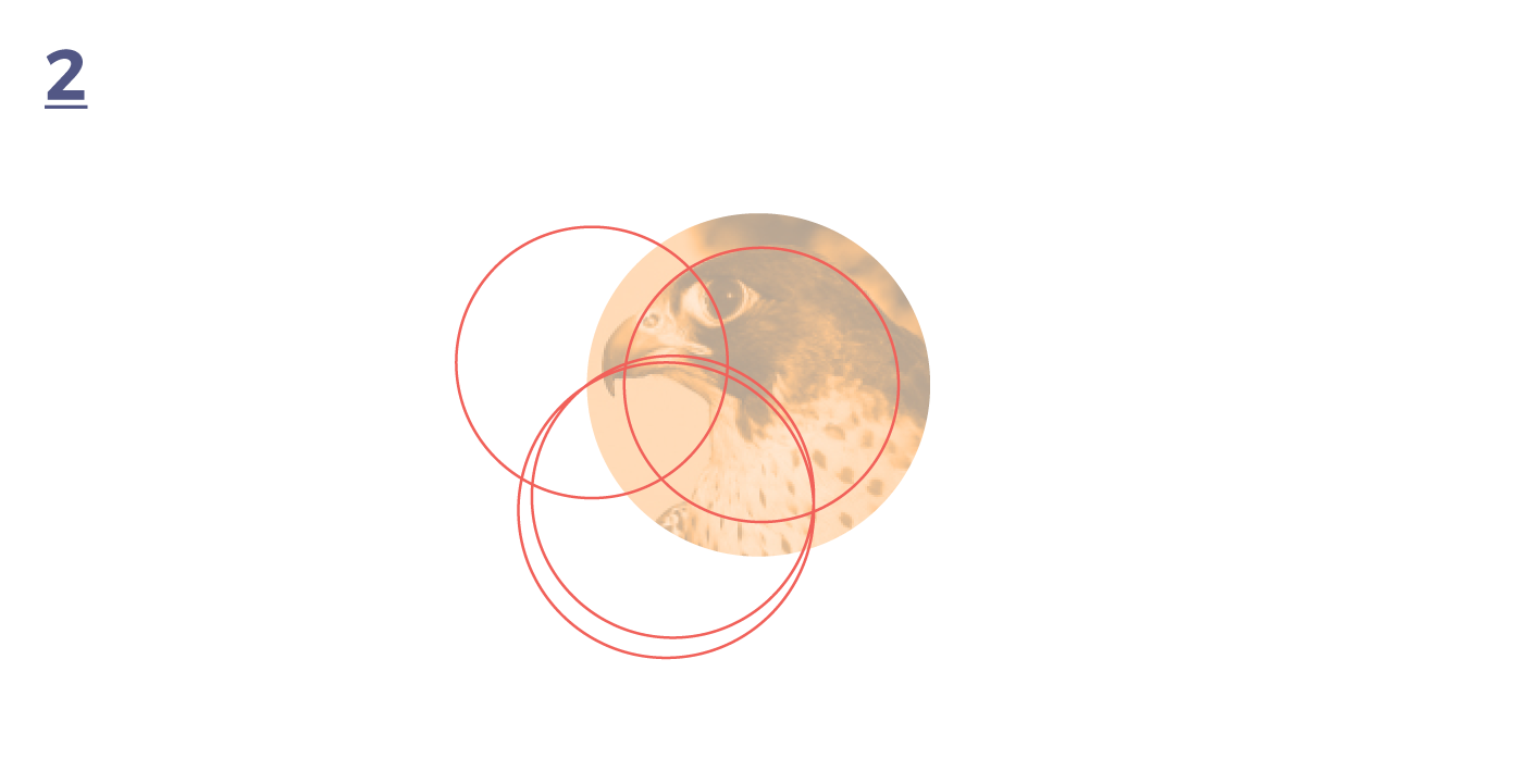
To remember the interesting parts that can be adaptable to a flat logo we can use the trick of colouring the standing out areas.
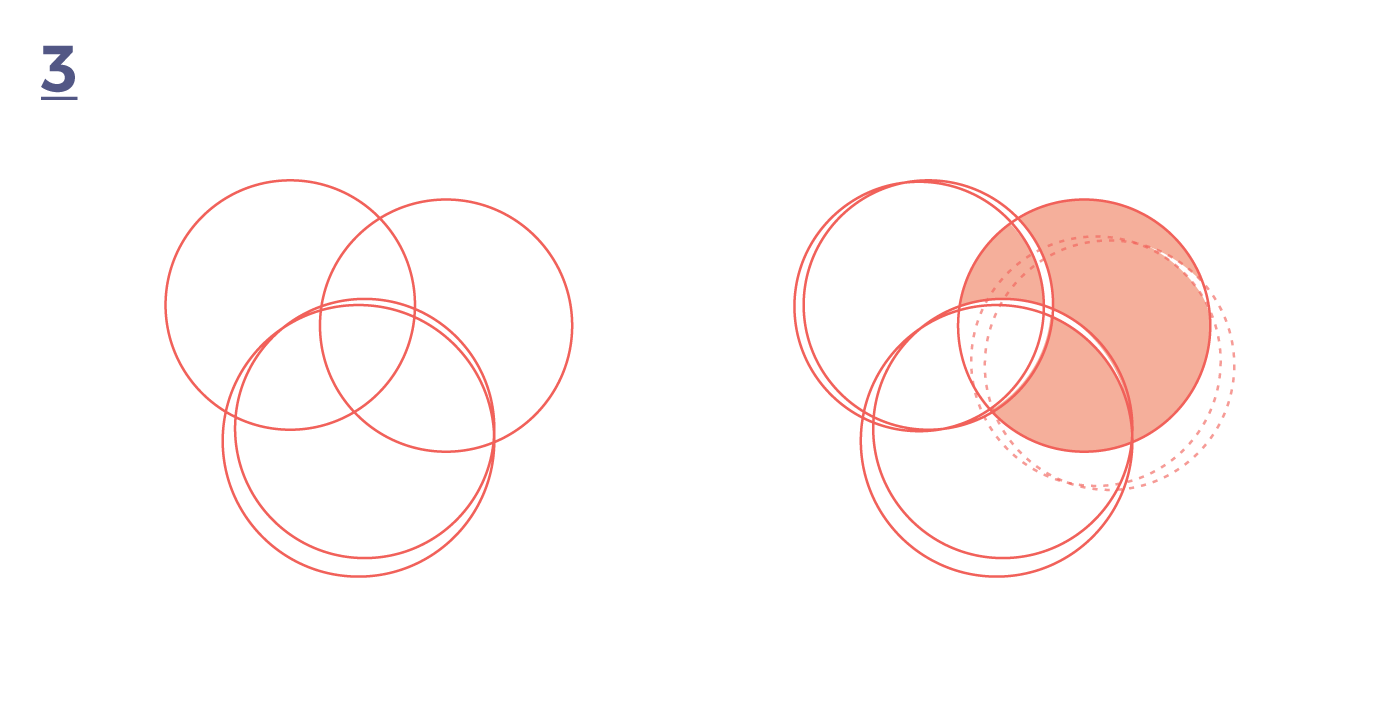
Once we have determined the shape of the final logo, we can start to elaborate the layouts including and excluding the circular parts (treasure the “Pathfinder” tool in this case).

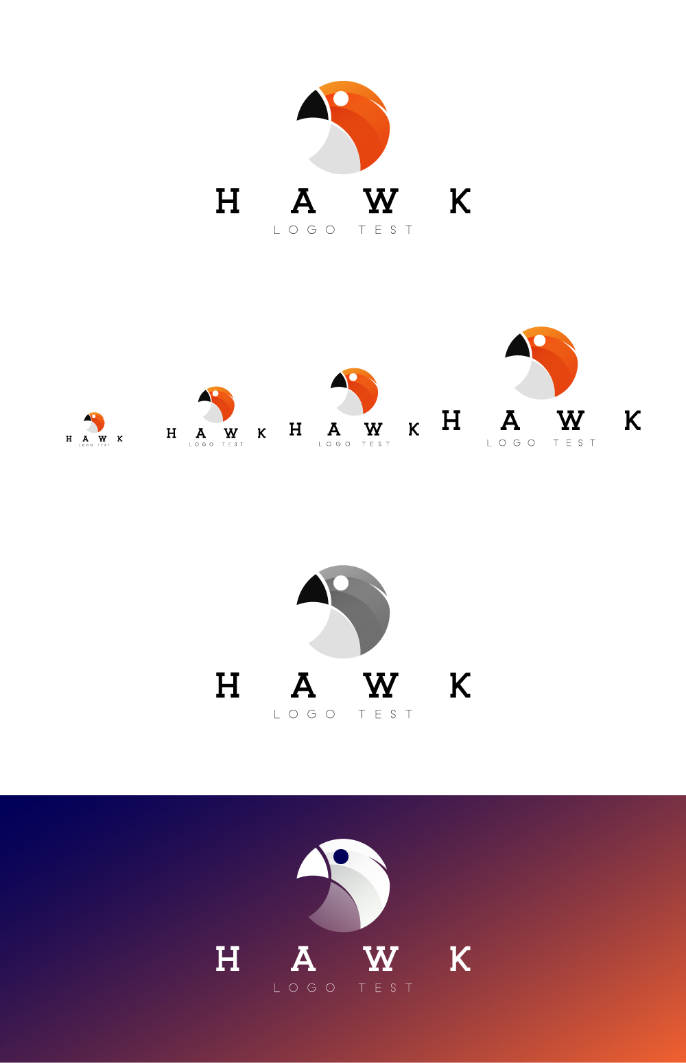
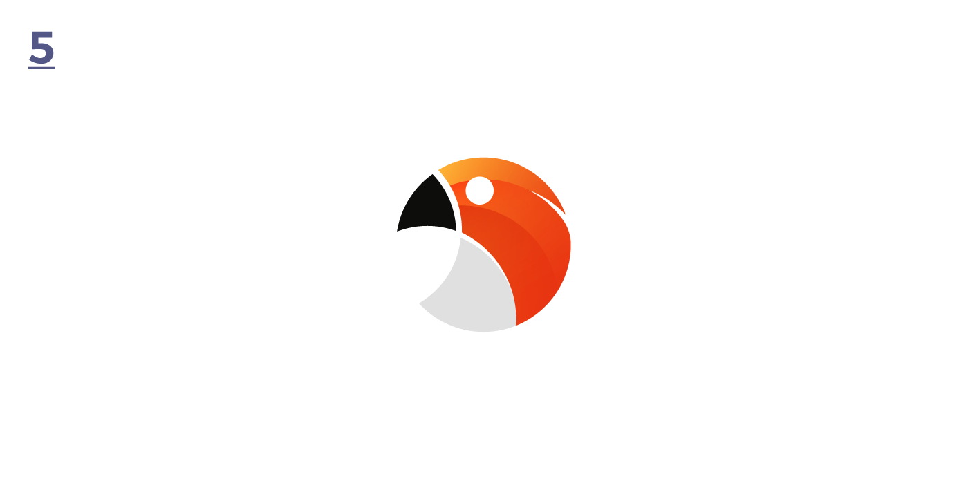
Here is our flat logo. Now we can go on adding all the details that can enrich our logo.
Have a look on my website and read there the article. Share it and send me your best works with the circular grids!
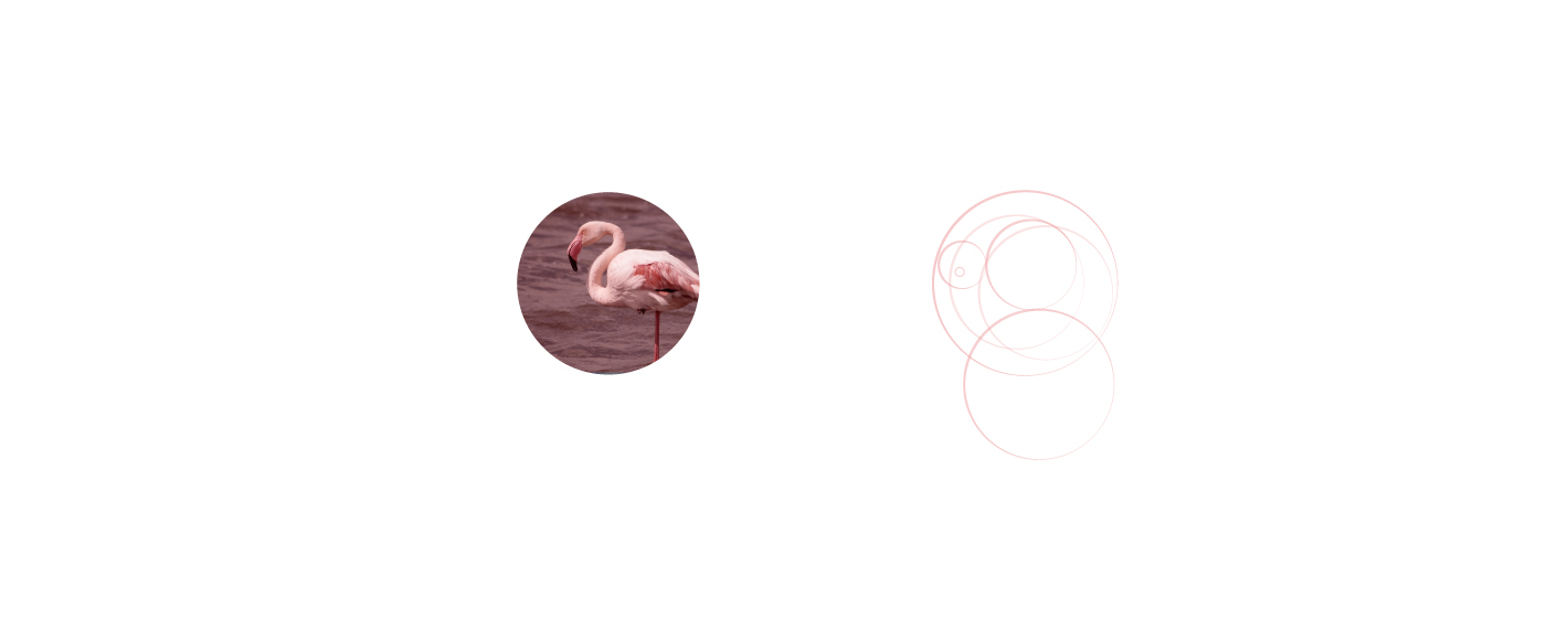
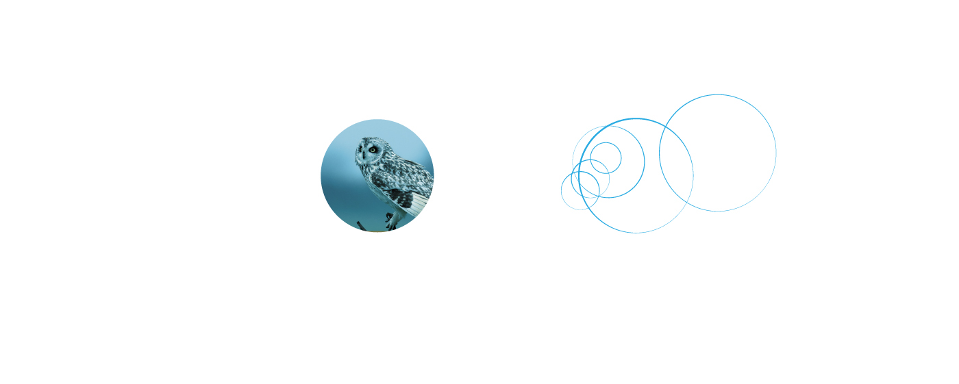
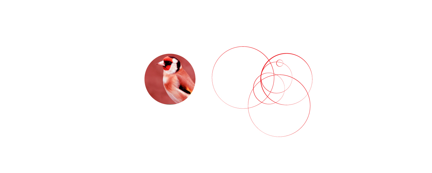
Continue down to see other examples!