Identity Update
Chicago Public Library came to FCB Chicago for a few ideas on how to refresh their brand. What they ended up getting was an entire refresh of not only their brand image but their brand voice as well. With minor adjustments to their logo, we were able to create a system that is easy to use for all their branches as well as their master brand.
Chicago Public Library came to FCB Chicago for a few ideas on how to refresh their brand. What they ended up getting was an entire refresh of not only their brand image but their brand voice as well. With minor adjustments to their logo, we were able to create a system that is easy to use for all their branches as well as their master brand.
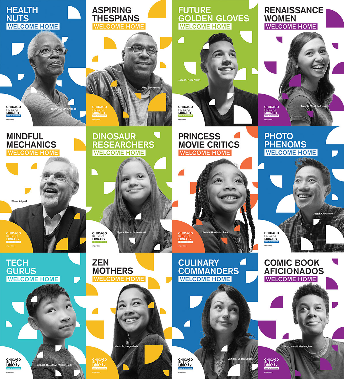
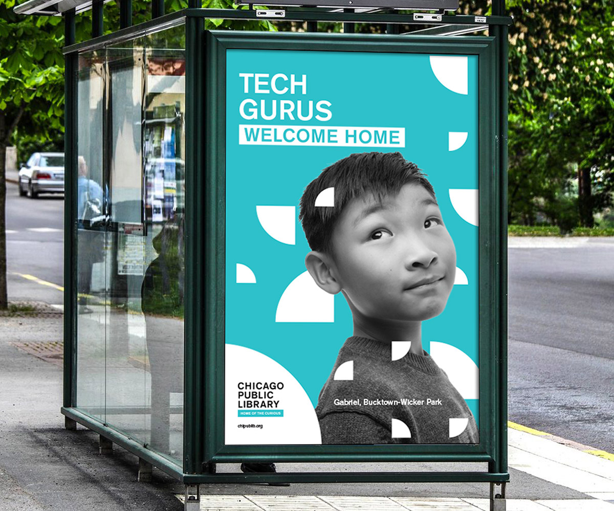
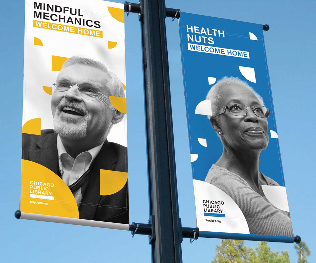
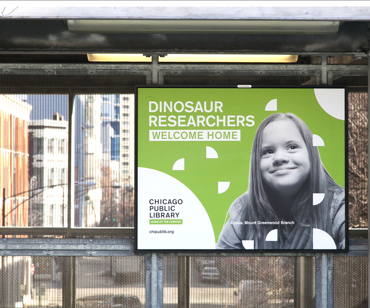
Home of the Curious
Home of the Curious is a campaign set to promote the library throughout the city as a free and accessible resource for anyone willing to learn. Chicago libraries have a massive amount of resources from legal help to entertainment to city passes and not many Chicago citizens realize just how much is being offered to them.
Credits:
Group Creative Director - Myra Nussbaum
Design - Jordan Sparrow, Jackson Bernard, Matthaus Frost
Art Direction - Jordan Sparrow, Lauren Swago
Copywriting - Matt Everts, Lauren Hystead, John Claxton
Planning - Hayet Rida
Account - Brooke Ward, Darian Weaver
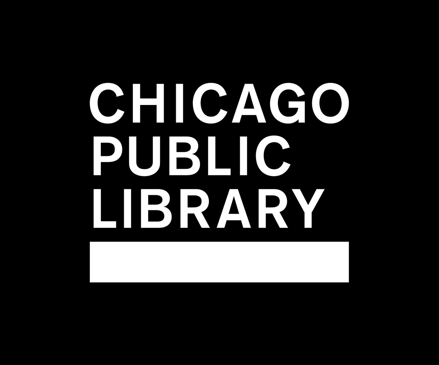
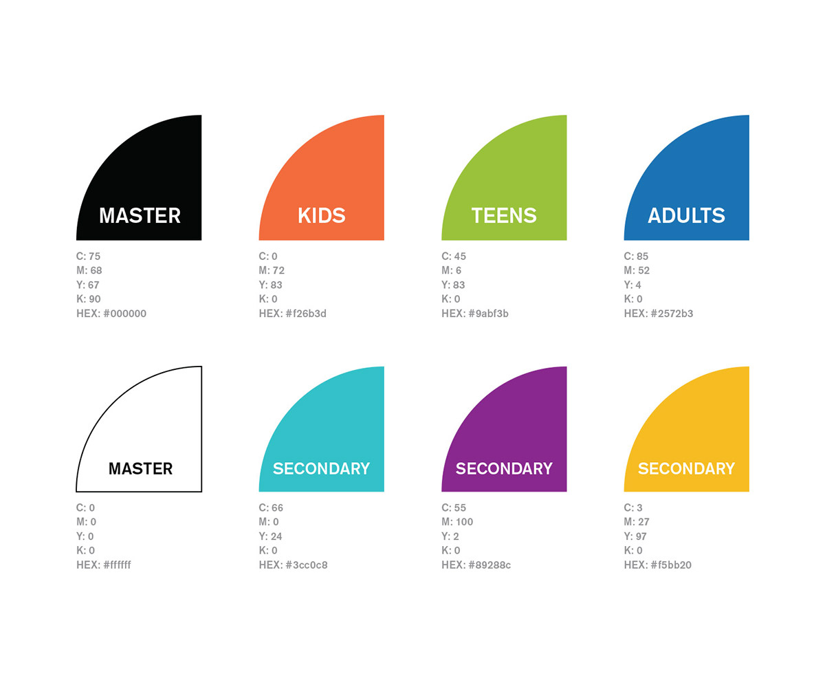
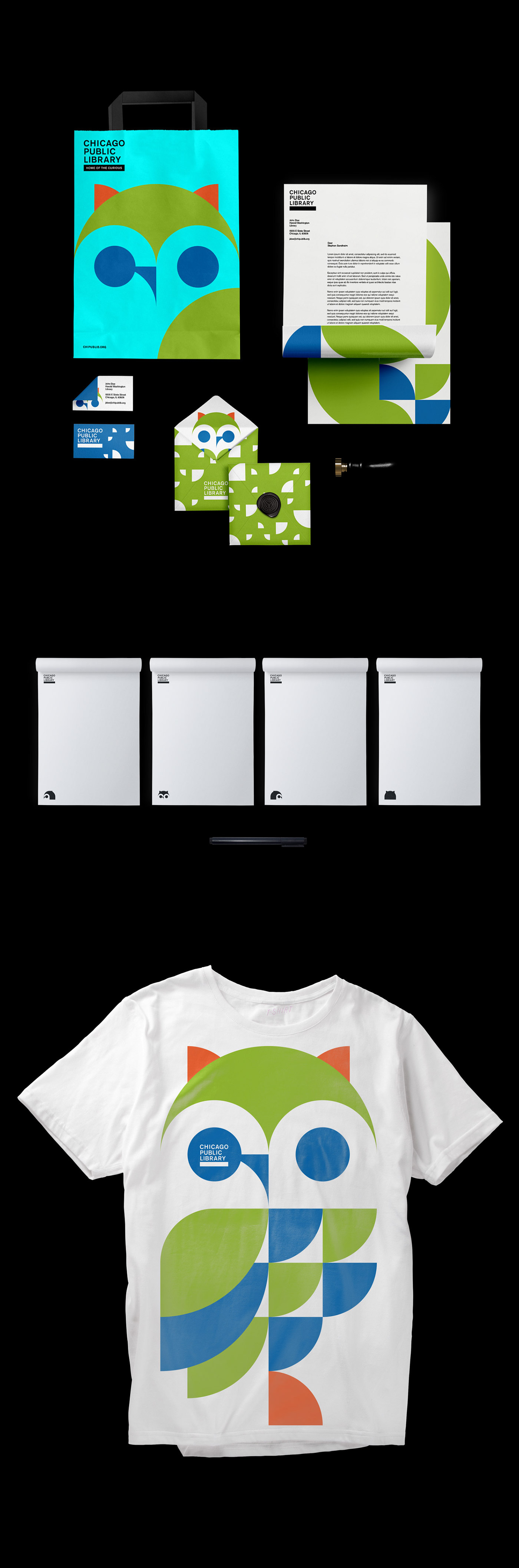
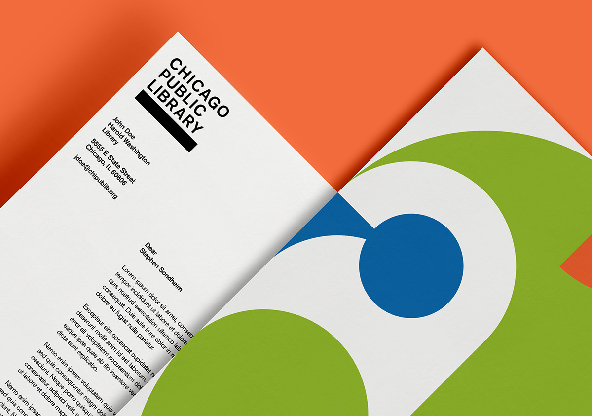
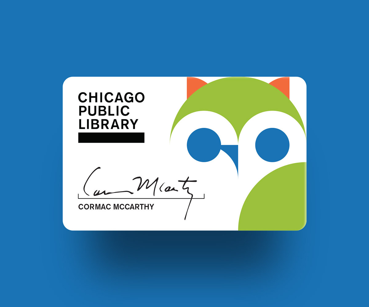
Utilitarian Logo Design
The library was struggling with a logo identity that could house the many programs they offered to the public. At the moment they had completely different logos for each program, and there was not visual cue that they were involved with the library. We chose to simplify their current logotype and introduce a bar that could be used as a wayfinding tool or a language break.
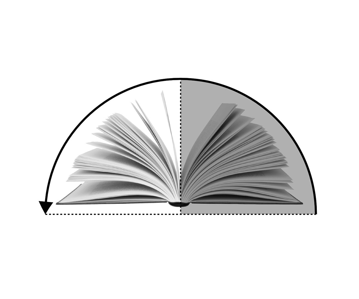
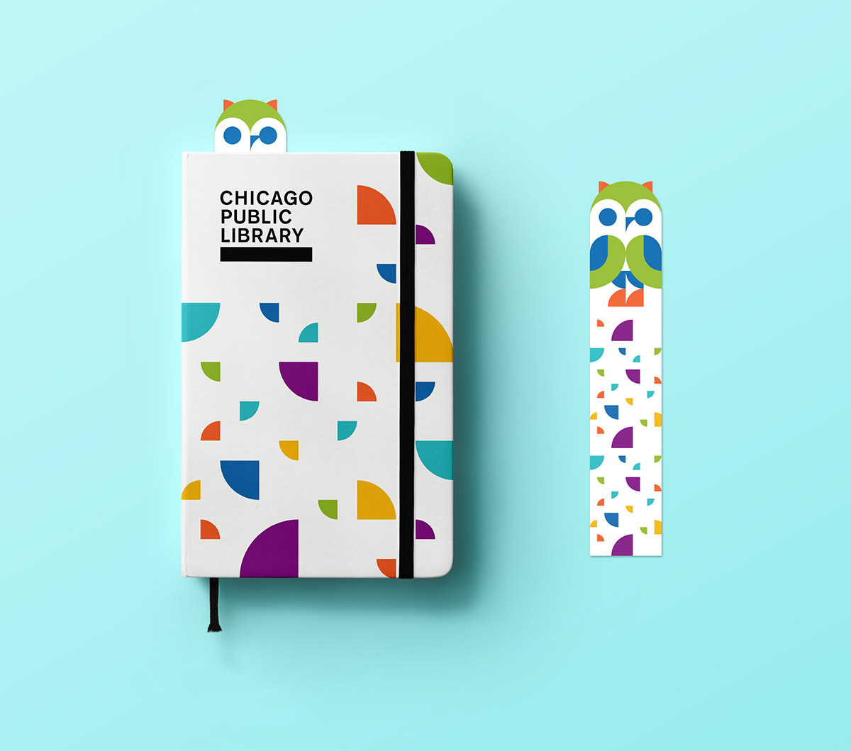
Open Book Motif
Since our logo is very minimal in visual cues, we introduced a simple open book shape to create visual rhythm and an identifier that represents curiosity and exploration.
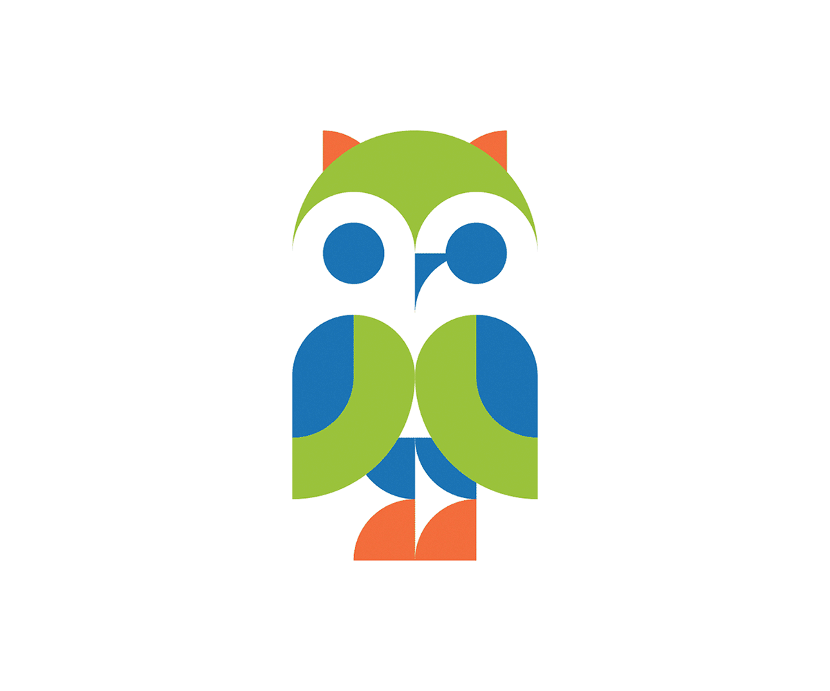
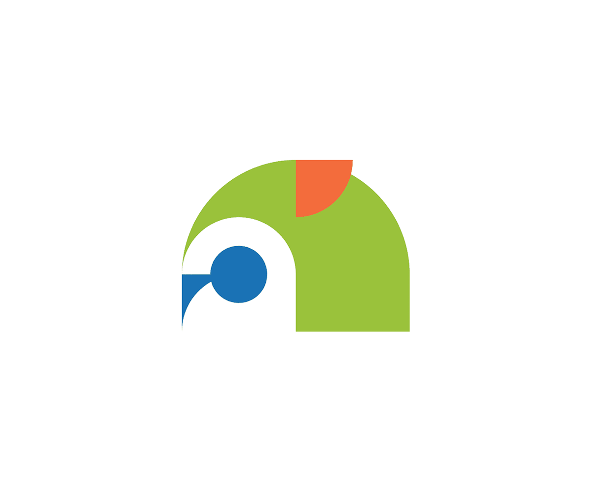
Owls
When you visit the Harold Washington Library, the flagship library in Chicago, you'll notice owls placed along the roof. We wanted to incorporate these identifiers into the brand as a fun element of the library's personality.


Social Videos
To promote Fine Amnesty, a program created to erase overdue book fees, we created a series of simple videos containing pleas from librarians to return your books.
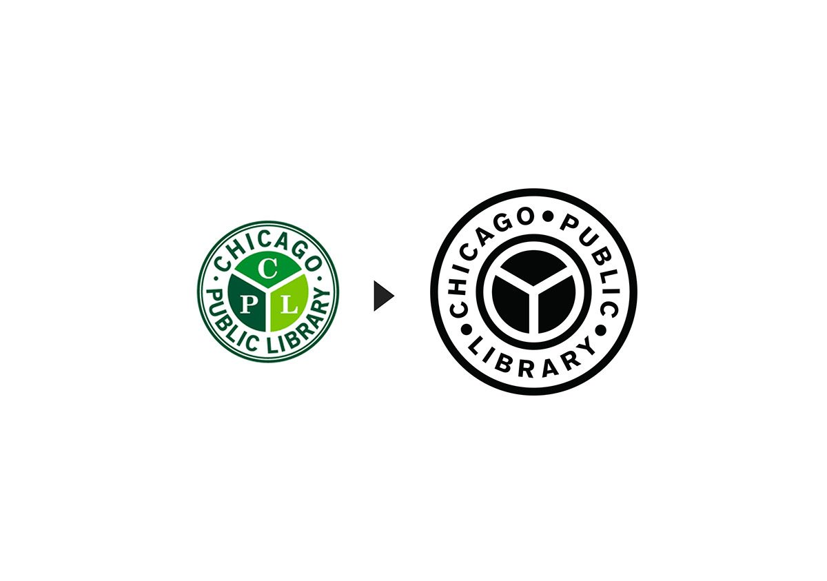
Library Seal
The library seal also needed an overhaul. We kept it around for internal use due to the importance of tradition. By simplifying it, we made it more legible and less redundant.