In MICA (Maryland Institute College of Art), weekend workshops are to look out for. Last week, we had a wonderful opportunity of working with Boston based design studio, Sosolimited for our weekend workshop. Sosolimited is an art and technology studio that specializes in interactive and multi-sensory designs studios. Before the workshop began, they (Eric Gunther and Jackie Littman) showed us an array of their work and baffled us by the simplicity of the concepts and the complexity of the behind the scenes work. After the presentation, the anticipation was rising and everyone had their own theories about the project brief they were going to provide us. Soon, all the rumours were put to rest.
The following was the brief provided to us.
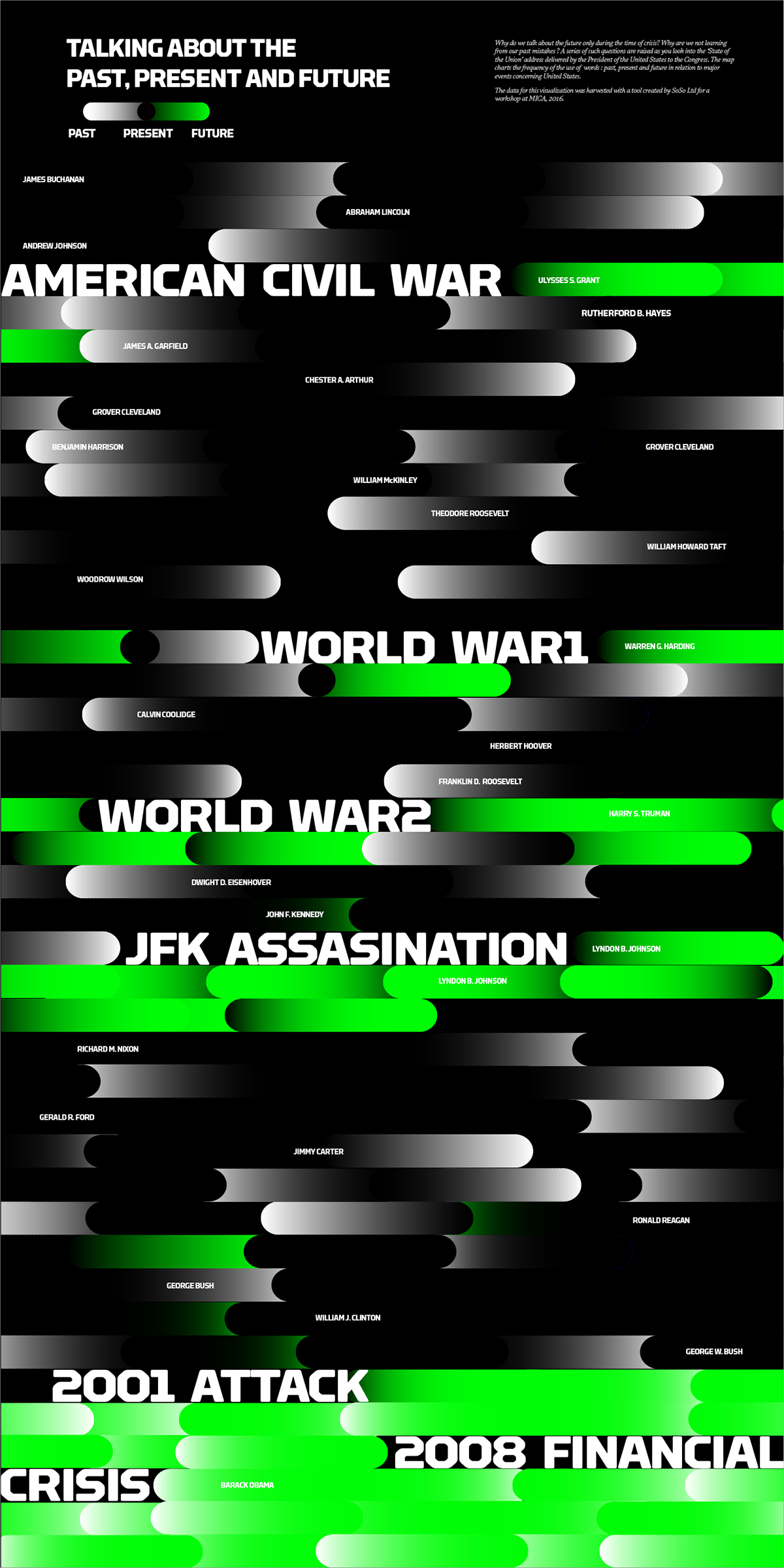
The State of the Union Addresses are a lens into a changing America and a changing world. The Addresses not only report on the condition of the nation but give insight into national priorities over the years — political, social, and otherwise.
Create a poster that visualizes the historical State of the Union transcripts as data. You will learn how to use simple tools to extract different stories from the same data set. You will focus on telling a story with the data and creating an editorialized view into the content.
For the workshop, they had created a tool for us to search a particular word through all the speeches of the State of the Union adressess and displayed the frequency of the usage of words as well as the context in which it was used.
As a student from India, I did not have a lot of insight into the subject and after talking to people regarding the nature of the addresses, one thing that stuck with me was that, the addresses are a sort of a report card. They map out the past successes and failures as well as future endeavours. As I started playing around with the tool, I searched for the word ‘past’, since, if it was a report card, I was expecting phrases like, ‘over the past years’ and so. Surprisingly enough, that was not the case. Other than Jimmy Carter, there were very few Presidents who used the word ‘past’. The most common was ‘present’ and even the usage of this word completely vanished after the horrific 9/11 attack. I decided to focus my data visualization on this and started mapping out the frequency of the usage of words ‘past, present and future’. Another interesting thing I noted while doing this was, the usage of word ‘future’ was only during or after the times of crisis and that became my base data to play with which created another dimension to the whole story.
While working on the poster, I remembered the essay by Michael Bierut, I had read not a long while ago, on the diagrams by Mark Lombardi. He writes :
But if the goal of information design is to make things clear, Lombardi’s drawings, in fact, do the opposite. The hypnotic miasma of names, institutions, corporations, and locations that envelop each drawing demonstrates nothing if not the inherent — the intentional — unknowability of each of these networks. Like Rube Goldberg devices, their only meaning is their ecstatic complexity; like Hitchcockian McGuffins, understanding them is less important than simply knowing they exist.
Ever since I had read the essay, I wanted to explore this area of information design. In my piece, I wanted to focus on the fact that, we talk about future only during the time of crisis. This was my primary information. And I started creating the other pieces around it and by the end of the weekend, the poster was almost ready.