
TypeFight
Two designers enter, but only one will leave victorious
Typefight is an online competition where two artists compete against each other by drawing the same character as a drop cap.
This was the first time I’ve entered this competition, not to mention my first attempt at drawing a drop cap. So this project was a real challenge, but one I really enjoyed being apart of. Plus I ended up winning by just 8 votes talk about a close call.

This was the first time I've entered this competition, not to mention my first attempt at drawing a drop cap. So this project was a real challenge, but one I really enjoyed being apart of.
My 5 Step Hand Lettering Process
All in all this piece took over 12 hours to complete that included research, thumbnails, sketching and digitalization.

Step 1: Thumbnails
I started my sketch process by drawing as many 5's that I could think of. I knew I wanted something gothic, similar to black letter style that would make my number stand out.
Then after drawing about four pages of 5's, I started to circle my favorite elements of each to then franstein together to make something truly unique. I ultimately went with the very last character, hence all the arrows and the smiley face.
Then after drawing about four pages of 5's, I started to circle my favorite elements of each to then franstein together to make something truly unique. I ultimately went with the very last character, hence all the arrows and the smiley face.

Step 2: Detailed Thumbnails
Once I had my character figured out, I needed to add in the details. The best part of a designing a drop cap are all the fine points. The more ornate, the better.
I had the body of my number, but it took a few tries to figure out how I would decorate the number itself that would match nicely with a illustrated background.
I played with some ideas but ended up settling on the bottom right with the branches swirling around my letter. I liked how the bare branches married well with the sharp points of my number.
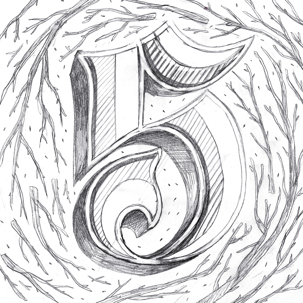
Step 3: Rough Drawing
Once I had my idea, I started to work bigger and bigger. I filled my page so that I could easily add all the details that would make this piece great.
I added a few levels of illustration to the number itself to make sure it was the center focus. By adding depth and layers of intricitsy I could easily draw in the eye.
For the branches, I wanted them to seem realistic, yet dead. I created weight in my branches from the bottom up so each branch would look like it was swirling clockwise. Then, I added little pieces of dirt and twigs to add to my circling effect.
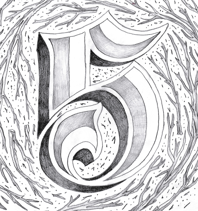
Step 4: Final Drawing
I decided to do something a little different for my final piece, so rather then inking this like I normally do I decided to create a detailed pencil sketch instead. Pencil when inverted looks VERY similair to chalk when digitalized.
I used various pencils to add the darks and lights but without adding too much shading. I wanted the piece to look sketchy and handmade rather then perfectly clean when digitalized.
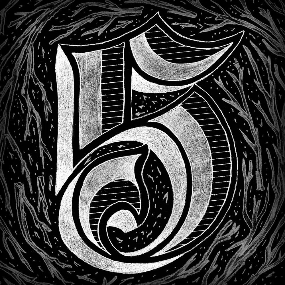
Step 5: Final Piece
I scanned in my artwork and started to tweak it in Photoshop. Not only did I clean up all my scuff marks but also moved around elements in my piece so each section could look more in line with the rest. I inverted my colors to white on black, and volia! Chalkboard was in full effect.
I decided to make my background illustration less opigue and added some vinette shading to bring just the right amount of focus to the character itsself. I didn't want this piece to get too busy that the 5 would get burried amoung the details.


