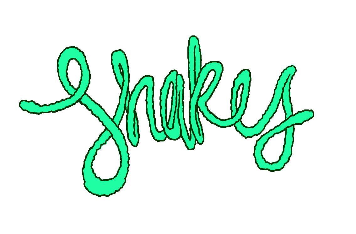
Logo created for the band after discussion with Alex Price. He wanted a logo that looked hand rendered and asymmetrical.
Promo video created in colaboration with Shakes to promote music and create a visual aesthetic.


Posters created for shows that Shakes were to be involved with. All posters consist of my illustration, and don't use too much computer based development. We have tried to maintain a hand rendered look throughout all projects related to the band.


The development of the EP cover was developed over several weeks. The work was sketched on paper several times before a final design was decided. After scanning in the image, I felt this piece should stand out from the rest. I did the coloring in photoshop for this reason. The colours are supposed to really pop out and create visual interest. The idea for the cover is supposed to be counter culture towards the genre the band comes from. We were wanting to have a dirty, hand made, unpolished look, achieved by leaving sketch lines and blocky shading of colour.


