Speculative Design Branding Workshop
This branding project was the result of a weekend workshop lead by Bonnie Siegler, of Eight and a Half, at the Maryland Institute College of Art. We were prompted to create a company that could exist at some point in the future —coming up with a name, mission statement, and mood board. To our surprise, everyone was assigned a company that was not their own, and worked with that “client” throughout the weekend.
The company I received was BLINK. In the not too distant future, you would be able to receive a computer chip implant that would capture and store all of your memories, allowing you to relive them again and again.
The company I received was BLINK. In the not too distant future, you would be able to receive a computer chip implant that would capture and store all of your memories, allowing you to relive them again and again.

My client described BLINK as futuristic, clean, and elegant. They also made it clear that it was very important that consumers would be able to understand BLINK would capture memories like photographs that could be recalled later.
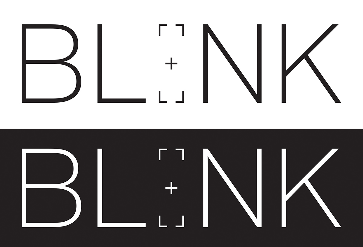
In order to convey the idea that product created a user populated image based library, I decided to allude to the cross hairs found when looking through the viewfinder of a camera. By placing the cross hairs where the “I” would be, it insinuates that the “eye” acts as the camera. Going deeper, it also makes the connection that the user is filling in the blank with their own memories.
The client was excited about the clean lines, and the luxurious feel of the overall mark. The cross hairs also leaves room for multiple branding opportunities, either standing alone as a secondary logo, or as part of a system where the cross hairs could be placed over photos in an ad campaign.

In order to convey that this is more than a photo capturing application, it was important to include visuals that conveyed this as a first person experience. By having the “user’s” hand in the photo on the landing page, this idea is driven home. If this website was to be live, the photo on the homepage could constantly be changed. It could be an opportunity for user generated content, for video clips, or to place the actual memories the user captured in order to customize their own homepage.
In the about section, a simplified line drawing of the product is included in order to instill a feeling of digestible science that a consumer can feel confident looking at. Taking cues from simplified schematics, I wanted the consumer to get the feeling that there was technology involved, but in a way that would not overwhelm them and scare them from the product. The client of BLINK wanted to make sure that this product was not scary or intimidating, so it was important that the copy supported this notion.
In the about section, a simplified line drawing of the product is included in order to instill a feeling of digestible science that a consumer can feel confident looking at. Taking cues from simplified schematics, I wanted the consumer to get the feeling that there was technology involved, but in a way that would not overwhelm them and scare them from the product. The client of BLINK wanted to make sure that this product was not scary or intimidating, so it was important that the copy supported this notion.

This packaging would not be seen by consumers, but would be used in medical settings. It was important that the cross hair mark would repeat on the box, further mirroring the “I” in the actual logo. The simplified schematic appears on the front of the box, allowing surgeons and other medical personnel to easily identify the product.
Special Thanks To
Bonnie Siegler
Jason Gotllieb


