NaturalExposures.com
A mobile repsonsive website design that was developed using the WordPress content management system.

Home page design

When viewed on mobile devices such as smartphones and tablets, the user is presented with a menu that slides in from the left hand side of the page.

The tours page of the site allows the user to quickly see upcoming travel opportunties.

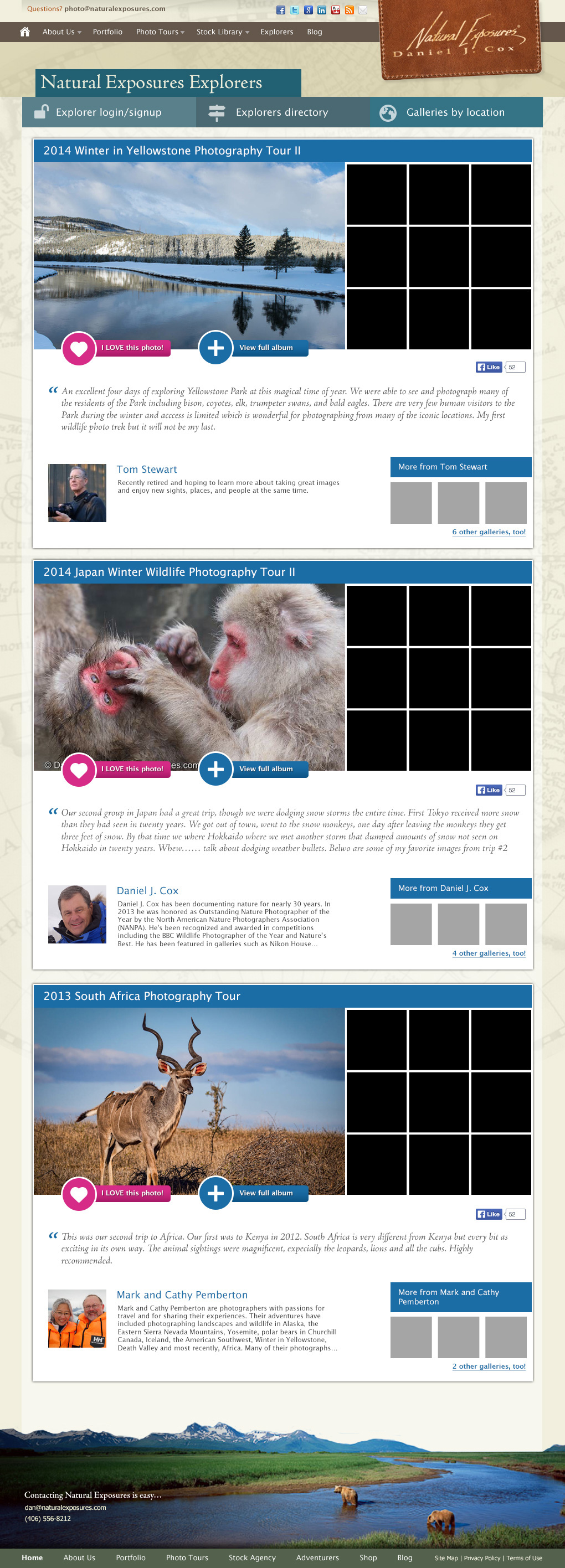
Once the user has selected a trip that may interest him/her, a myriad of information is available to them. Recent upgrades to the site also show photographs that were captured and uploaded by other guests (called Explorers) on trips similar to the on that is being currently displayed.

Guest that travel with the company are called Explorers and are given the opportunity to upload the images that they capture to the site. Other clients who were on the same tour are notified automatically so that a fellow traveller has uploaded images, and are encouraged to do the same.
Administrative staff has the ability to promote and highlight user-generated submissions to surface particularly good content.

Each Explorer on the site receives their own al-la-Facebook style timeline that displays their activity on the site. Galleries from all Explorers are displayed organized by date, geographic region, number of views, etc. Only site users that are also Explorers are allowed to comment on images, or to "Love photos". This helps to provide a sense of community, and encourages participation and cross-member feedback.

The owner of the company is a well recognized photographer in his particular niche and has gained quite a following on his blog. This recently completed redesign allows visitors to more easily see the breadth of content available while highlighting the great photographs that keeps readers coming back.

To maximize screen space I opted to go with a JavaScript-powered drop down menu that would allow users to select a category or topic of interest. This approach allows the categories to grow, while still providing ample room to showcase recent posts.

With the blog re-design I had two primary goals... First, to howcase the author's photographs in the best possible light. This is done by allowing images to spread slightly wider than written content. The darker framing of captions helps the image colors to pop off the page.
My second goal was to improve the visual clarity by which comment responses were displayed. Previous iterations didn't provide very many visual cues to which comments were responses by the post's author, so both highlighting them and nesting them helped drastically.
The site's registered members (called Explorers) have the ability to upload an image that is associated with their timeline and profiles. If a blog comment is made I opted to use the image they've uploaded (rather than a standard Gravatar.com image) to maintain visual continuity between the blog areas and the associated Explorer profiles.


