Task
Designing identity: visual representation of the brand Zap — a service that solves an actual problem of extreme fast, predictable, intracity delivery of small packages within the territory of Singapore.
Designing identity: visual representation of the brand Zap — a service that solves an actual problem of extreme fast, predictable, intracity delivery of small packages within the territory of Singapore.
Idea
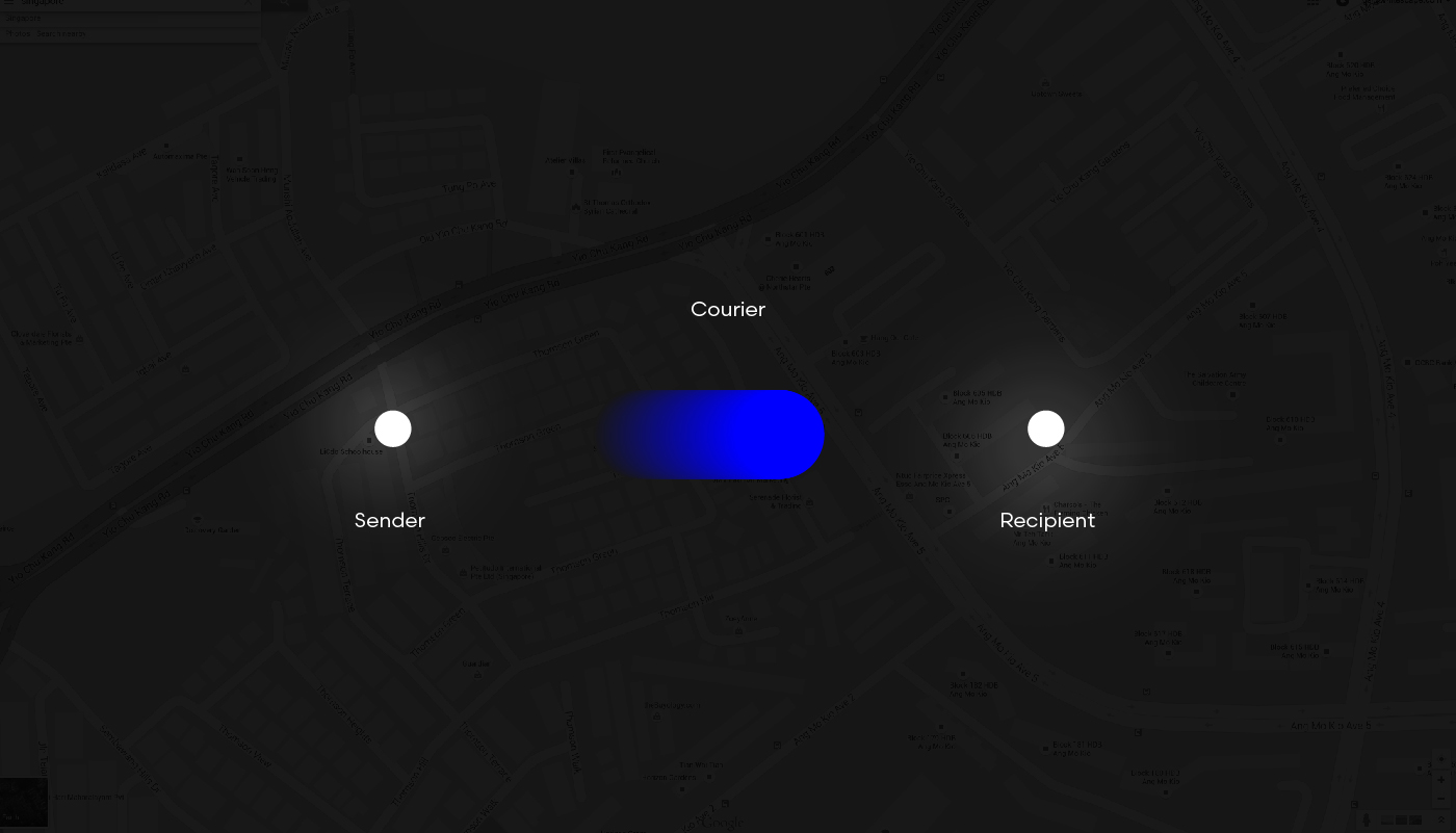
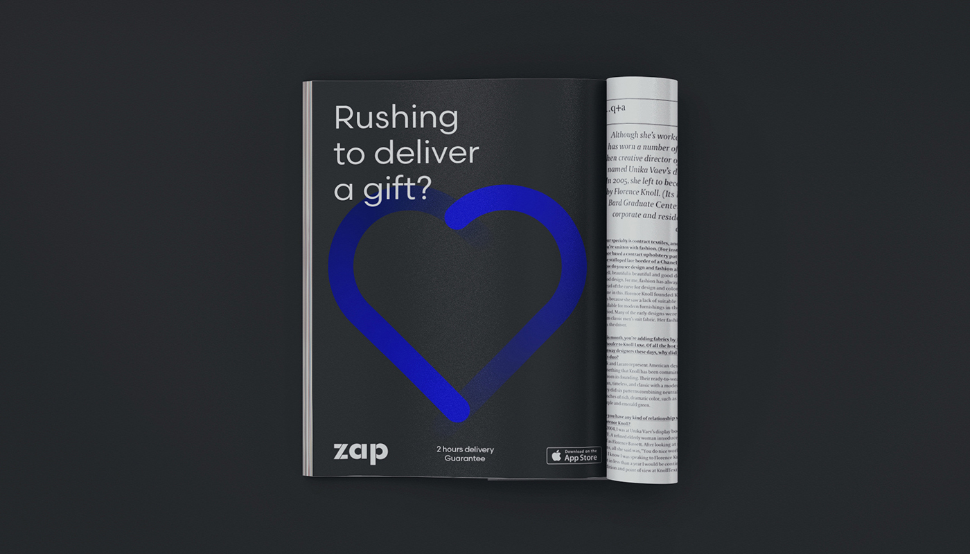
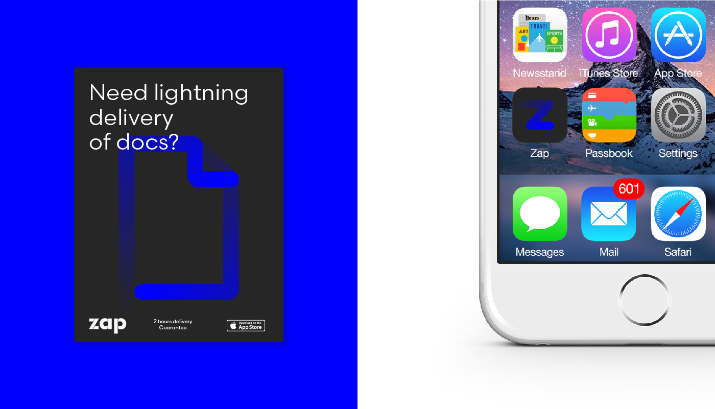
Visual language elements of the brand identity are created to highlight three main benefits of the service: simplicity, versatility, and speed. Where speed is the core value and is represented by a loop idea.
Identity
Gone are the days when a logo in the upper left corner was enough for identification. In a time when the environment is overloaded with visual messages, with less and less time to process it all, it’s vital to create a cohesive image that will be consistent throughout the entire communication of the company or product, and can be easily recognized by the target audience. Here everything is working together: the font, the combination and proportions of the colors, the graphics, the image and text message styling. For Zap the messaging is the image of a “meteor” — sharp, simple and dynamic. The flexibility of the element permits the creation of a wide range of metaphors, by utilizing the trail of the flying “meteor”. When working together with the brand name, it creates effective recognition.
Gone are the days when a logo in the upper left corner was enough for identification. In a time when the environment is overloaded with visual messages, with less and less time to process it all, it’s vital to create a cohesive image that will be consistent throughout the entire communication of the company or product, and can be easily recognized by the target audience. Here everything is working together: the font, the combination and proportions of the colors, the graphics, the image and text message styling. For Zap the messaging is the image of a “meteor” — sharp, simple and dynamic. The flexibility of the element permits the creation of a wide range of metaphors, by utilizing the trail of the flying “meteor”. When working together with the brand name, it creates effective recognition.