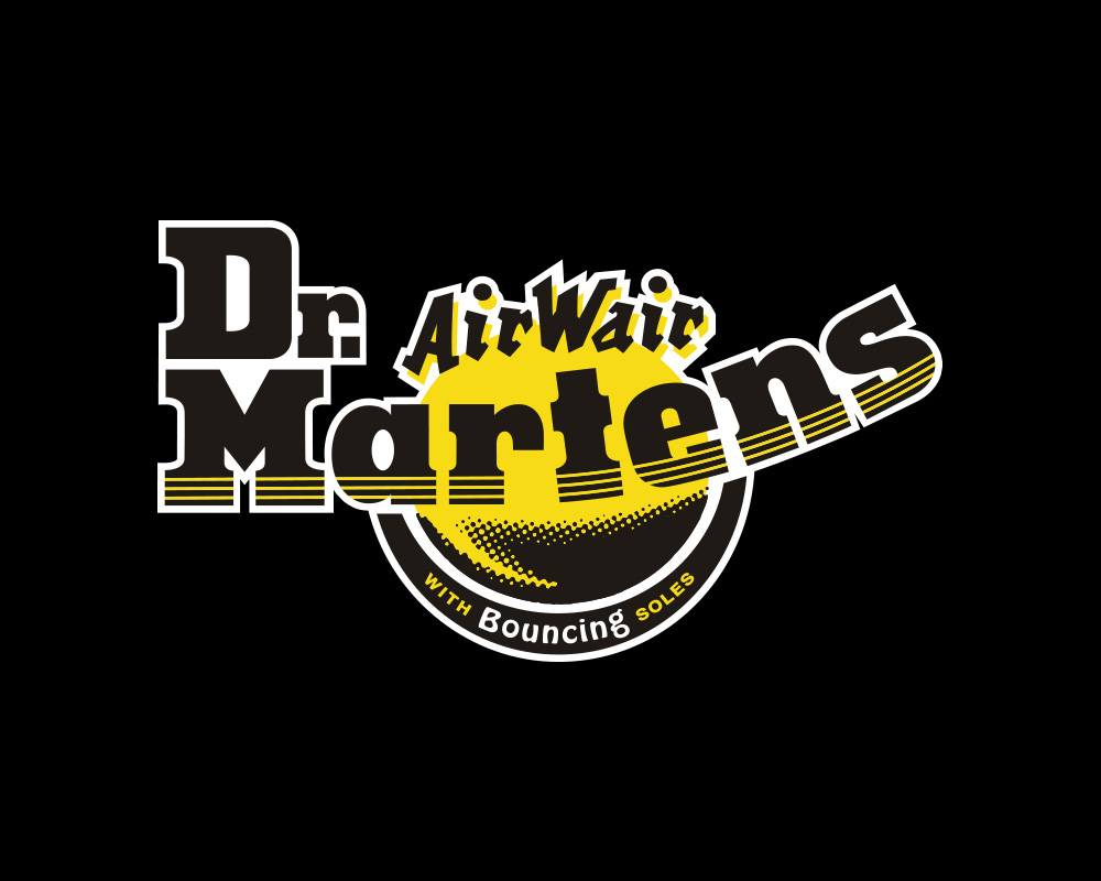
Original Logo
Refreshed Logo
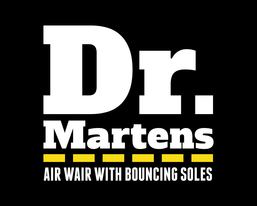
The new Dr. Martens logo refresh gives the company a much more modern feel about it, something that may help brand and target towards a new generation. Retaining the strong slab-serif typeface (which has also been updated and modernised) will ensure that the refresh is still linked back to the original logo, thus being less of a shock to older customers.
The introduction of the signature yellow thread ties in the physical appearance of the boots as well as acts as an identifier to customers that may not be too familiar with the company yet recognise the famous yellow threads.
By focusing on the type-based logo design, the logo will now be much easier to read when scaled and printed at all sizes and all the unnecessary clashing typefaces and imagery that were found in the original logo are no longer a problem.
Packaging Mockup

Photoshoot

Thank you!