This is a comprehensive rebrand for the Brooklyn Botanic Garden done as an assignment for my Brand Identity class at the School of Visual Arts in NYC.
Before starting, I first looked at what made the Brooklyn Botanic unique as a garden. Two of the things that immediately stood out to me was 1) its history of starting out as an ash dump in the 1800s to its evolution into what it is now, and 2) its being situated in the middle of Brooklyn with its raw, vibrant street culture. From this, I knew urban was a feature I definitely wanted highlighted in the rebrand.

Garden map from the BBG website
In doing my research I was looking at the map of the garden and thought that its shape would be a good way to play up the urban aspect without going the obvious route. Below are some initial sketches I worked on.

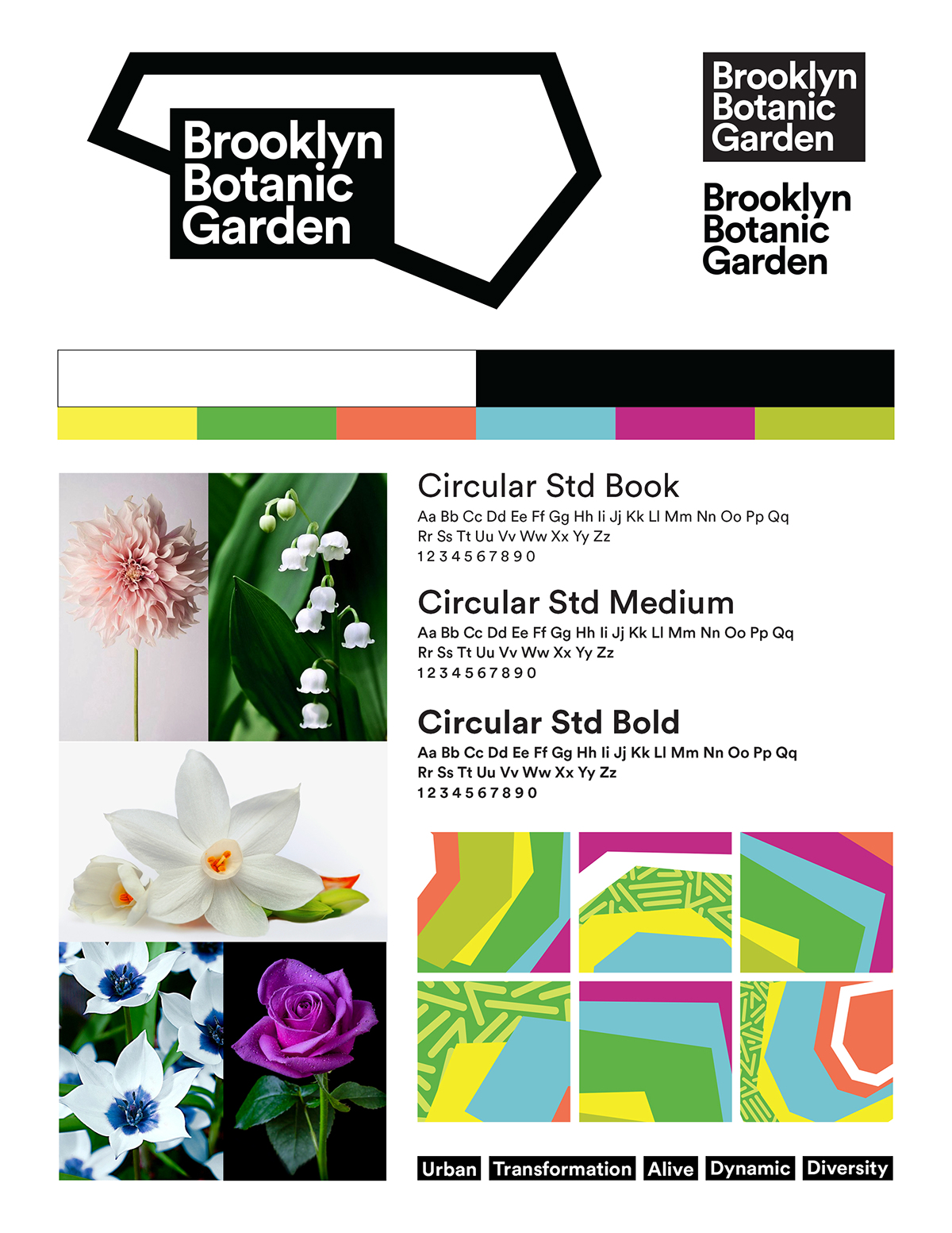
I came up with various iterations but eventually settled on a simple black and white outline paired with a nice, bold typeface.

To be able to carry this symbol throughout the visual system I knew it needed to go beyond this sharp, rigid shape. I played around with it and in the process, I realized that by stacking the shape on top of each other in a sort of messy pattern I was able to create something that looked somewhat like an abstraction of a flower in bloom - took that as a sign that I was heading in the right direction! I also tested it out by placing it on contained spaces and canvases.

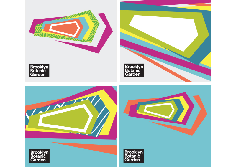
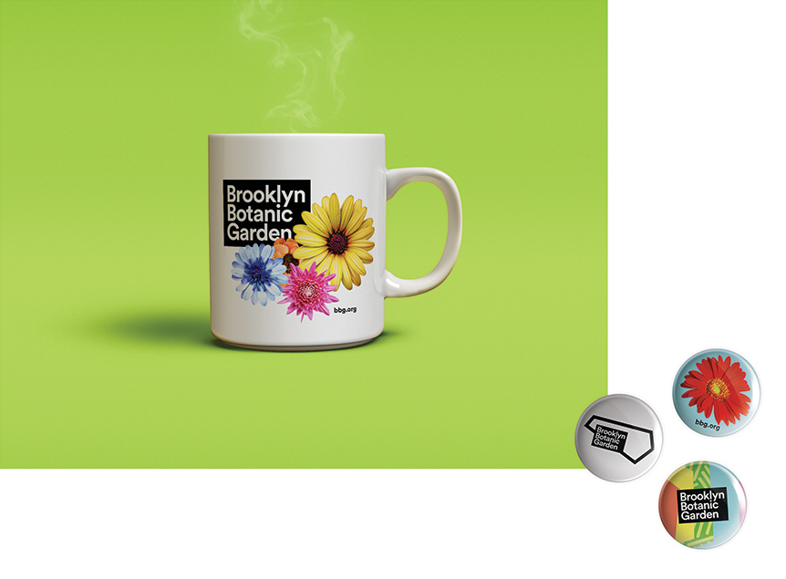
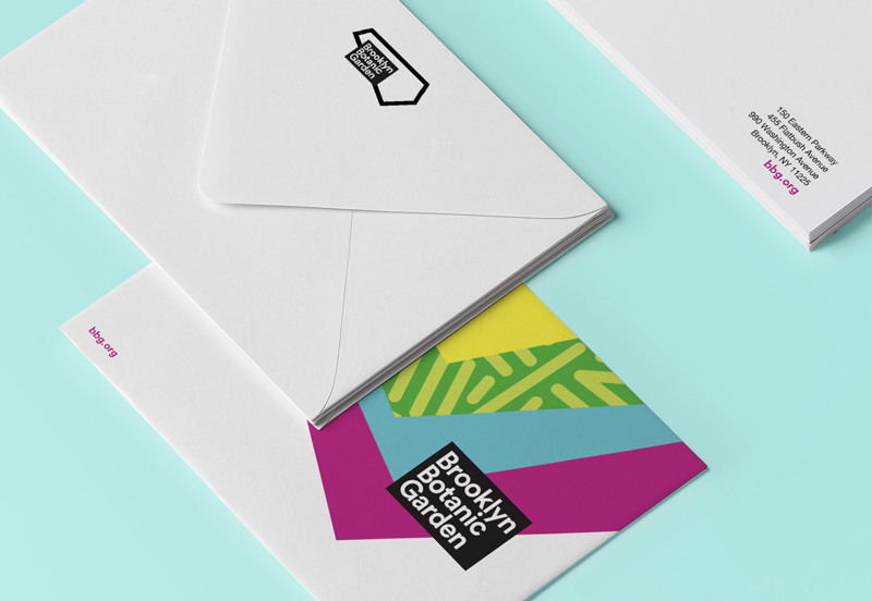
From there I just worked on the various applications and it eventually ended up taking on a life of its own.


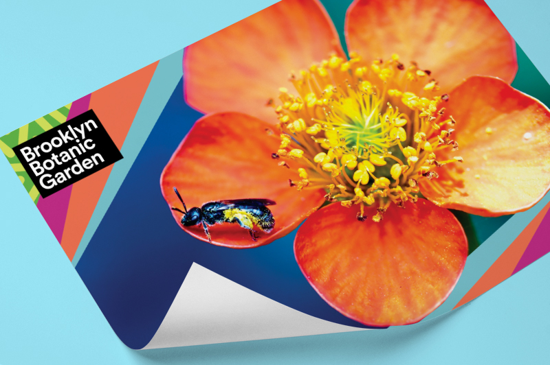
Posters to announce what plant species are currently in bloom

Postcards