
Taking inspiration from 80’s aesthetics and duct tape, I created this logo to brand my graduating graphic design class of 2015. The concept was voted on by the group and proposed by a student in the class, Elliott Wilson. The logo directly incorporates elements of Back to the Future through its connected letterforms and reference to the Delorean's tyre tracks whilst also being very designed in its approach. Directional lines and structured spacing gives the logo a sense of purpose and flow, which is also enhanced by the skewed angle and sharp edges.
Duct tape was used as inspiration as it is widely associated with constructing and conceptualising new ideas, which is essentially what we all do in design. The bold lines also makes the logo very clean and geometric, which allowed it to be applied to many different applications. The applications of the logo using duct tape and stamps were a collaborative effort between students when the related events were organised.
As well as creating the logo I also designed and built the website around profile images my classmate Alistair Bell edited to reflect the neon 80's colour scheme. You can view it in full here.

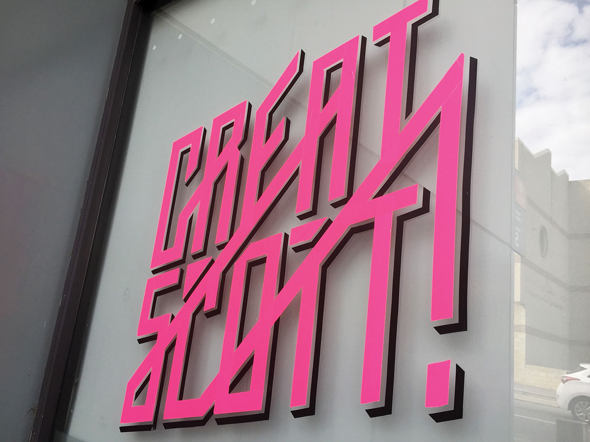


Illustration by Alice Kang


More photos of our grad show can be found here.


