


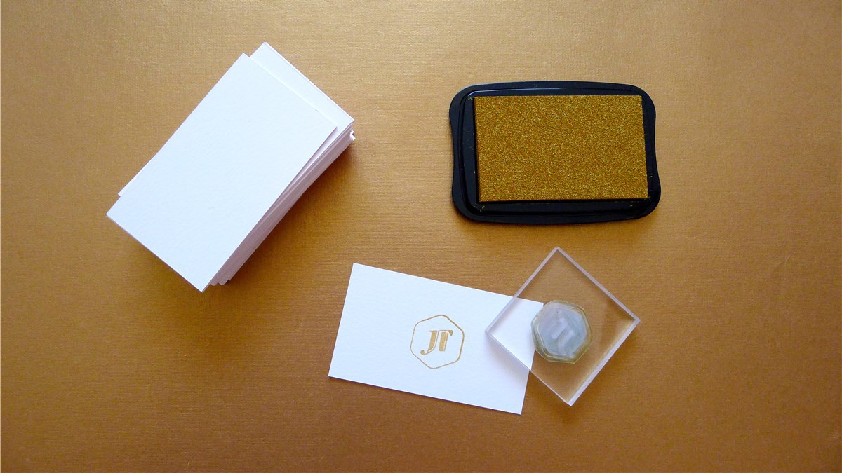
I love contrasts and playing with the unexpected in design, which is probably the most important thing I wanted to convey through my personal branding. The monogram itself began as a really simple reverse pi symbol, but quickly evolved into something which contrasted the harshness and softness of design in its edges and linked/unlinked shapes. I used the hexagon shape to anchor it as a separate element as a hexagon is made of curves similar to that found in the j letterform. The pastel pink and gold colour palette was chosen to reflect my own personal style, and contrasts a matte finish with a sparkly gilded yellow-gold in its different applications and textures.
The folio and cards below were created for my graphic design grad show, and I wanted them to be memorable and impactful using unique materials (particularly since I'm on a student budget).
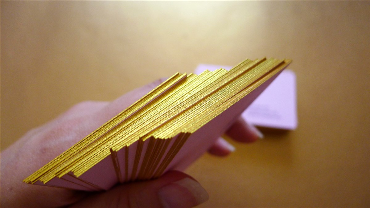
The business cards were a single sided print on matte uncoated Mohawk Superfine Eggshell stock, and hand-stamped and gilded using a gold pigment ink stamp pad.
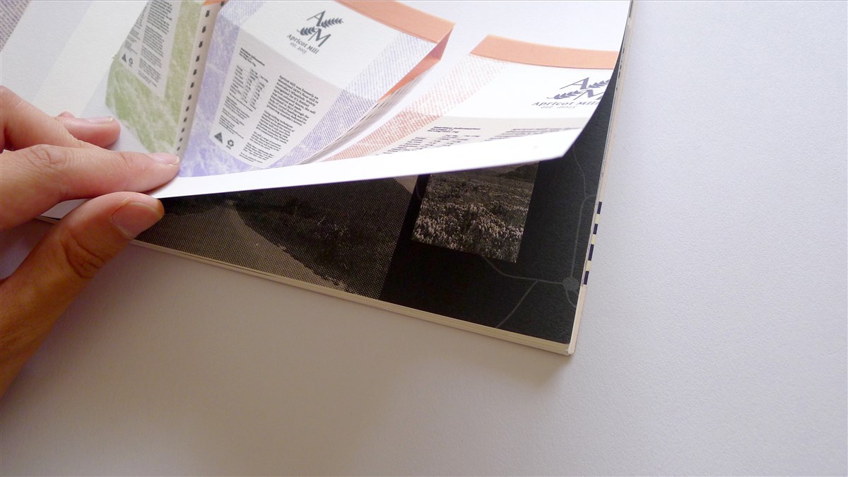
My folio was also printed on Mohawk Superfine Eggshell stock, and hand-stitched using gold embroidery thread. It features an inside front and back feature spread with original digital illustrations combined with a custom-cut vellum page details about me and contact info. The cover is double mounted at the bottom using an antique gold textured stock and die-cut shape for the logo. The contrast in textures was used to not only highlight the branding, but to also protect the cover as well (the cover is matte finished so it is easier to damage).


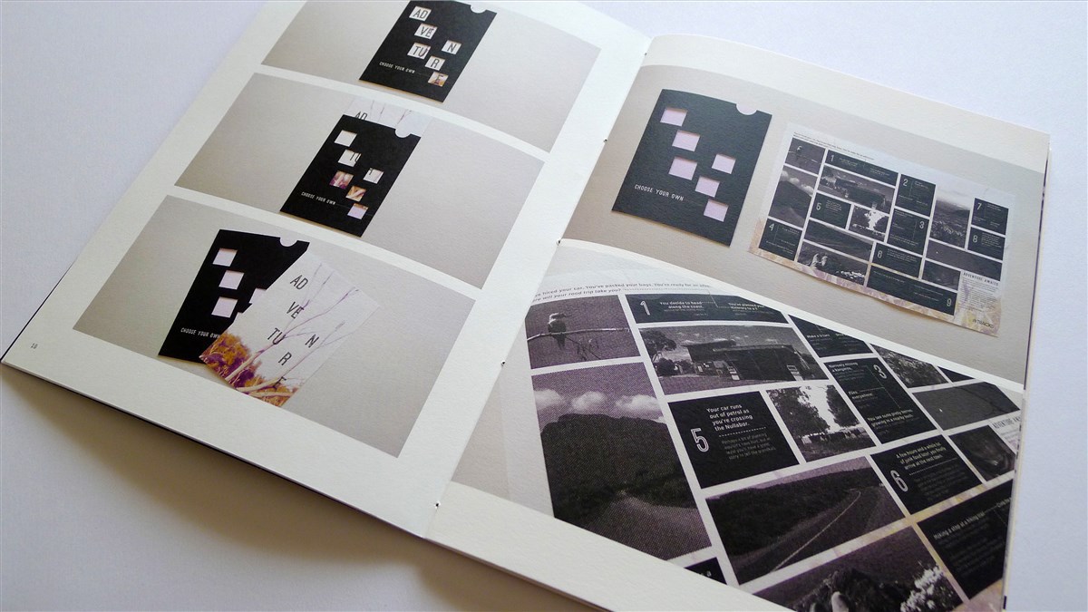


My folio and zine exhibited at my final year grad show.
To see more pics of my zine, click here.
For more pics of the grad show click here.


