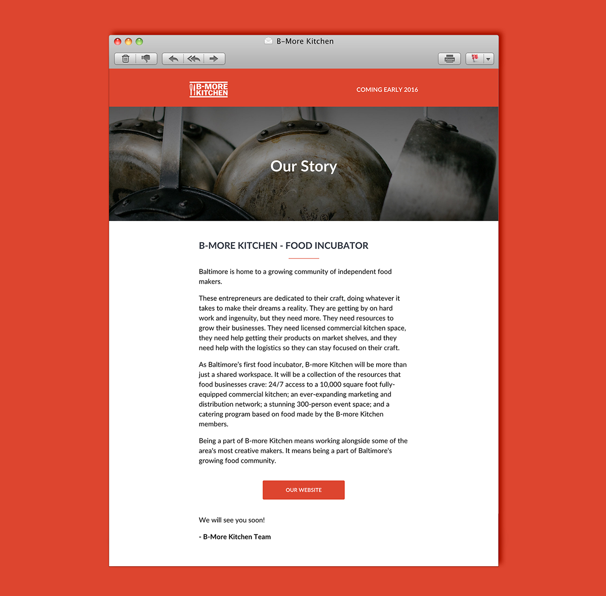
Challenge – B-More Kitchen, a new incubator kitchen, started in Baltimore City. They came to me in need of a full brand identity, as well as an initial website that got people interested in joining.
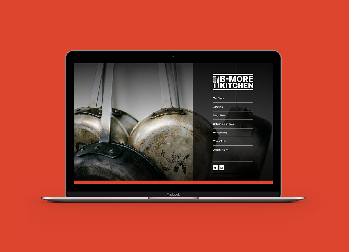
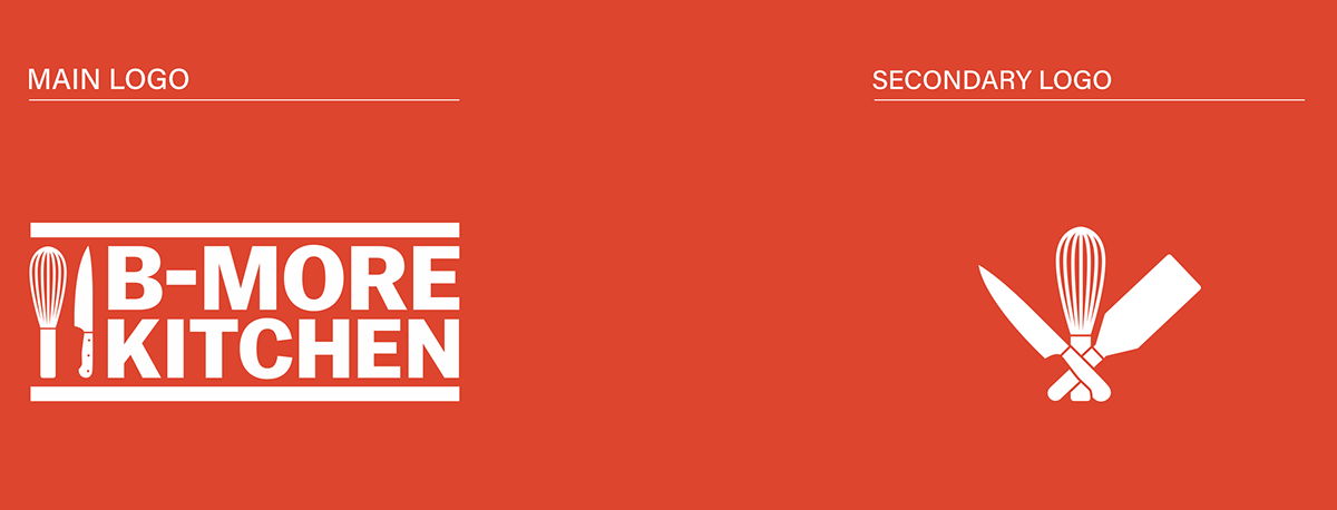
Solution – Starting with the logo, I utilized the typeface Balto. Balto both references the city of Baltimore and the strength in each letterform hints at the industrial style machinery available for use inside. The logotype is paired with two strong rules to lock the elements in place and incorporates a whisk and a knife to represent the array of cooking done in B-More Kitchen.
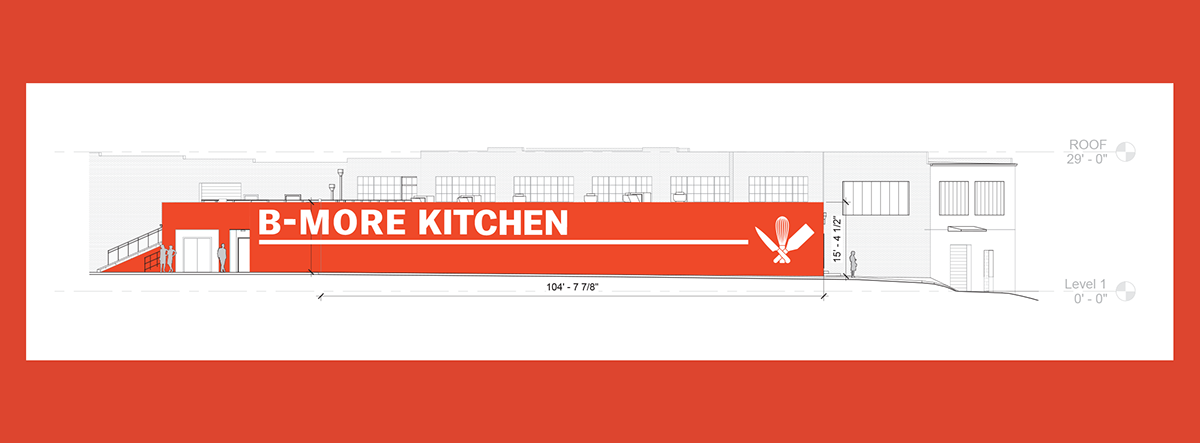
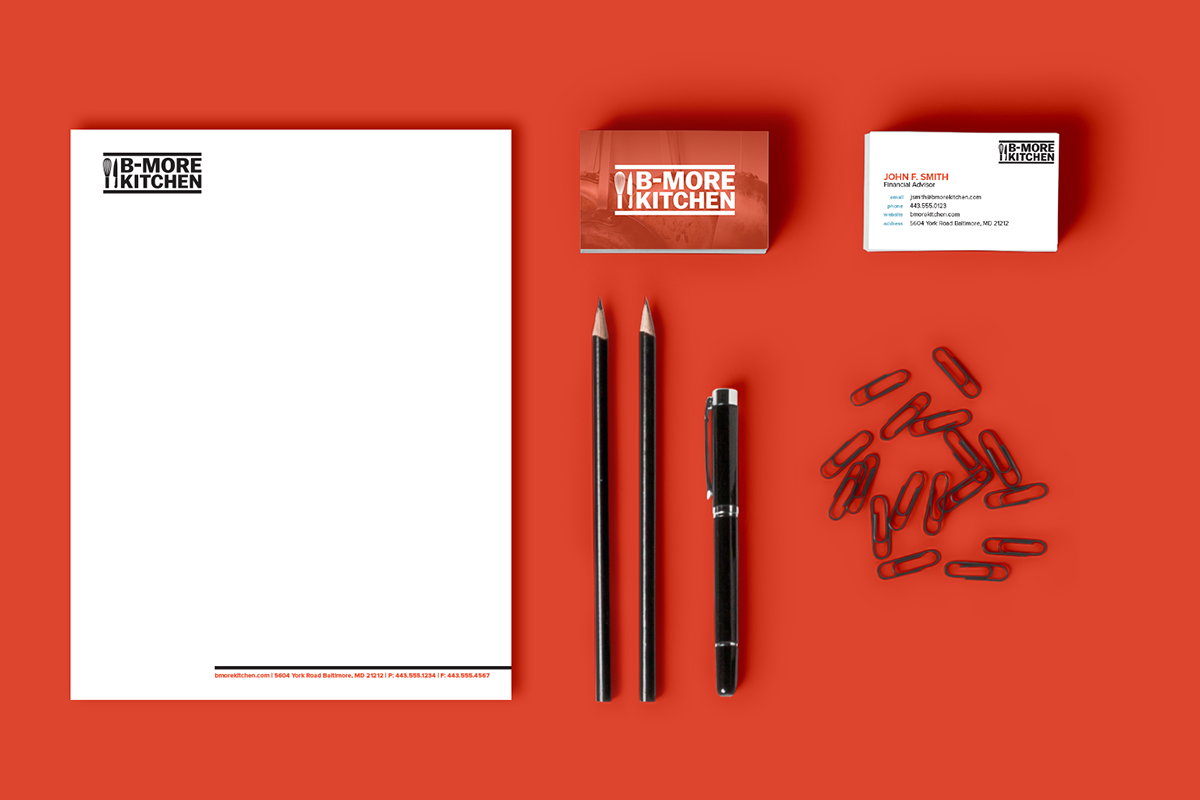
From there, I created the rest of the brand system with a strong but minimalistic approach. Other elements such as business cards, stationary, and email templates spawned from the strong logo. I wanted to keep everything clean, bold, and elegant.
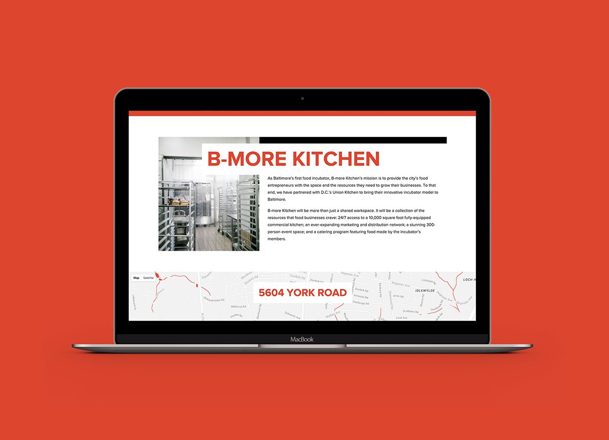
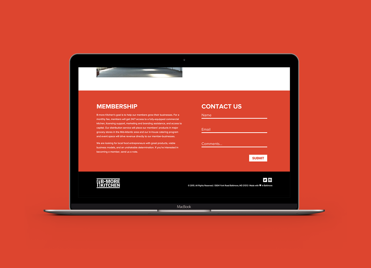
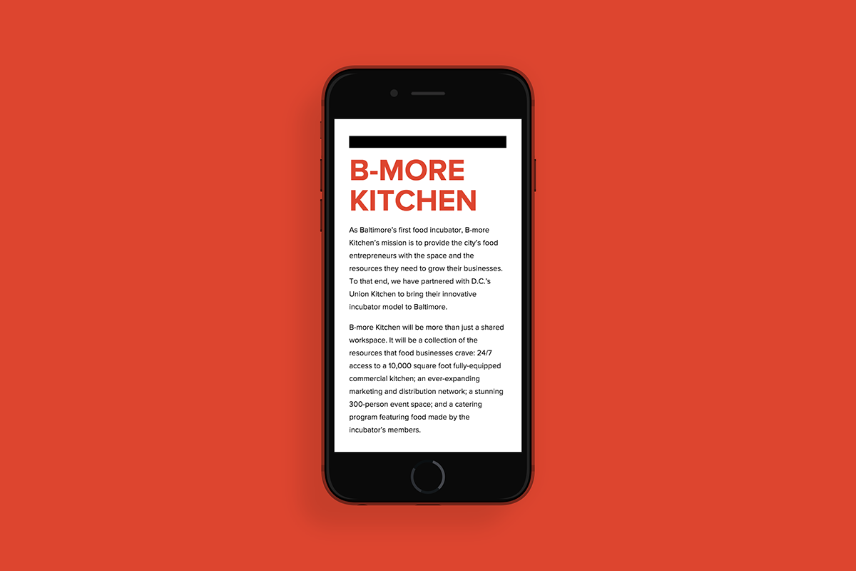
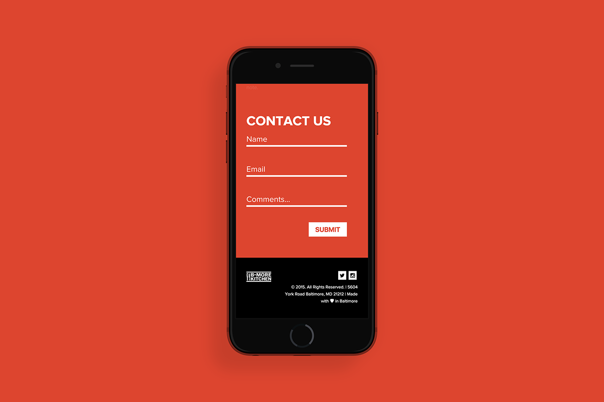
The website incorporates all the elements together with beautiful photography and clean design. I used HTML 5 and SASS + Bourbon and Neat for this project and the site was fully responsive.
The website incorporates all the elements together with beautiful photography and clean design. I used HTML 5 and SASS + Bourbon and Neat for this project and the site was fully responsive.
WIREFRAMES