Logo design | Web design
CIDE was looking for an identity to represent it's 40th anniversary. The common restriction: it had to be as close as possible to the actual CIDE logo. I respected the logo original typography, the brand color, and try to keep the shapes as bold as their logo. The concept makes the number 40 emerge from a bar chart.

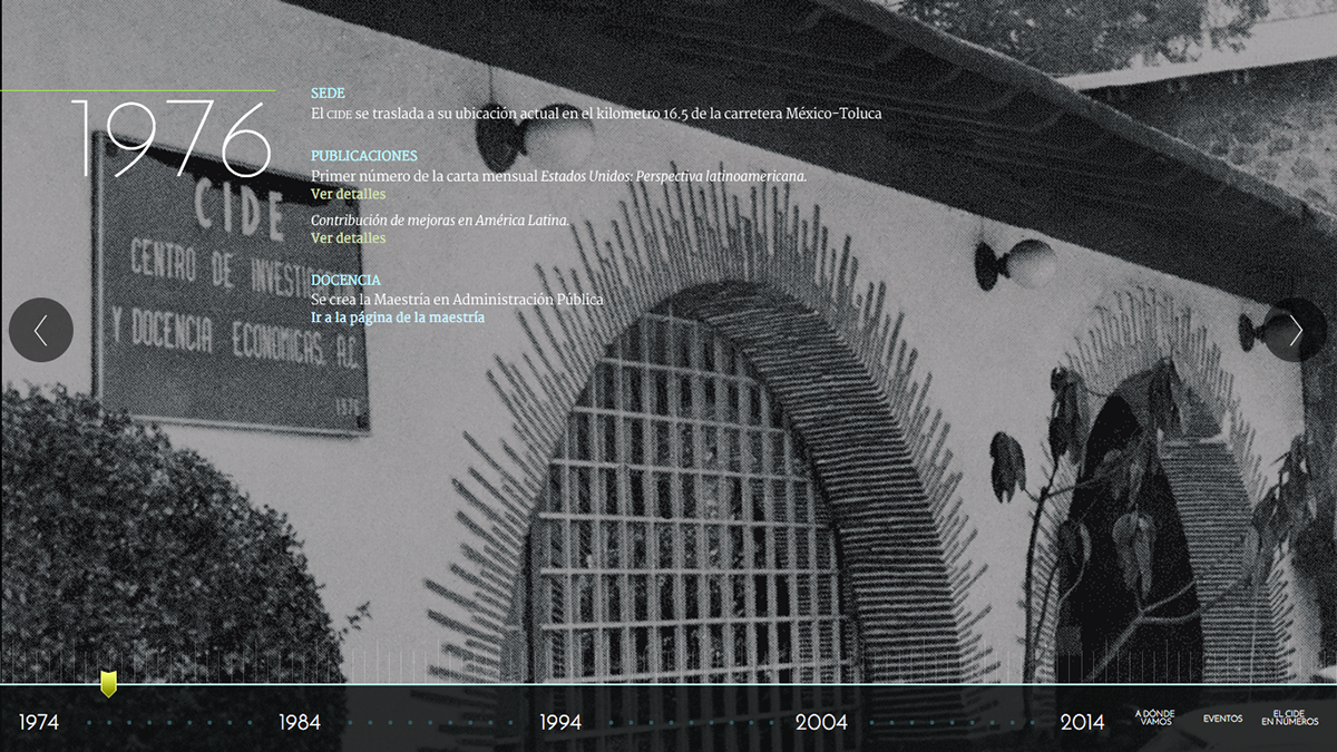
Of course they wanted a microsite also : ) So we made a timeline with some of the most important events of the institution.