I had the privilege of developing the Green Dreams logo for the organization's founder, Mr. CB Ramkumar, who is a Climate Leader in Al Gore's Climate Reality Initiative.
The design process was creatively stimulating and rigorous. There were many routes that were considered before this final direction was chosen.

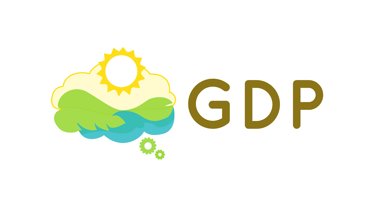
Final Green Dreams for the Planet logo
Originally, I played with a leaf and water drop motif. I wanted the image to be simple, elegant and to suggest a sense of balance.
The second idea I toyed with was the dream catcher. This would reinforce the "dream" aspect of the organization's title and also connect back to themes of unity, positivity and balance.

An early draft brainstorming different ideas for the logo direction.
In parallel to the ideas above, my client also wanted to consider an option using the dream bubble pictured on his book cover "Green Dreams" http://www.greendreamsbook.com/
These were some of the preliminary ideas from that direction:

Some of the preliminary options from the "dream bubble" direction.
Next, we tried to foreground the "planet" aspect of the organization and merge it with the "dream"; the resut was the earth as a dream-catcher.
These are some of the early renderings of this hybrid option:

A third direction combining the earth with the dream catcher led to the following drafts.
Following that, I sought to refine and simplify the direction and incorporate elements that more forcefully represented the organization's values.
These drafts emerged as a result:
I used concentric circles to evoke ideas of 360 degrees, balance, and simplicity. Each ring colour also represented an element/energy pertinent to the organization’s interests—green for the Earth in general (that is why it surrounds the other two circles), blue for water/rain, yellow for solar power.
A few of these sketches (see first row) also push these meanings with little symbols: green leaves (outer ring), blue waves (middle ring) and yellow sun rays (inner ring). I included these elements to make the associations more prominent. Further, I drew these symbols before the arrow to suggest a forward push…
The arrows themselves should also suggest motion/movement and therefore change. As you can see, I staggered these arrows to imply these circles are all moving independently but also as a single unit—this is to emphasize "harmony" amongst the various goals/environmental priorities of the project, and self-sustainability (the idea that the circles are running on their own).

The final 3 images are a hybrid of the dream-catcher and a cloud--since a "cloud" can suggest “dream” while also being synonymous with rain (or water).
The clouds also incorporate the yellow circle with arrows--this is to push the “360 degrees”, as well as solar energy (the yellow circle should appear like a sun resting on the cloud).
We eventially decided to move in an alternate direction from the dream-catcher, as this symbol may not have been unanimously recognized in a South-Asian demography.
My next suggestion was to use the metaphor of the Newton's Cradle--a powerful symbol that suggests a change from potential energy into kinetic energy. This would have a strong connotation when considering the power of social movement to initiate change: whether by means of lobbying or collectively adapting new ways of living that benefits the planet. This idea would also resonate with one of Green Dream's key organizational apsects of helping develop and implement sustainable technologies.


The following were alternative drafts developed from the cloud/Newton's Cradle concept.
The goal was to shift the shape of the cloud away from "cloud computing" and towards a "raincloud". I re-introduced the cyclical arrows to reinforce concepts of balance, motion and self-sustainability.

While the Newton's Cradle concept held its merits, my client wanted to try another idea with a more visceral form.
Subsequently, I began sketching alternative shapes with overlapping layers that played with negative spaces. I wanted the shape of waves to also produce an image of the leaf, which would double as a landscape.
This would be the concept guiding the rest of the design process.

An early sketch playing with shape and negative space.
The result of this concept led to the following drafts:

While my client was receptive to this concept of producing meanings through negative space, the next challenge was to implement it within a cloud form.
Here are some of my early brainstorming of various cloud shapes:


The following sketch established the direction the final logo would take. Here, the curves in the waves also create leafy ridges in the rolling hills in the background. The sun aslo presents itself as a cog--this is to suggest the sustainable technology interest of the organization.

The early digital rendering of the above concept led to the following sketch:
The above design was refined and simplified. The lines were tightened and colours were reduced to 3 Pantone shades. Furthermore, a fine white line was added between neighboring shapes to accomodate for screen-printing--which is the most common printing method in India.

The final version removed the ruffles in the edge of the wave as well as the cogs at the bottom of the cloud. After a rigorous process of creative problem-solving, we found a winner!


