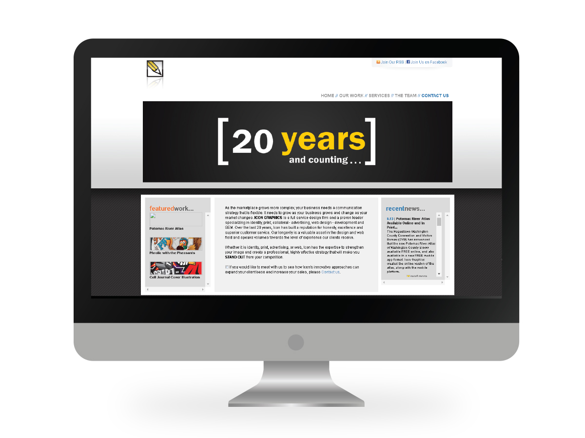
When I joined the team at Icon Graphics in 2011, one of my main goals was to start migrating our sites to responsive web design. Naturally, this brought me to our site, which had been developed before the advent of responsive design...and when Flash was still a norm in web design.
Content Strategy
Of course, client work always takes precedence when you're a design company. But even as we focused on our clients, I began developing a content strategy and branding guide for the direction I thought would be best for our company to move. Over the course of a week, I wrote up a branding guideline for our visual and written work based upon the reputation we'd already earned by the longevity and breadth of our experience along with how we'd like to be perceived going forward. This branding guideline helped as I began to restructure the site and rewrite our content. I began a notebook in Evernote to easily share my ideas with my team members. (I converted this notebook into a visual guide here for ease of sharing with you.) My boss and coworker were both thrilled with the guideline, mood boards, and initial copy.
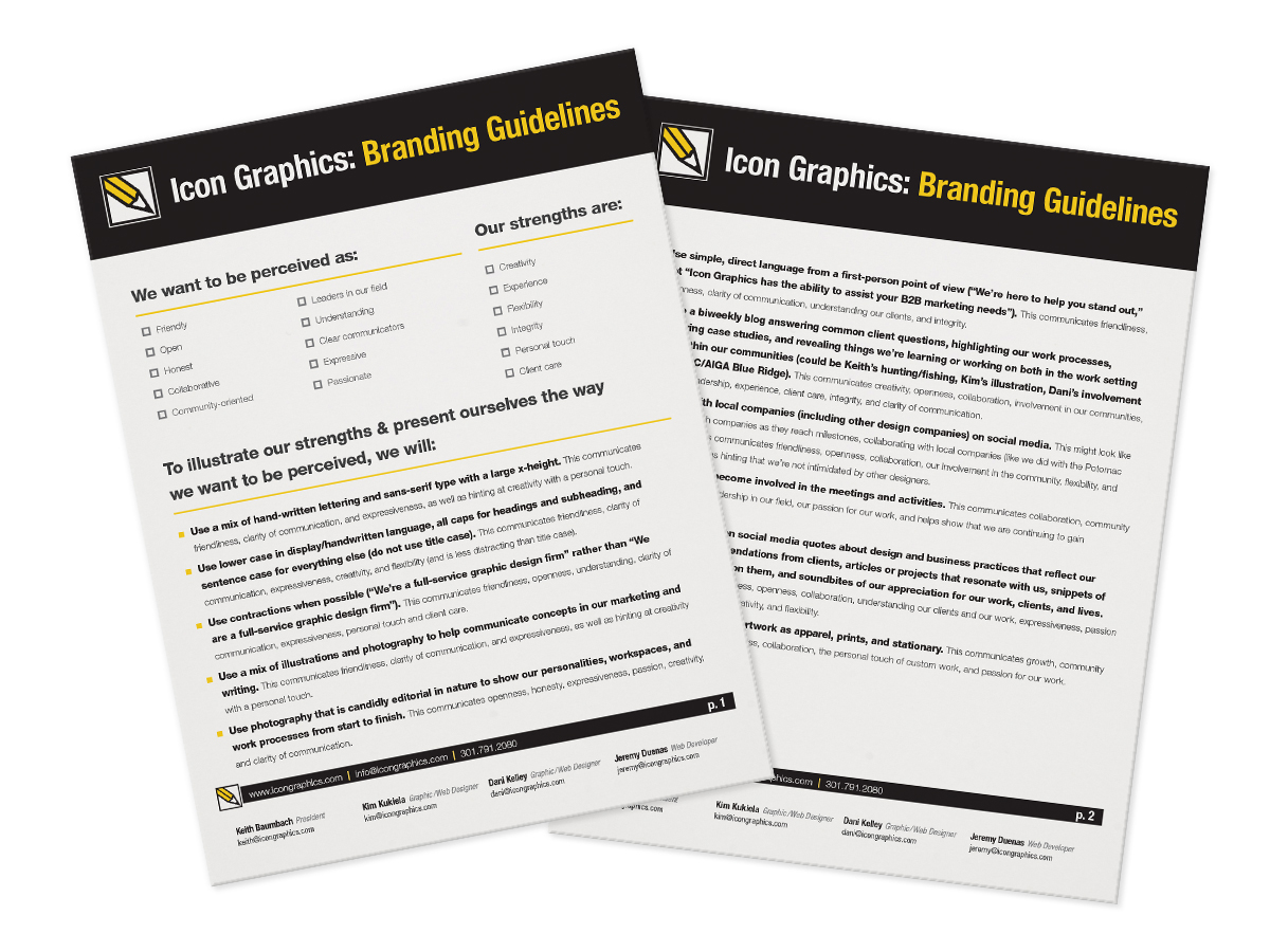
I took the research I've done for years on best practices for communication and design and combined it with what I knew of our company's strengths and goals and created a list of things to keep in mind as we communicate with clients and work with our own branding and overall company representation.
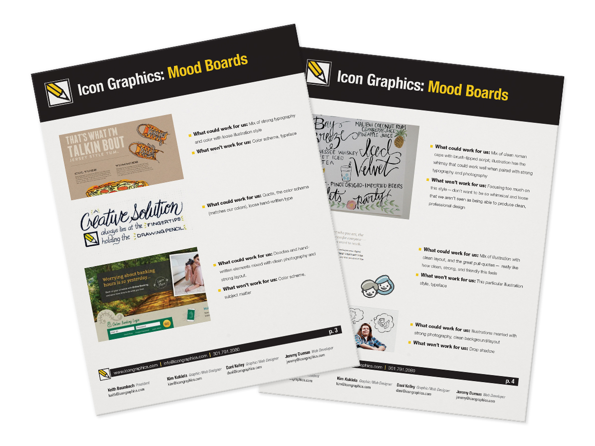
Then, I began looking for visual representations of what would constitute as something visual that supported our goals. It's not a very formal mood board, but it worked for visually communicating my vision for the company.

Between running my own semi-successful blog and doing lots of research on content organization and structure, I had a pretty good idea of how we should approach both our portfolio and our blog posts. I outlined all categories we should use, along with tags and what their function would be.
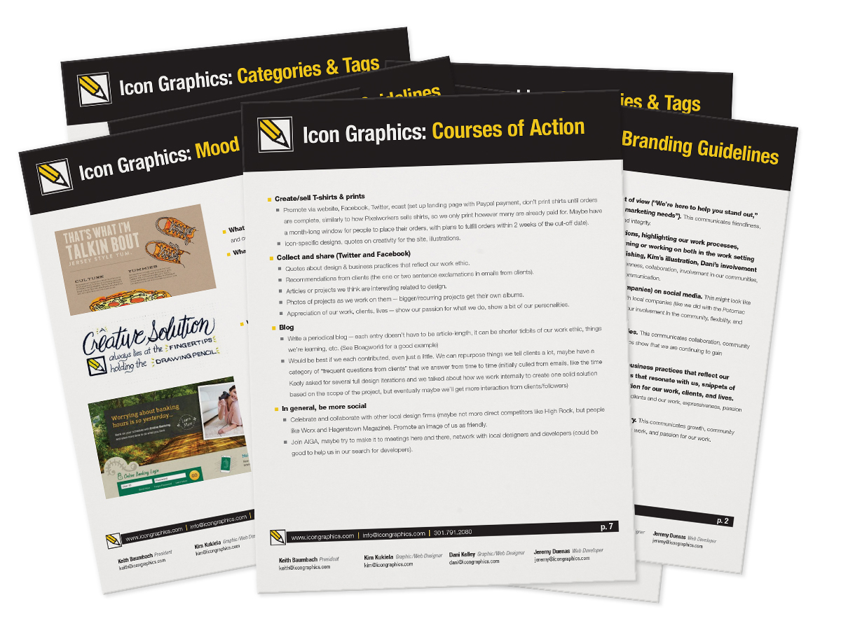
Finally, I wrote up a general suggested game plan for how to implement all of these strategies into our daily office lives.
Design, Copywriting, SEO, and Development Assistance
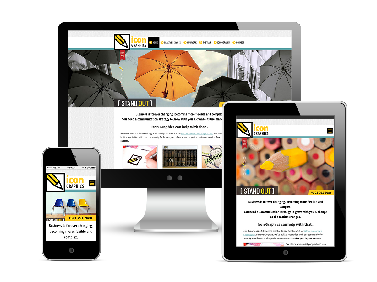
We brought Jeremy, a talented PHP developer, on board in 2013, which was just the push we needed to begin redesigning our site. My coworker, Kim, spearheaded the redesign based on the branding guidelines, restructuring, and copy I provided. After Keith, our employer and owner of Icon Graphics, approved Kim's homepage and template design, I took the design and reworked it to ensure maximum responsiveness. I wanted to be sure that the design didn't lose any of its charm as it scaled down for tablet and mobile views, along with ensuring that content and the user's experience of the site were the main focus at each break point.
I also chose and manipulated several photos for use as our rotating header images. I wanted the photos to showcase our tagline of "STAND OUT" while also fitting in with the color palette Kim selected for our new branding efforts.
At this point, our new developer, Jeremy, began working on programming the site as I began working on interior page designs for our contact forms, portfolio, blog archives, blog posts, and team pages. All throughout this process, I revisited the initial scope of the site and checked in with Keith, Kim, and Jeremy to make sure that what we were doing reflected the needs of our company, met web standards, and served the needs of site visitors and potential clients.
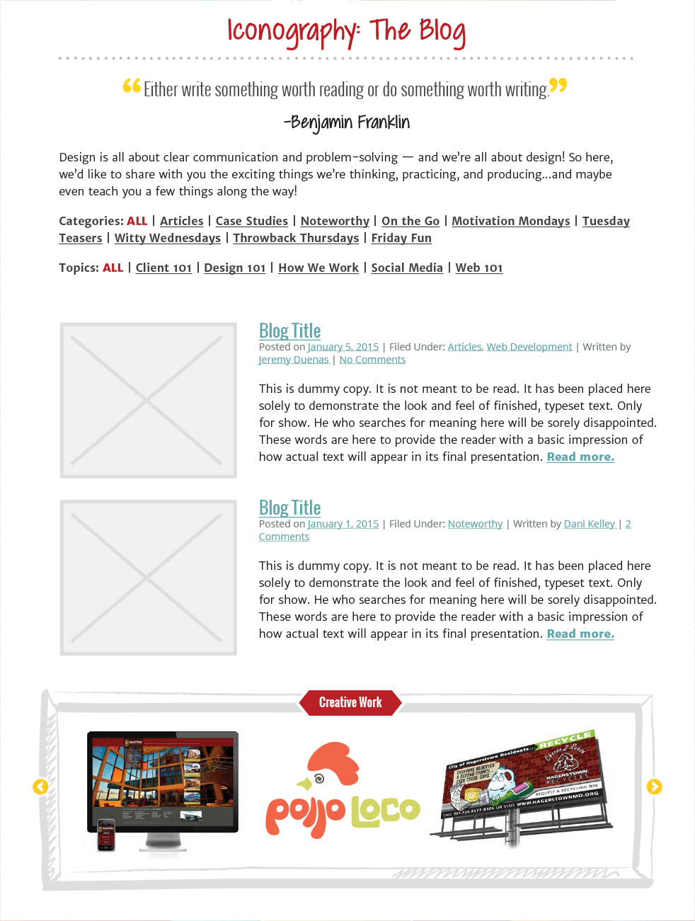
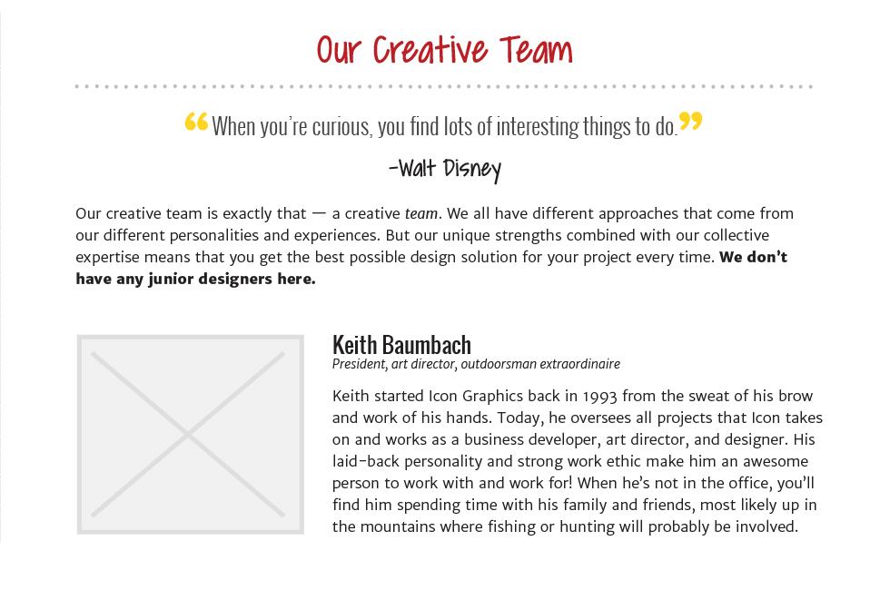
The initial design of the website was just the homepage, so I set out to make sure all interior pages had a cohesive design system in place that meshed well with the template my coworker had created. This started in part with the blog archives page. I didn't want it to look like an accident or afterthought, and realized I could re-use the styles from it for our Team page (pictured below).
Next was individual blog posts. We needed to consider how to best display the meta information (date, categories, author).
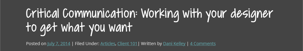
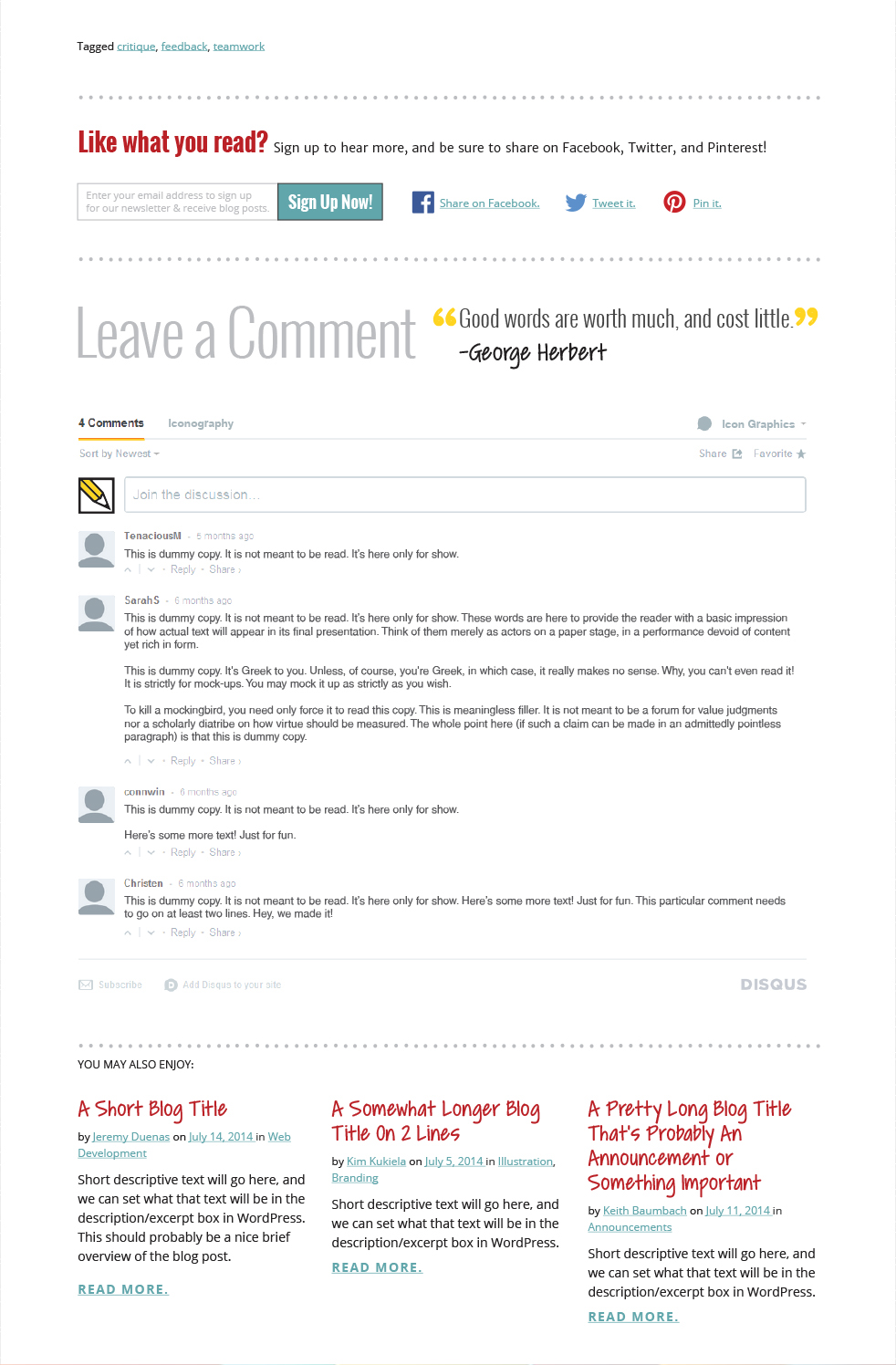
There was no need to adjust the typography styles for blog posts since those styles were in place already, so I focused on how tags should be displayed after a post, how to share our content, and what an integrated Disqus comment system would look like.
At this point, Keith felt the copy on the site was too playful and not robust enough. With the aid of an SEO measurement tool, I rewrote the entire site, making sure to appeal to both search engines and people using them. The copy on the current site is the end result of what I wrote.
Portfolio Organization and Mock-Ups
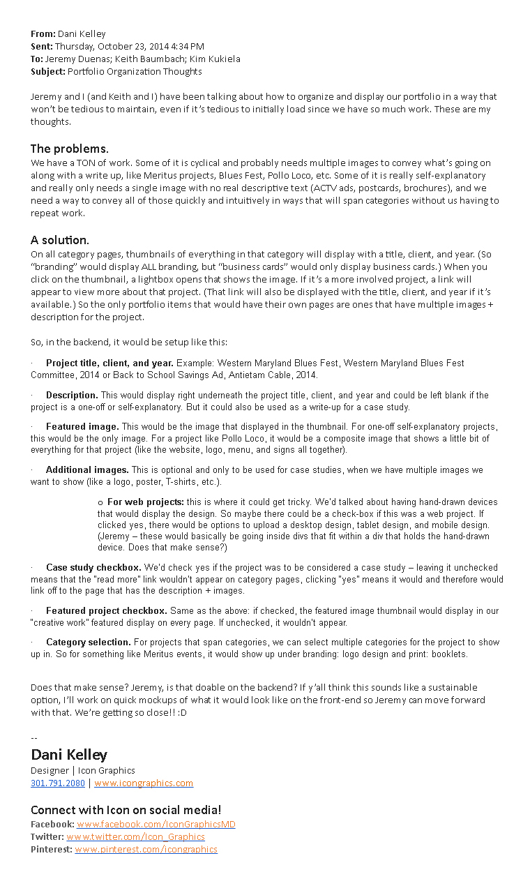
The final piece of the puzzle was figuring out how to upload, organize, and display our extensive portfolio. I spent some time talking with Keith and Jeremy, along with brainstorming best organization methods, and came up with the following:
After getting approval for this direction, I worked with Jeremy on implementation. To help, I created an animated gif to demonstrate both my vision for the design of the portfolio and how selecting a specific portfolio item would trigger the lightbox.

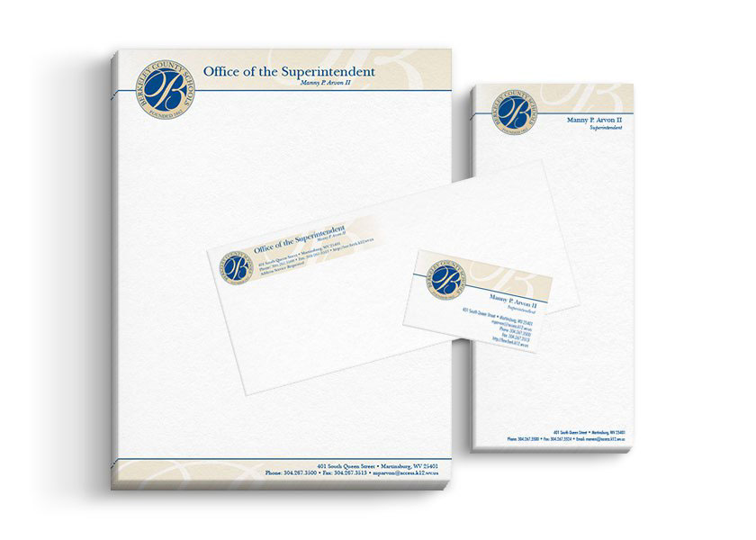
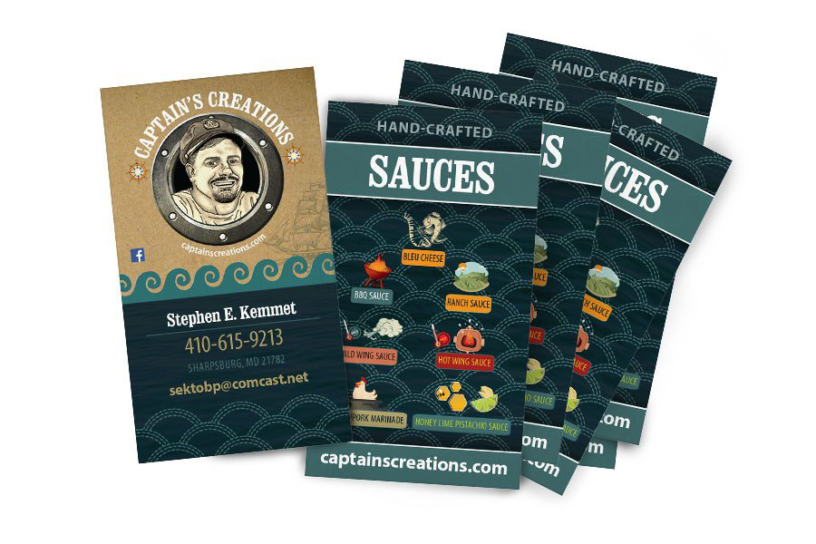
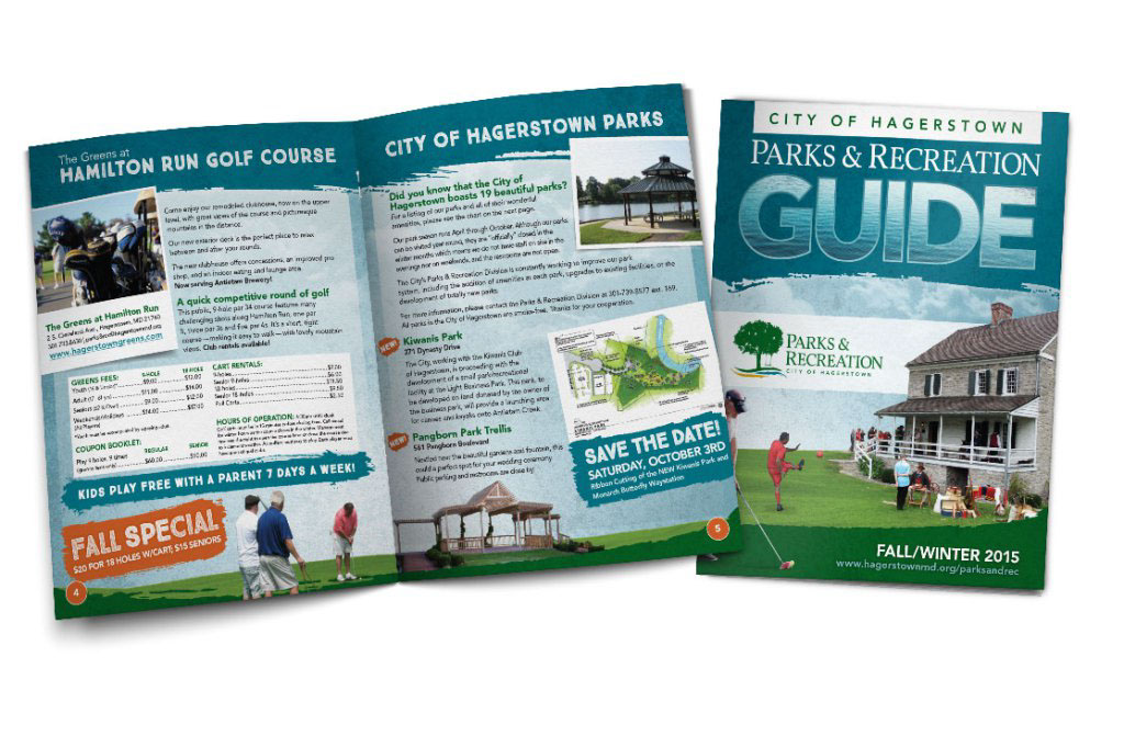
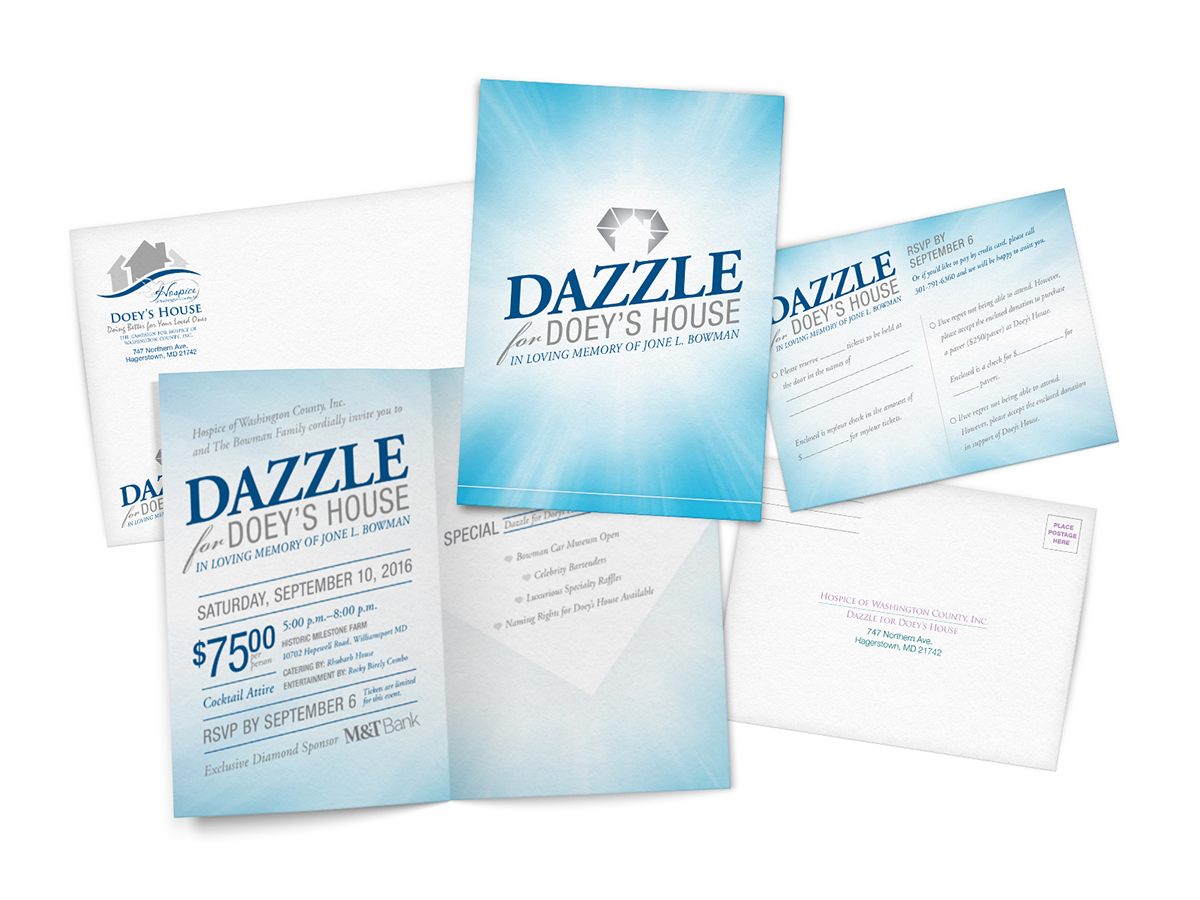
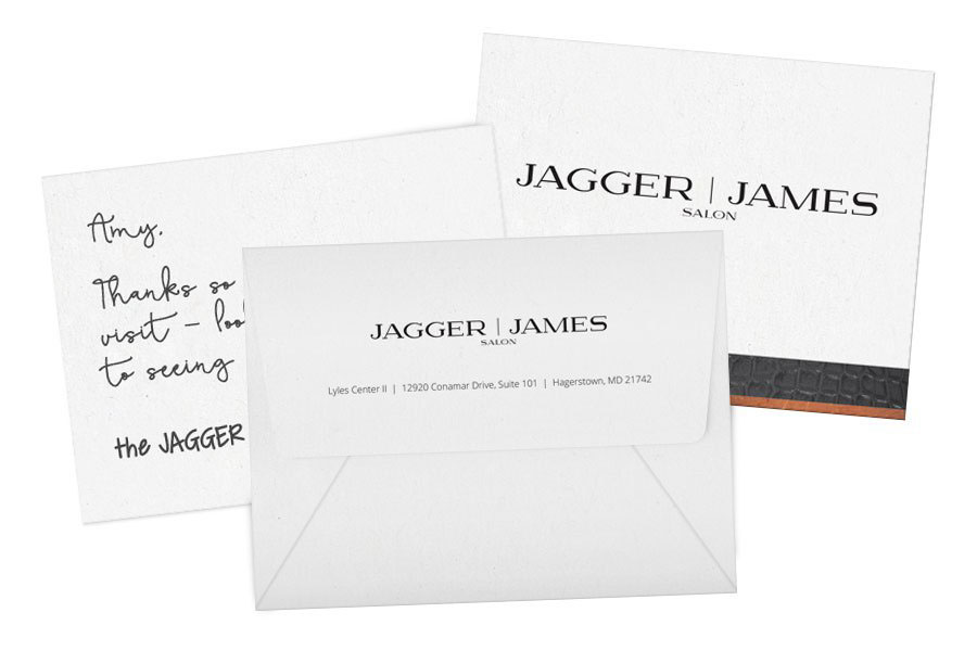
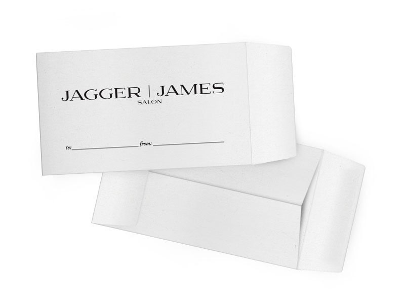
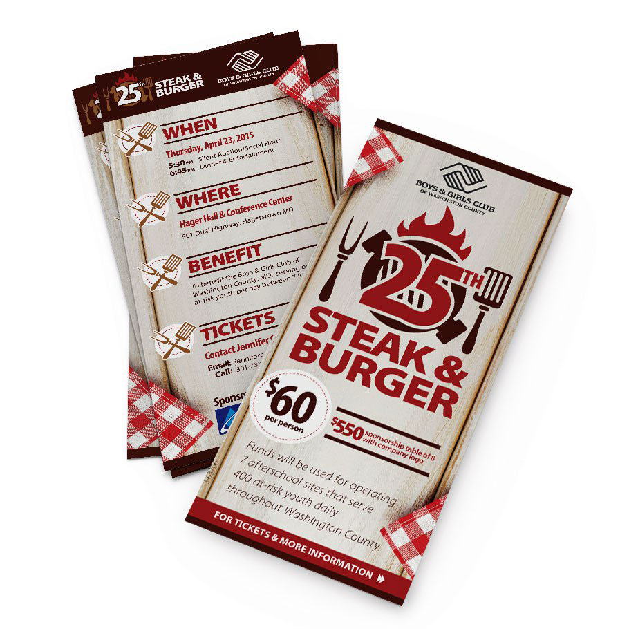
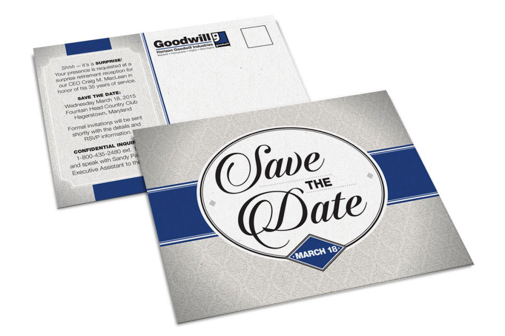
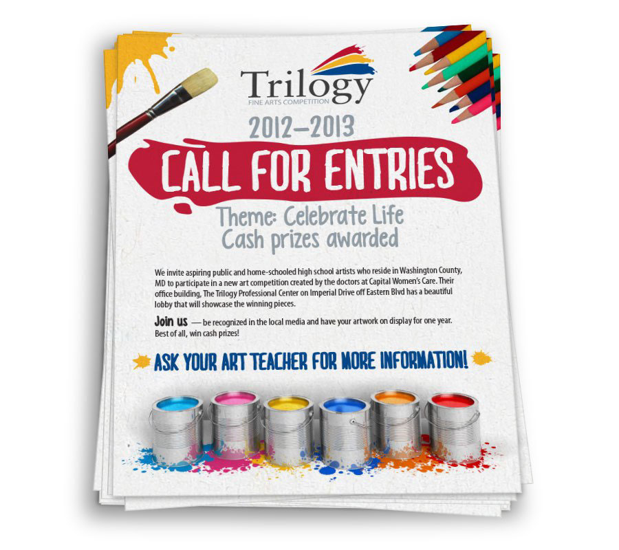
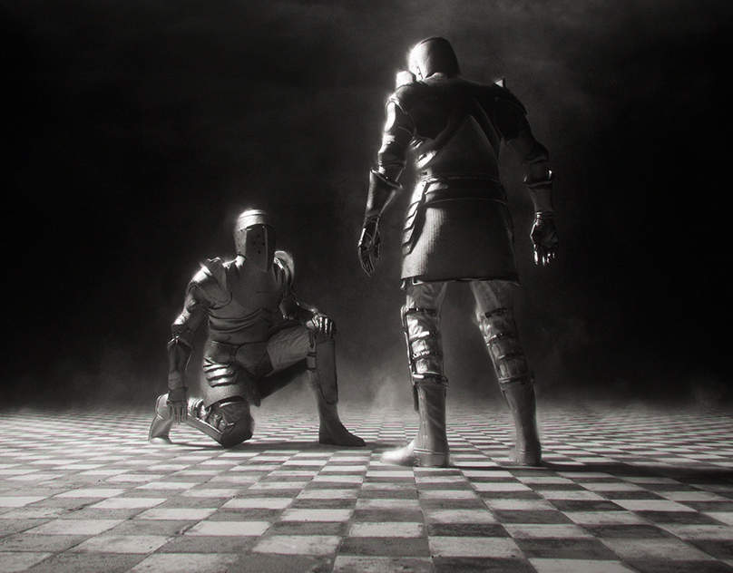
Finally, it was time to load our portfolio. The problem I ran into was that there were many projects where we didn't have physical proofs of the final products. Rather than posting just the files as they were, I set out to create realistic scene mock-ups in Photoshop for various print pieces. I used smart objects to make updating these mock-ups quick and easy. The following are mock-ups that I created from scratch specifically for Icon's design portfolio.