Millo Rebrand
A new hand lettered logo for a popular blog that helps creative people.
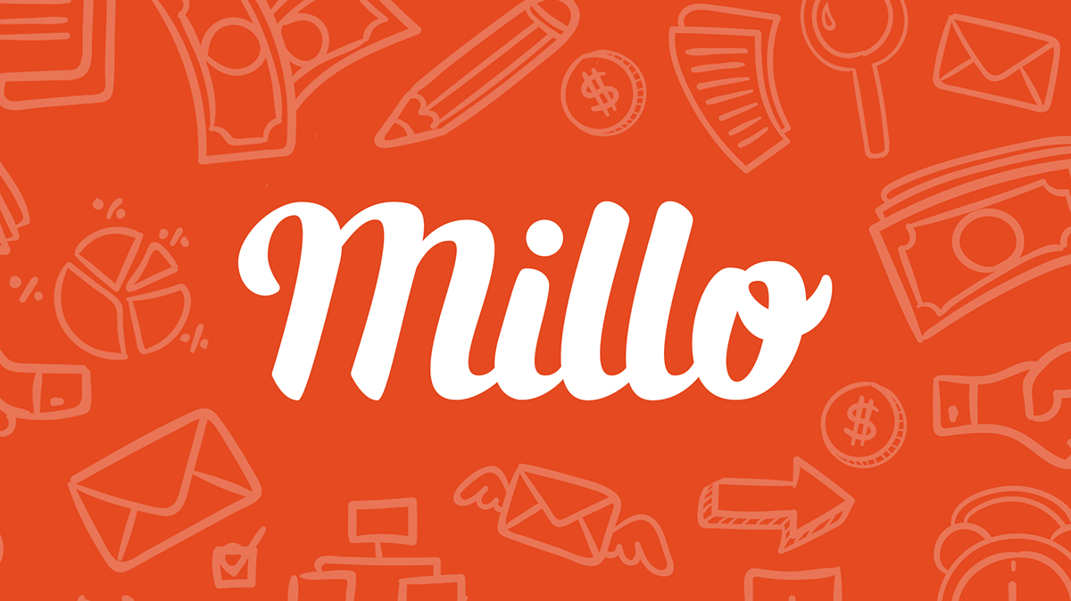
Preston reached out to me to redesign his logo into a fluid work mark with a more creative feel. Something fresh, fun and distinct while staying close to their current visual presence.
Originally he used a simple hand rendered font for his logo but found himself wanting an identity that was authentically handmade.
Timelapse
While creating this logo, Preston and I both thought it would be a great idea to live stream my process on Twitch. This way Millo fans and creatives alike could hang out in the chat and be a part of the rebrand. We shot 12 hours of footage over the span of 3 days on Twitch and condensed it down to just over 2 minutes.
Mood Board
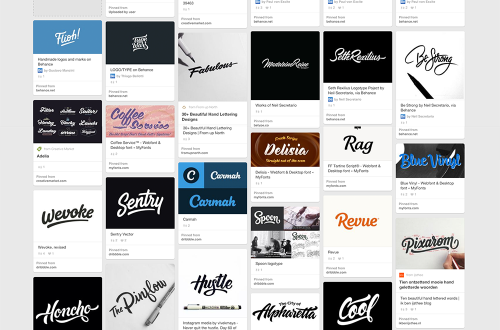
I began my process by collecting a series of inspirational images consisting of different type styles, colors and fonts in a Pinterest Mood Board. I started off my sketching phase by doing a few monoline thumbnails to give Preston a few ideas I had for composition and structure.
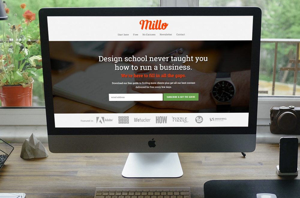
After our Mood Board meeting, it became clear that Preston wanted a brand that felt organic without being too decorative. It was important for the word mark to be albe to fit in mostly horizontal formats, so it could fit nicely into the header of millo.co.
We settled on a stylistic direction similar to the Carmah and Wevoke samples from our Mood Board. Then we both agreed to come up with an icon version of the word mark using just the letter "M" for square ratio profile images and his website's avatar.
Thumbnails
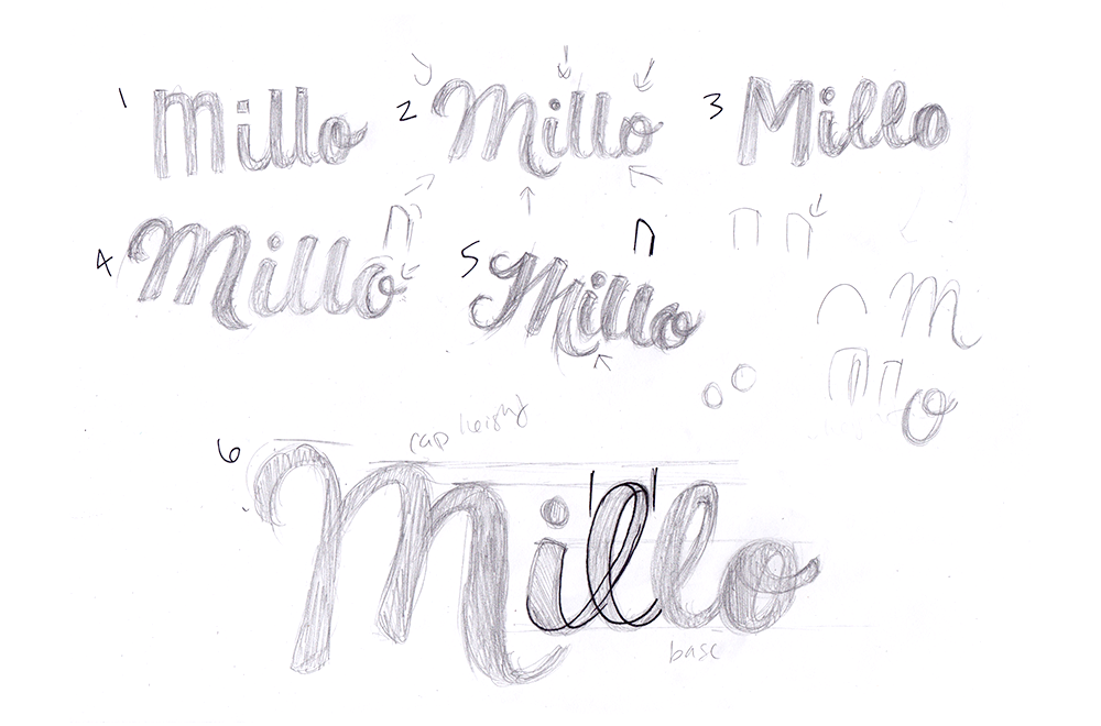
Once I had a stylistic direction in mind, it was time to get to work and get a few ideas on paper. This page is just one of the many I filled up with thumbnails both on and off stream. With each new concept, I drew closer and closer to a word mark I felt was appropriate to represent the new Millo brand.
As you can see, I drew out which aspects of each logo I preferred and started to develop an idea of what characteristics of my letters I wanted to include in the final word mark. At first I thought having the "M" ligature come under the "i" would be a nice customization for the brand along with the possibility of having an additional "o" ligature to help close off the piece.
Drawn Concepts
I had an idea of what kind of structure my lettering would take, I started to work bigger and create more fleshed out concepts. I ended up spending the most time on the bottom two pieces. I liked their initial direction, but I realized no matter how much time I spent on them they didn't have that refined quality I was looking for. They were too playful, too young for an audience made up of creative professionals well into their 20s and 30s.
So with that in mind, I started again going towards a completely new direction. Then using some font inspiration from our initial Mood Board I created two new concepts. I liked both top concepts but felt I needed to Frankenstein them together to get the clean, natural aesthetic Preston wanted. Ultimately I went with something closer to the top left sample to be my winning word mark that I would spend the rest of my time refining.

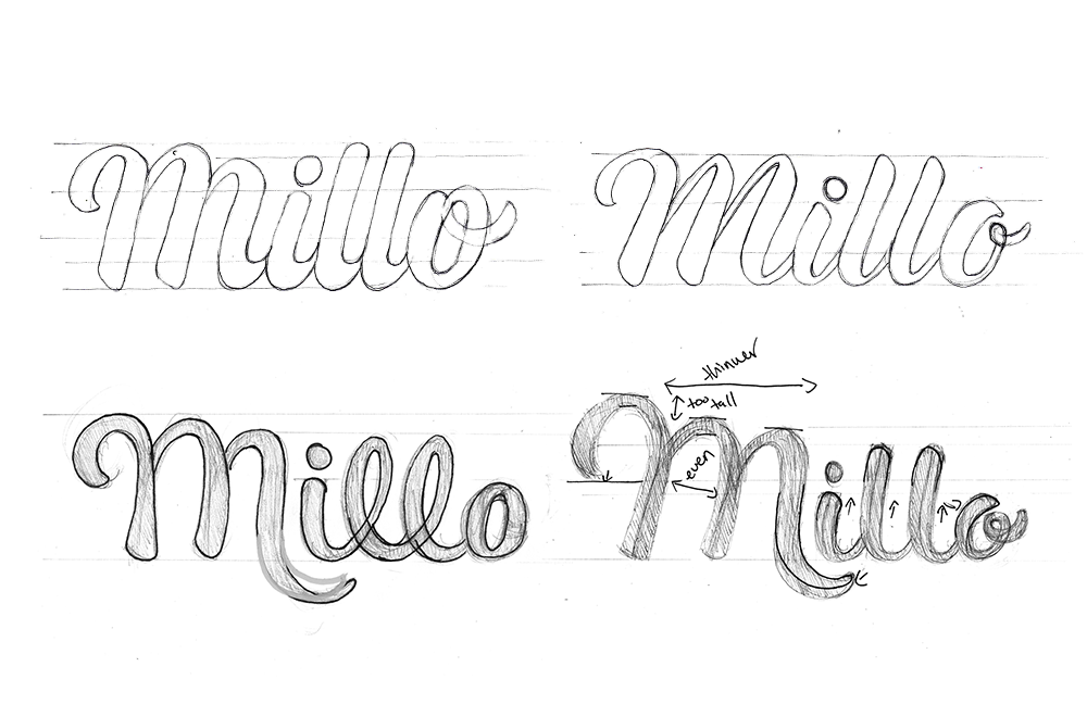
Final Concept
With a clear view of the finish line, I spent a few more hours refining my final concept. I ended up making a more distinct thick to thin contrast to increase readability. I also started to align my typography to a more balanced grid ensuring that my baseline, x-height, and cap-height were all consistent.
I ended up doing a lot of work upside down to see clearly that my kerning was even, and each letter had the same amount tilt. Sometimes its best to edit your lettering upside down so you stop seeing the characters as letters and more as shapes so you can get a good idea of the negative space.
Then to make things easier for me going into Illustrator, I drew in some mock bezier handles of where I thought my anchor points would go. That way once I was ready to vector my word mark I wouldn't have any hesitation when using the pen tool.
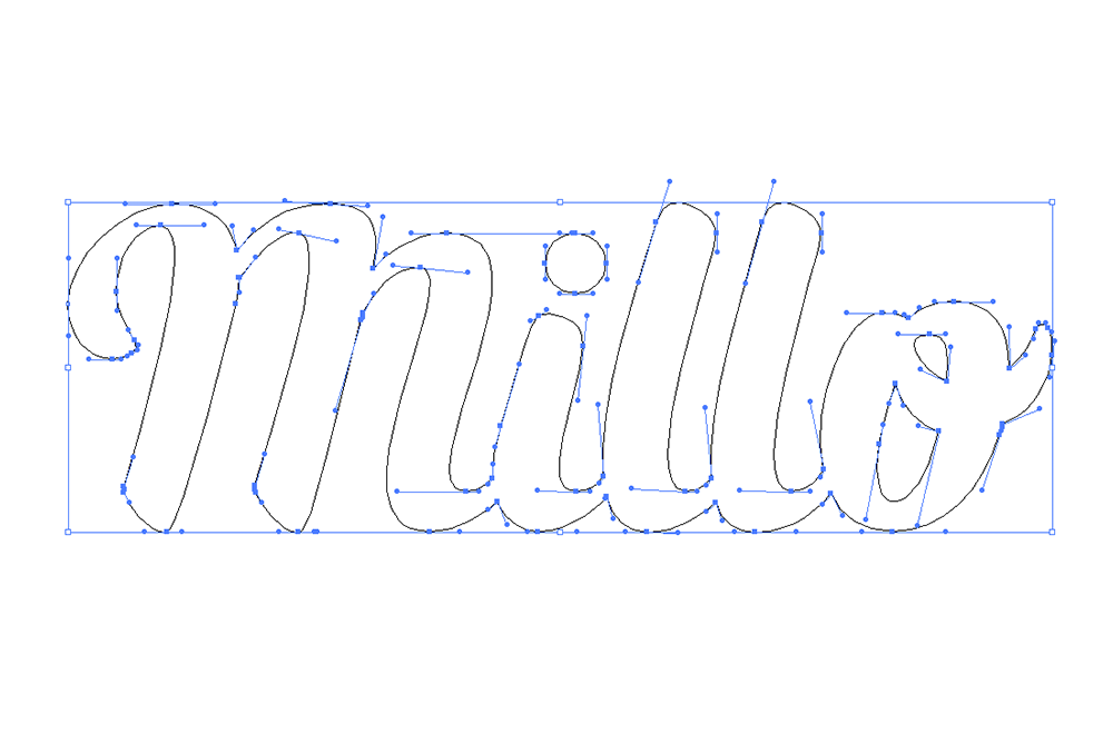
Vector
Since I was able to do most of the refinement on pen and paper, it was relatively easy to vectorize this piece. I knew where my anchor points went, I had a grid in place, now all that was left was to make sure this word mark looked as smooth and effortless as possible.
I was pretty dead on with my mock anchor points, but, of course, there were a few that ended up not being a right fit for the piece. I always try to create every logo design using only vertical and horizontal bezier handles to keep my file size down and make it easy to make little adjustments. I know all to well that the more anchor points you have the harder making subtle changes can be.
I was pretty dead on with my mock anchor points, but, of course, there were a few that ended up not being a right fit for the piece. I always try to create every logo design using only vertical and horizontal bezier handles to keep my file size down and make it easy to make little adjustments. I know all to well that the more anchor points you have the harder making subtle changes can be.
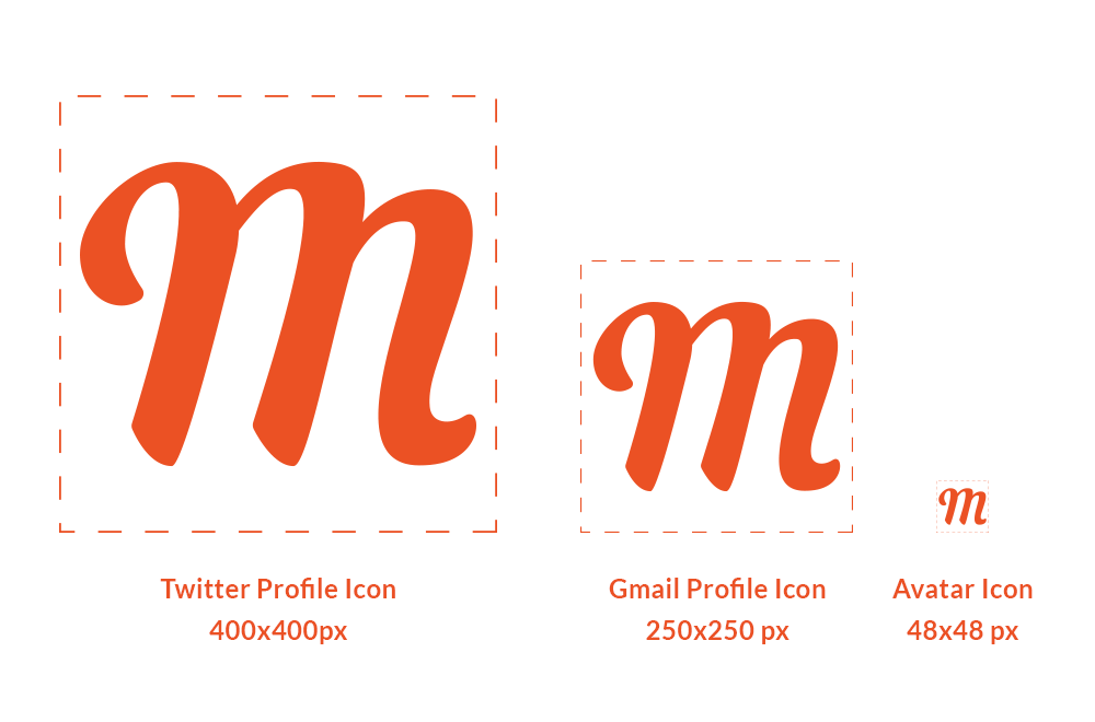
Icon
I had planned ahead for the icon version of this logo by drawing out the "M" separately. The only real change that I made was that I included a rounded off end to the right stem. This way the letter could be used on its own without looking cut off.
I also made some sight adjustments to the negative space between each steam in the "M" to increase readbility so even when this icon is as small as 48x48 pixels it can still be reconized.