What Comes Around Goes Around
Brand Development, Print Collateral, Packaging & Marketing
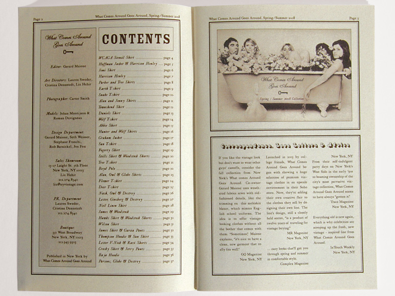
The color palette for this vintage clothing collection and boutique was inspired by vintage clothing labels and advertisements. We chose a rich, sepia brown color as well as a cream color (both hinting at aged paper and printing) as well as gold accents to symbolize the high-end, vintage positioning of this brand.
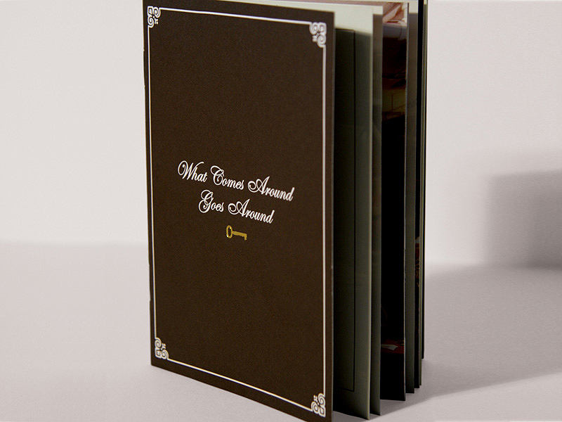
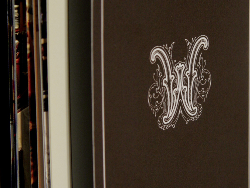
The custom typography echoes the look of vintage clothing labels while keeping the brand's sophistication and high end positioning in tact, while the rich, masculine brown color and key logo balance the more feminine aspects of the brand aesthetic.

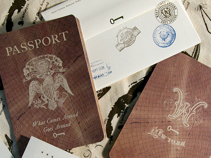
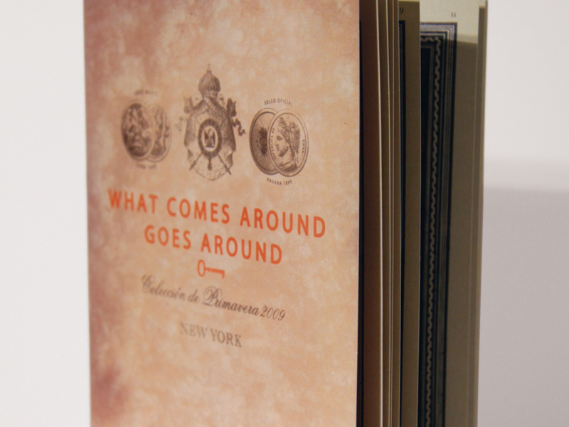
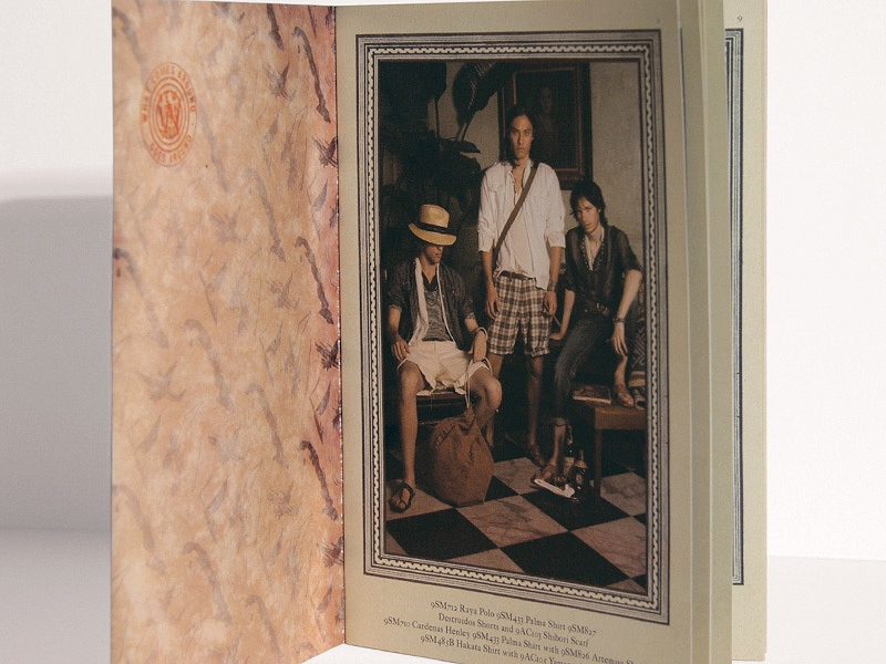
For the launch of the 2009 Spring / Summer Collection—inspired by the idea of The Rolling Stone's on vacation in Cuba in the 1970's—we designed a custom pattern for tote bags along with a passport invite to a launch party where guests received gift totes containing free music download passes and other party favors.
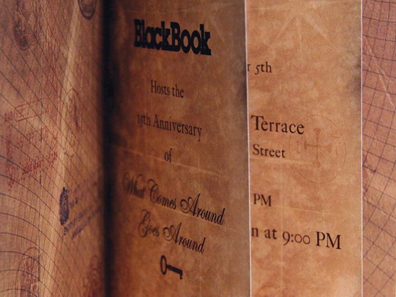
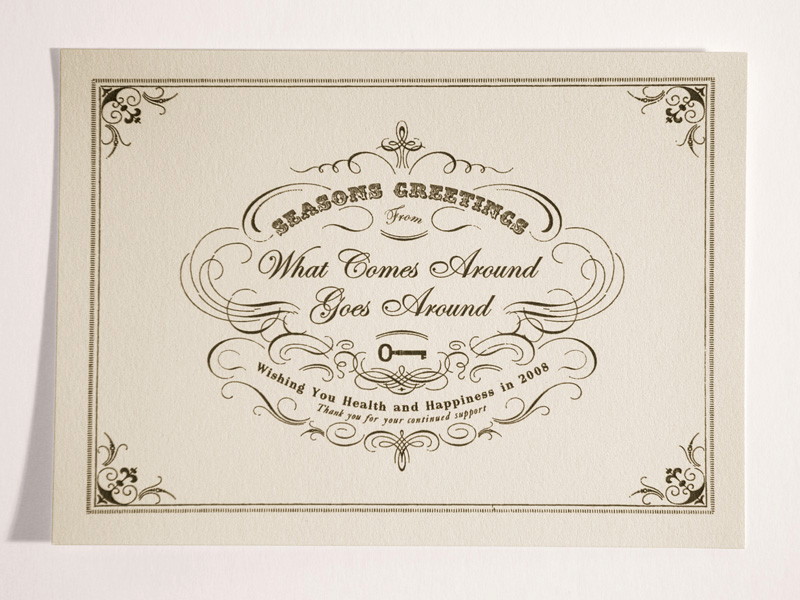
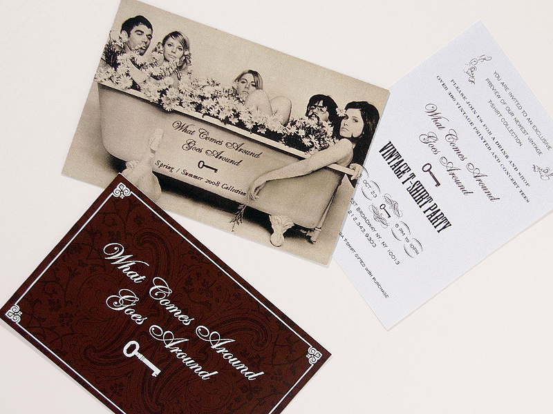
All company wide promotions and collateral remain rooted in the Western Victorian theme of the general brand direction where the key logo is prominent, while promotions for different fashion collections convey more specific themes.
This look book convey's the Rock n' Roll, 1970's Cuban theme of the Men's Spring Collection while still staying true to the company's overall brand positioning of high-end vintage inspired design.
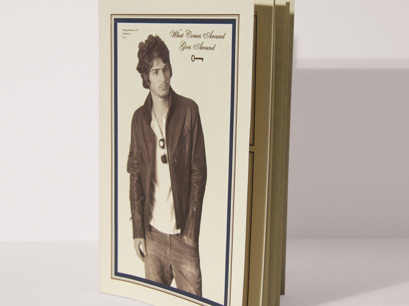
This look book conveys a 1960's Summertime hippie vibe—the concept which inspired the clothing design of this collection—while still staying consistent with the company's overall brand image.
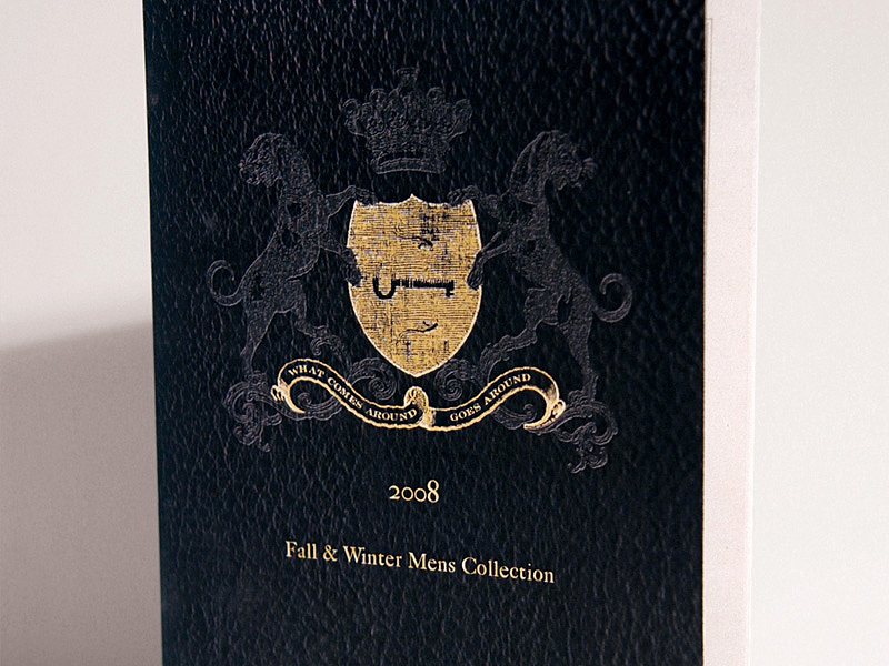
This Men's Winter collection was inspired by the idea of "The Rolling Stones at English University in the late 1960's." While the visual theme of each collection changes, the company's overall brand positioning of high-end vintage remains consistent.


This company has recently changed it's name to What Goes Around Comes Around for various reasons and we have acted as consultants for the re-branding effort.
"Rob is easy to work with and was able to help us create a brand image and accompanying collateral that are perfectly suited to our clientele... his consulting services in our recent re-branding effort have been essential to keeping our company's image consistent and attractive to our customers."
-Gerard Maione, Founder & Chief Creative Officer of What Goes Around Comes Around
