
Project Overview
TrafficJunky is an advertising platform that allows people to bid on ad spots inside various websites to have their ad shown to millions of visitors daily.
Information provided here is limited due to non-disclosure agreement.
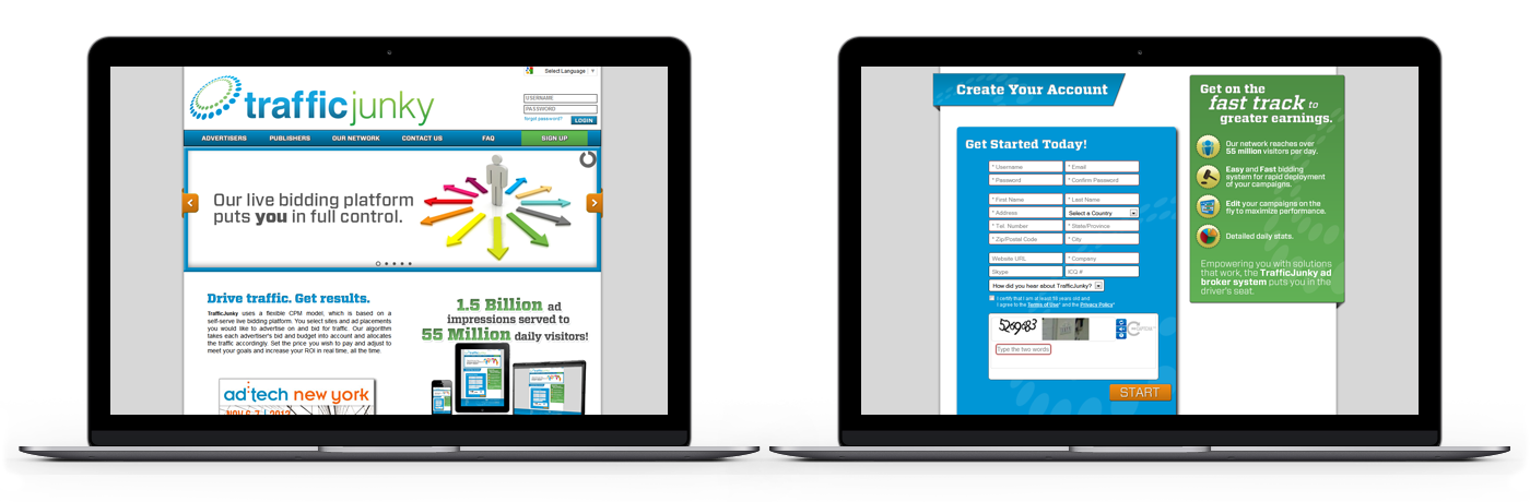
TrafficJunky’s interface when I joined the team (created before my arrival)
Getting to Know the Product
I integrated the team as the first UX Designer of the company. I started by doing interviews with all the departments involved with the product. Once I had an understanding of the project and what information the different departments had about users, I set up a survey to understand how users felt about the platform.
With the survey results in hand, I created personas to represent the different groups of users. Using web analytics softwares I validated my findings and identified other possible issues.
Users were mostly satisfied with the product and, according to their wishes, there were just a few improvements that could be made.

From left to right: Survey questions; Survey results; Web analytics; Example of actual sentences from the survey that represented each persona
Validation of Findings and Advocating UX
To clarify my role to my coworkers and to avoid misconceptions between UI and UX, I scheduled a few presentations where I explained how UX could help improve the product and how it would make their lives a lot easier. I also presented the survey findings and the personas I had created. I made sure to validate the personas with both Marketing and Customer Service departments to see if it was an accurate representation of our users.

Presentation about UX and how it would bring a lot of benefits to my coworkers daily routines if done properly
Definition of Baseline
After the initial research to understand why the product exists, who uses it and how, now was the time to analyze the product itself. I invited a designer from another department to perform an Expert Review with me and I also performed a Competitive Analysis.
We invited a few users from the survey to have an online interview and I used the opportunity to acquire an initial SUS Score.
At this stage we had polished the User Flow and Information Architecture.

Example of SUS Score. We tried to have it updated from time to time to serve as a quality measurement
Assumptions and Definition of Goals
With more allies on my side enjoying the UX process, we defined the product needed a redesign to improve the code, the interface and the usability. Even though users were relatively happy with the product, we identify a few modifications that would possibly make them a lot happier. Another proof that UX is about the user needs and not their wants.
We also created an analytics interface for internal users to be able to get the data they needed. You can check this other project here: TJ Analytics
We did a few brainstorm and sketching sessions both on paper and on a board. Once we had a direction agreed upon, I created a low-fidelity prototype with Balsamiq and tested internally.
Together with the prototypes I was doing static mockups on Photoshop to define the new UI style. You can see some versions below.

Versions of the product during the various iterations. From lo-fi prototypes, to Photoshop mockups to hi-fi prototypes in Axure
Always Iterating
As our assumptions were confirmed or discarded, we started creating a high-fidelity prototype using Axure. Trying to be Agile, we performed periodic Usability Tests with internal users from other departments and with external users from time to time.
We compared each improvement with the baseline, validated with users and then updated the baseline to reflect the latest improvement. Every few weeks we acquired a new SUS Score as one way to validate the improvements.
I got more responsibilities inside the department and led a small team of front-end developers for a while, but I was still doing all the UX and UI work alone. After some time we hired another designer with good management skills to take my place as a lead so I could focus more on UX.

New interface landing page
Highlight
An example of a non-requested modification that we came up with during the UX process is shown below. Before, users needed to create one campaign with one site and one spot inside of it. Nobody complained about that but we noticed we could streamline this process a lot. We then inverted the campaign logic by getting the information about the campaign first and presenting all the available sites and spots that could fit their ads. Check it out:

Feedback
The redesign was a success when it went live and it didn’t stop there. Since we had implemented a culture of Continuous Improvement, the team continued to make the product better with each iteration.
TrafficJunky won the 2015 GFY Best Advertising Network Award and we started receiving some pretty good feedback from users on emails and forums without even asking:
“…I’m just LOVING your new user’s interface - campaigns can be set up in 1/100th
of the time compared to the old interface. Thanks so much for making things easier!”
"The new interface is really great guys!! I'm able to launch in a single campaign what used
to take me 10-20. Very, very cool. I love how easy it is to manage all my bids. Great stuff.”
"I just spent some time to refine our ads on TJ and I wanted to say WOW! I love the new
updates. It was so nice to see ad thumbnails next to their stats and I got all my work done
in 1/4 the time. This put a big smile on my face, thank you for making this happen!”
When I left the company we had a small UX team with 4 designers and 5 developers and I was proud to see that the company went from Stage 2 to Stage 4 on the Corporate UX Maturity scale from Nielsen Norman Group since I joined.


