Fruit of the Loom // Logo Reduction for Screen Use
The assignment was to re-design a screen compatible version for a known print-based logo- an alternate version for use in smaller screens and applications. The goal was to identify the core values of the brand and maintain them under the technical requirements for adjustment to screen.
This exercise was given as part of Advanced Typography for Interaction Design class at H.I.T
(Holon Institute of Technology), Visual Communications Department in Israel.
(Holon Institute of Technology), Visual Communications Department in Israel.
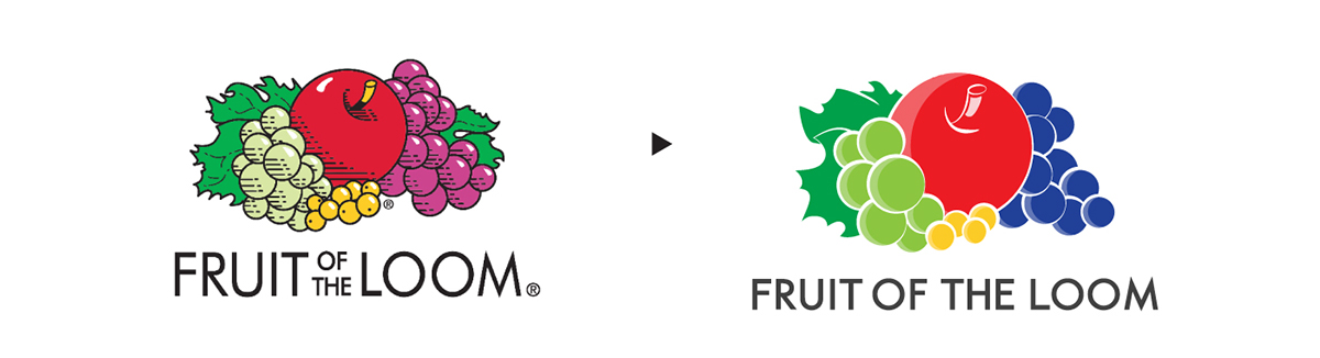
Final Result
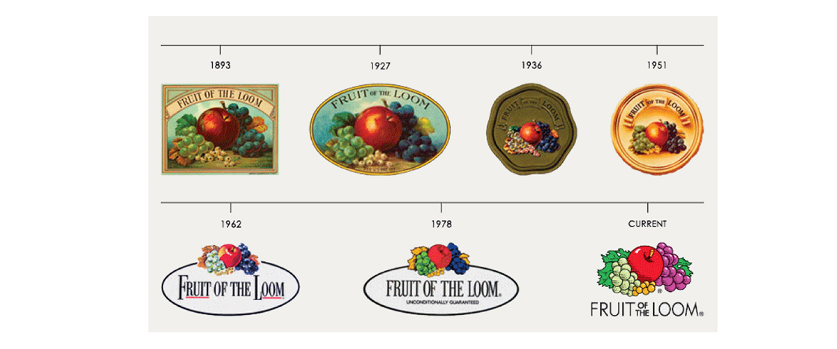
Logo History
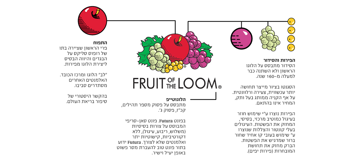
Analysis of history and visual elements
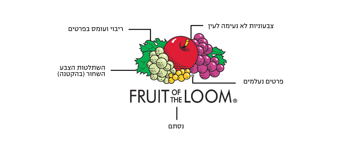
Problems when translated and used on screens
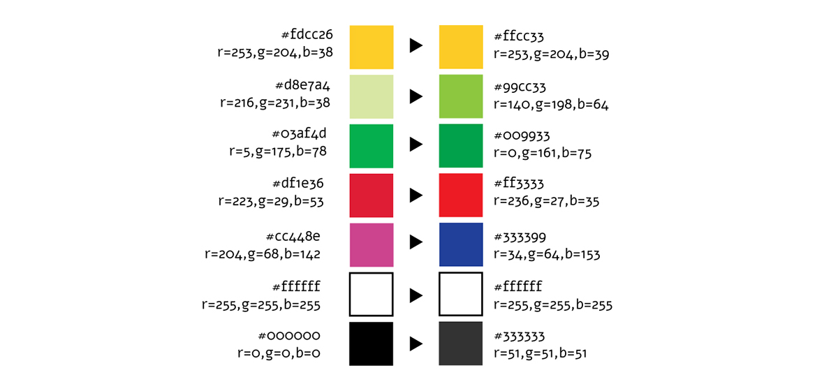
Changing to web safe colors

Illustration reduction
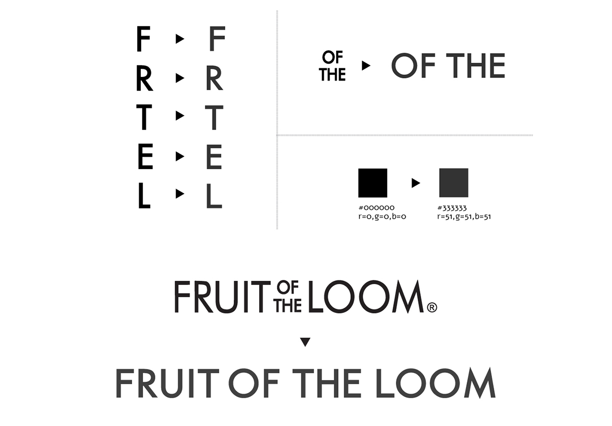
Addressing the logotype: color change, small changes in letters & changing it into a one liner


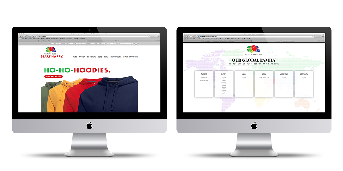
For Website
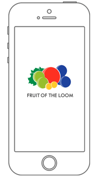
Splash Screen for App


