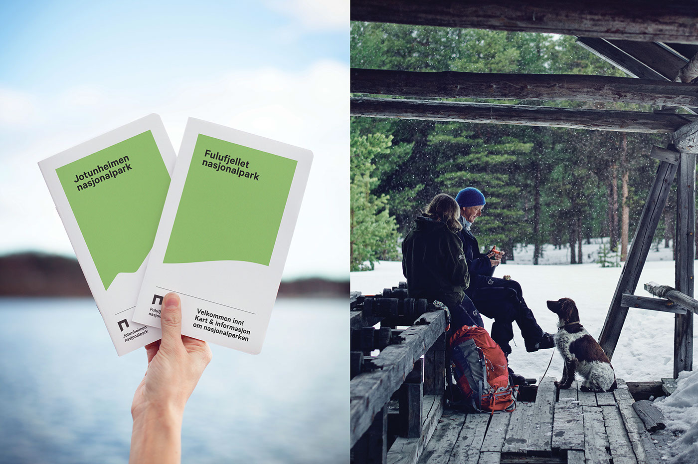
Snøhetta has developed the new visual identity and a brand strategy for Norway’s National Parks. This encompasses 44 parks, visitor centers, and national villages and municipalities, and the strategy and design aim to tie stakeholders closer together, as well as to communicate the important message of both visit and protect to users and visitors.
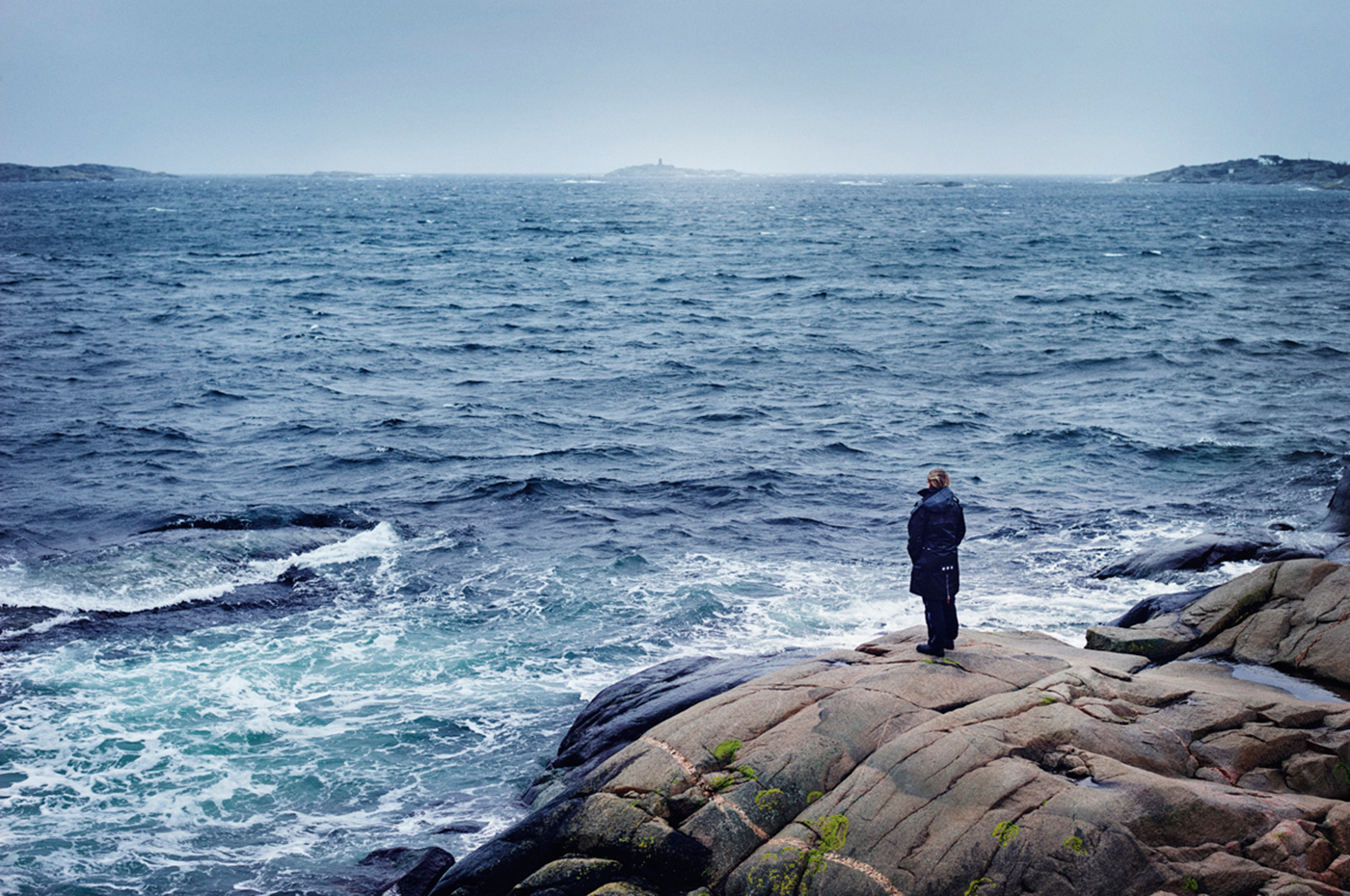
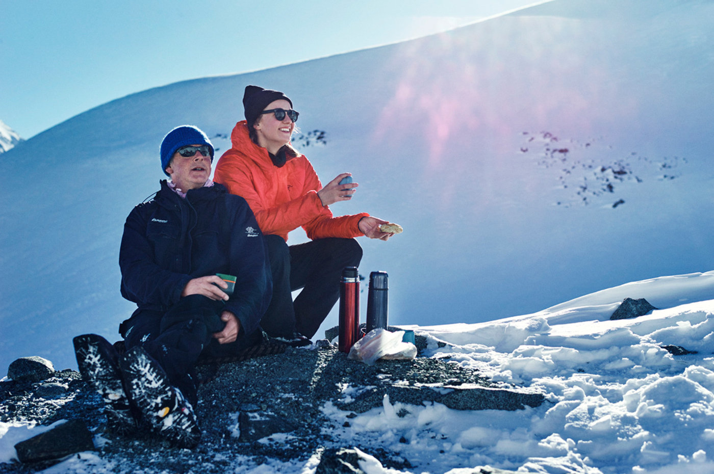
Nature has an important place in all Norwegians souls – the joy of ascending a mountain, experiencing the nature’s silence, or feeling the power of the untouched surroundings. The national parks represent some of our nature’s most beautiful parts. It should be experienced, but at the same time be protected.
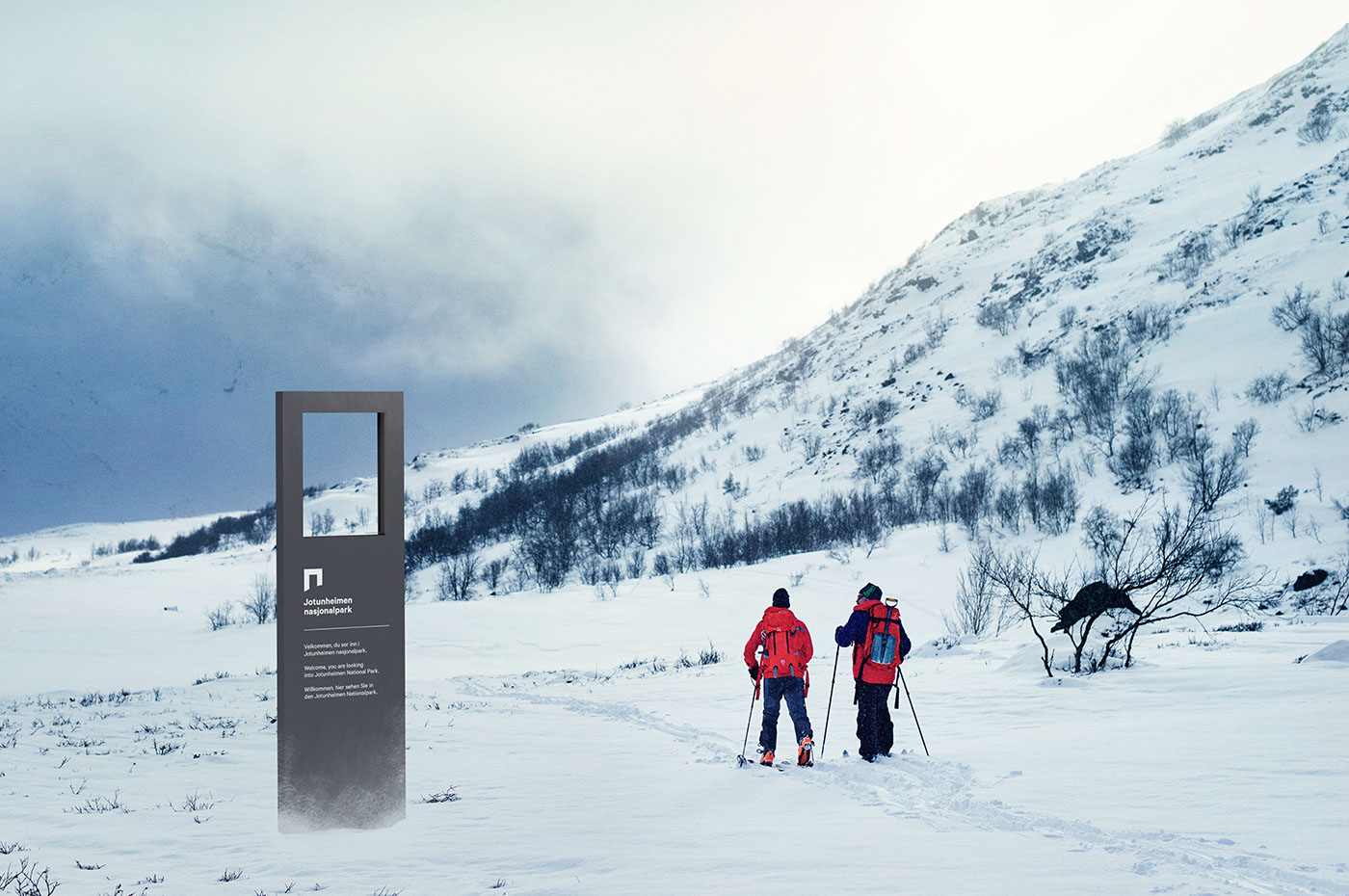
The visual identity is built on the concept of a portal. A portal is an entrance, or a gate, which symbolizes the transition between two dimensions; the traversing between the cultivated and the natural. The new, unifying visual identity opens a gate to these new experiences, it lowers the barriers for visiting, and facilitates the increased knowledge of our precious surroundings.
The logo represents a portal – a protective frame shaped by a natural landscape curve. It shows the interaction between culture and nature, as well as the balance between visit and protection.
By gathering all stakeholders under one symbol, the portal, a clear common identity is created for all national parks, visitor centers, as well as national villages and municipalities. The portal simultaneously gives room for individuality through the landscape dependent curve.
Nature has an important place in all Norwegians souls – the joy of ascending a mountain, experiencing the nature’s silence, or feeling the power of the untouched surroundings. The national parks represent some of our nature’s most beautiful parts. It should be experienced, but at the same time be protected.
The visual identity is built on the concept of a portal. A portal is an entrance, or a gate, which symbolizes the transition between two dimensions; the traversing between the cultivated and the natural. The new, unifying visual identity opens a gate to these new experiences, it lowers the barriers for visiting, and facilitates the increased knowledge of our precious surroundings.
The logo represents a portal – a protective frame shaped by a natural landscape curve. It shows the interaction between culture and nature, as well as the balance between visit and protection.
By gathering all stakeholders under one symbol, the portal, a clear common identity is created for all national parks, visitor centers, as well as national villages and municipalities. The portal simultaneously gives room for individuality through the landscape dependent curve.

The logo represents a portal – a protective frame shaped by a natural landscape curve.