As part of the celebration around the World Statistics Day 2015, and following the launch of the 2015 Millennium Development Goals Report, the United Nations Statistics Division announced the #WSD2015 Data Visualization Challenge competition, where participant were asked to build an infographic or dynamic visualization featuring the latest data from the 2015 MDG report.


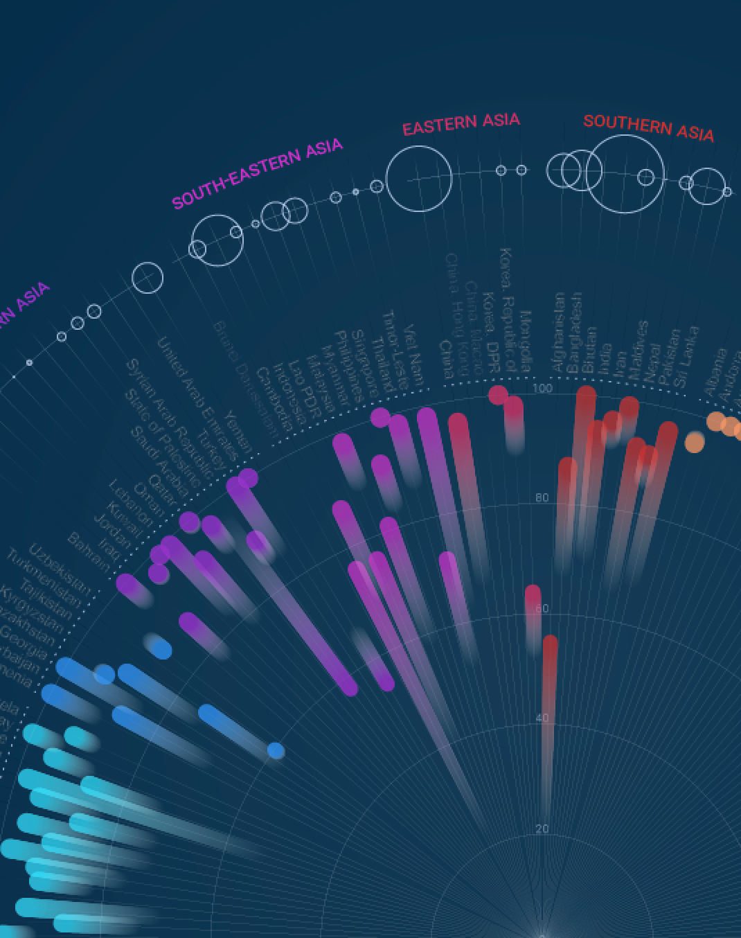
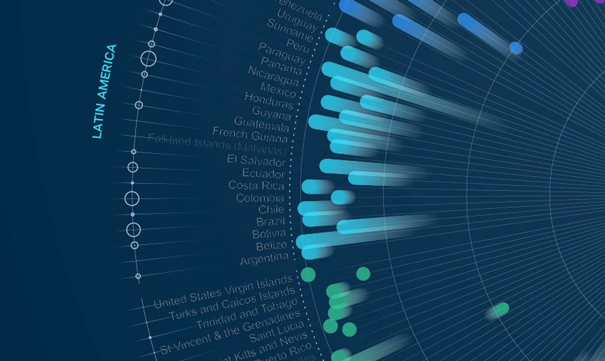
The lenght of the segment represents the growth of the percentage of population from 1990 to 2015. If the direction of the segment is towards the centre of the circle, the percentage of population with access to safe drinking water sources has dropped
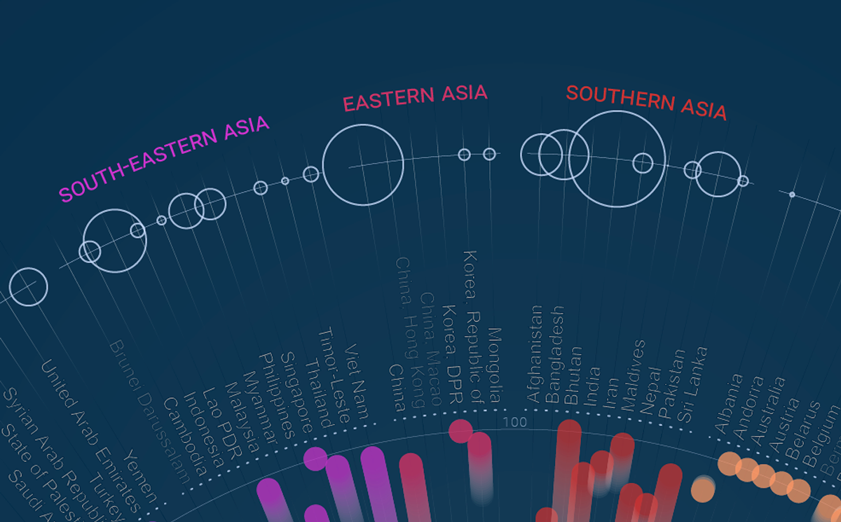
Circles on the top shows how many people (size) are still missing a safe drinking water source now in 2015.