Mark Schreck Concrete Designs Rebrand
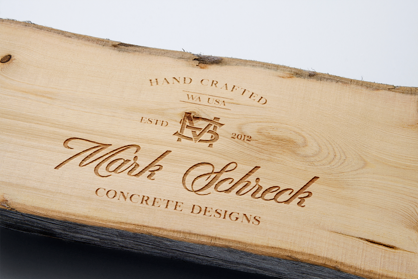
This hand lettered brand was created to reflect the custom made products Mark makes in his shop using one of mans oldest mediums.
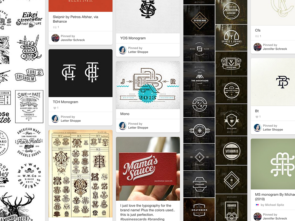
MOODBOARD
I began my process by developing a Pinterest mood board that reflected the personal taste and style Mark had described to me. They wanted a classic almost vintage style brand that had the same level of craftsmanship Mark brought to his products.
During our first art direction meeting we all agreed that a responsive logo would work best for their rebrand so they wouldn't run into any application or size restrictions when trying to present their business.
So I created a horizontal logo that would be best presented when placed on their website and on stationary. A monogram logo that would combine "MS" together that would be used for their social media icon and to brand Marks projects. Then finally I would combine all these assets to create a badge that would be great when used for swag, business cards and on printed marketing materials.
HORIZONTAL LOGO
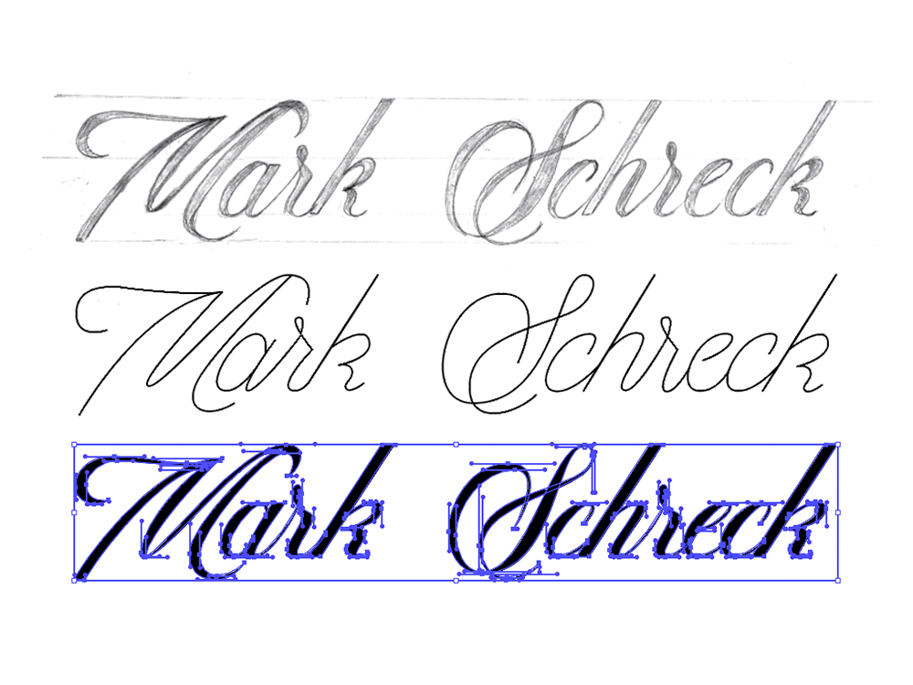
When designing the rebrand, I started with the word mark since it was going to be the primary focus. After many pages of trial and error, I decided on a simple elegant script. This script was custom made to represent Marks high end products while remaining approachable.
After I had a good enough sketch, I scanned in my artwork in Illustrtor and created a monoline first in Illustrator with the prn tool. This phase helps me better form my letters to be consistent and keeping the negative space between the letters balanced.
Once I had my monoline exactly where I needed it, I began to add weight to my letters to give just the right amount of personallity. I made sure to have perfectly horizontal and vertical handles on my anchor points in Illustrattor so my line work could be as simple and smooth as possible.


MONOGRAM
This monogram was designed based on the font "Copperplate" one of the oldest industral fonts around today after its creation in 1901. I customized the weight and height so that each letter could easily wrap around the other, with equal negatve space on each side.
Orginally I was going to create a illustrated version and a simplified icon, but later realized that a cleaner version of the monogram was nessary so it could remain readbaile even when used as a small profile image.
This design needed to work in both 1 color white and black with both a clean and textured version. The textured version could easily be used for digtal purposes, where the clean version was created for letterpress, screenprinting or even embossing.
