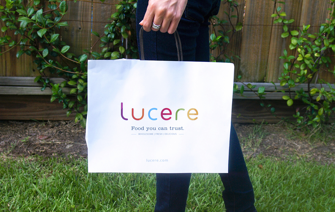
LUCERE
A takeaway salad, soup, and sandwich shop that provides a worry-free and wholesome experience for customers with food allergies or dietary needs.
___________________________
Concept
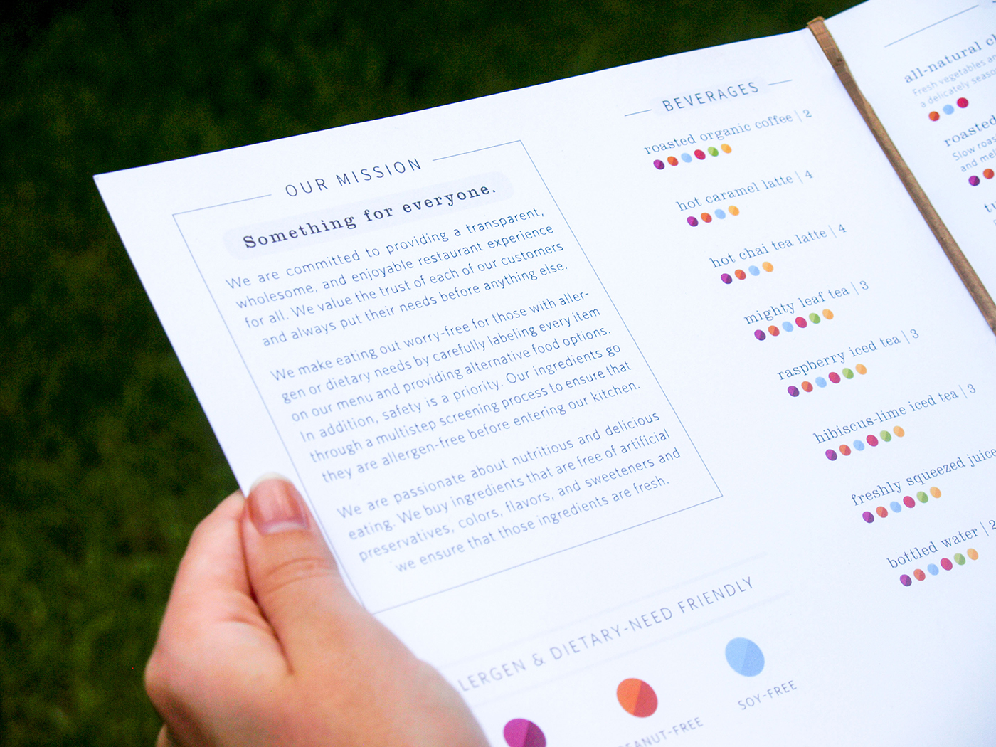
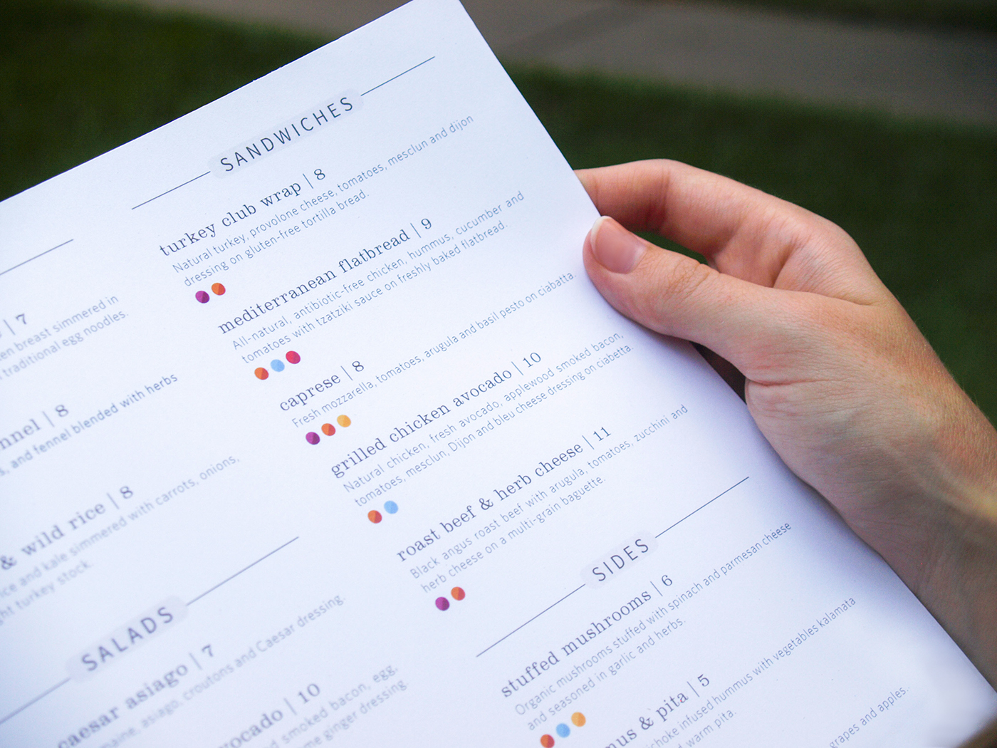
From research and conceptual ideation, I developed Lucere. The brand name, Lucere, is the latin word for lucid, which is synonymous with transparency. The idea of transparency is critical for the brand because customers with allergies and dietary needs seek clarity and truthfulness when eating out.
Outcome
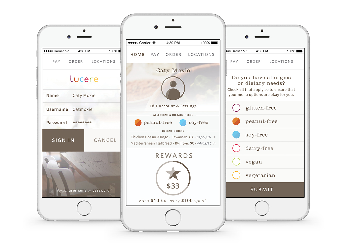
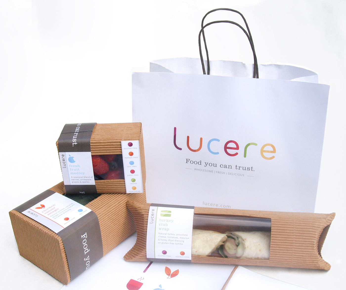
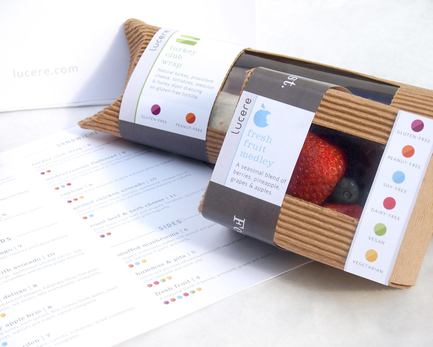
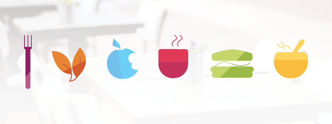
Throughout the identity system, there is a common theme of half fully-filled and half translucent shapes in the logotype, icons, and allergen dots. This was done for two reasons: First, as a way of differentiating the brand from the many other sandwich and health restaurants out there so people can recall Lucere first. Second, the parts that are fully filled in communicate wholesome and confident food because they are bright and easy to spot. At the same time, by making half of each element translucent, customers can read transparency and know what they are actually getting in their meals.
___________________________
Design Includes
Logo / Identity System
Food Packaging
Logo / Identity System
Food Packaging
Menu
Mobile App
___________________________
Semifinalist Adobe Design Achievement Awards May 2016
CLICK HERE for process work.