


Jul. 2015
INDIE EXPRESS | 獨立急行 | インディーエクスプレス
INDIE EXPRESS | 獨立急行 | インディーエクスプレス
-
企劃概念 | Project Concept
台北–東京間的獨立音樂快速直達車 | Indie Express between Taipei and Tokyo
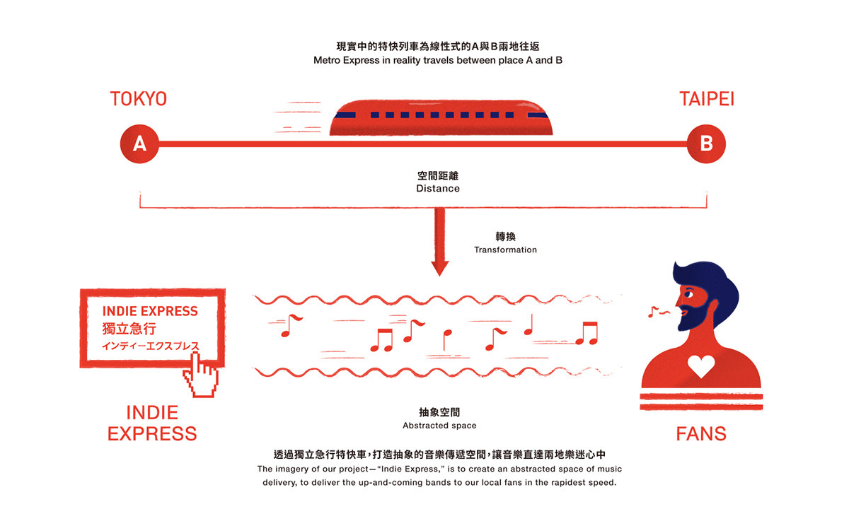
日本與台灣的首都–東京與台北,不管在文化背景、地理位置以及時空距離都十分相近。台北、東京往返的時間也約莫僅等於在日本當地搭乘急行新幹線往返東京、大阪之間的距離。作為兩個亞洲獨立音樂發達的城市,此次企劃希望藉由「Indie Express」獨立音樂特急列車的意象,將台灣/日本在地的新銳樂團以「特快急行」的方式推薦給在地樂迷,將最新穎、最獨具時下代表性的日本/台灣獨立搖滾樂團以最快速送達到各地樂迷的手中。(最初設定日本方面以東京為代表,後改為大阪為主)
Tokyo, Japan and Taipei, Taiwan are not only close to each other in geographic and temporal distance but the culture backgrounds are very similar. A trip from Taipei to Tokyo takes around the same time as taking express train from Osaka to Tokyo. Therefore, as the two big cities in Asia of Indie Music, the imagery of our project—“Indie Express,” is to deliver our up-and-coming bands to our local fans in the rapidest speed. We will bring our fans the modernist, most representative bands of the age. (Initiative representative was Tokyo, but now is Osaka. )
主視覺設計概念 | Visual Design Concept
主視覺設計概念 | Visual Design Concept
出發/穿梭/抵達 | Departure/Journey/Destination
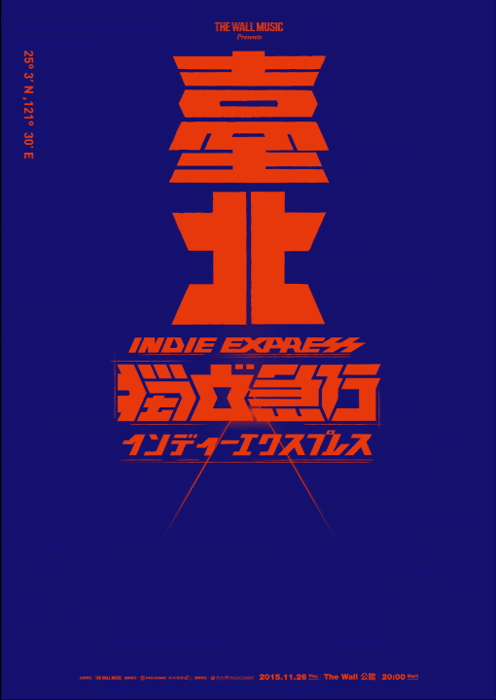
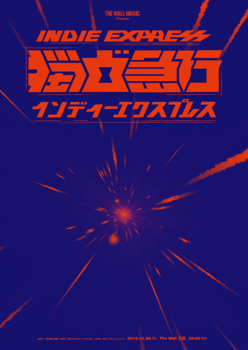
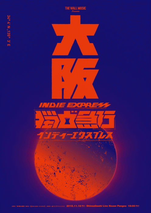
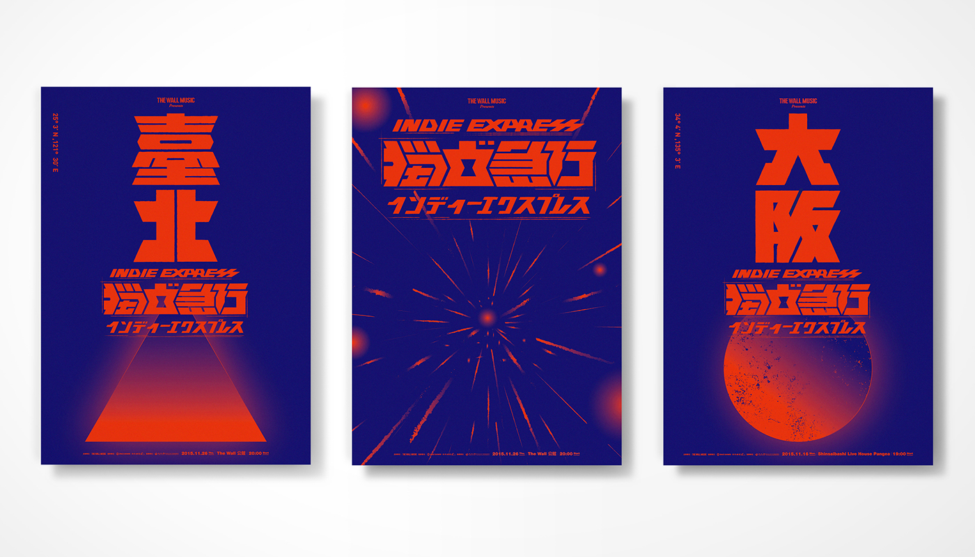
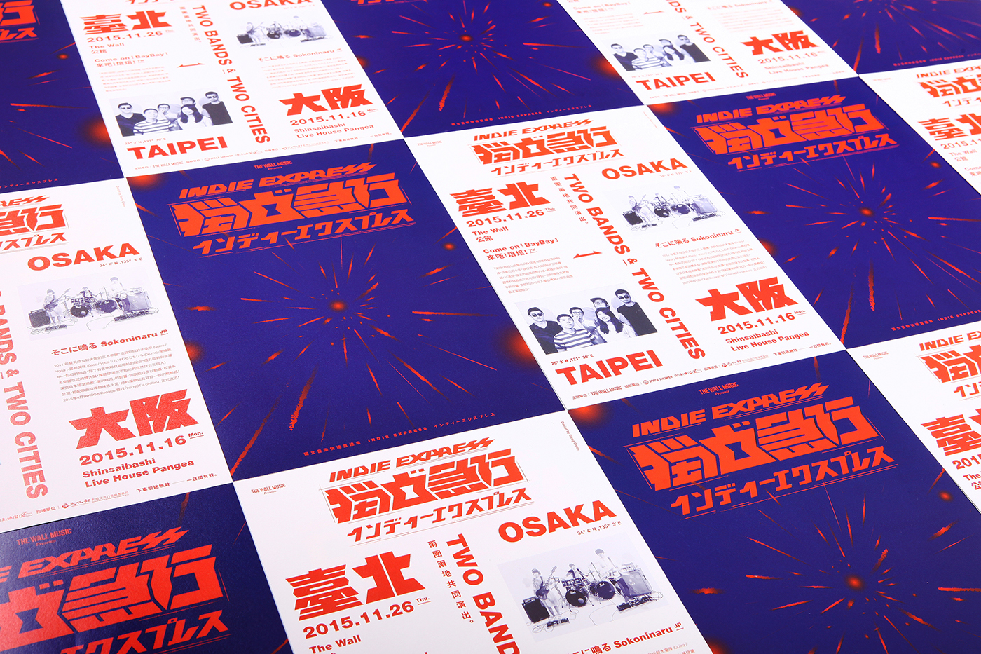
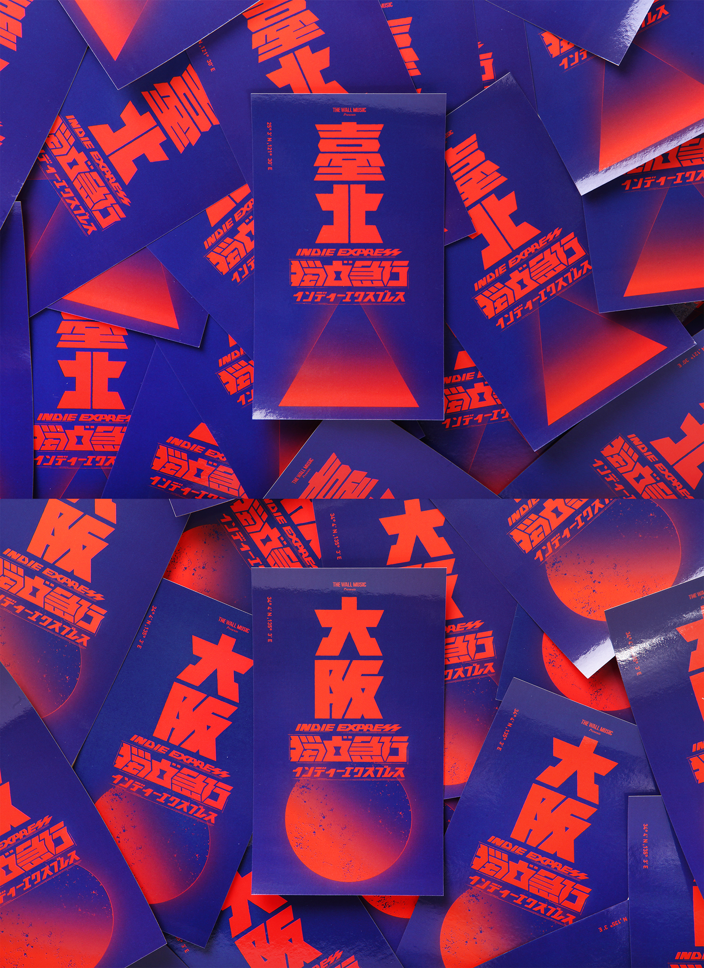
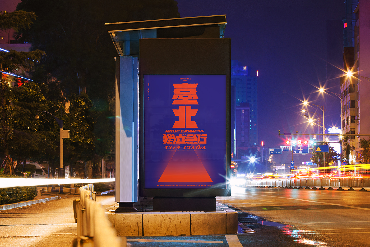
根據本次企劃概念,將急行特快車作為音樂傳達的媒介,主視覺設計,我們將音樂的傳達與交流以空間穿梭的概念呈現。聲音/音樂的傳達是透過聲波,而軌道是無形的,所傳遞的是感知上與精神上的作用,直達的目的地即是聽者的內心。視覺設計上將實際的空間轉換為較抽象的空間,透過獨立急行的特快車,讓音樂在不斷地穿梭中直達每個人的內心,藉此達到音樂文化上的交流。城市海報的視覺符號上,由於這次的活動策劃由台北出發,三角形的概念是一個意識的型態,三角形的透視頂點如同延伸的路,延伸的盡頭即為交流的目的地─日本,日本的象徵符號以最顯著的國旗符號代表,同時將星球的概念與圓形的符號做了連結,讓觀者對畫面的感受多一點想像,整個視覺也可以說是對於抽象的音樂交流空間做出的另一種詮釋。
Our project concept is to have Indie Express as the media of delivering music; for the visual design, we present our concept as “shuttling through space.” Sound/Music is conveyed through sonic waves, but the waves are invisible, only the experience of spirits can be perceived. And the listeners’ spirits are the destinations of Sound/Music.
Based on the visual design, we transferred the real space into an abstracted one, and Indie Express shuttles through this invisible space to deliver music into everyone’s heart, to communicate over the culture of music.
The concept of the visual design on the city poster connects Taipei with Osaka. Triangle is a symbolism. The perspective vertex symbolizes the extending roads to the destination in Japan. We combine the concept of a planet to the symbol of Japanese national flag, for the audience to have more imagination to the poster. The whole image is an interpretation of abstracted space of communications between music.
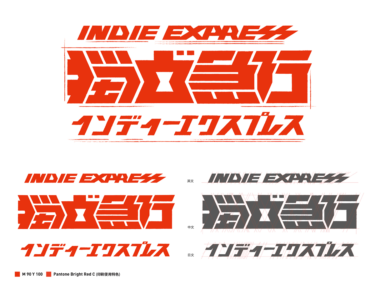
標準字 | Typeface
氣勢/指引/粗礦|Power/Leader/Masculinity
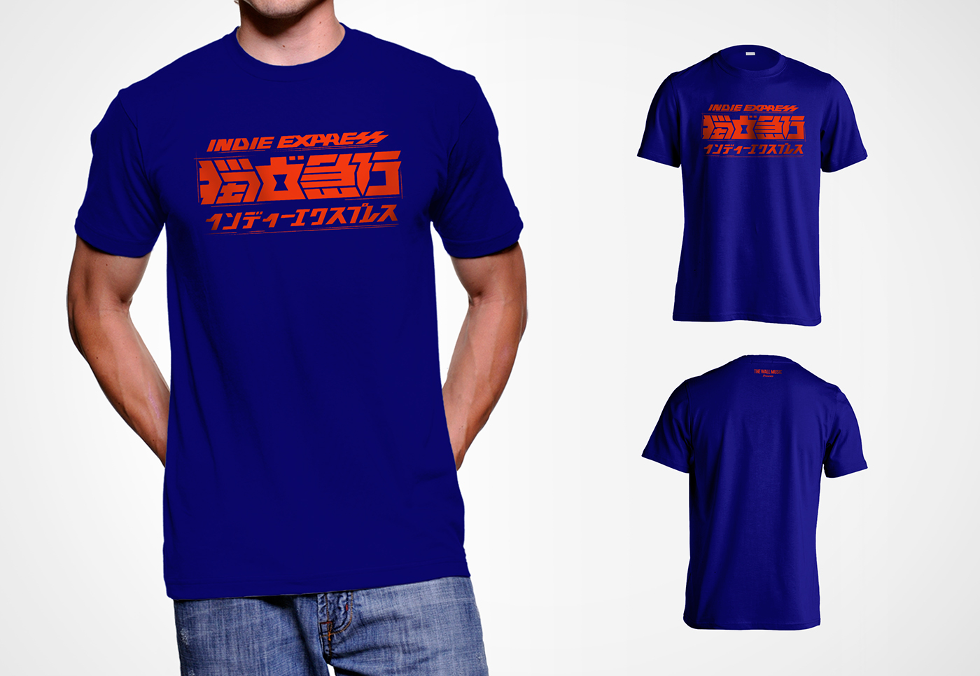
標準字設計上,在文字的設計上加入指引與匯集的意向,希望透過獨立急行的活動進入音樂交流的時空。字體選擇粗獷有氣勢的特粗黑體為設計骨架,結合列車車廂緊密連結的特性,將字體的負空間緊密地扣在一起,配色上參考日本地鐵特急/急行等列車使用顯著之橘/赤紅為文字配色。
The design imagery of typeface is to lead and to integrate. We want to take everyone into the music space with our Express Indie events. The powerful and masculine font is the design structure, combined with the characteristics—closely attaching—of passenger cars, links the negative space in the font. The color uses the same scarlet orange as the Japanese metro express.
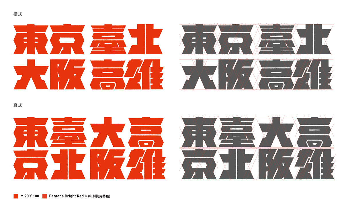
標準字-城市 | Typeface-City
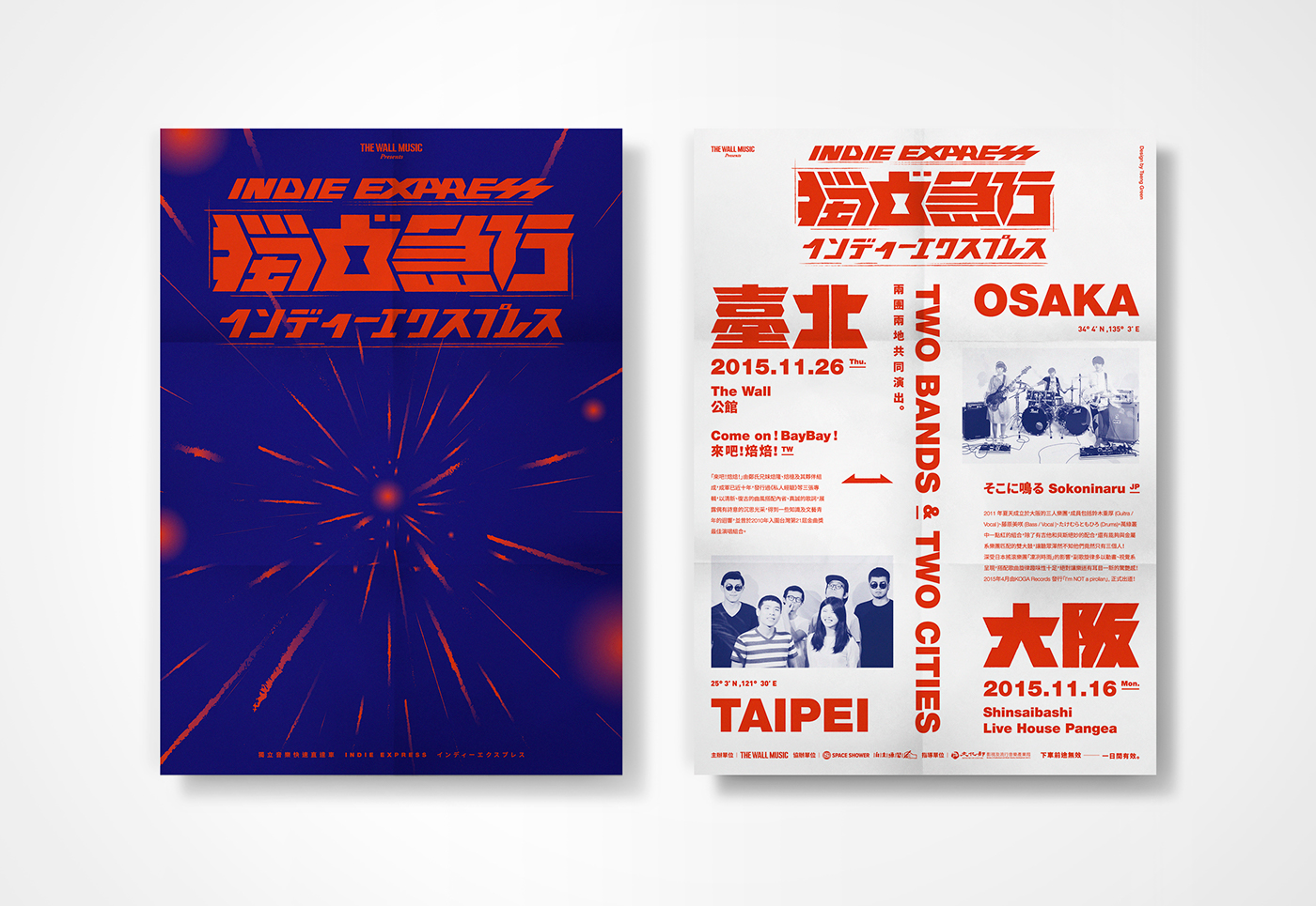
海報設計 | Poster design/700x1000 mm
DM設計 | DM design/176x250 mm
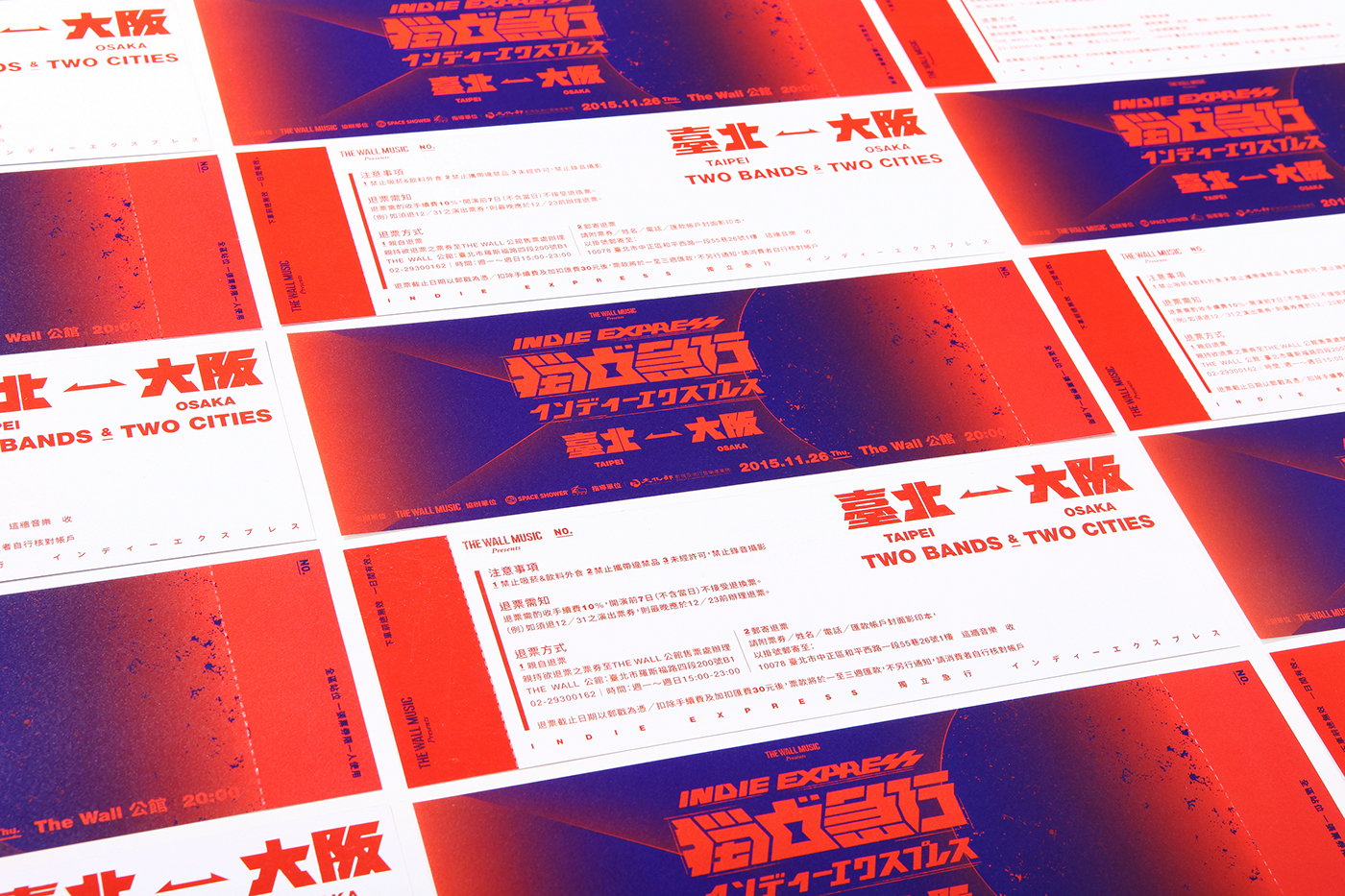
門票設計 | Ticket design/210x70 mm

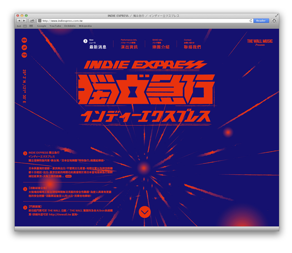
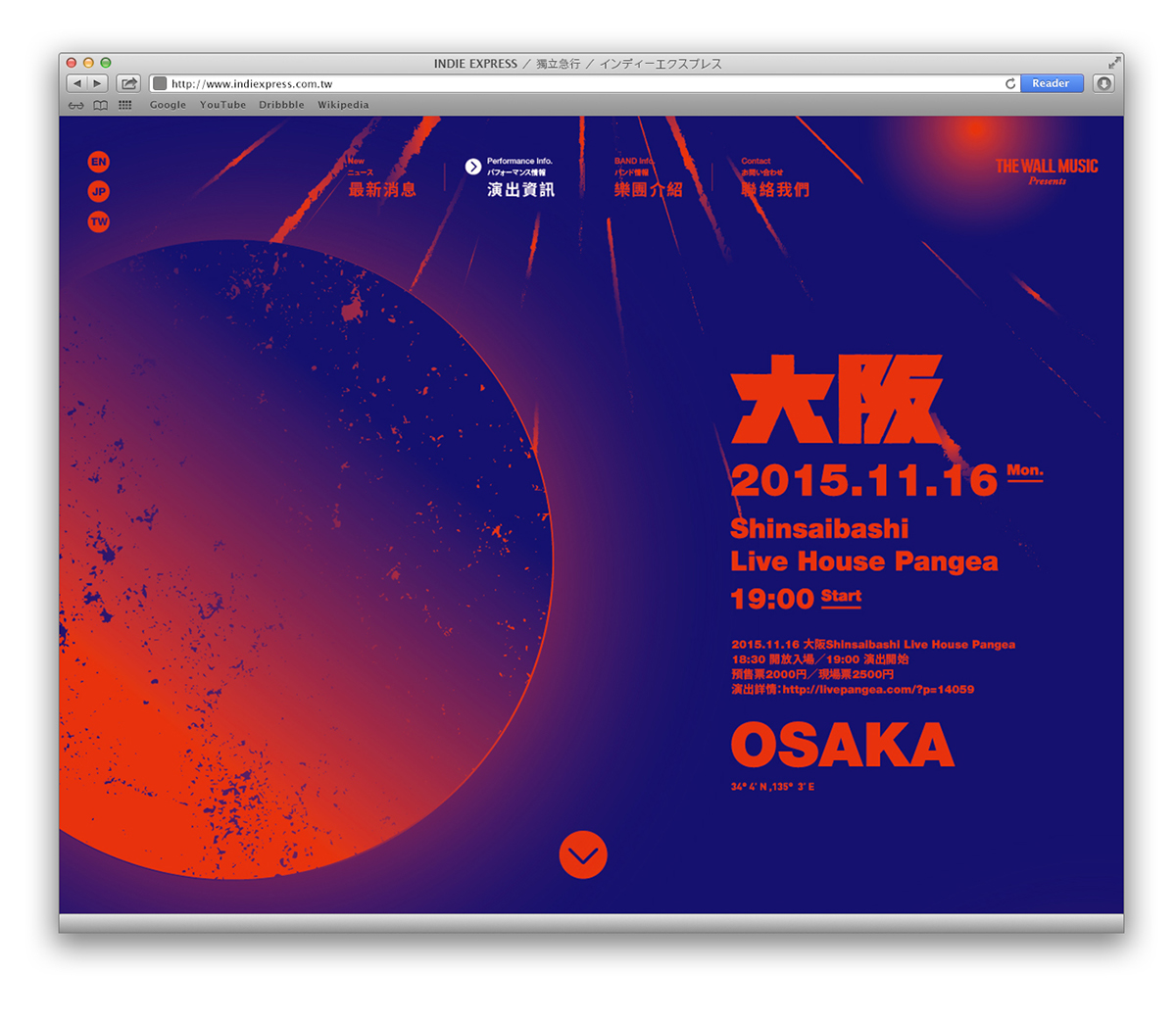
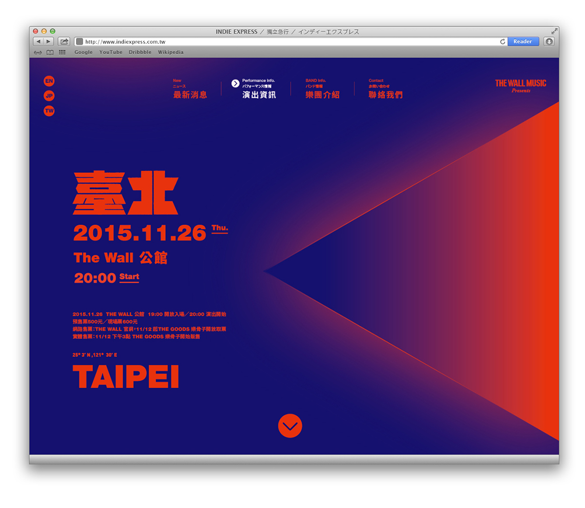
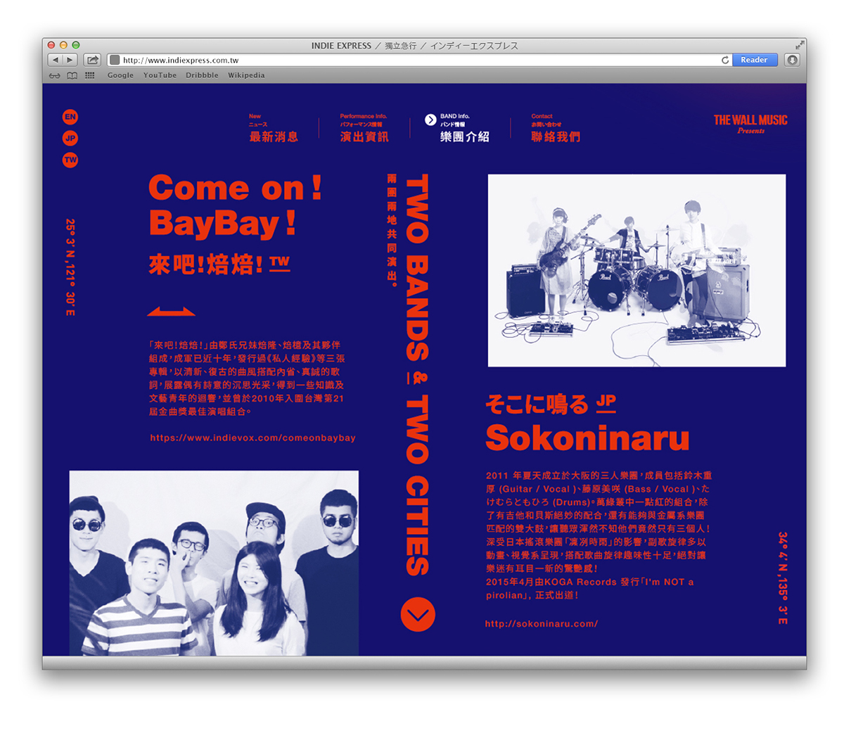
網頁設計模擬 | Website design mock-up
週邊設計-胸章 | Pin Button design/Φ=32mm

貼紙設計 | Stickers design/70x120 mm
週邊設計-T-Shirt | T-Shirt design
Extra Info.
Project : INDIE EXPRESS / 獨立急行 / イソディーエクスプレス
Client : The Wall Music / 這牆音樂
Typography / Poster Design: Tseng Kuo-Chan / I-Mei Lee
Client : The Wall Music / 這牆音樂
Typography / Poster Design: Tseng Kuo-Chan / I-Mei Lee
Animation Design : Phil Wu
Print : 立屹印刷 / Li-Yi printing
Print : 立屹印刷 / Li-Yi printing


