Situation: The company Just Food - a major new supplier of fresh and healthy food: mostly vegetables and fruits.
Problem: The client wanted to see the style and image, simple but beautiful at the same time; status at all times! But it is not alien to the young target audience.
Solution: In the course of solving the problem, we decided to create a vivid style, which clearly shows the scope of the company, but wherein creates a sense of elegance and good quality.
Ситуация: Компания Just Food — новый крупный поставщик свежих и полезных продуктов питания: преимущественно овощей и фруктов.
Задача: Клиент хотел видеть стиль и образ, простой, но вместе с тем красивый; статусный, на все времена! Но при этом не чуждый молодой целевой аудитории.
Решение: В ходе решения задачи был создан яркий стиль, который явно отображает сферу деятельности компании, но при этом создает ощущение изысканности и хорошего качества.

Old, but new!
Contact us in the studio, the client already had an idea of his right logo and even created earlier sketch. It is based on the bird, symbolizing the flight without borders, which means products Just Food will be delivered to customers at either end of the world. Well, the desire of the client - the law for us and so we bring thr thoughts in order and created this simple and very well-built logo.
Contact us in the studio, the client already had an idea of his right logo and even created earlier sketch. It is based on the bird, symbolizing the flight without borders, which means products Just Food will be delivered to customers at either end of the world. Well, the desire of the client - the law for us and so we bring thr thoughts in order and created this simple and very well-built logo.
Старый, но новый!
Обратившись к нам в студию, клиент уже имел представление о нужном ему логотипе и даже созданный ранее эскиз. В основе его лежит птица, символизирующая полет без границ, а значит продукты Just Food будут доставлены потребителям с любого конца мира. Ну что ж, желание клиента — закон для нас и поэтому мы привели в порядок чихарду его мыслей и создали этот простой и очень правильно выстроенный логотип.

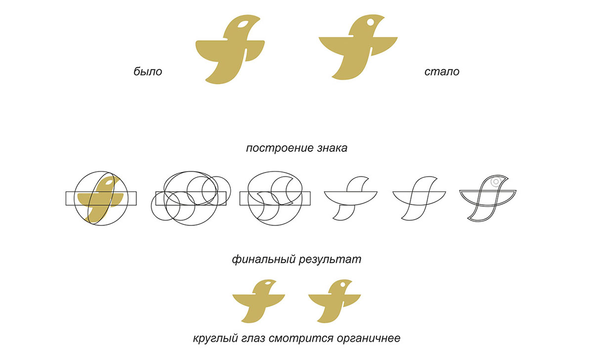
Before and after
Design of the logo from head to toe was not done just so, and exactly according to Feng Shui). Bird became easier it is on the way and clearly looking to the future, as opposed to it previous version, where main character is a little depressed.
Design of the logo from head to toe was not done just so, and exactly according to Feng Shui). Bird became easier it is on the way and clearly looking to the future, as opposed to it previous version, where main character is a little depressed.
До и после.
Исполнение этого логотипа от макушки до пяток было сделано не просто так, а точно по феншую). Птица стала легче, она уже в пути и ясно смотрит в будущее, в отличии от своего альфа-варианта, который определенно немного приуныл.
Исполнение этого логотипа от макушки до пяток было сделано не просто так, а точно по феншую). Птица стала легче, она уже в пути и ясно смотрит в будущее, в отличии от своего альфа-варианта, который определенно немного приуныл.


Stylistic decision.
We have developed identity, elegant but simple! It is like the cornerstone, it attracts with its bright color scheme and fascinating beauty of form.
We have developed identity, elegant but simple! It is like the cornerstone, it attracts with its bright color scheme and fascinating beauty of form.
Стилистическое решение.
Разработанная нами айдентика, изысканная, но простая! Она как основа основ, привлекает своим ярким цветовым решением и очаровывает красотой форм.

Elements of corporate identity.
Элементы фирменного стиля.

Gifts for partners
It is non-trivial, and at the same time, a memorable gift for the most valuable partners. And yes, you can eat out of it)
It is non-trivial, and at the same time, a memorable gift for the most valuable partners. And yes, you can eat out of it)
Подарки партнёрам.
Очень нетривиальный, и вместе с тем, запоминающийся подарок для особо ценных партнеров. И да, из нее можно есть)

Stickers on fruits and vegetables can be perfectly re-stick on your forehead to a friend)
Наклейки.
Наклеечки на фрукты и овощи отлично можно переклеить на лоб другу)
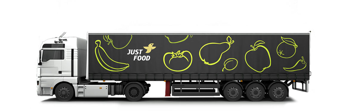
Transport
Large, but such beautiful machines will carry products Just Food, delivering to sales points juicy and fresh!
Large, but such beautiful machines will carry products Just Food, delivering to sales points juicy and fresh!
Транспорт.
Большие, но такие красивые машинки, теперь будут возить продукцию Just Food, доставляя до точек продаж сочной и всенепременно свежей!

Thanks for seeing the result of our joint activities with Just Food, now you can go and eat)
Спасибо.
Вам, что посмотрели плоды нашей совместной деятельности с Just Food, теперь можете пойти и поесть)


