


Iguushin Logo Redesign
Revitalizing a Brand
The CEO of Proliance, a Mongolian healthcare corporation, wanted to change the wordmark of Proliance's subsidiary, Iguushin, to match the feel and character of the mother company. Proliance recently underwent an identity redesign, and they wanted Iguushin's identity to have a family feel.
To make their identity fresher, and tie it to the mother company, we chose to have the Iguushin logo the same orange color - the leaves from the Proliance logo were also brought in to the Iguushin logo.
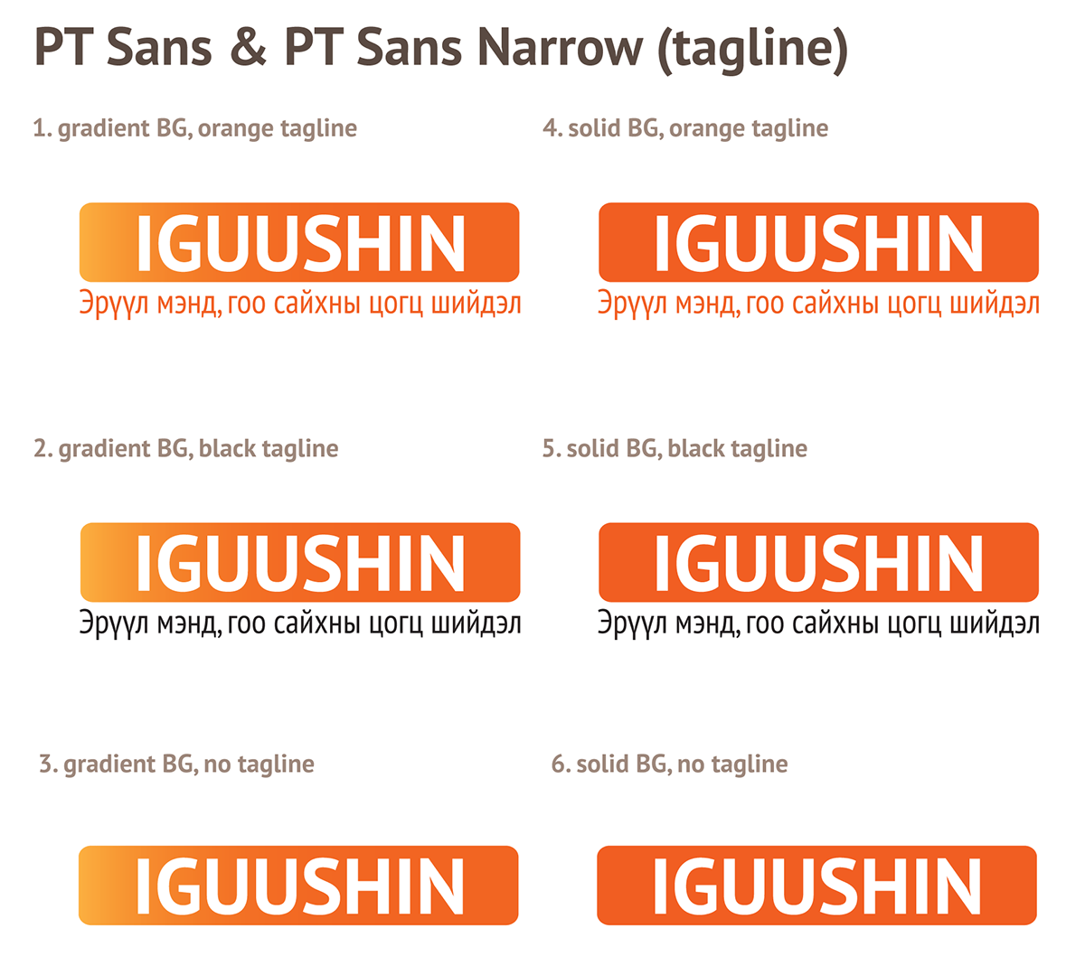
A matter of importance was the font chosen for the logo, as well - Iguushin is a local Mongolian pharmacy, and would have collateral signage, labels and packaging, as well as letterhead, and other traditional corporate identity needs. The font chosen, therefore, would need to have a full Mongolian Cyrillic as well as Latin character set, be free of charge, usable as a webont, and be clean and modern. This turned out to be a tall order, but eventually PT Sans was chosen.

Final logo (with optional tagline)
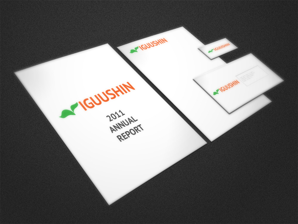
Sample presentation
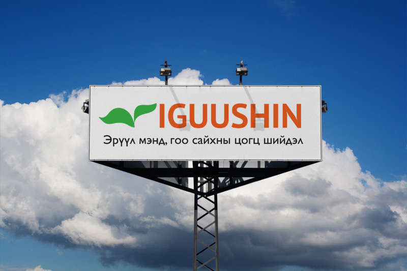
Sample billboard

Sample prescription label
Preparatory Work
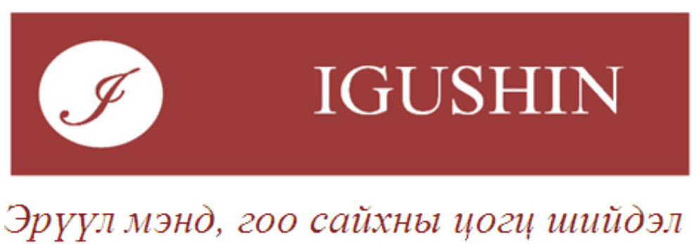
The old Iguushin logo was pixelated, unavailable in multiple formats, less modern, and worst of all...misspelled.
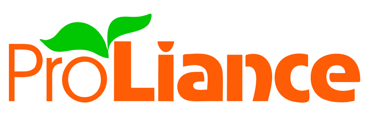
The modern Proliance logo represented the direction the companies want to go, with a vivacious orange, and growing, green leaves.
I started by presenting the client with the initial concept - I chose PTSans for its flexibility, and the orange box for its boldness. The client wanted the orange to be prominent...

It was then decided to bring in the leaves to add a closer tie to the parent company. The orange box was dropped, and a variation of #6 chosen.


