
The brief
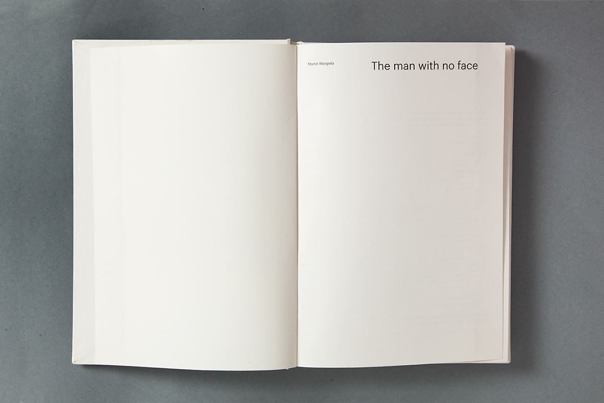
Martin Margiela is often considered designer number 7 of the Antwerp's 6, but there is one key thing about the way he approaches design: he puts the focus in it, not the people behind it, whether it's the designer or the models. Up to the point that he doesn't give interviews or appear at the end of his shows when he was creative director.
The concept
Since we couldn't get to know Margiela by interviewing him, we took a lateral approach: get to know him through his most famous classmates: Ann Demeelemeuster, Dirk Bikembers, Walter van Berendonck, Dries van Noten, Dirk van Saene and Marina Yee.
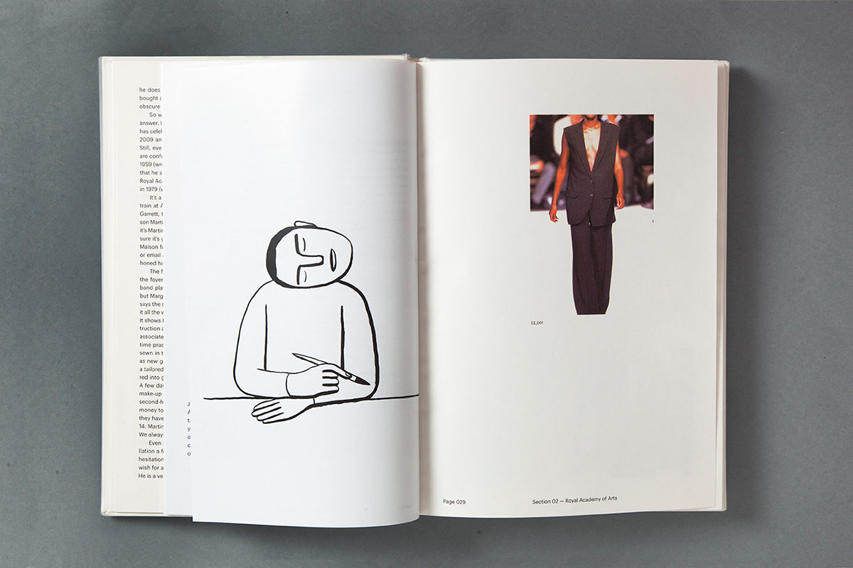
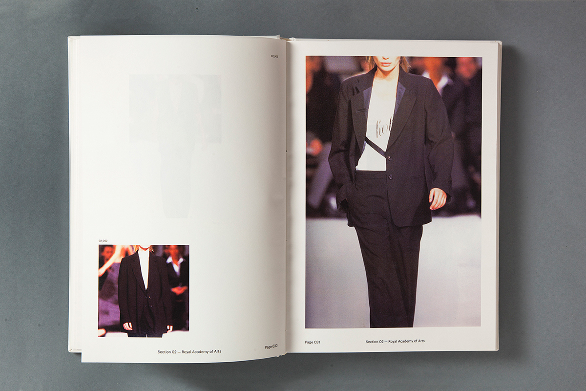
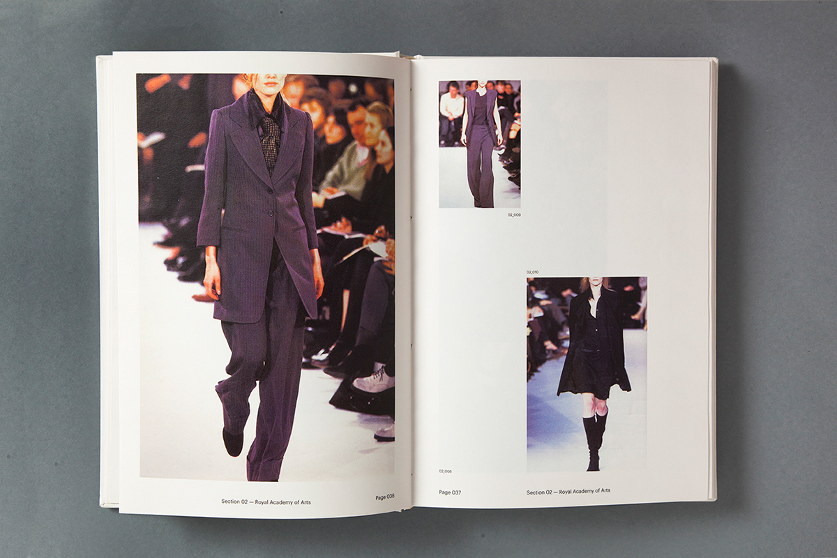
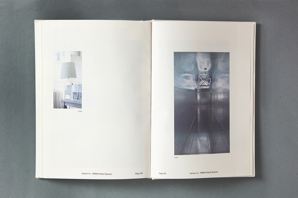
The book is divided in 6 interviews to each designer, focusing on Margiela, and 6 chapters of photographs around his career: his time at the Royal Academy, his work at Jean Paul Gaultier and at Hèrmes, Maison Margiela's Identity, Collections and Retail spaces.
The design
We decided to follow Margiela's approach to design through all our decisions: typography, layout, composition, art direction…
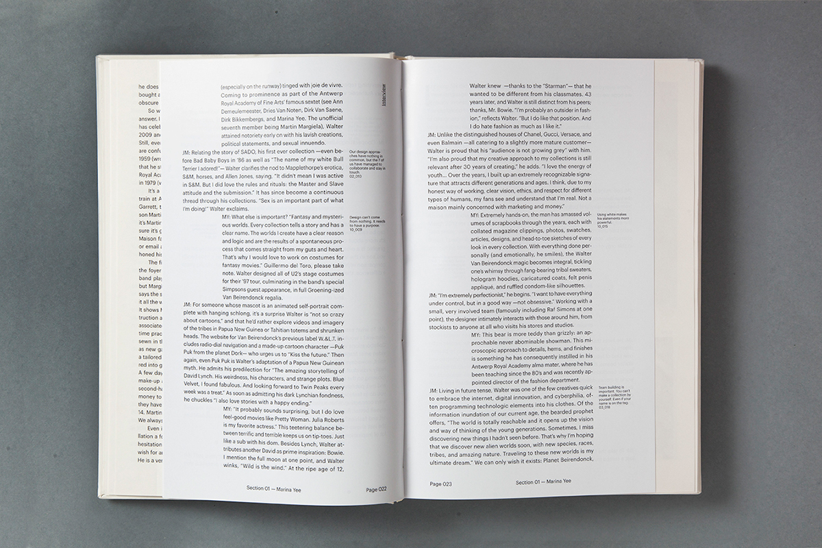
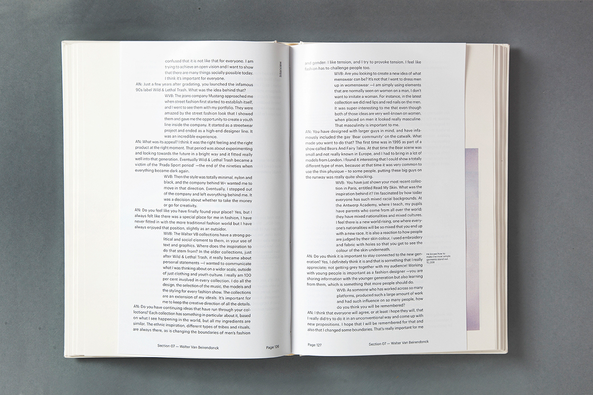
First, we completely separated the text and the photography sections by not mixing the content and by using different page widths, linking them only through a code, similar to the one that Margiela used at the Maison. Every reference made in the interviews to one of the pictures, had a side note including its code so the reader could navigate easily.
First, we completely separated the text and the photography sections by not mixing the content and by using different page widths, linking them only through a code, similar to the one that Margiela used at the Maison. Every reference made in the interviews to one of the pictures, had a side note including its code so the reader could navigate easily.
For the typography, we decided to go as simple as possible and use only Graphik Regular in 3 sizes: one for the titles, one for the main text and one for the side notes. Graphik is a typeface that represents simplicity, Margiela's view on design and allows us to make the content the important thing in the book.
As for the layout and the composition, since we were keeping everything as minimal as possible, we needed a grid that was versatile enough to allow us to differentiate questions and answers of the interview sections while keeping one typeface and one weight.
For the cover, we decided to keep it simple and recreate what Margiela would do at his stores by painting —by hand— everything white.
The production
Since Margiela has such an attention to detail regarding to materials —but always does things his way— we decided to use 2 different papers: Freelife Vellum White 120gr. and 170gr for the pictures and the cover and Glossy Coated 135gr. for the text.
We don't own the photos and the illustrations that are used in this book, all copyrights belong to the authors.
