In the beginning...
I was asked to help a small but growing juice company with their logo and the labels on their bottles. Filled with all the energy and vigor of a company fuled by tasty raw juice, I leapt at the opportunity. The owners had a simple sketch and a Microsoft Word file of what they wanted for the logo. I took their idea and ran with it, and that first logo began the story of the brand. Over the course of the next 18 months, I worked with Goûter's owners to design new labels and branding that would help them launch the company and position it for future growth.


This was the original logo featuring the "U-Man"

The revised "circle" logo featuring the "U-Man" that could both be stickers and the new logo.


Label for the "treats" that came in two different sized flip-top containers.

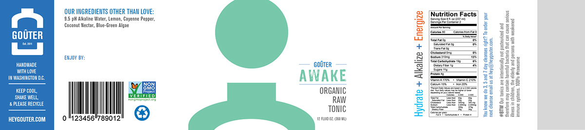
Label for the tonic bottles. At the time the recipes were constantly changing, so I created one label that could be leveraged across the entire menu of fresh pressed juices and nut melks.


This was the main poster used at farmer's markets and other festivals.

L-R: The front and back of the first Goûter t-shirt, printed on a heathered dark blue organic cotton shirt, with 4-color silk screen to match the above poster's colors.

Back Cover and Front Cover of the Goûter wholesale brochure for retailers.

Inside full spread of the Goûter wholesale brochure for retailers.

The New Look
I felt it was really important to fully realize the brand of Goûter, and take it from its quirky and cutesy birth to its fully formed adulthood. I did a lot of research on the many brands within the space, and one thing I noticed with the most successful juice companies was the fit and polish of their brands. That's where I brought Goûter.
There were long discussions and client-designer workshops that produced this logo. It was a collaborative process that produced some of the best branding and design work of my career.
The wordmark, including the established date, were included in the logo in a way that represents the appearance of the label on the bottle. The size and shape of the bottle in the logo are identical to the size and shape of the bottle.
Welcome to the new, more grown-up Goûter.

L-R: (a) Gouter Logo incorporating the proportions and shape of their juice bottles. (b) The Goûter wordmark using a different weight of Akzidenz Grotesque from the original logo. (c) Semi-retired is the U-Man. Say hello to the G-Man, now based on the size and shape of the bottle as well.