The overview of this project was to come up with a cereal packaging design for adults. We are no longer kids and it is important that our cereal packaging reflects exactly that. The challenge of this project was to neglect the stereotypical cereal box design. I explored many shapes and came up with two ideas. After much dilemma, I decided to push both concepts. The simple solution was to work on both ideas and see how far I can develop them.
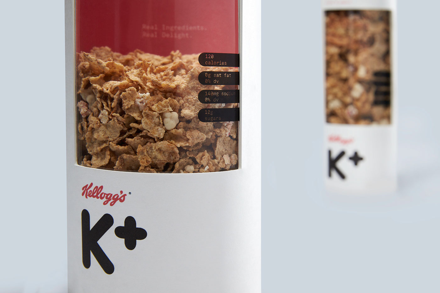
Special K was chosen for this re-branding project. Being a suitable cereal brand for adults was a key criterion when choosing the brand to work with. Brands like “Cheerios” and “Trix” strongly caters to the younger population while Special K caters more towards the adult population. Also, I had an urge to change the Special K brand into a unisex design, leading to the creation of a b-line for Special K called “K+”. K plus creates a positive reputation and symbol for this packaging. The positive sign symbolizes good health and better nutrients. These perceptions allow consumers to feel like they are making a good decision by buying this product. The target demographics are ambitious and aspiring young adults in their 20s.
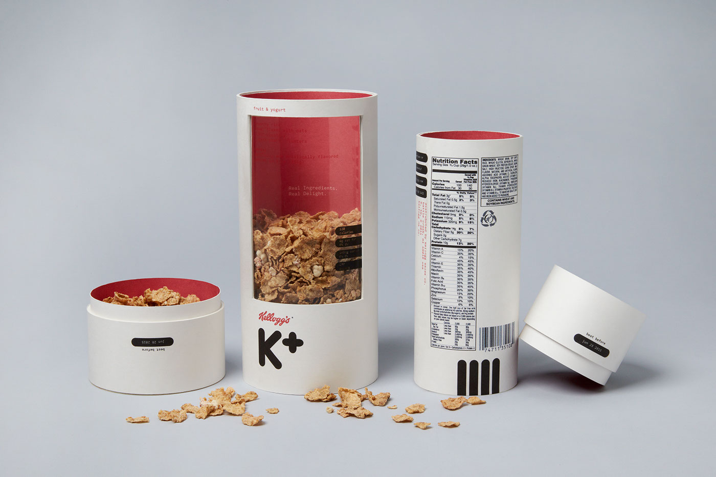
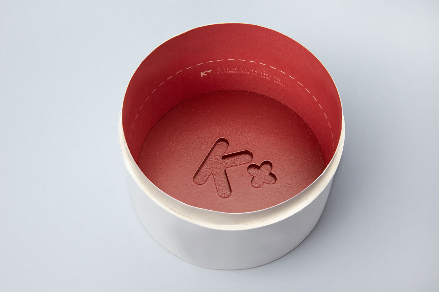
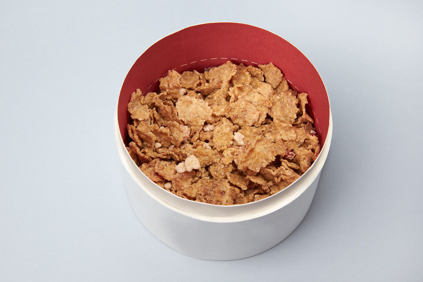
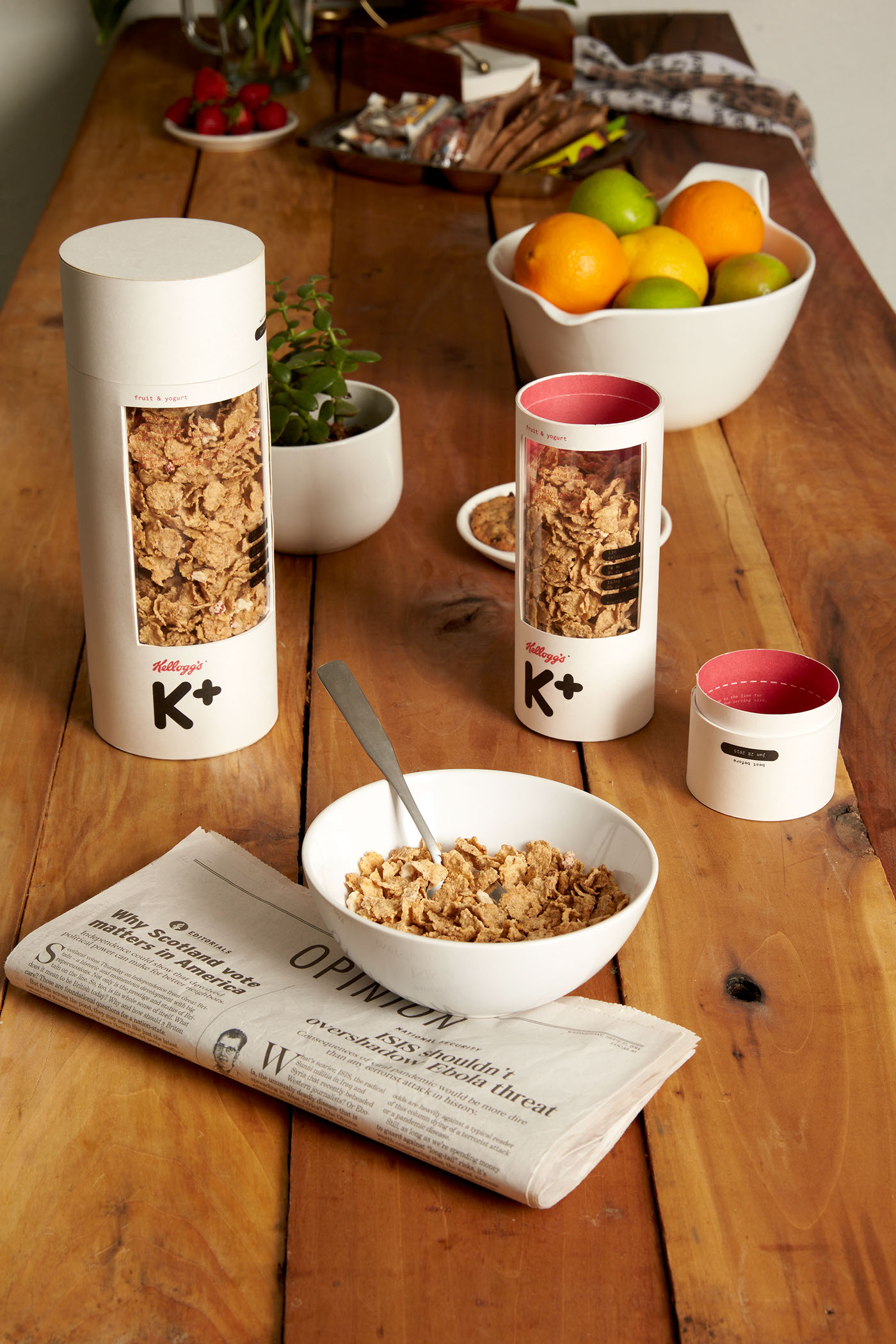
The font for the first concept is carefully created with geometric forms. The Kellogg’s logo must be on top of the K+ logo to show contrast between the two logos. This allows for easy identification of the logos, even when small. This first concept is more for the high-end consumers. It is designed with a measuring cup of recommended serving size inside the cereal package lid.
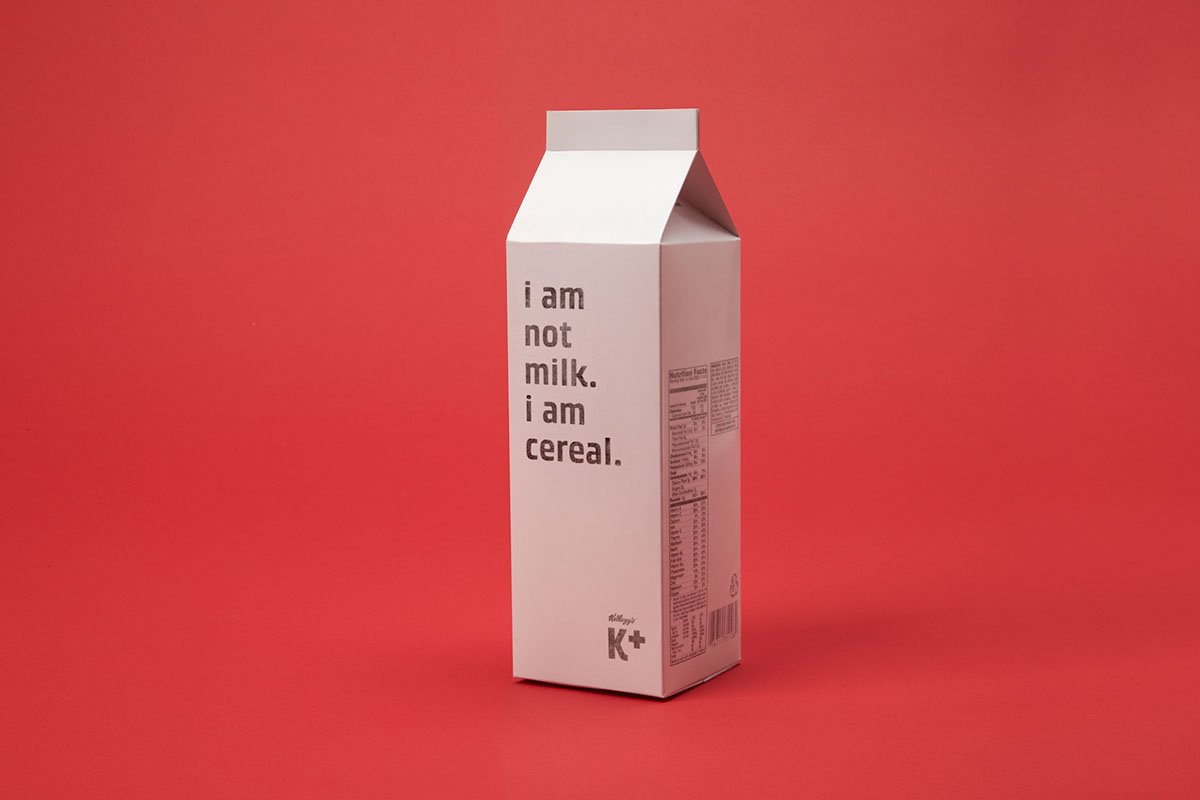
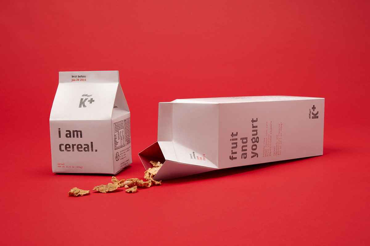
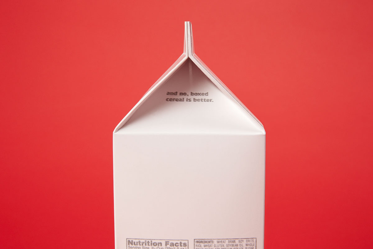
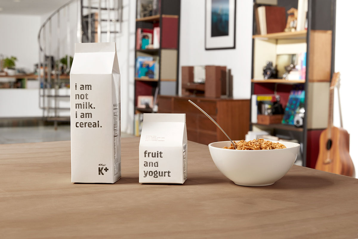
The font for the second concept is created with the typeface Kabel. Kabel gives off a slick feeling like as if liquid is flowing through. The plus sign for the logo is the same size as the top stem of the K. Kellogg’s logo must also be in black and white. The second concept is the charming and friendly side of Kellogg’s K+ brand. The cereal will be in a milk carton-like packaging with statements like “I am not milk. I am cereal.” written on them.
Disclaimer: Student work only. Project is for graphic design demonstration purposes only. Please contact me for any questions.

