Last year «Огонёк» magazine was celebrating 115th birthday. We were glad to do something for this famous Russian edition.
So at the end of last year magazine has designed lettering for subheadings.
So at the end of last year magazine has designed lettering for subheadings.

Starting point was a 50's reference provided by Art Director:

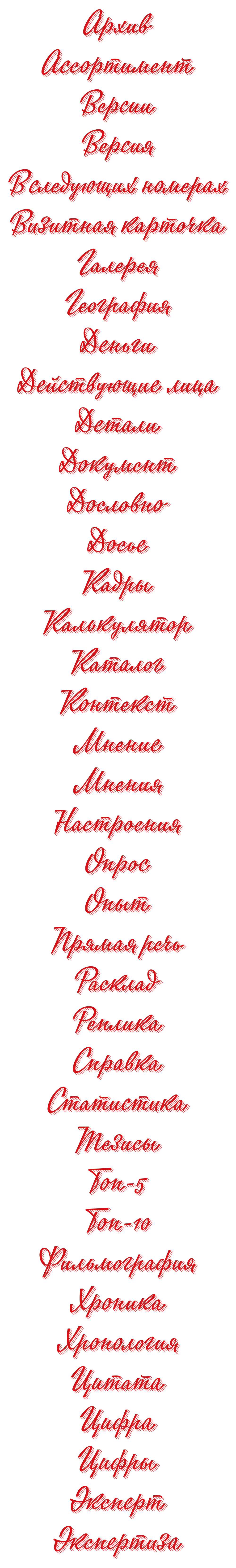
There was no need to copy the example, it was necessary to write it today with keeping the tonality. Leaving out the work on sketches, at first we have written four dozen words. Decisions on distance between the letters in a word were made keeping in mind that the striped shadows will be added later.


Then was no less laborious and painstaking stage of works on creation of the ‘shadows’ each time...
...40 times! And that's what came out:
——————————————————————