


Brief & Concept
I was asked to design an "attractive but timeless" book. The director told me it had to be cool but not based in an actual (or hipster) trend. Otherwise, in a couple of years it 'd look obsolete. A heavy challenge, to be honest.
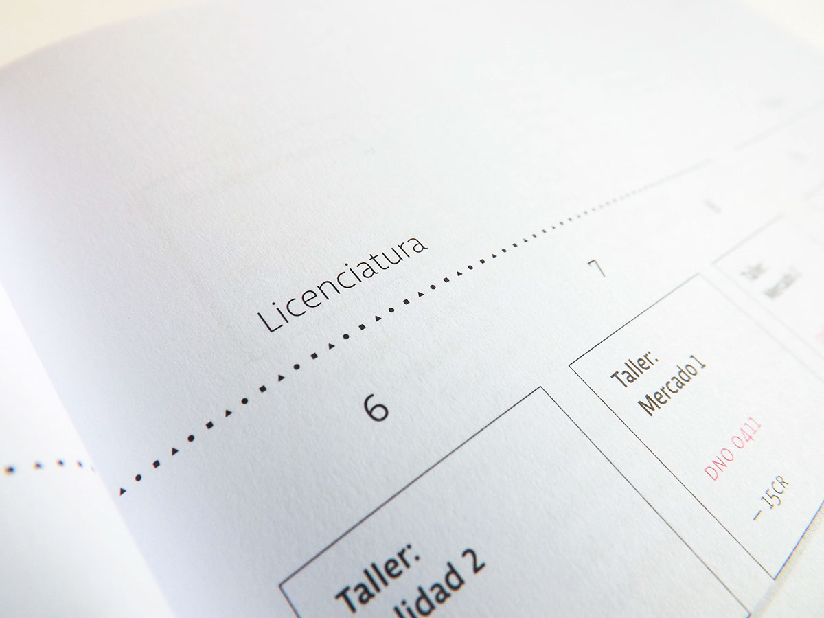
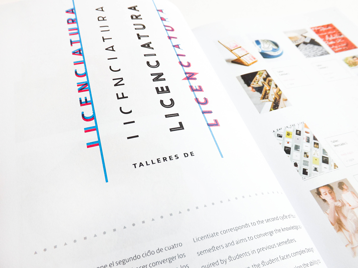
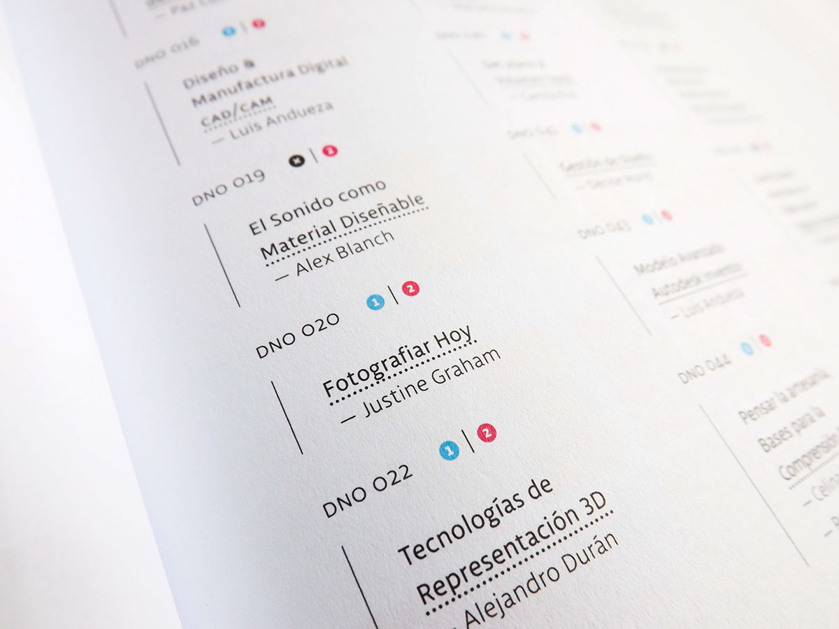
In order to aim that, I took the evolution of design techniques through the time as a graphic concept, seen in the way the text is composed, as typography is — in my opinion – the basic knowledge/skill every designer needs.
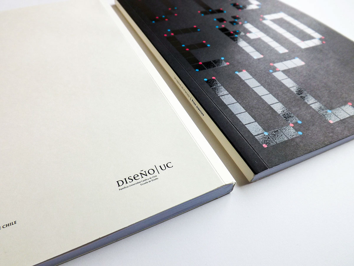
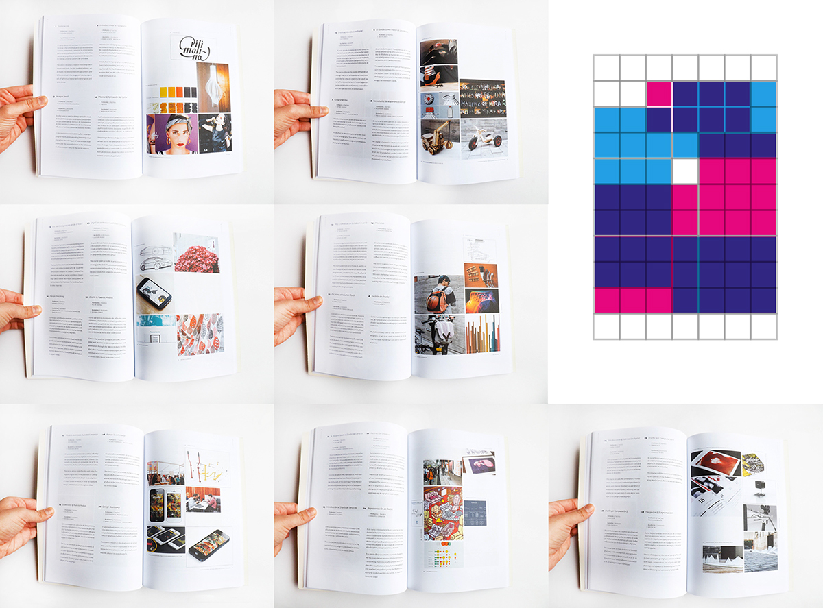
For the cover I played with the two main dimensions in which it's used: the print design (formed by ink dots) & the digital design (formed by pixels). I designed two versions of the cover (225 copies of each were printed): The black: the sum of all ink colors & The white: the sum of all light colors, inspired by the different color theories/models.
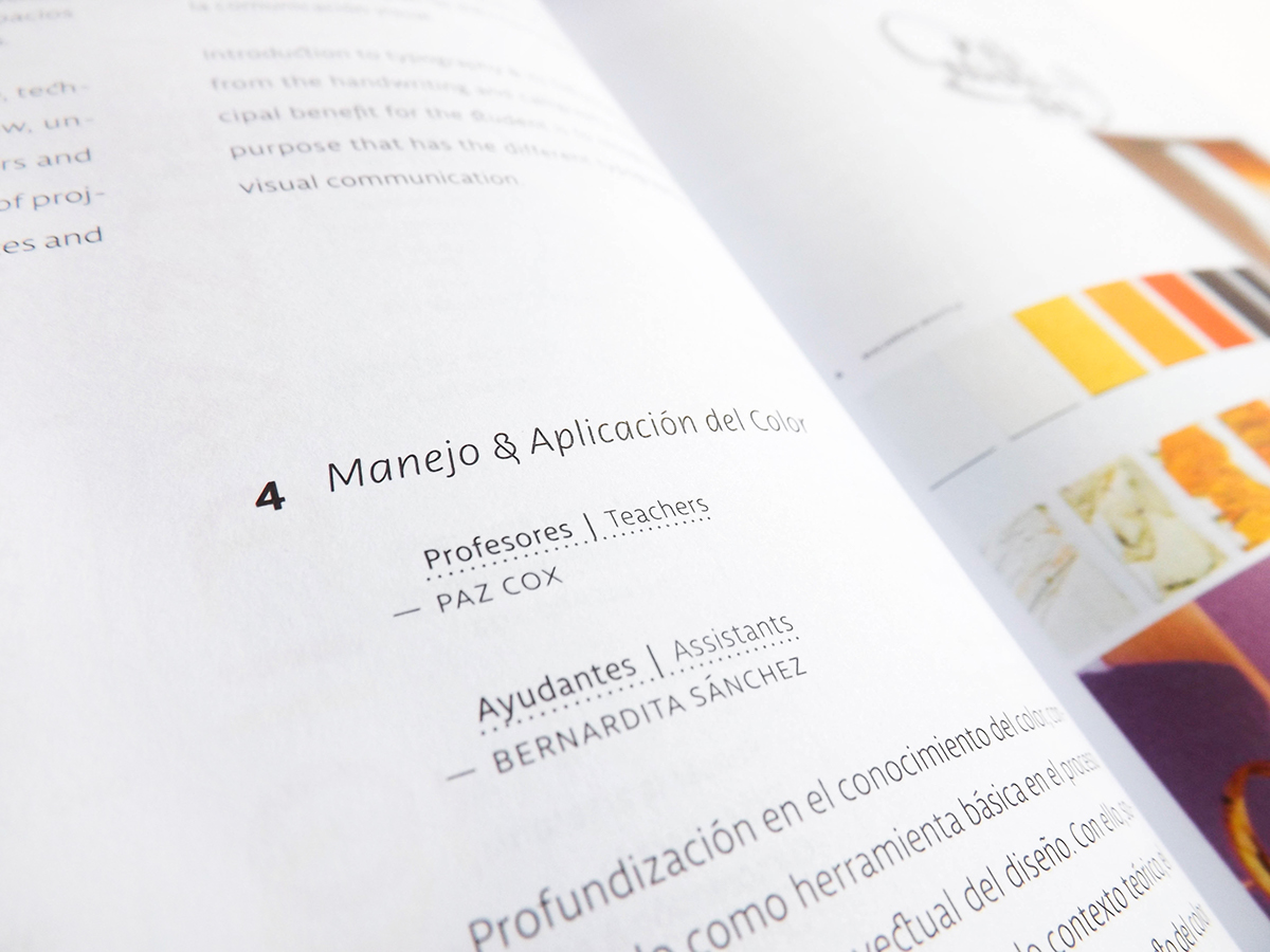
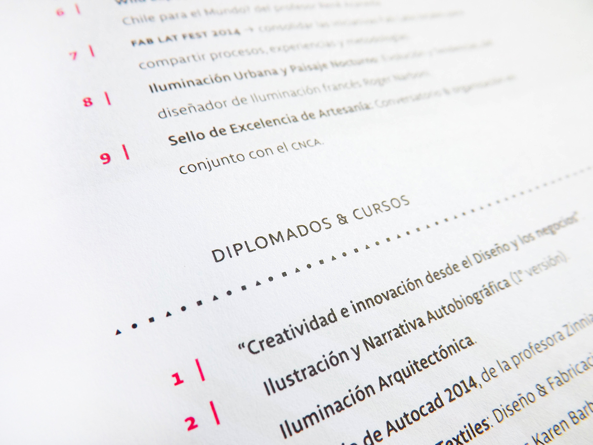
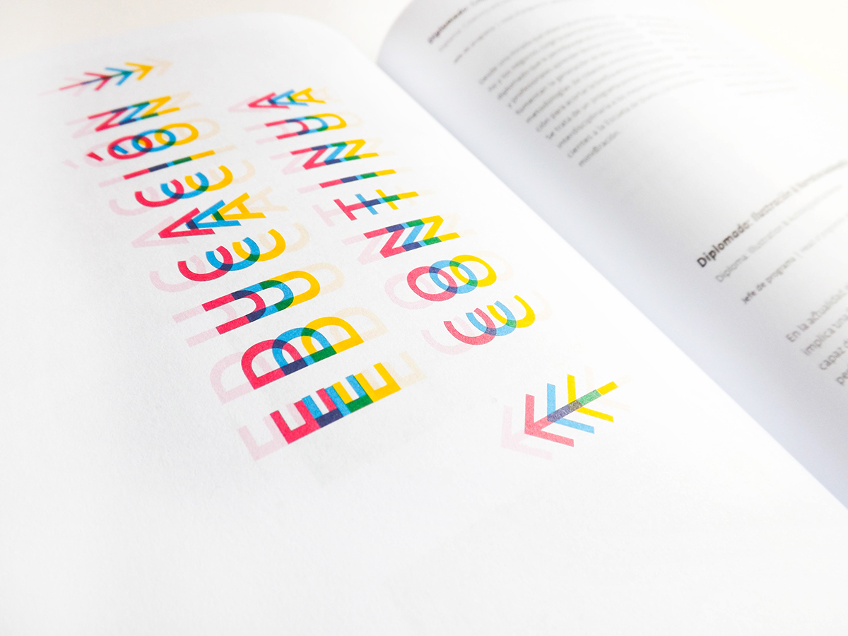
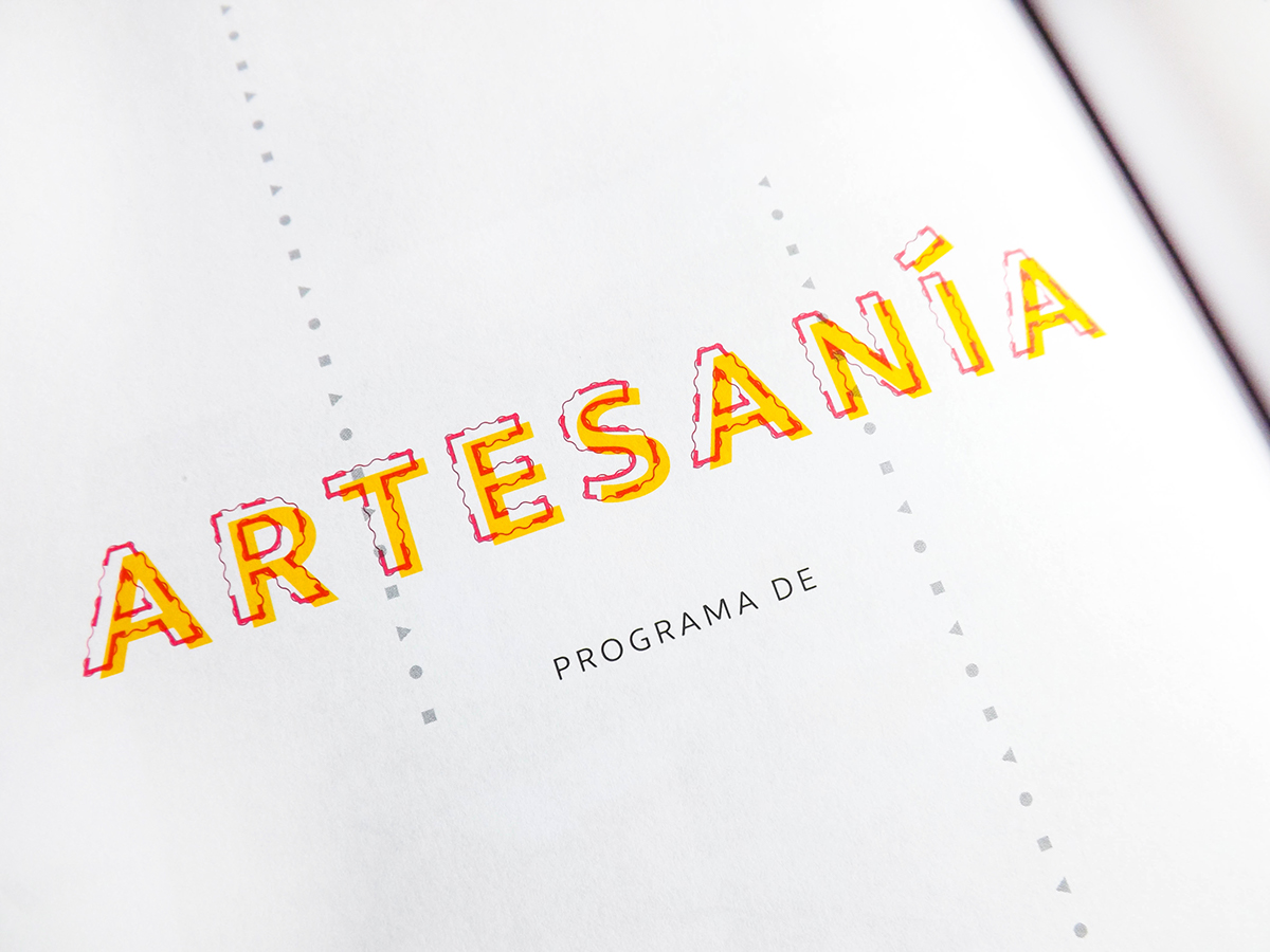
For the rest of the contents I combined CMYK colors, digital typographic compositions with overprinting & the three basic geometric shapes (which were the elements used to design anything in the beginning, like the Bauhaus tradition) for details and visual representation of numeric facts. This sounds pretty abstract, but guided the graphic style in all its levels.


See the complete book with detail at Issuu
–––––––––––––––––––––––––––––––––––––––––––––––––––––––––––––
Thank you for watching!
–––––––––––––––––––––––––––––––––––––––––––––––––––––––––––––
Thank you for watching!
–––––––––––––––––––––––––––––––––––––––––––––––––––––––––––––


