Malinda Prudhomme is a talented artist from Toronto, Canada. Recently, she invited her friends and fans to fill in the lines of one of her original portrait sketches as part of an international art party colouring contest.
I've been following Malinda's work for some time. Her portraits are romantic and full of character. Her focus is at the same time soft and feminine as it is powerful, promoting the message that every woman is beautiful in their own unique way. That's a message I can personally identify with. Even though there's a stark contrast between her style and mine, we are both committed to portraying beauty in an inspirational way that highlights the individuality of women above the constraints of the expected. Our shared goal of making women look and feel beautiful in their own way despite the pressure to be perfect put on them by the media is what drew me in with so much excitement for this collaboration.

Process
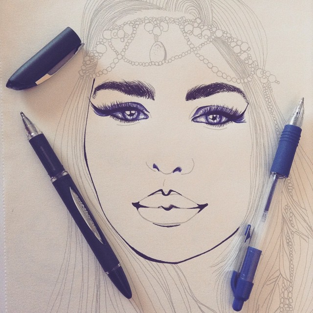
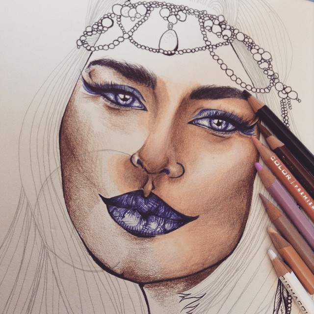
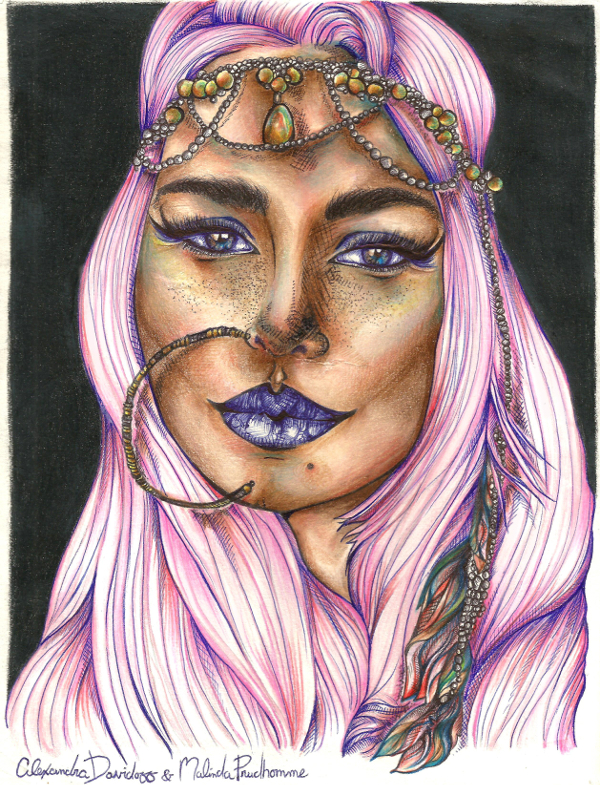
Malinda's original sketch, a gentle, sweet, full cheeked beauty with long locks and an earthy smile, can be seen underneith the added jaw definition and mascara. Two ballpoint pens, one black and one blue, filled in her brows and her eyelids, also adding a more severe cupid's bow.
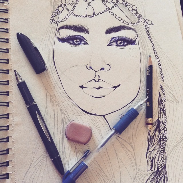
A 2HB pencil is brought on board to play with the idea of a giant nose ring. Some lines can be seen as a sort of contour map between her eyes, down her nose bridge, and through her cheekbones. The beads and feathers in her hair are fully inked. There's a little heart tattoo and a tiny piercing on the right side of her face, but that addition was later scrapped.
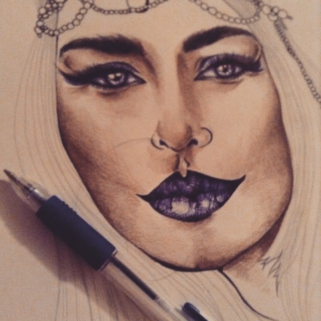
A light dusting of Prismacolor Dark Brown #346 added depth to her brows, her under eye creases, her cheeks, her nose and her chin, while the blue ballpoint pen filled in her lips. The dark blue lipstick effect matched her eyeshadow, bridging the softer shading of coloured pencil that sulpted her changing facial structure with a harsh scratching that kept a satisfying contrast of features.
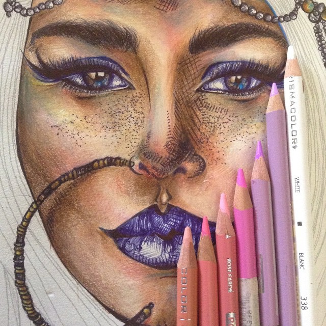
Her skin was gradually contoured, not too dark, but tanned just enough. I decided to keep the overal tone a bit exotic. Prismacolor pencils from top to bottom: Dark Brown #346; Sienna Brown #945; Peach #939; Lavender #334; Beige Sienna #1080; Peach Beige #1085; White #338.

I added a bit of Prismacolor Chocolate #1082 to deepen her cheekbones and the curve from her brows to the top of her nose bridge. Being brave, I also decided to go ahead with the nose ring accessory, taking my black ballpoint pen and outlining each section so that it would complement the beads in her hair and hopefully not clash. It was a big risk and I was uncertain how it would play out.
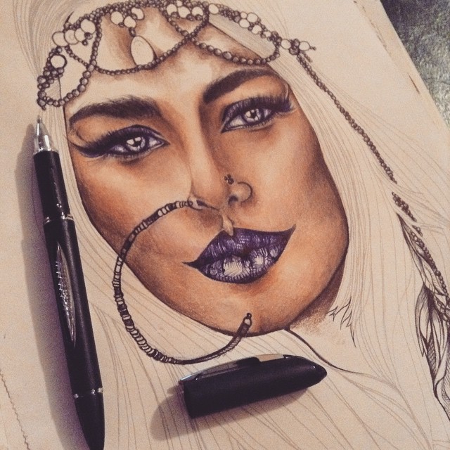
The nose ring finally fully inked! It didn't curve as perfectly as I imagined, but I grew to like how the slight squished "C" look complemented her quirkiness more than a perfect circle.
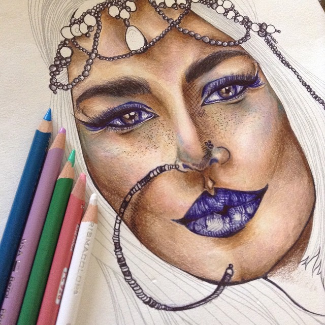
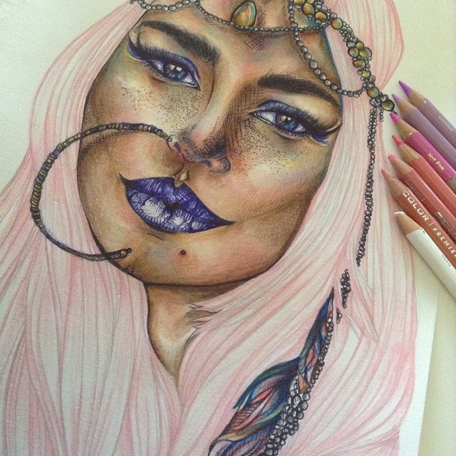
I felt like taking even more risks. Never before had I mixed ballpoint pen directly ontop of coloured pencil. I had always thought that the idea was unachievable because the ink would slide and smudge. But this time I got curious, courageous and daring; I whipped out my black ballpoint pen and added some minor cross-hatching on one side of her nose bridge all the way down where the nose curved above her cupid's bow, then a few lines as a shaddow to show how her nose ring hung slightly away from her skin, then some subtle freckles. Surprisingly the ink did not smudge and the coloured pencil remained vibrant too! So what other crazy idea did I always want to try? Mixing unconventional colours into portrait skin, of course! Prismacolor pencils from top to bottom: True Blue #903; Lavender #334; Lime Green #310; Blush Pink #928; White #338.
Slowly you can see her creamy complexion turn iridescent. Prismacolor pencils from top to bottom: White #338; Lime Green #310; Peach #939; Lavender #334; Dark Brown #346; Chocolate #1082; Sienna Brown #945; Scarlet Lake #923; True Blue #903; Gold #316; Peach Beige #1085.
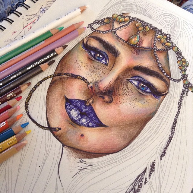
With her face finished and even her jewllery filled in, it was time to decide what colour her hair could be. It became apparent that this girl was a risk taker, a vivid, wild, loud, confident woman afraid of nothing and no one. Her crown-like accessory of beads and feathers gave her a bohemian feel, while her suntanned, contoured, hippie highlighted complexion got me thinking of complementary sweet pastel tones. Prismacolor pencils from left to right: Peach #939; Pink #329; Blush Pink #928; Hot Pink #993; Lavender #384; Lavender #334; White #338.
Her pastel pink hair in it's first soft layer, just to test the look with her complexion.

The goal of the pink was to make it look like a cloud framing her face, keeping it light as was possible without sacrificing depth. For that reason, each coloured pencil layer was applied with soft stroking caution.

Back to the blue ballpoint pen to achieve the harsher lines my pink coloured pencils couldn't takle.
I followed most of the lines in Malinda's original sketch to complete the hair, cross-hatching between sections so that there would be some contrast between the soft pink and the shadows which again tied into her blue lips for a unifying effect. The ballpoint ink applied ontop of coloured pencil is a technique which I am going to be exploring more in the future. It adds such a quirky dimension between colour transitions and allows for completely unrelated colour combos with a pleasing contrast.

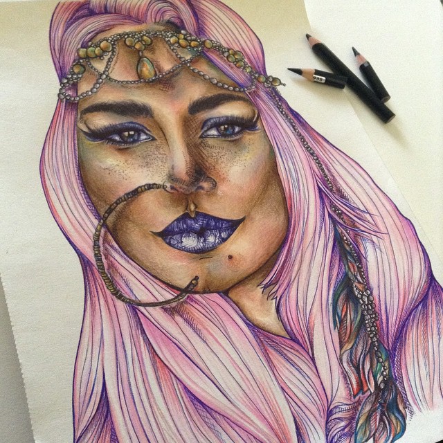
To maximize drama, I decided to darken the background instead of leaving it bare.
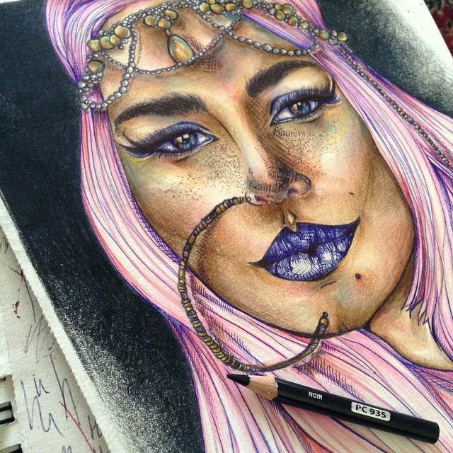
My black background exploits of the past have plauged me with alot of doubts in the possibility of getting the background as jet black as I wanted it to be. It's difficult to get an even spread of black, because if you press too hard the paper will develop crators and holes. The solution was to slowly smoke out the background with Prismacolor Black #935 and apply several layers until the paper was dark and glossy.

Final

A side by side comparison of the original sketch by Malinda Prudhomme, and my final coloured piece.
Malinda Prudhomme's colouring contest closed on the first of June. Artists of all ages from around the world participated, resulting in a wide array of interpretations. Some were gentle and softly coloured, with subtle blush and natural toned locks. Others were more dramatic with smokey eyes and deep lips contrasting porcelaine skin tones. One had horns, another had watercolour hair that resembled fantastical mermaid swirls, one was conprised entirely of glitter, another was digitally coloured like a cartoon. This collection of images was posted to Malinda's Facebook page for a public vote. Voting closed on the fifth of June, at 5:00pm EST; my piece, the girl with the pink hair and blue lips, emerged victorious.
A fellow artist said, "I really love this one, it has your style all over." But all the feedback was positive and encouraging:
"You really made it an unique piece!"
"Love the texture, details and colors. Very bold. Love it."
"The colors are amazing! So vibrant."
"Beautiful application of shading techniques combined with primary and secondary colour combination. Well done Alexandra."
"This is the one that drew my eye, and as I zoomed in on it, I can see all the thoughtful detail put into it. By far the most complex."
"You are incredibly talented. She looks phenomenal, I love where your imagination took her."
Malinda herself included my interpretation as one of her favourites, describing her just as I intended: "this piece makes me feel bold and brave! She's clearly a unique soul with her pink hair and blue makeup. Yet despite being different she's got a confident expression! She's rocking her style!"


