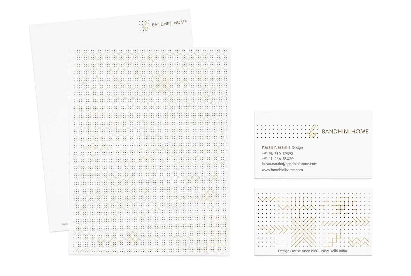
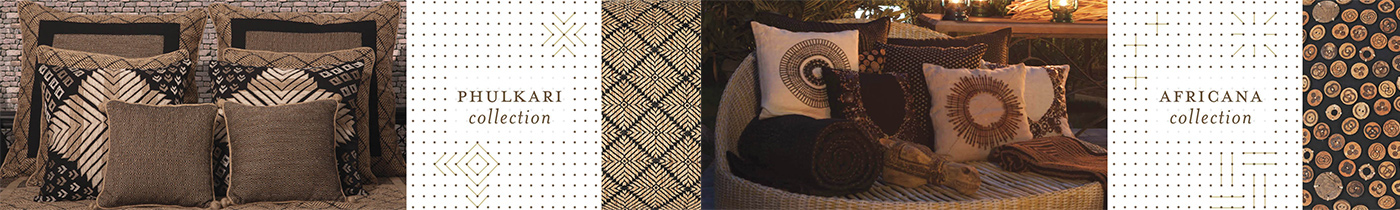
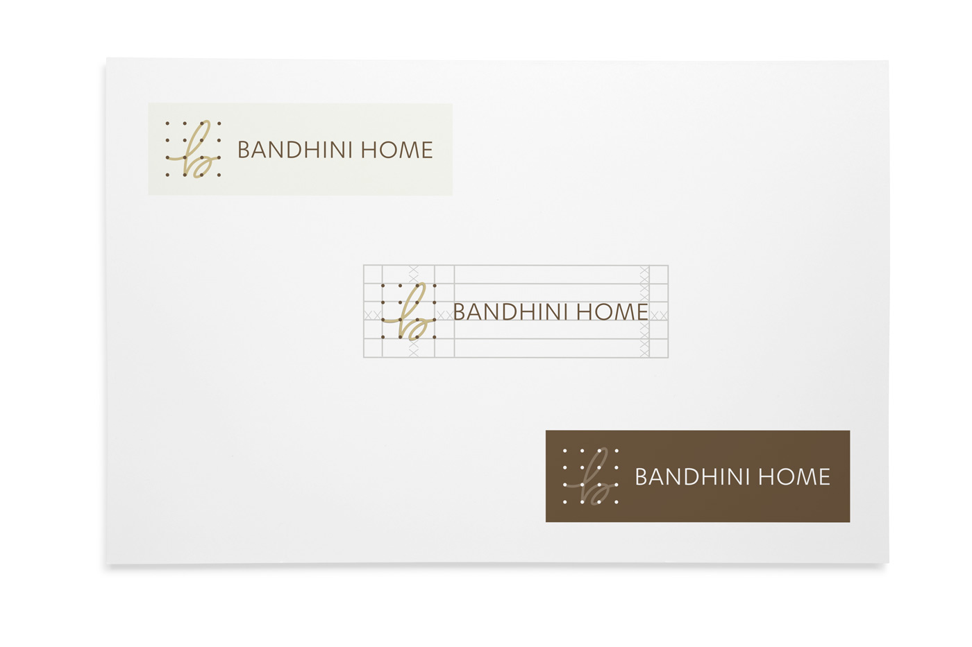
Bandhini Home is a homewear store in New Delhi working with revival of generation-old weaving techniques. They take these bits of history and the present, and throw them onto creations in wonderous ways. My approach for the identity was to create a system for them to constantly build on. I take inspiration from the weaving grid and create a modular system. It not only captures all their iconic collections like Phulkari, Lattice and Slate but allows they to add their future collections in a similar way. Repindia, 2013


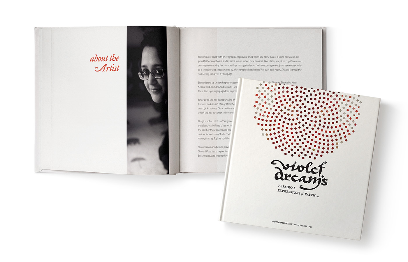
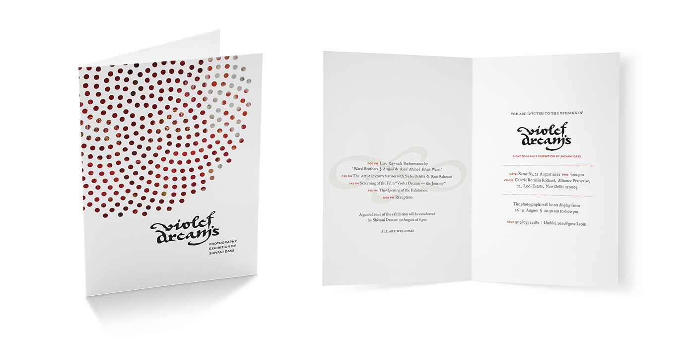
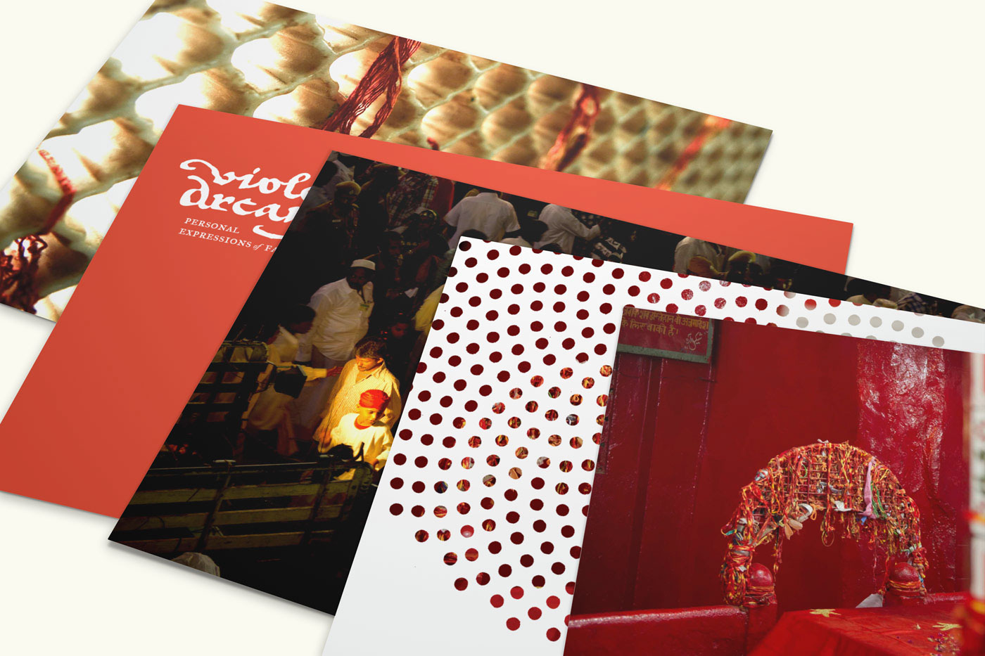
Violet Dream is a series of photo – exhibits that delves into the mystical world of Sufism in India. I designed a customised typeface that takes inspiration from the urdu calligraphy but also comments on the modern relevance of this culture. This project was done for Red Earth India, 2012.
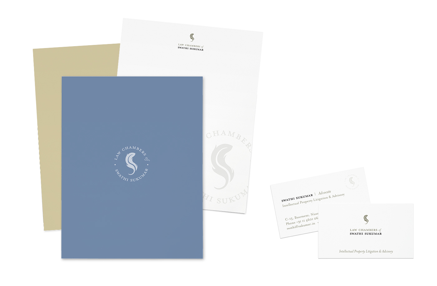
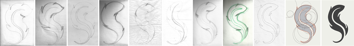
Law Chambers of Swathi Sukumar An identity for an intellectual property lawyer represented by the quill. Rendering of the form to gave the quality of flame of oath and cleverly read the letter ‘S’. The single-colour identity, was adapted on a stamp to attest documents and other legal work. Fisheye Design, Spring 2012
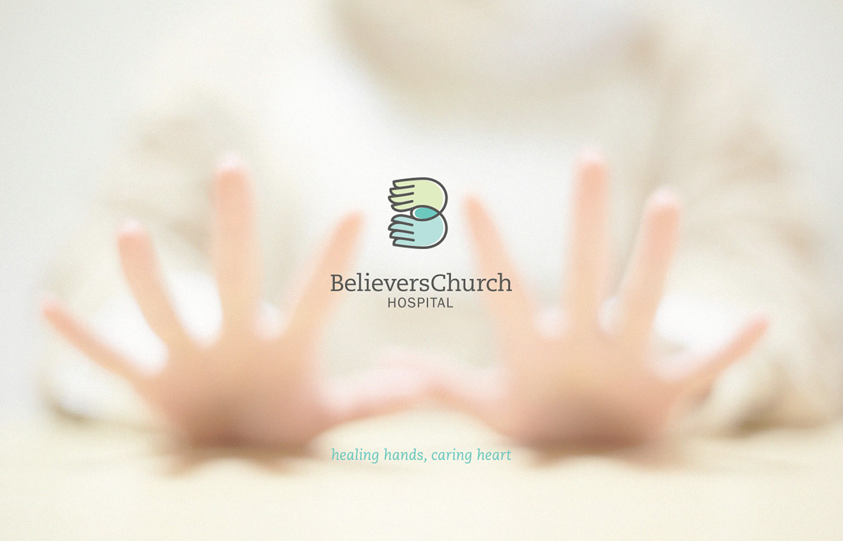
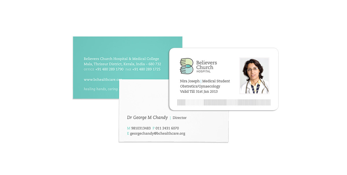
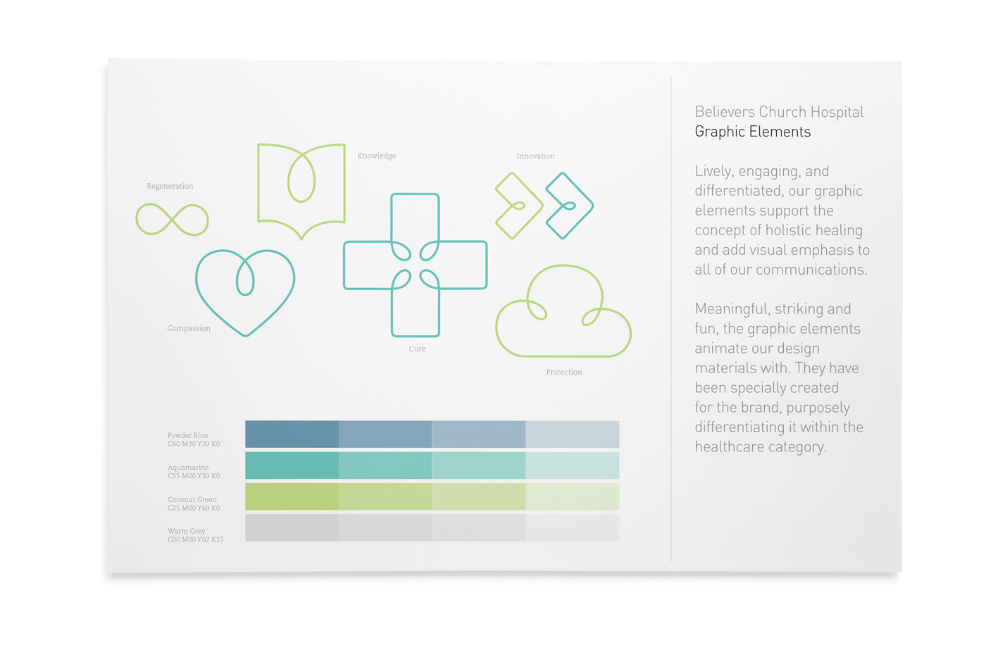
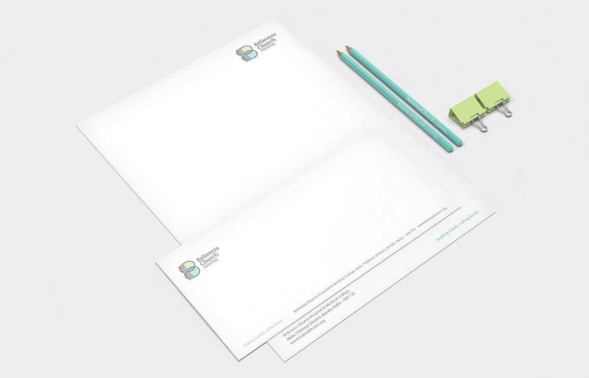
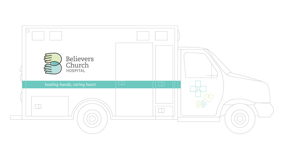
Believers Church Hospital We have designed a visual identity system that is reflective of the values of Believers Church Hospital - compassionate, warm, positive and forever hopeful. The new style emphasises caring for people and their quality of life. From the notable wordmark to the iconic symbol, we have created an extensive system for the organization that is versatile, adaptable and built to last. The Believers Church Hospital parent signature is the cornerstone of our visual identity. It is the basis for all other visual elements in our identity system. It also evokes the multiple specialities and strengths interacting to create a compassionate, effective organization. The slab serif typeface of the wordmark elegantly expresses the essence of the brand.


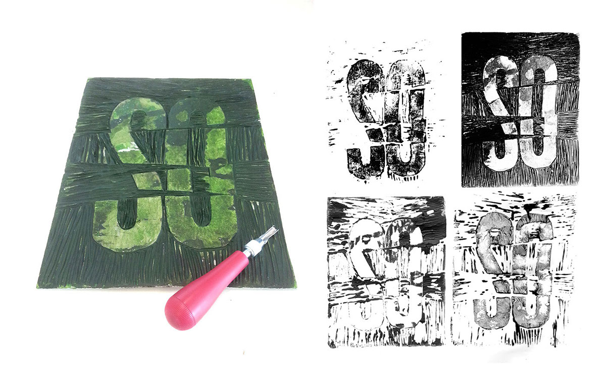
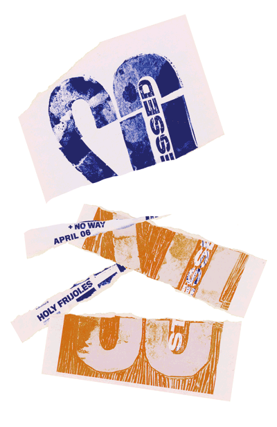
So Stressed In Hand-Lettering Studio with Bruce and Nolan, from Post Typography, we were asked to create a gig poster for upcoming band performances at a local Hampden bar in Baltimore. I was given the brief to design for a Californian band 'So Stressed'. Their music mixed new wave California with the 90s punk and noise to create fresh, original score. I use lino-cutting and collaging techniques to show the aggressive nature of the music.
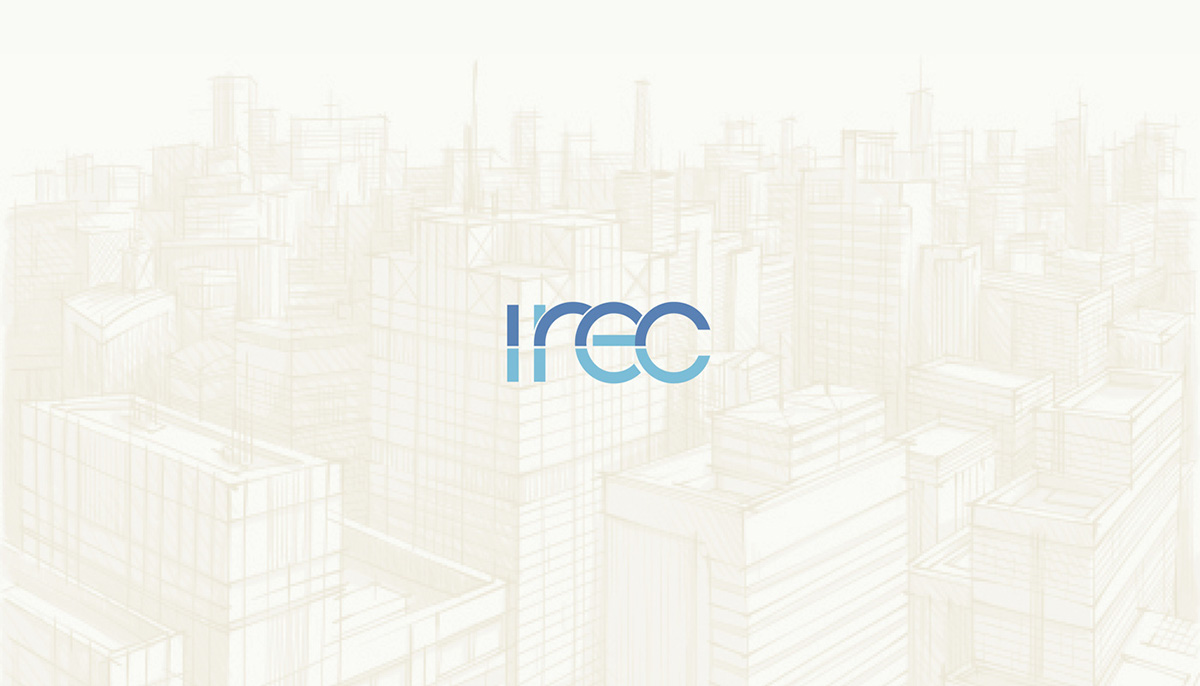
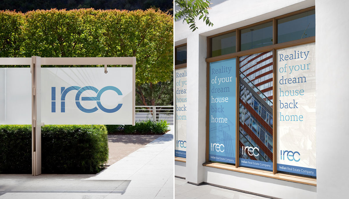
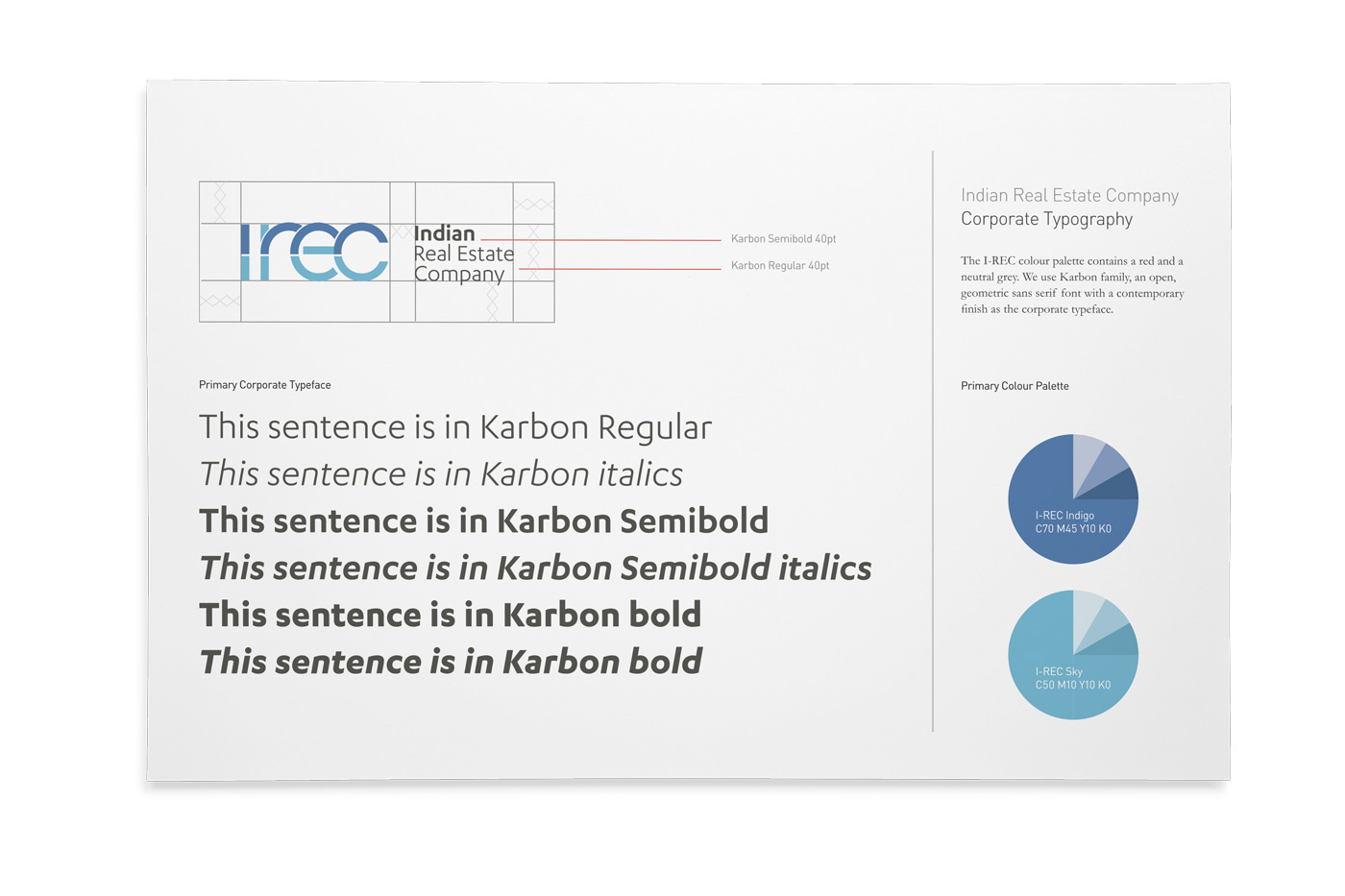
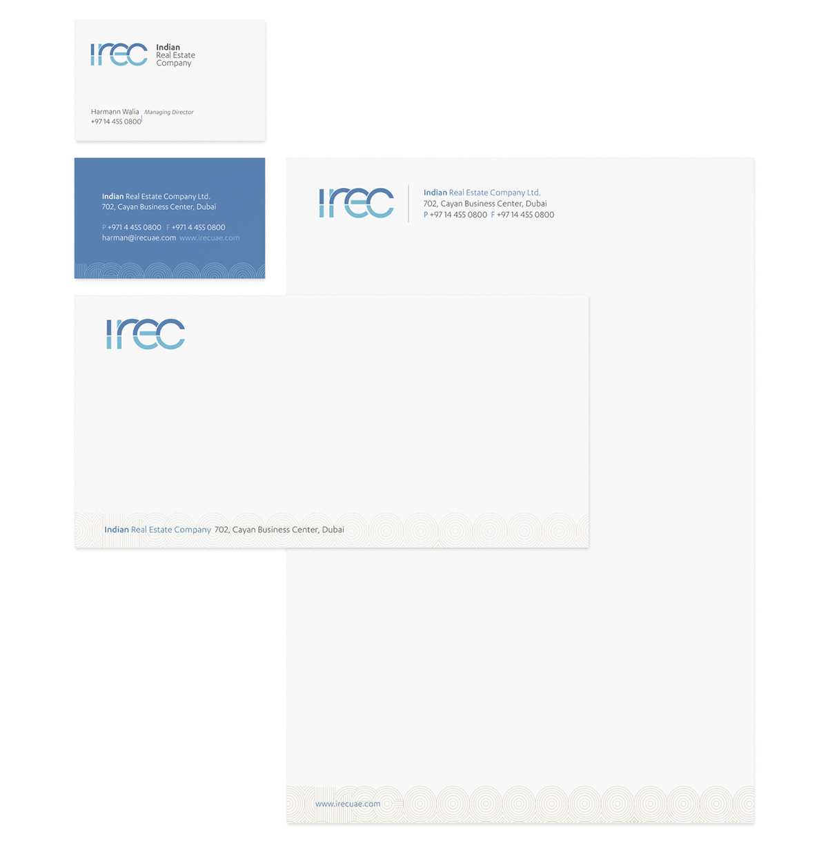
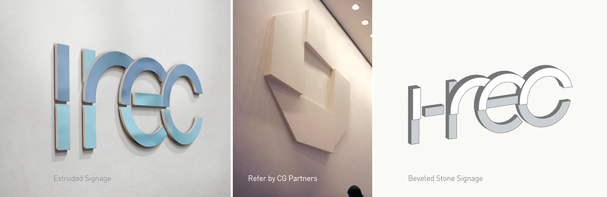
IREC I created a new contemporary brand and style of communication that draws inspiration from the Indian culture. The visual vocabulary suggests totality and a connection with India. The new style emphasises thinking about the long term, caring for people, their quality of life, whilst preserving the culture of India. The rhythmic forms of the wordmark create a sense of linkage and growth. It evokes a connection with people. We use a indigo colour whose origin can be traced to India. Powerful and dignified, indigo conveys integrity and deep sincerity. We complement the indigo colour with a sky blue, that connotes ambition and trust
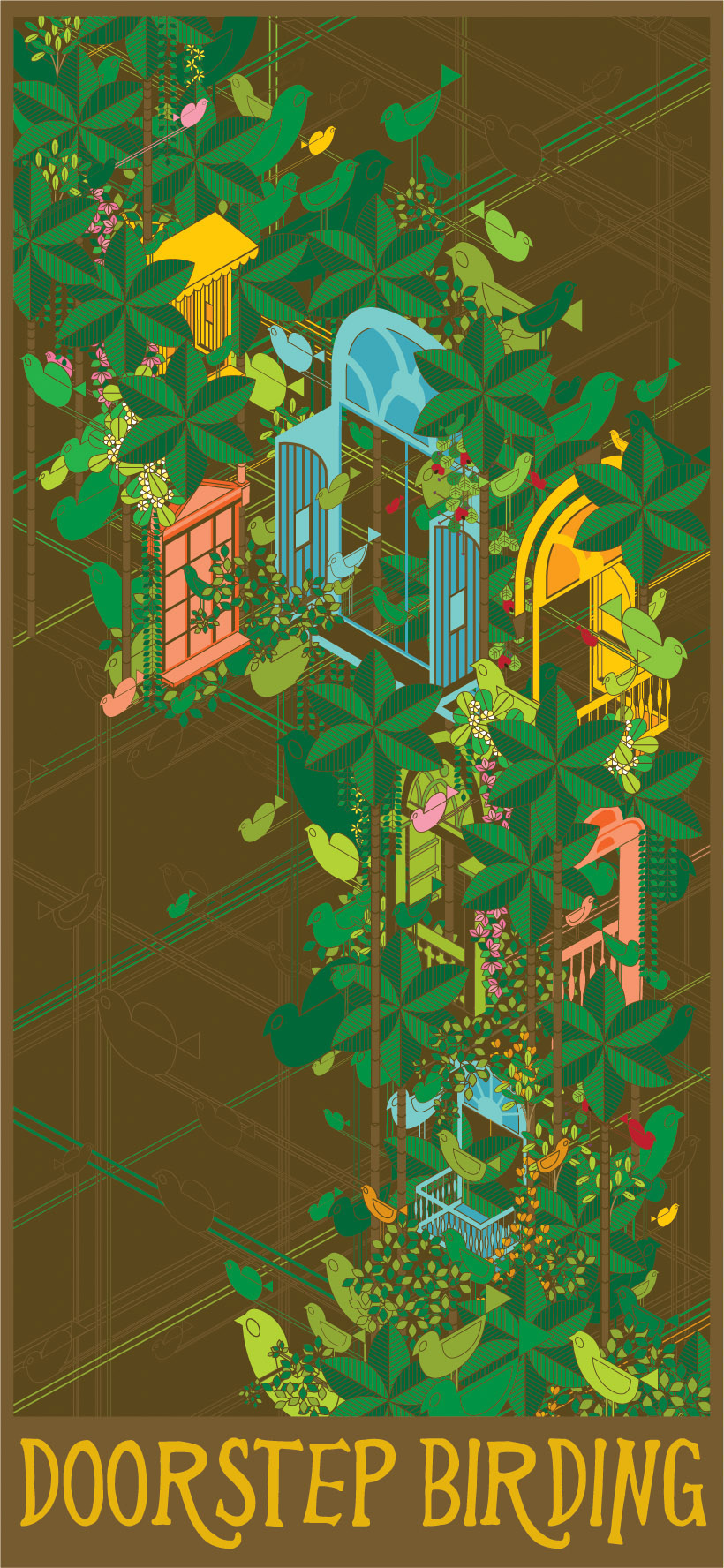
Doorstep Birding This project was conceived during my internship at Fisheye Design in 2010. The project brief was to promote ecological tourism in Goa. I chose to promote Birdwatching in Goa. We coined the project as ' Doorstep Birding' as one only has to go till their window or doorstep to find the beautiful and varied birds of the Malabar Habitat. In order to promote the same I have devised a visual style that has been implemented on a poster.