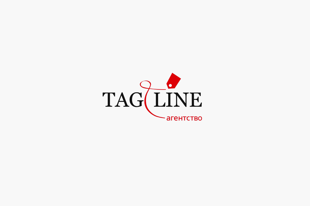
Over the subsequent 9 years the logo went through some simplifying modifications but essentially remained the same. The main problem was the lack of any continuity of style and graphic order.
It was obvious that the project had long ago outgrown its own visual image as well as its initially built-in legend. Tagline needed a completely novel, easily recognizable and modern style. The approach to its visual design had to be more organized and neat.
All this time the idea hadn’t been hard to plumb: we just had to take it and make it work.
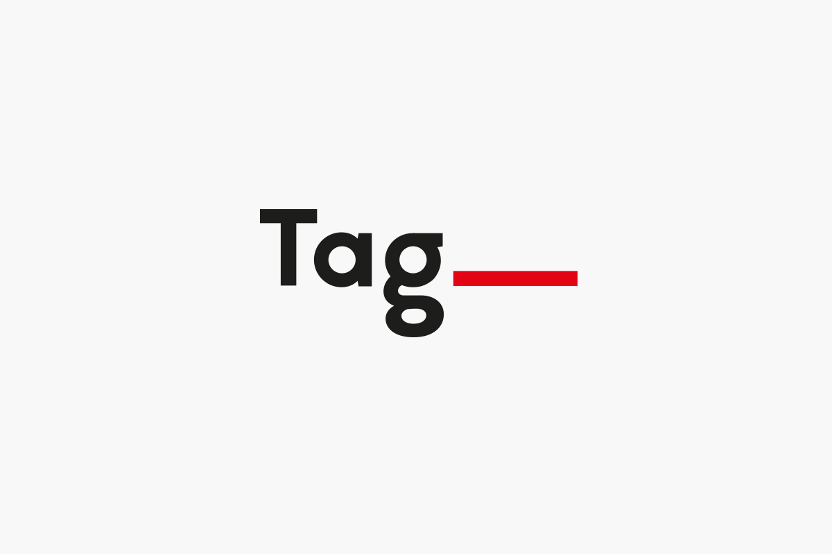
It’s a decent step into the next decade. New Tagline is so special and bright!
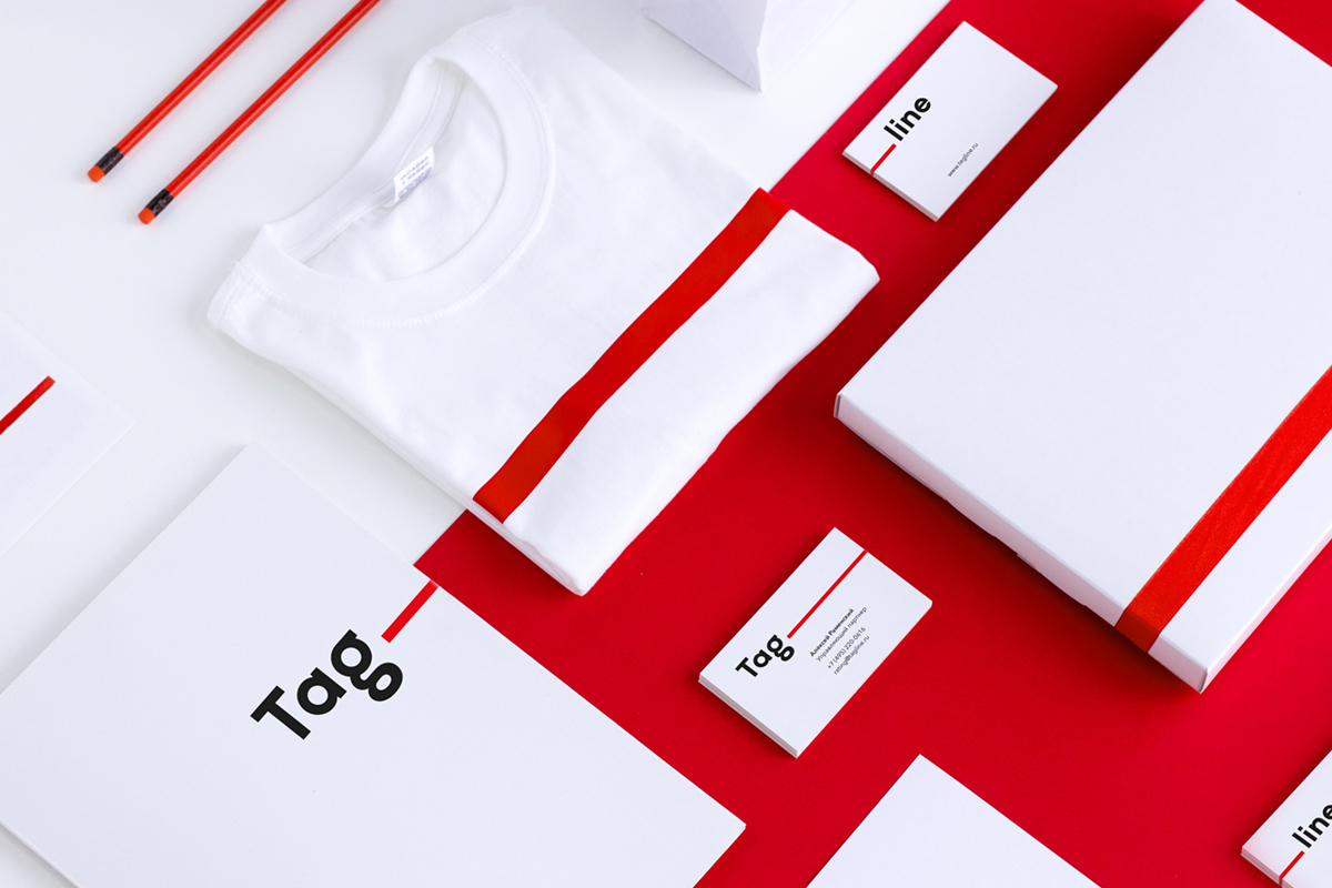
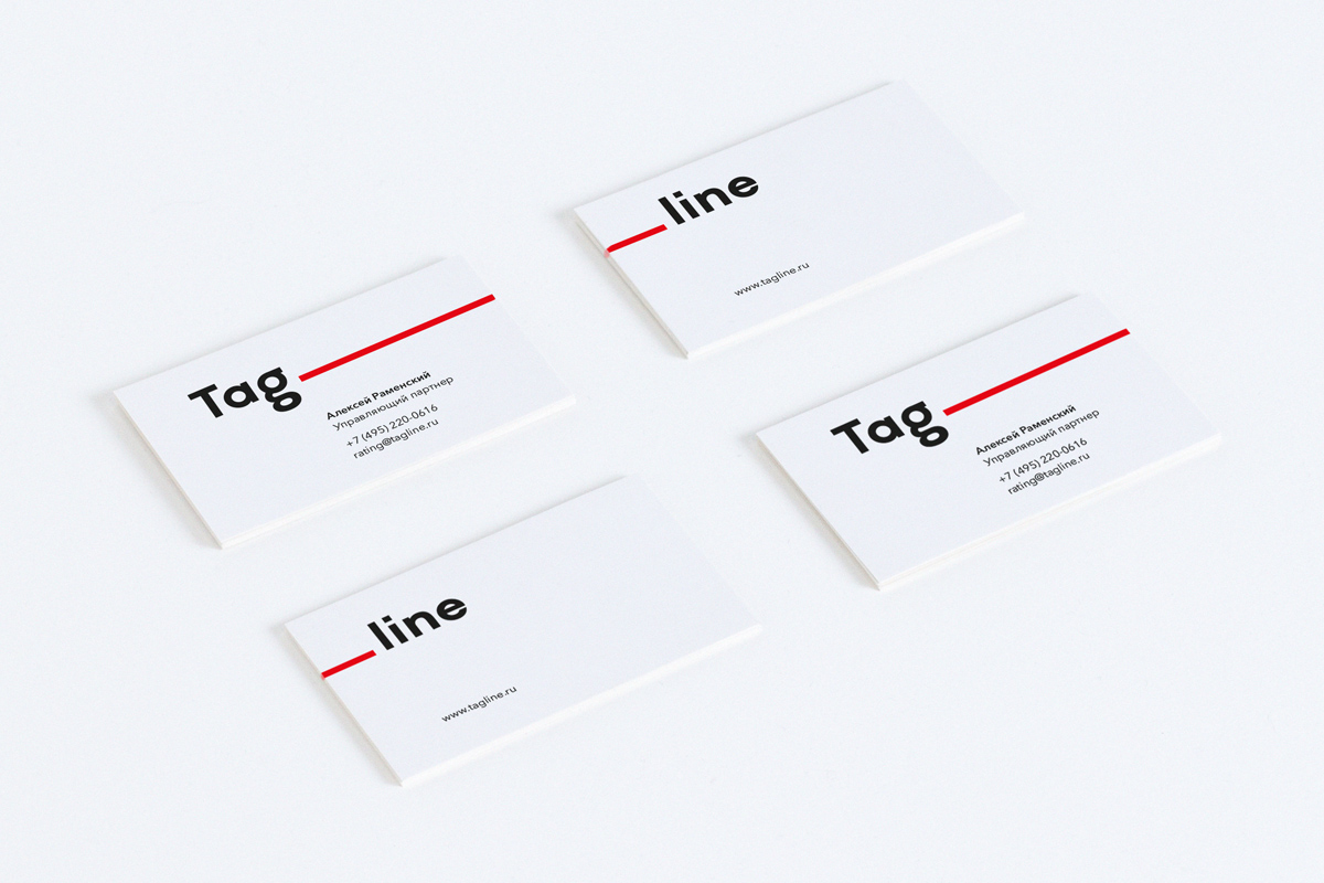
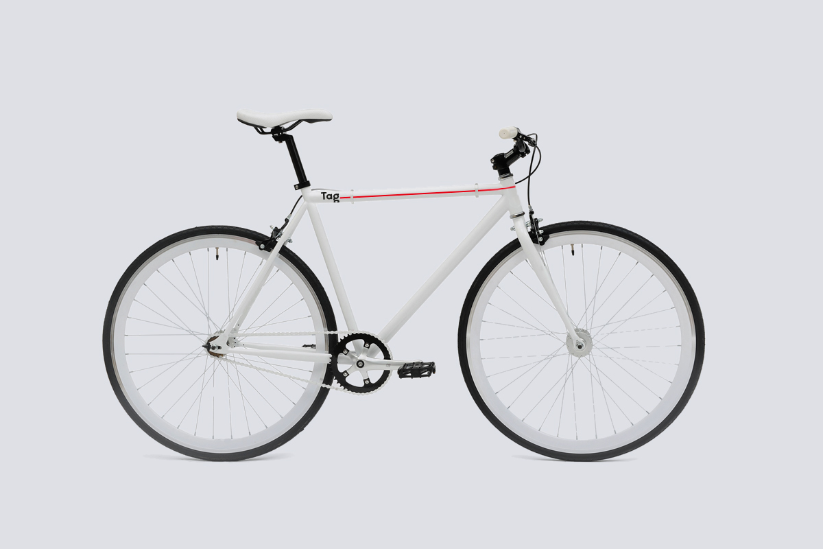
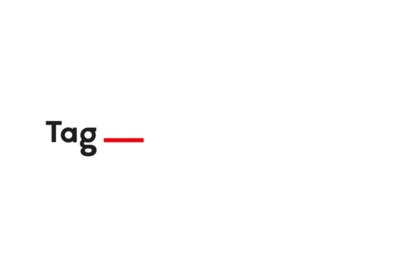
The logo’s structure allows easy branding of the conference names and agency ratings.
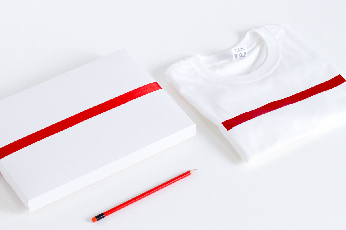
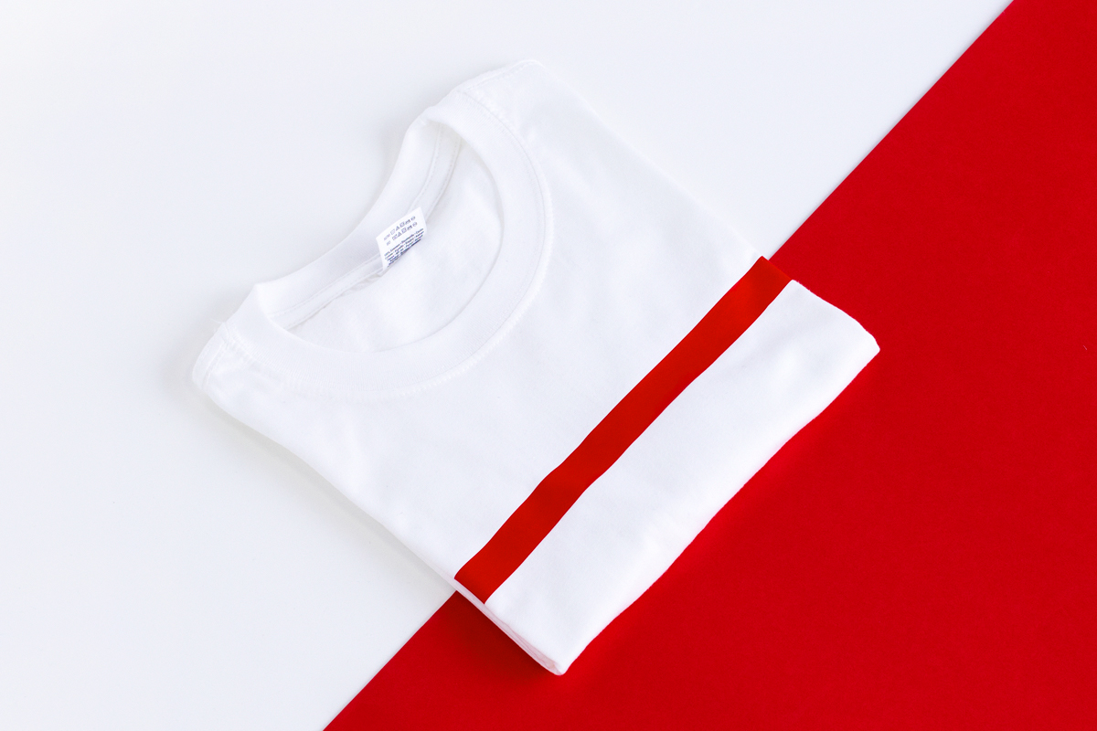
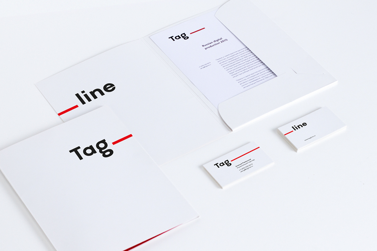
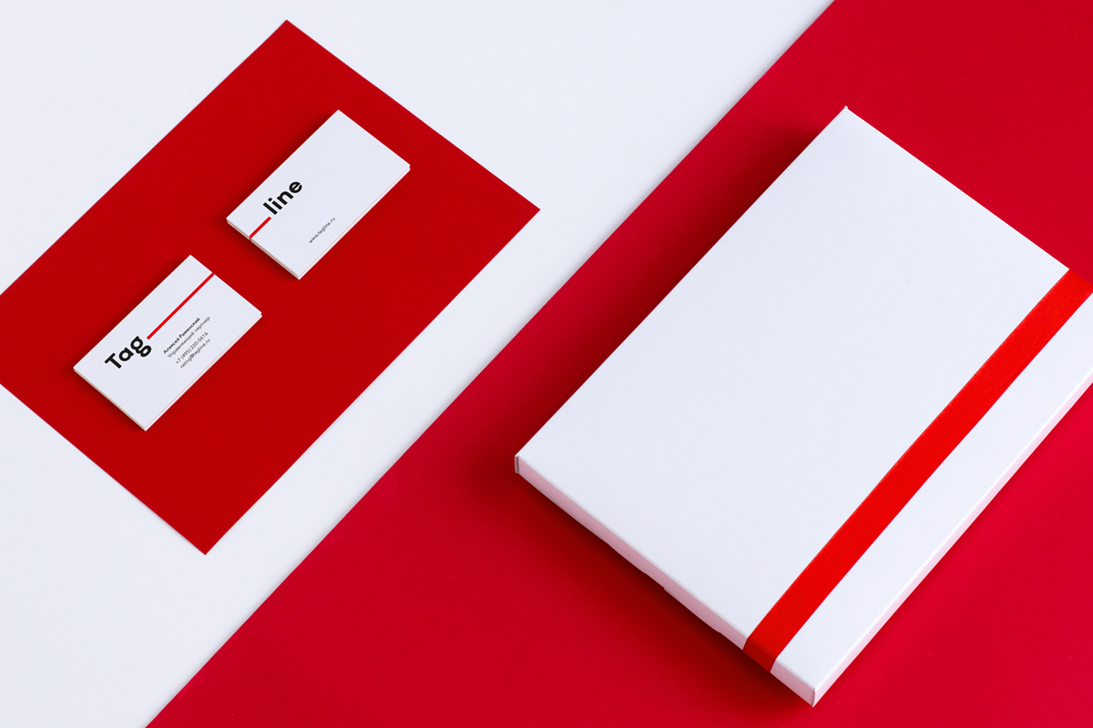
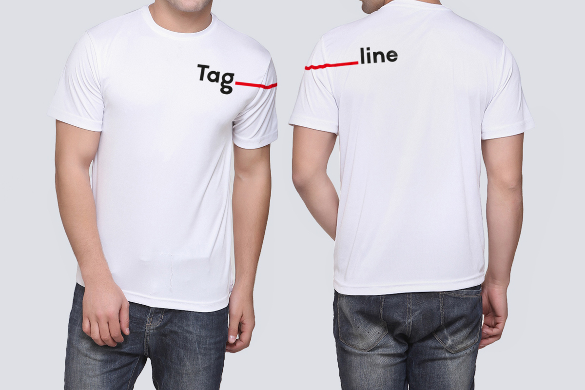
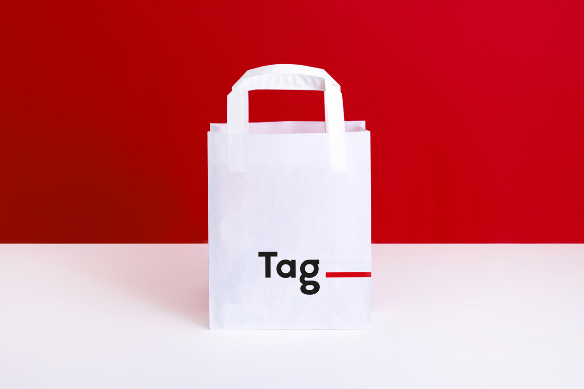
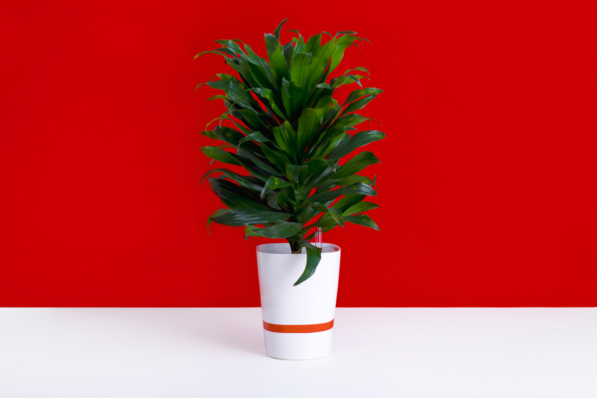
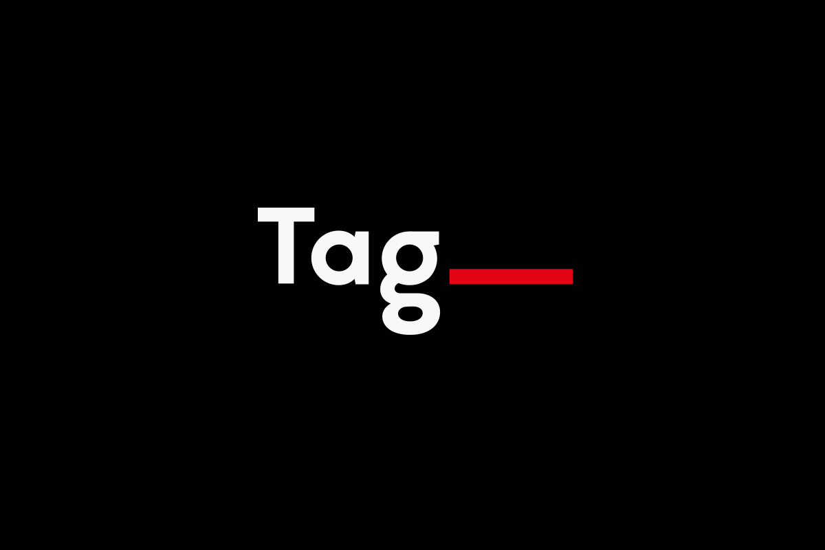
There used to be two logo alternatives: primary Tag__ and supportive Tag__line. The red line is easily read like the word ‘line’, so we recommend using the basic alternative of the logo.