Cadigal
Website Design and Creative Direction
Website Design and Creative Direction
Myself and another designer worked together on this project to create a site that would build on Cadigal's branding and really cement their presence online.
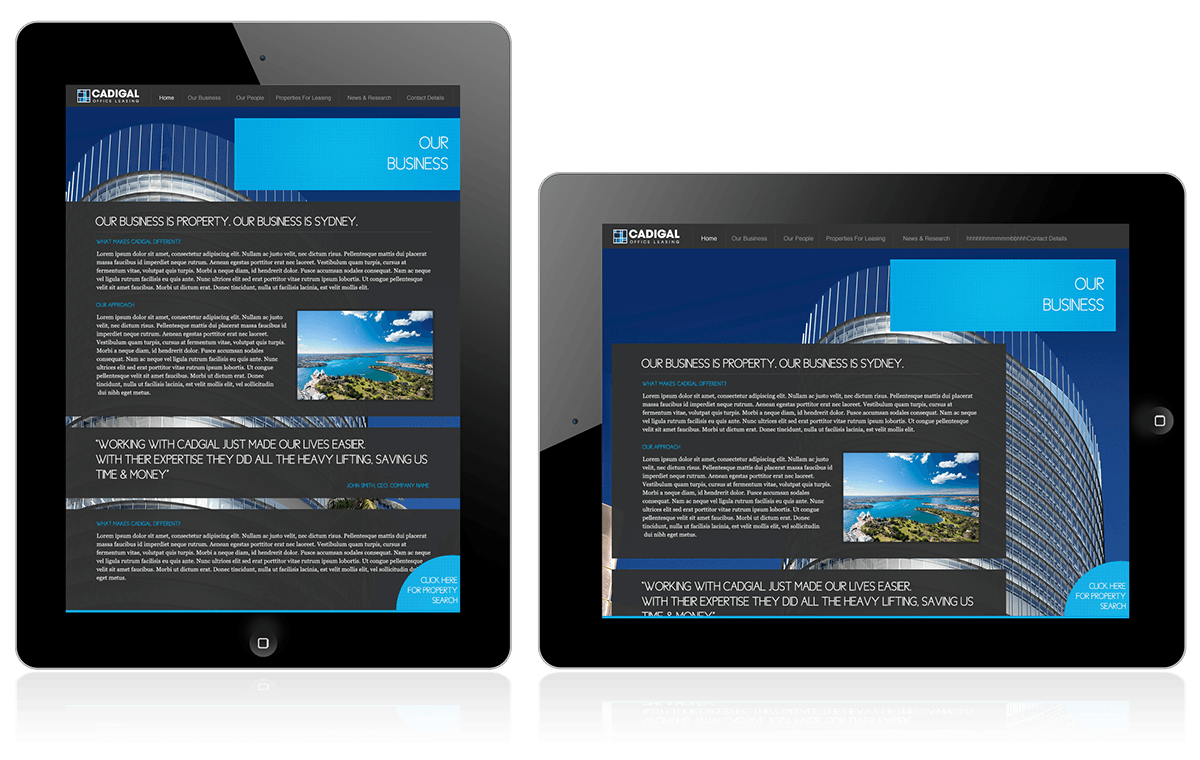
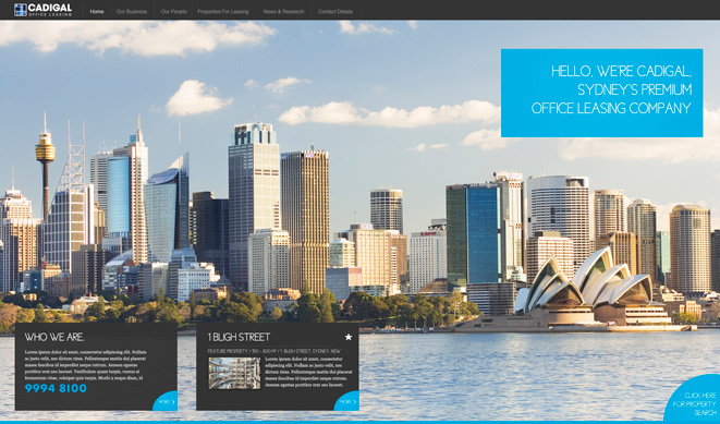
The site portrays Cadigal as a fresh and bold no-nonsense company; right from the start it is all about Sydney with the large home page image consuming the entire screen space with the Sydney city scape.
We also decided the site should be fullscreen so it would maximise the avaliable screen real estate and give a bold, 'in your face' confidence.
The pages where all about showing off the beautiful properties that Cadigal dealt with whilst also creating a structure that worked well on Mesh's CMS and would easily fit around some of the unique ways the system handled content.
Home Page

General Page: Shows how compilers will be able to construct pages

Property Page

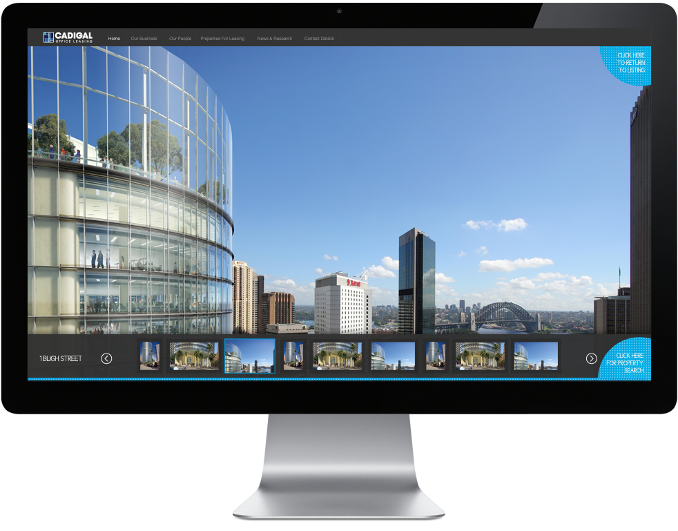
Property Gallery: This was designed to be full screen and really put the property on display so you feel like you are there, standing inside that room which helps you get the sense of whether you could work in that space. We didn't want to create a small gallery like so many other property sites where it's hard to see the details and there is a lessened sense of scale.