

RETHINKING CARTOGRAPHY
EXPLORING UNCONVENTIONAL METHODS OF
CHARTING DATA THROUGH INTERLINKING VISUALS
CHARTING DATA THROUGH INTERLINKING VISUALS
'Rethinking Cartography' is my design degree thesis project (2013). The project involved studying and analysing iconic maps that were charted between the 1300's up to the maps produced today. This lead to the exploration of various forms of cartography, be it illustrative or purely functional, and decipher which method(s) would work best to create a chart illustrating the harbour cities surrounding Malta's capital, Valletta.
MAKING THE MARK
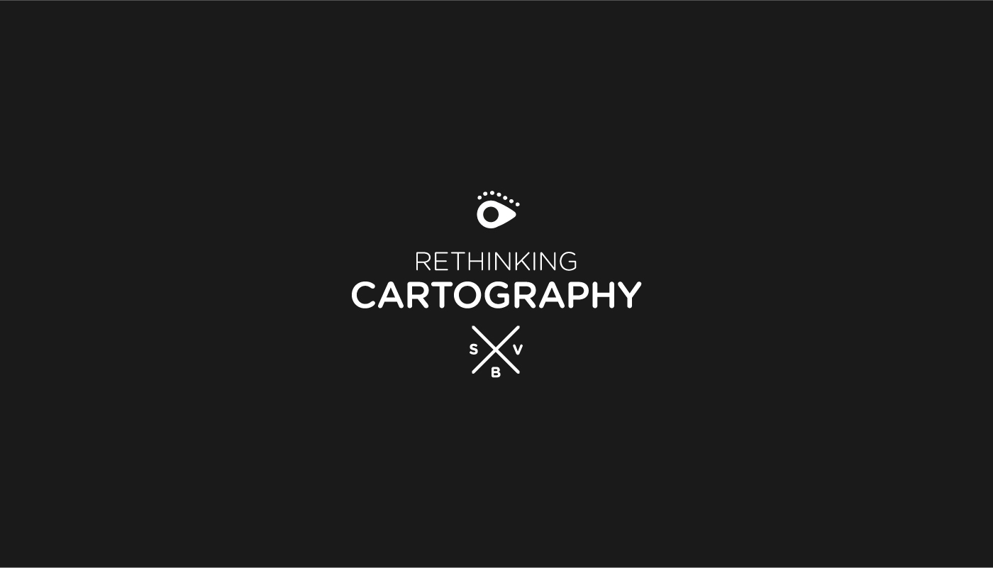
PROJECT IDENTIFIER
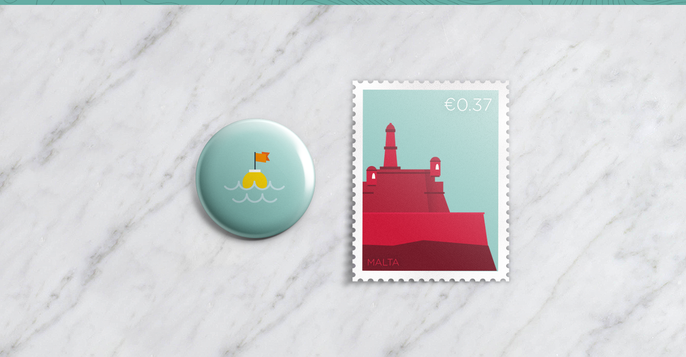
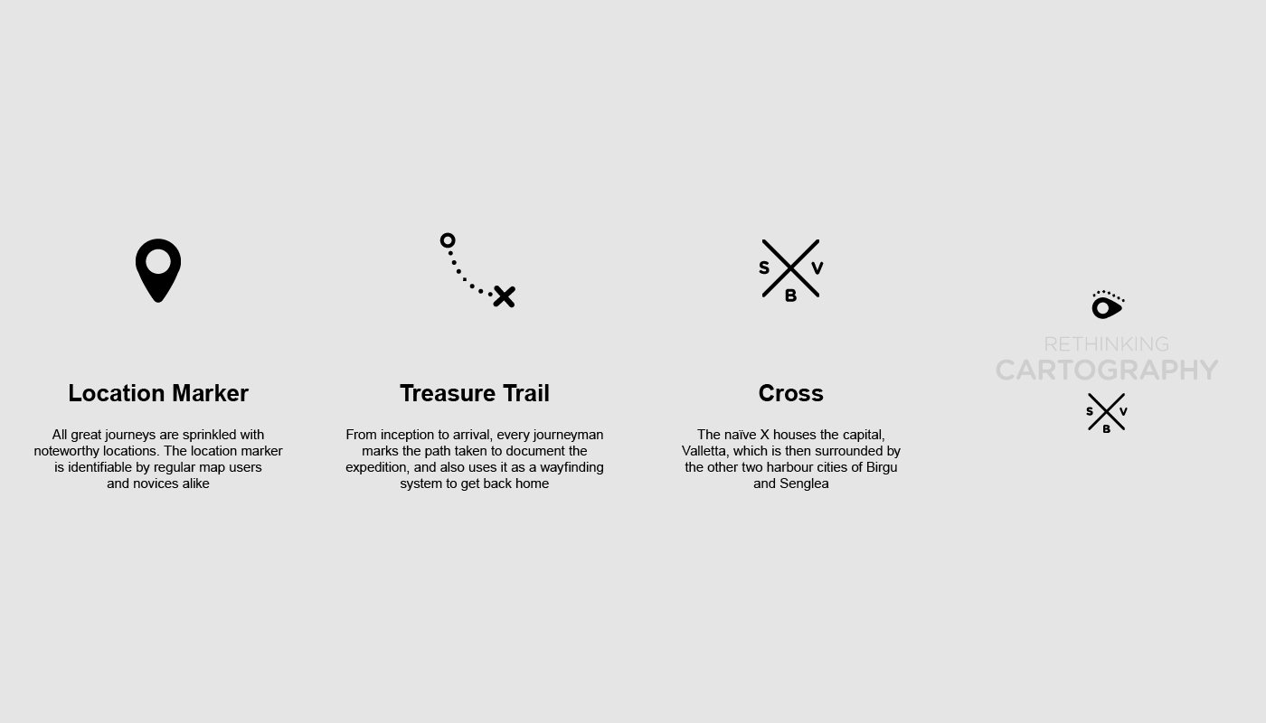
The logo created for the project was put together by combining a Location Marker with a dotted Treasure trail to form a stylized rendition of the Luzzu Eye, a symbol that is tied within the roots of Maltese nautical culture. These eyes are regularly affixed to local fishing boats as to protect the fishermen while at sea.
CONCEPTUALISATION
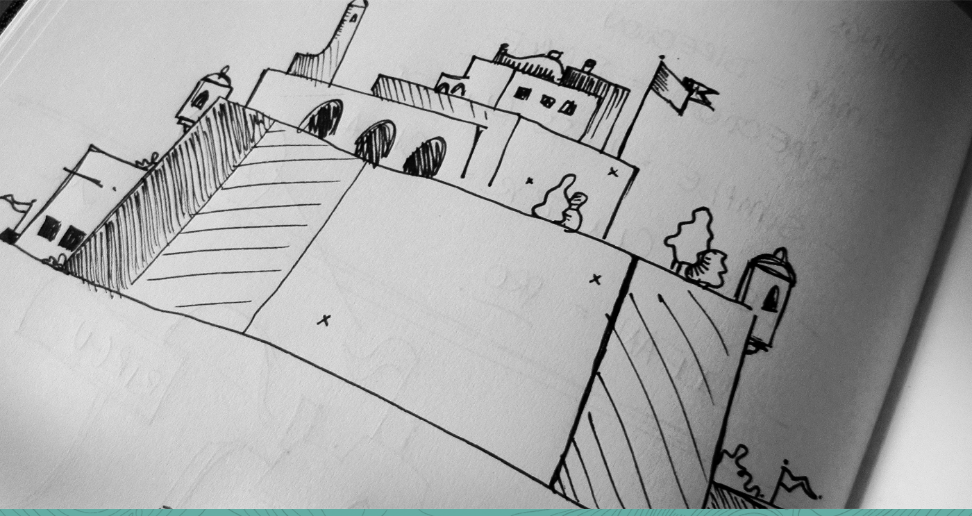
SKETCHWORK
Unlike most projects, my thesis dissertation allowed me the luxury of time. With a 7 month window, I dedicated the first couple of months strictly to literary and on-site photographic research and sketch work. Even though I was more than familiar with the architecture of the locations I chose to chart, I used this time to explore the nooks and crannies of Valletta, Birgu and Senglea, sometimes finding myself in alleys that felt foreign. This allowed me to truly familiarise myself with the structural DNA of the three cities, which I then began to sketch out and, at a later stage stylise, for them to be implemented into the final map.


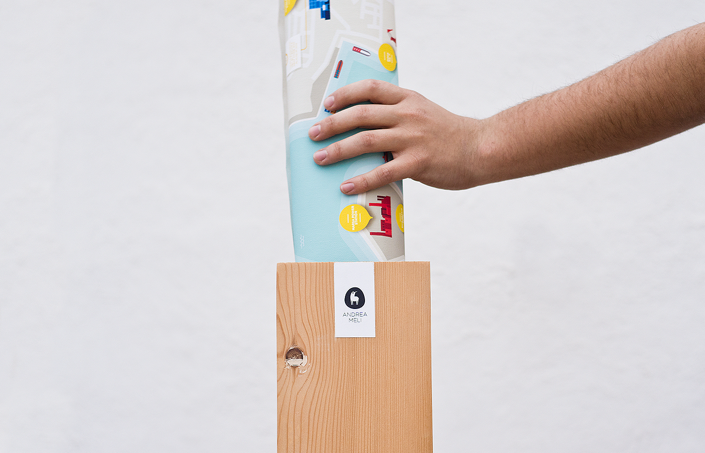
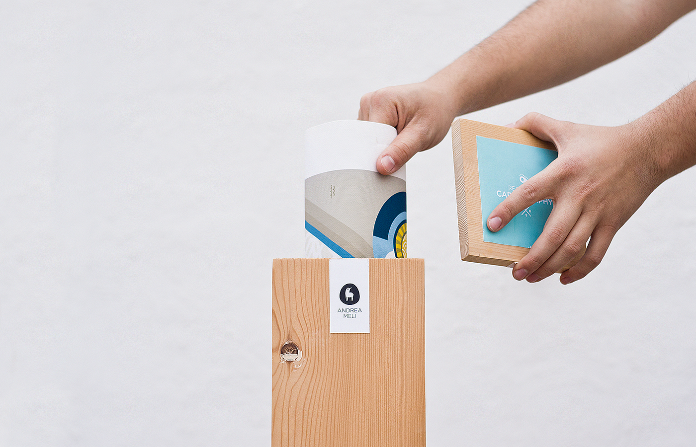
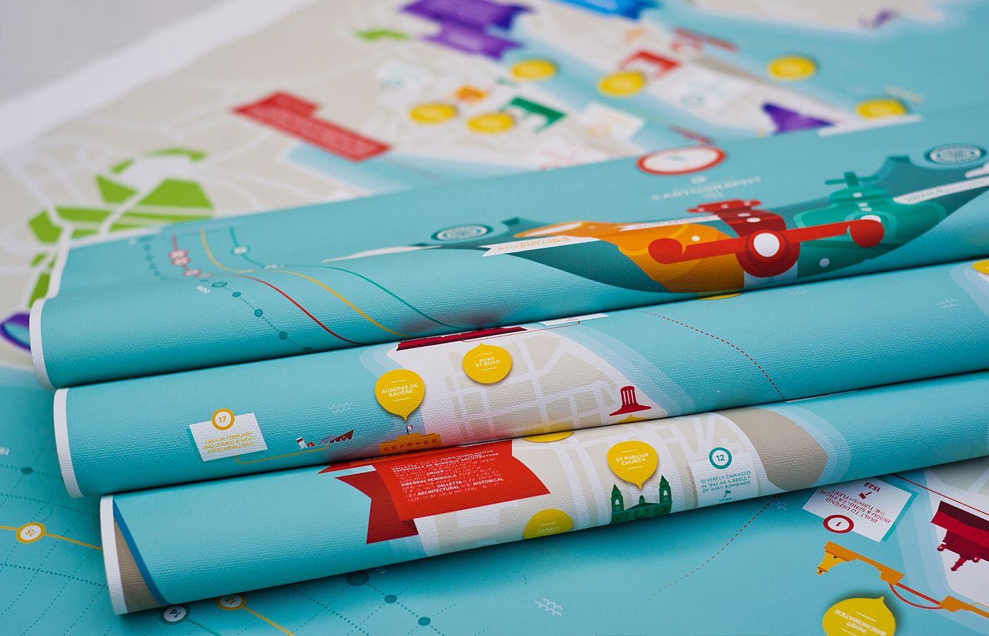
CHARTING THE GRAND HARBOUR
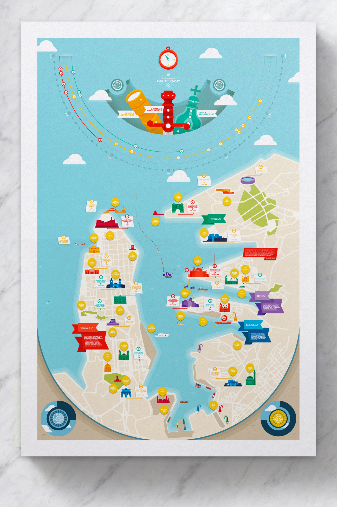
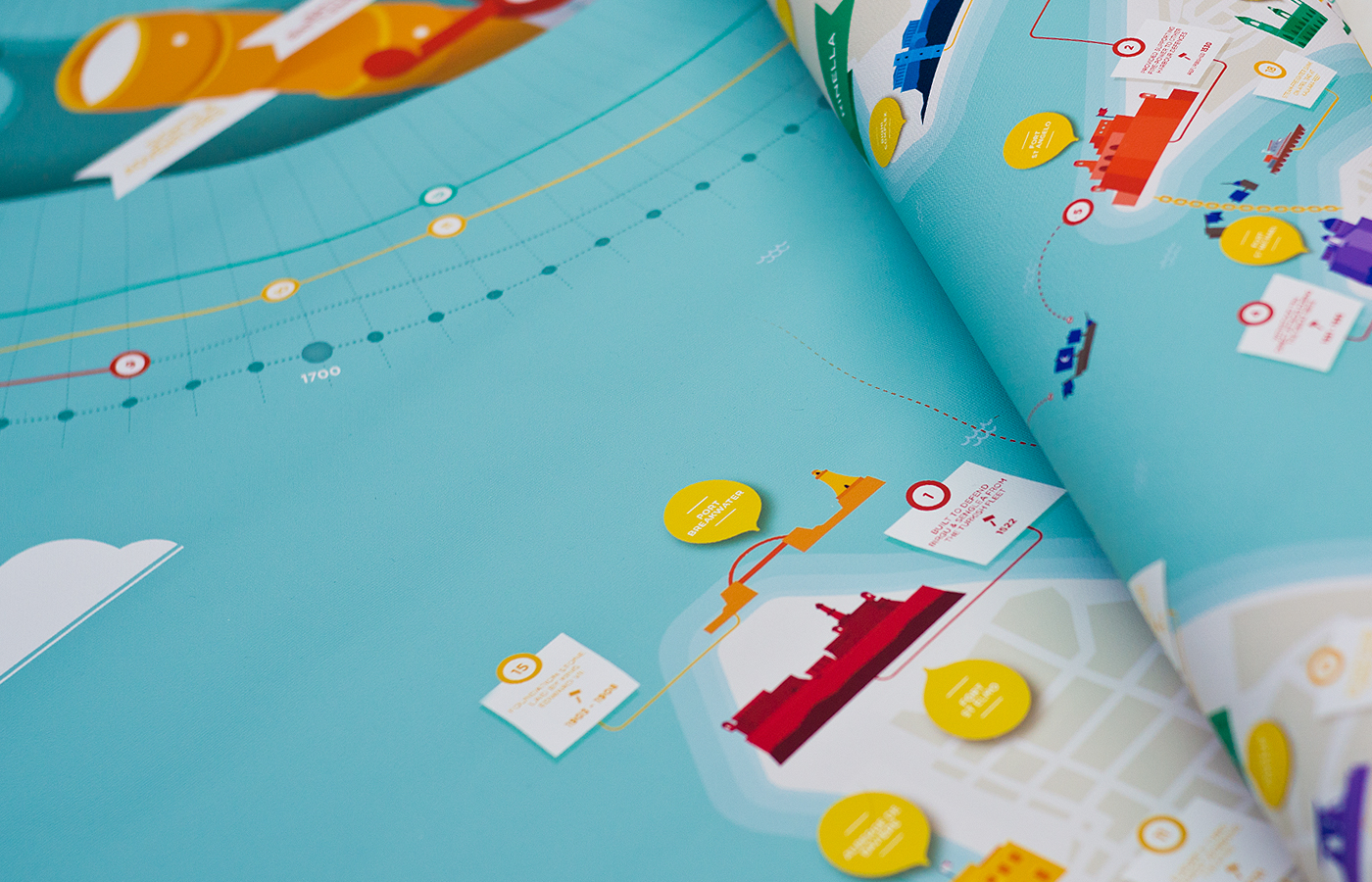
MAP MAKING
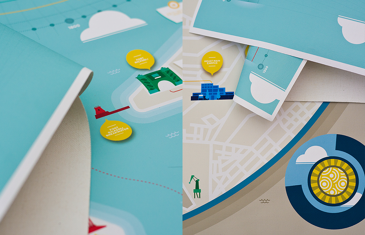
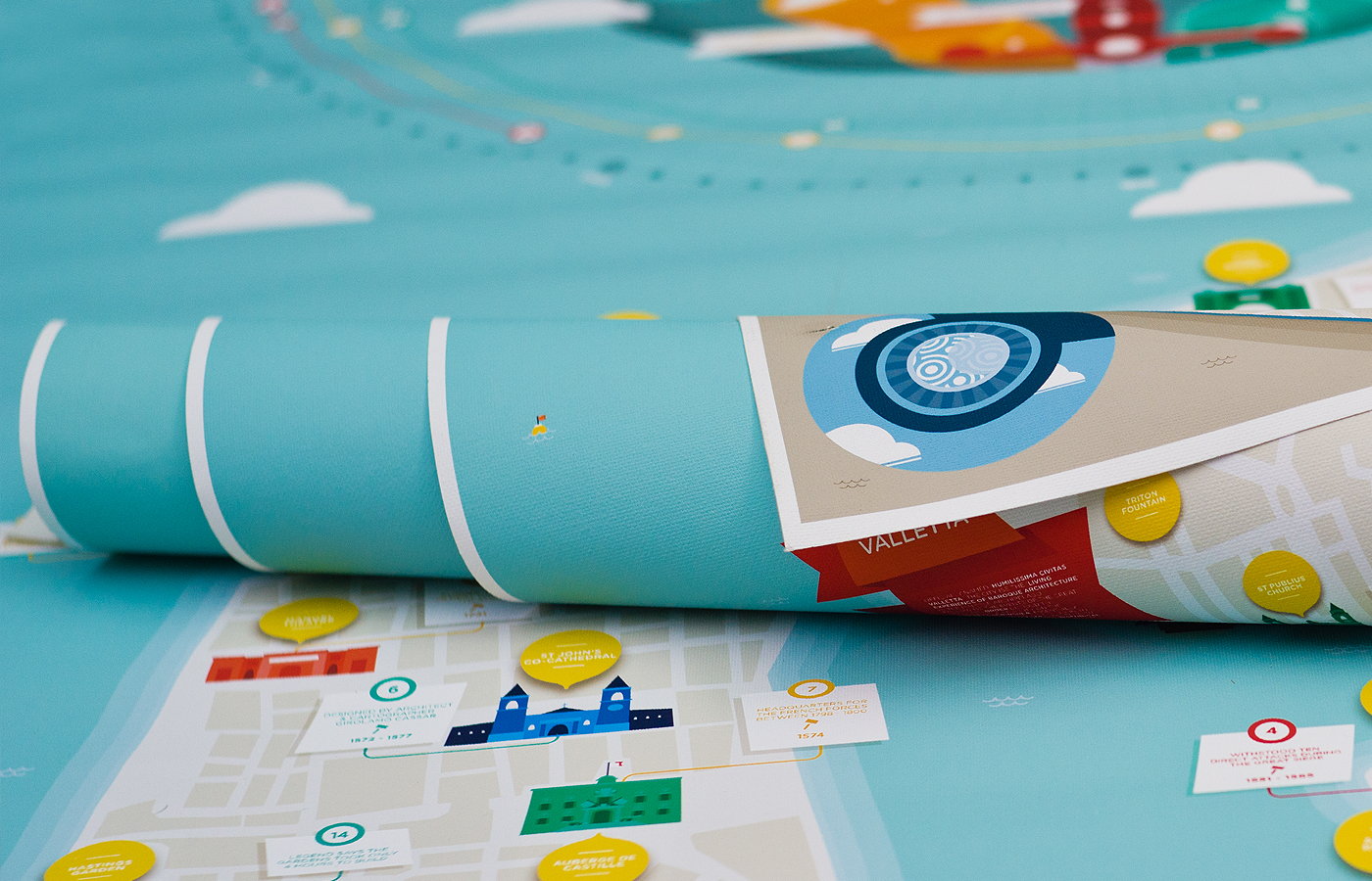
The map (above) took several forms in its early sages; initally the harbour cartograph was planned to house a circular frame. However, I later opted to contain the illustrated map within a relatively standard portrait field, and build the circular framework within the artwork itself.
A variation of colour combinations were also experimented with during the design stage. At one point, the sea took a rich purple hue and the cities itself were way more vibrant in nature. Yet the unorthodox colour schemes did not reflect the nature of these cities; I opted to integrate a combination of natural teals, blues and creams to serve as the canvas for the buildings. These illustration, on the other hand, were reproduced used a single hue inspired by the vibrant colours seen on the luzzu boats mentioned earlier.


FUNCTION BEHIND WAYFINDING
SPACE & TIME
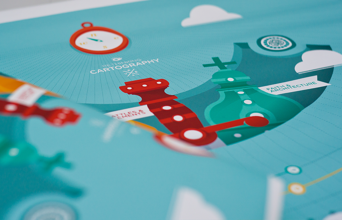
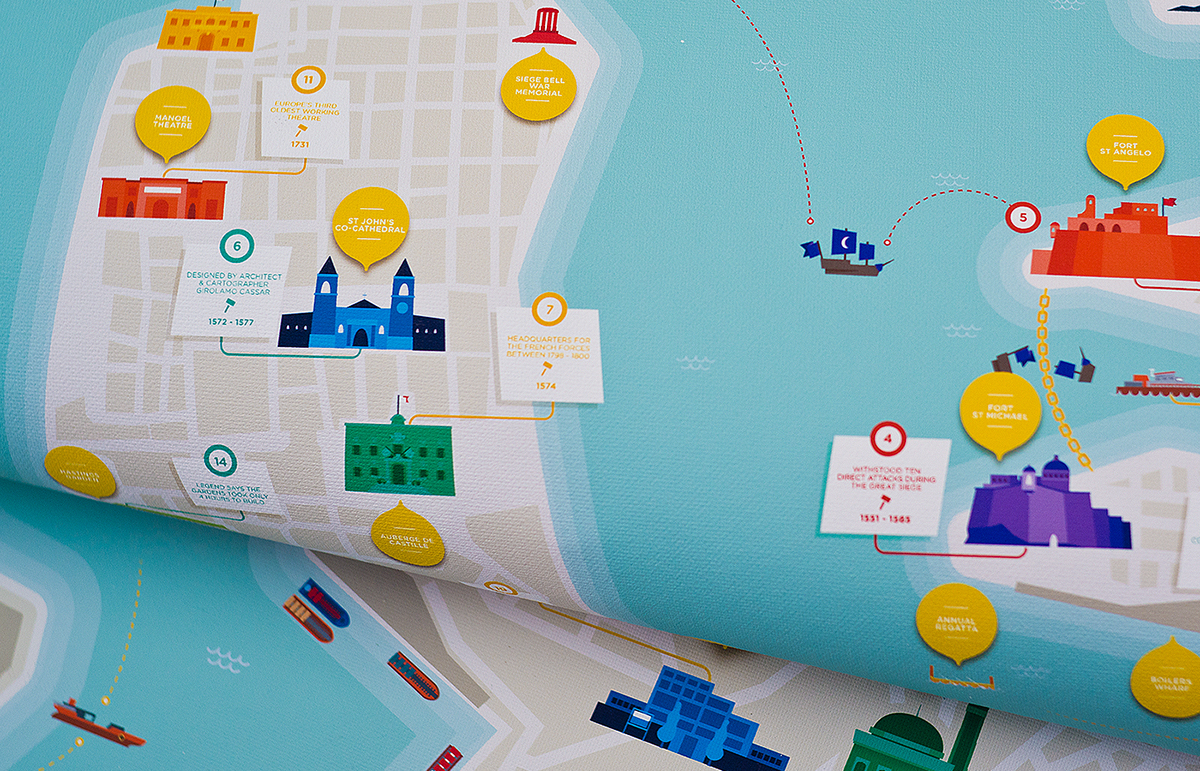
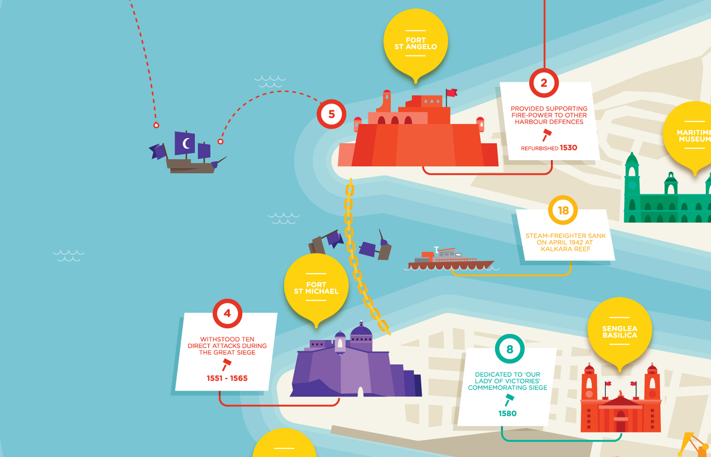
One of the limitations I aimed to overcome with this Cartographic project was the factor of time. Most maps tend to only include structures in the area that are present at time of production. However, the harbour area witnessed various structural changes through the ages, and was also the stage for Malta's most iconic event, the Great Siege of 1565.
I devised a method composed of a hemispherical timeline that worked in conjunction with numerical, colour co-ordinated markers. Each hue indicated one of three divisions of the location and event categorisation system. Yellow indicated 'Sights & Adventures', Red marked 'Battles & Battlements' whilst 'Faith & Architecture' were marked in Turquoise. At the hemisphere trajectory, a compass was reproduced to indicate the maps' rotationary orientation.


WRITINGS ON THE WALL
DISSERTATION
The map was produced in tandem with the writing of my thesis dissertation, which covered the various functional and artistic uses of maps; with a particular focus on the charts produced by local cartographers and artists.