
First of all, I have had always complaint about most of designs of daycare center in Korea because it is not modern and simple, somehow, they were like completely kitsch advertisements. I don't like it. Therefore, I started to choose one daycare center that my mom has worked for about five years and neatly tried to make design artwork again for my mom.

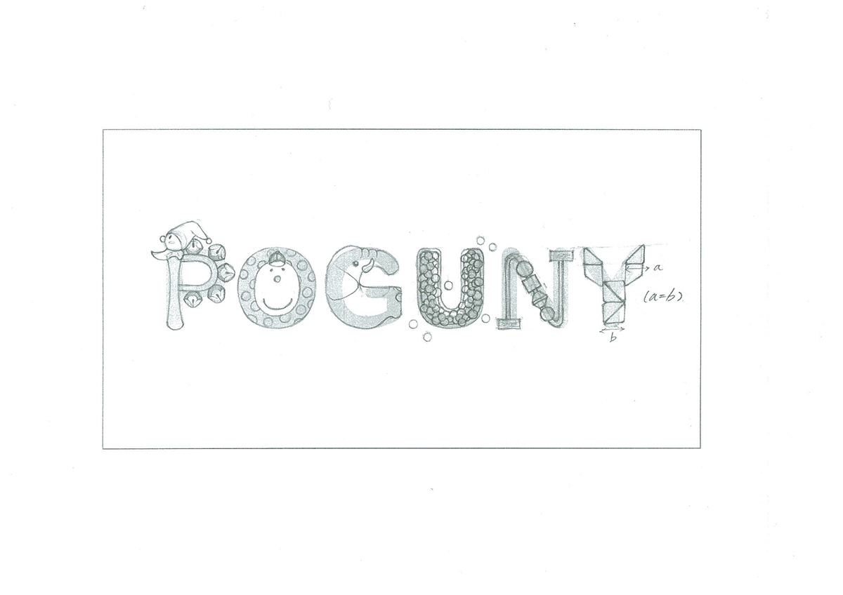
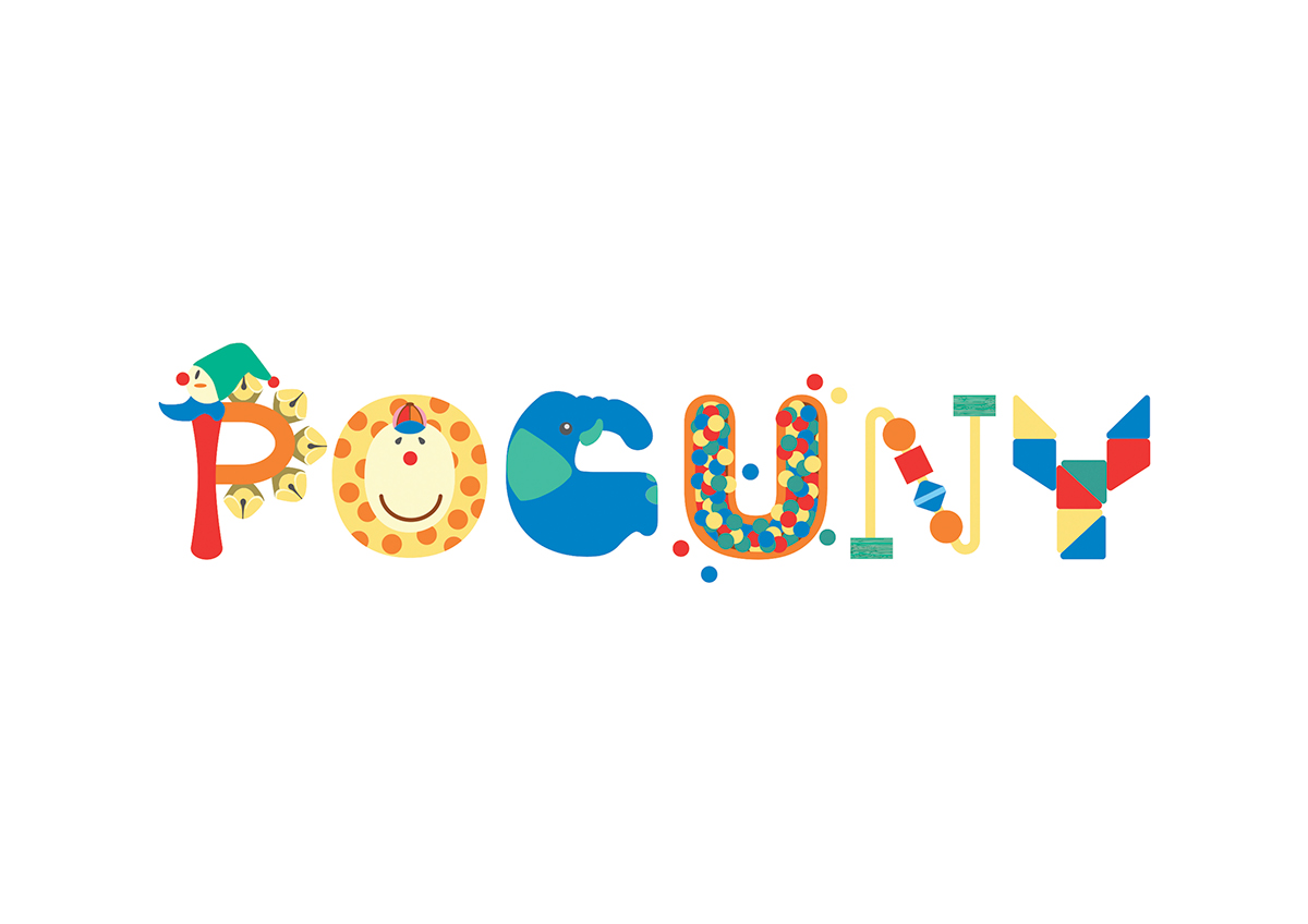
1. Logo
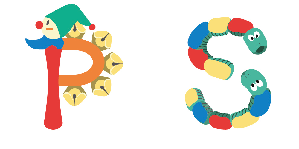
I referred to many kinds of baby toys and tried to apply to Logo design. Especially, I took care about selecting colors and shapes because the direction of my branding was simple so it was easy to awkward when getting minor mistake.


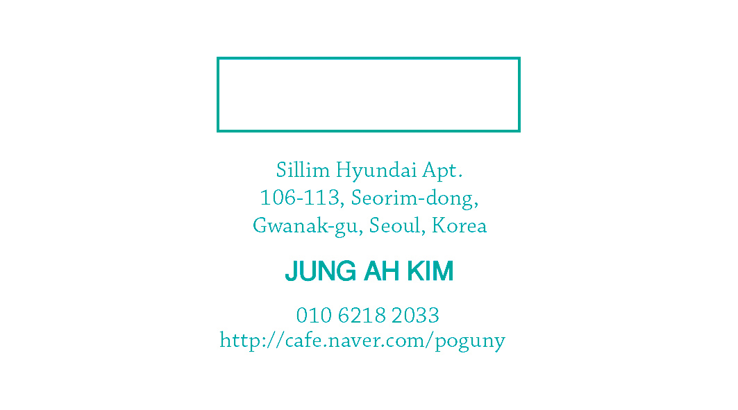
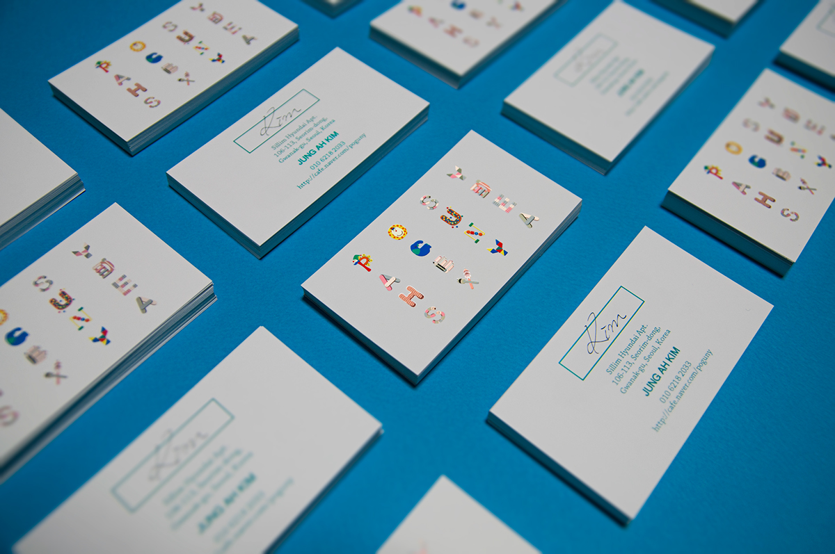
2. Business Card
Broadly, I kept the rule of rectangular shape and grid rule. I weighted importance to vertical and horizontal line, not curve and natural lines. Alphabets neatly ordered make the regular features.

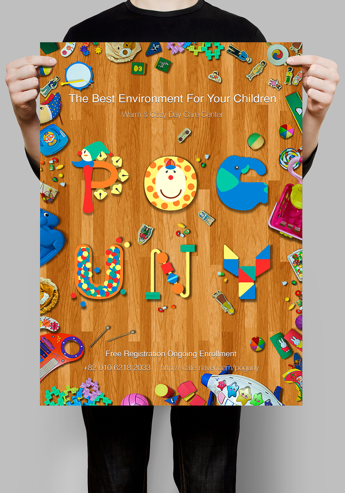
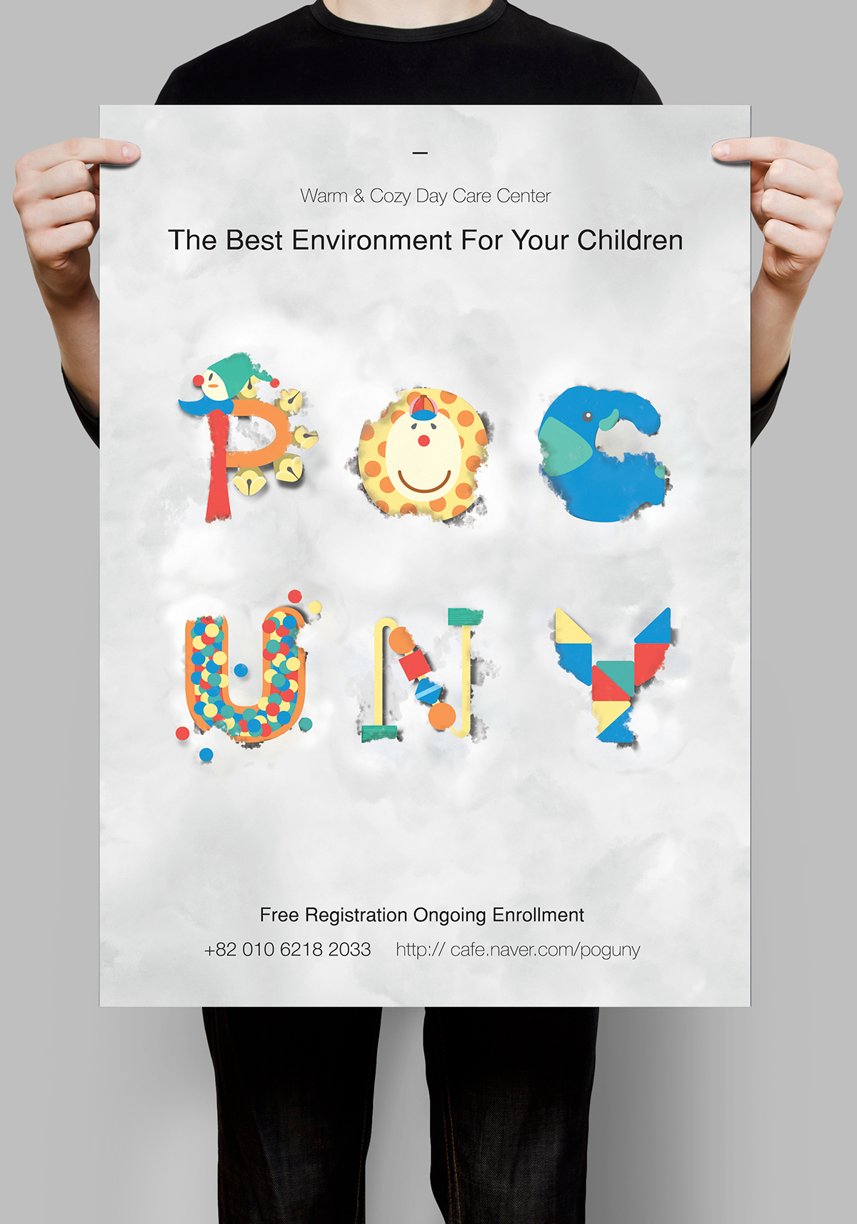
3. Poster
I removed tedious decoration and concentrated on informing 'POGUNY'logo. The POGUNY's original meaning is "Warm and Cozy'. Therefore, focusing on "Warm and Cozy' and tying up with the concept of daycare center is very important work.


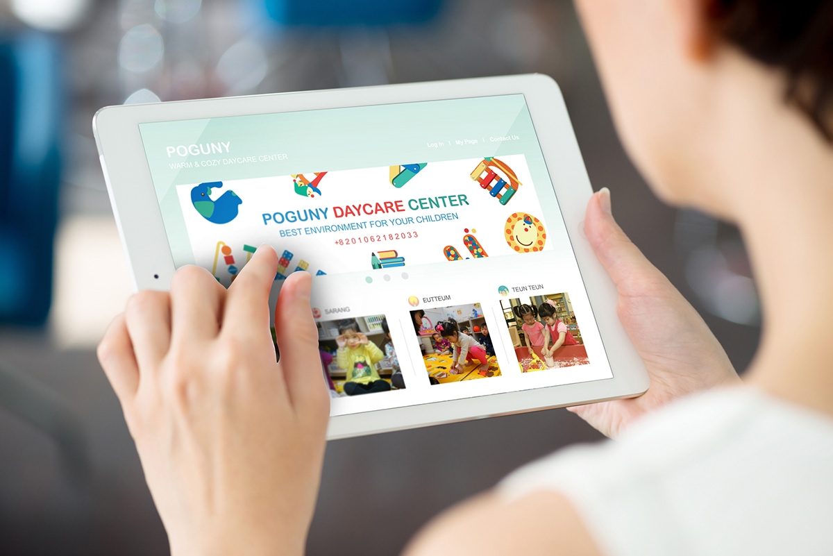
4. Another Advertisments, Billboard, Webpage
Additionally, I made variable ads fit with vehicles, busstop and mobile devices.


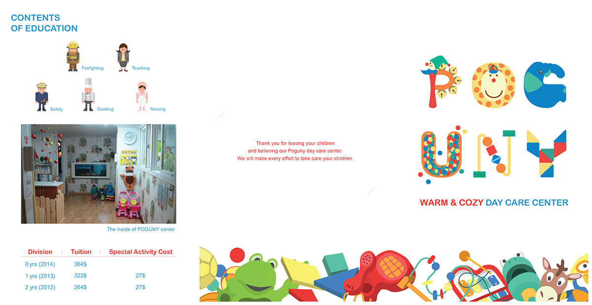
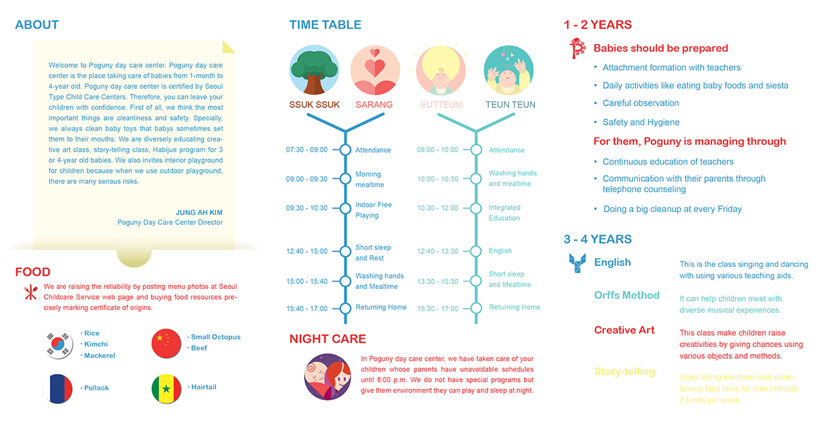
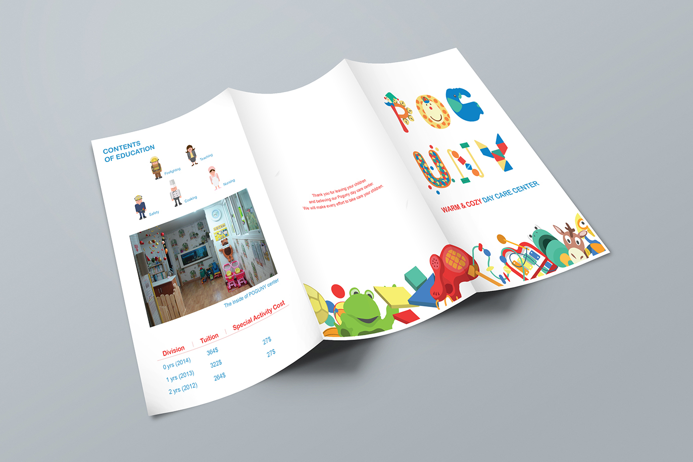
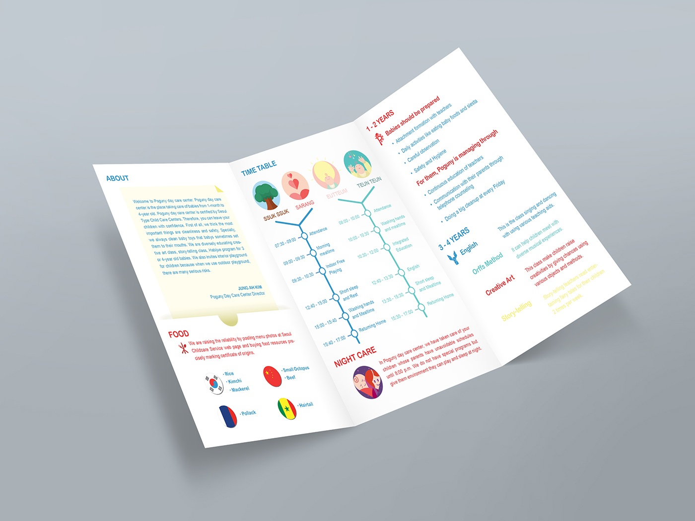
5. Brochure
I made Tri-fold brochure packed many information about planning time tables food ...etc into it.

Thank You for seeing them!
