
Torani is a flavoured syrup company with flavours ranging from vanilla to sugar-free chocolate chip cookie dough. Created by R. Torre & co., located in Southern San Francisco, California.

The logo has never changed since 1925 and felt too formal for being such a fun product.
Torani already has a comfortable fanbase, so retaining brand loyalty is crucial.


this ad does a better job of displaying the fun side of the brand. Pastry background and picnic plaid red on the bottle.

To get a feel for what classification of font the logo was going to use, I sketched the core design of what I wanted to follow. The steam/flame coming off the i is purely experimentational and was not used in the final design

During development, I accidentally made this bigger than necessary and decided to tape some paper together to get enough space around the design. Torani employee Matt Wills was kind enough to send me a detailed illustration of the Iconic Castle in their current branding.

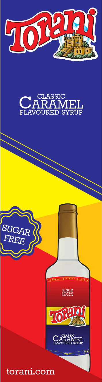
the red blue and yellow colours on the front label of the torani bottles is what customers remember about the product. Changing this would hurt Torani's brand loyalty, so the colour of the new brand will be based upon this.

After some group discussion, it was decided that:
The darker red detailing would be removed
The overall size of the torani castle would be reduced
The swash that becomes part of the r (between the r & a) would be reedesigned
The text that reads Amaretto Syrup would be stylized with a more suitable font
The wordmark overall would be widened

I also made the decision of reducing the height of the castle at its highest point. This was done to not disturb the space in the n.

A duo-tone of dark blue and cyan is used in the portrait of Gina Lollobrigida.
Brighten up your beverage is the slogan, which only appears in this exclusive printed advertisement & is to be on display at partnering coffee shops.
Torani bottles are repeated to suggest an abundance of flavours, the colour scheme is expanded upon with darker colour pairings to compliment the original design & gives added flow when entering from the top left and finishing in the bottom right.


This collection of online advertisements is perfect for website banners, headlines and more.
Varying background compositions paired with individual flavours give each advert a boost of personality for connecting with potential customers.
Whether your favourite food is banana, apple, blackberry or coconut, Torani's got an advert that'll grab your attention using more than just its engaging colour combination.
All measurements are in pixels.

728x90

720x300

468x60

336x280

300x600

300x250

300x100

250x250

240x400
160x600

120x600

120x240

I used a slab serif in my designs to match the stylization of the Logo, but still have its own features. The Torani logo's slab serifs have curves joining the serifs to the rest of the letters, whilst Rokkitt does not have these curves. Uppercase gave me a clearly defined cap height and gives a bit more difference in stylization from the logo.
Thank you!


