BARCELONA METRO REDESIGN
A redesign that makes the metro clearer, friendlier, and true to Barcelona culture.
___________________________
Concept
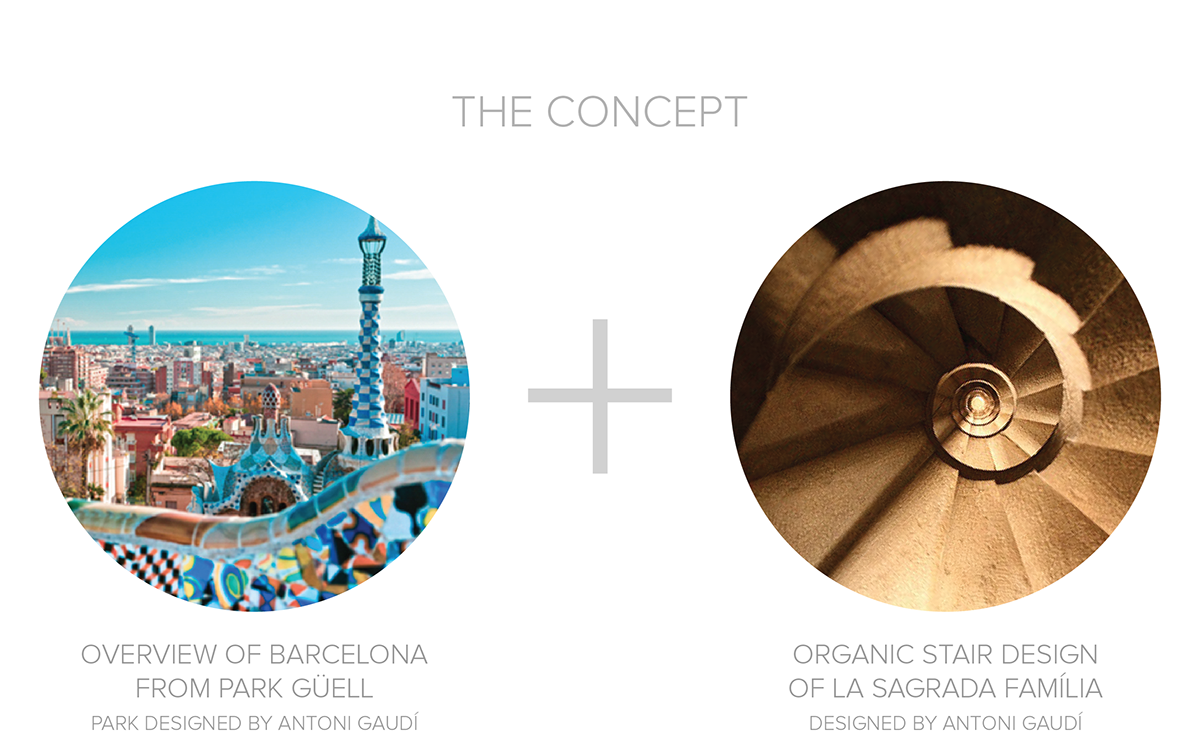
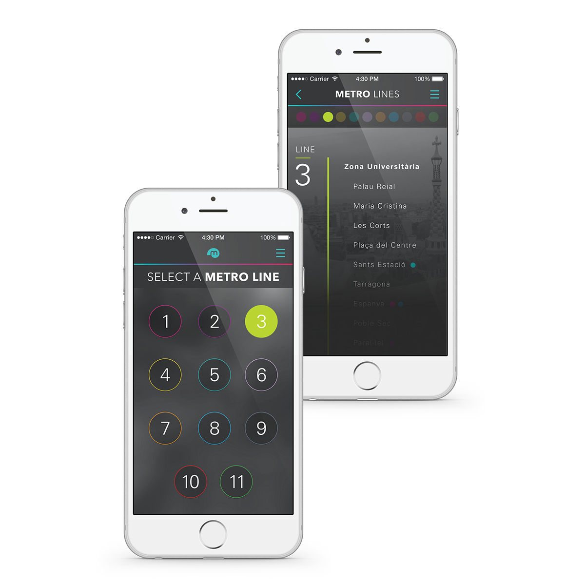
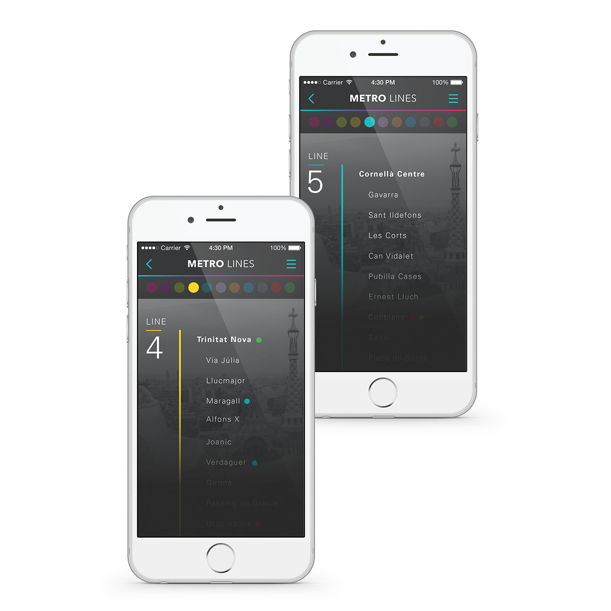
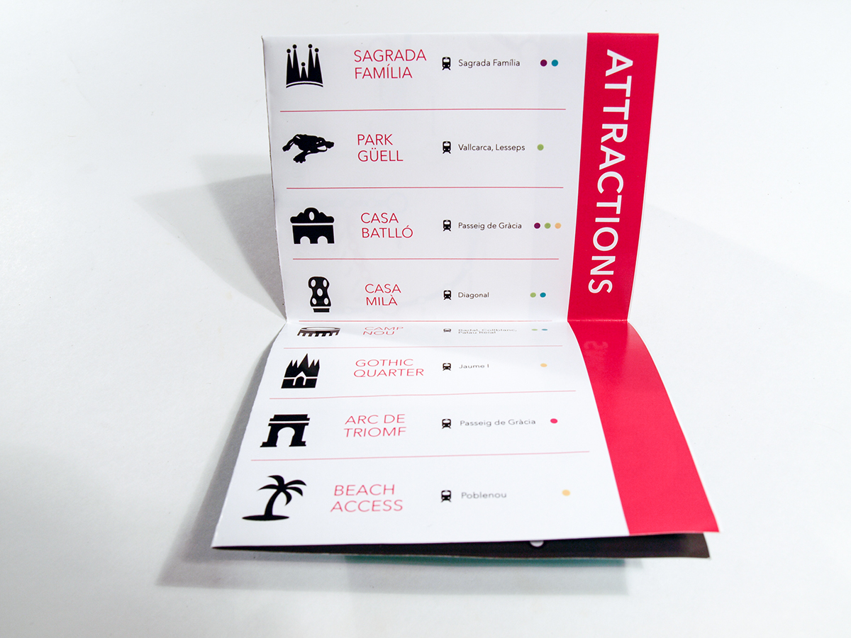
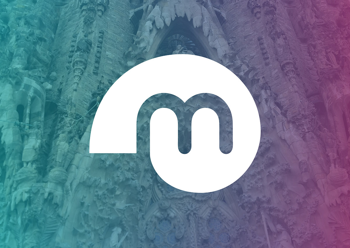
To capture the feel of Barcelona, both, the branding and the map design, take inspiration from the work of Spanish Catalan architect, Antoni Gaudí, whose distinctive style can be found all over Barcelona. Gaudí was fascinated by nature and the geometric forms that make up all living things.
Outcome
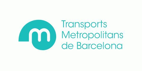
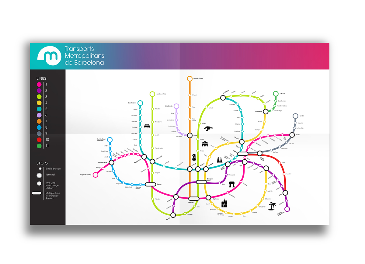
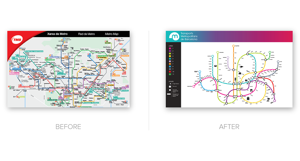
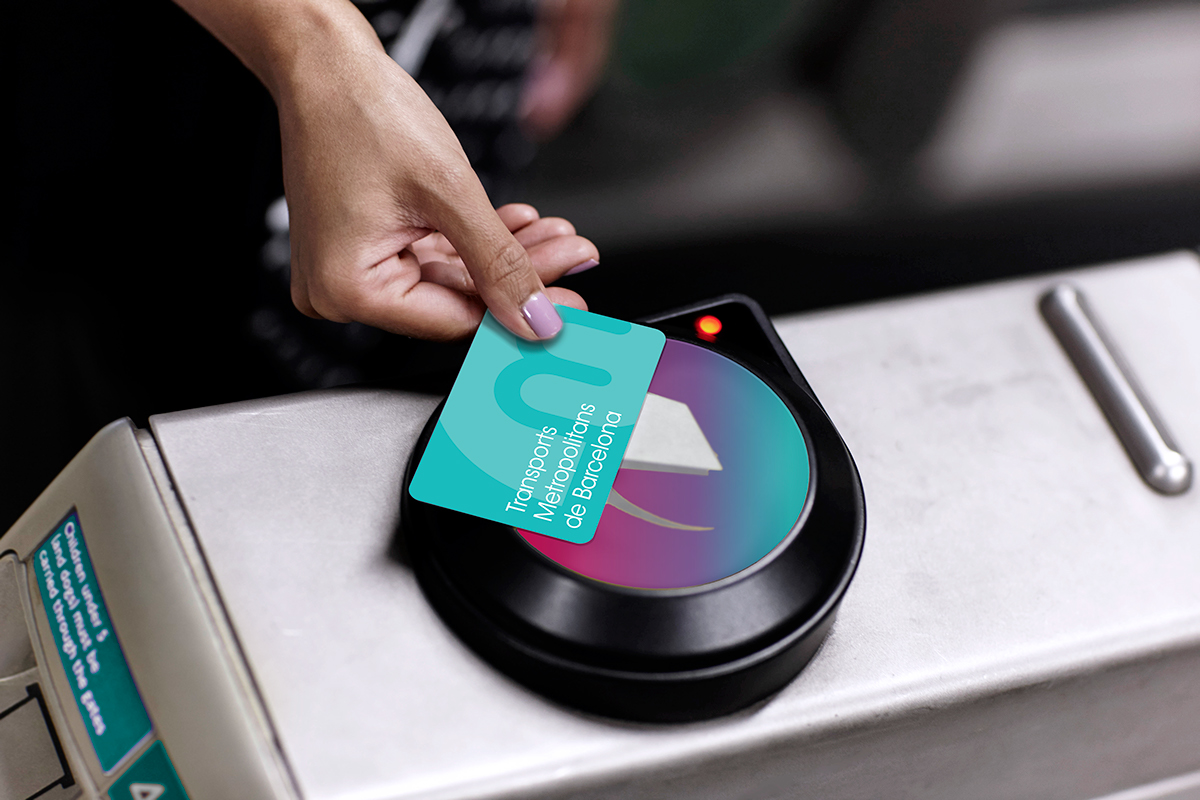
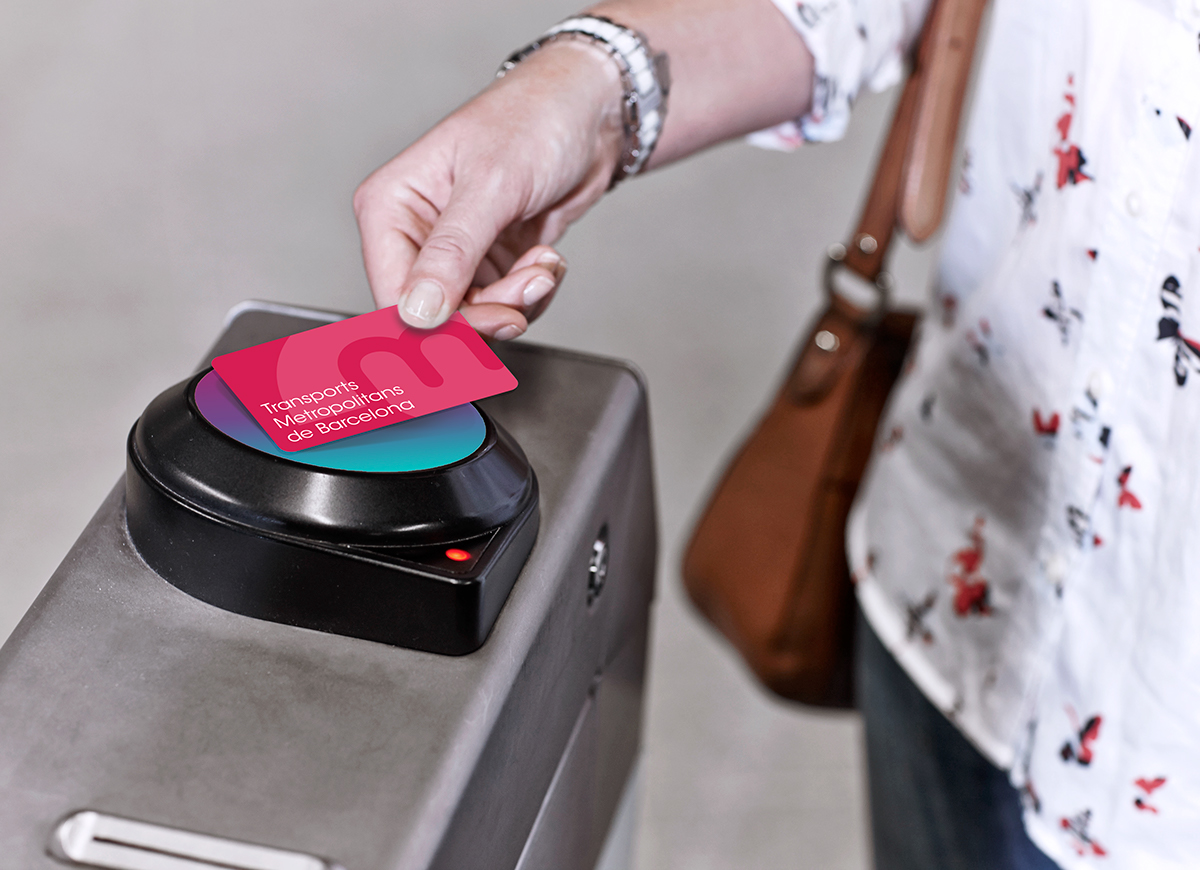
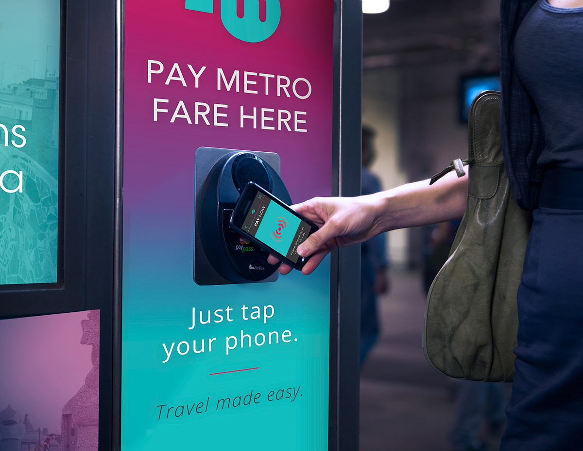
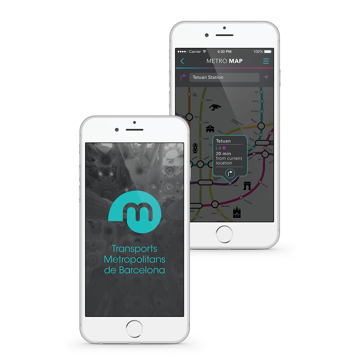
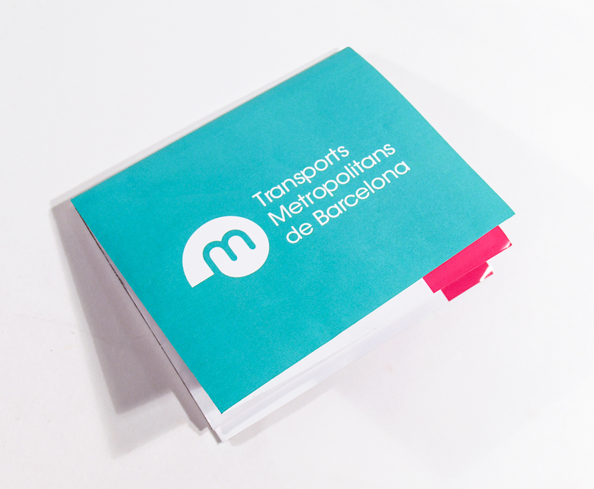
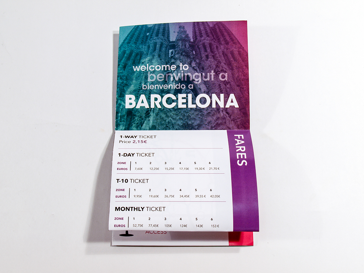
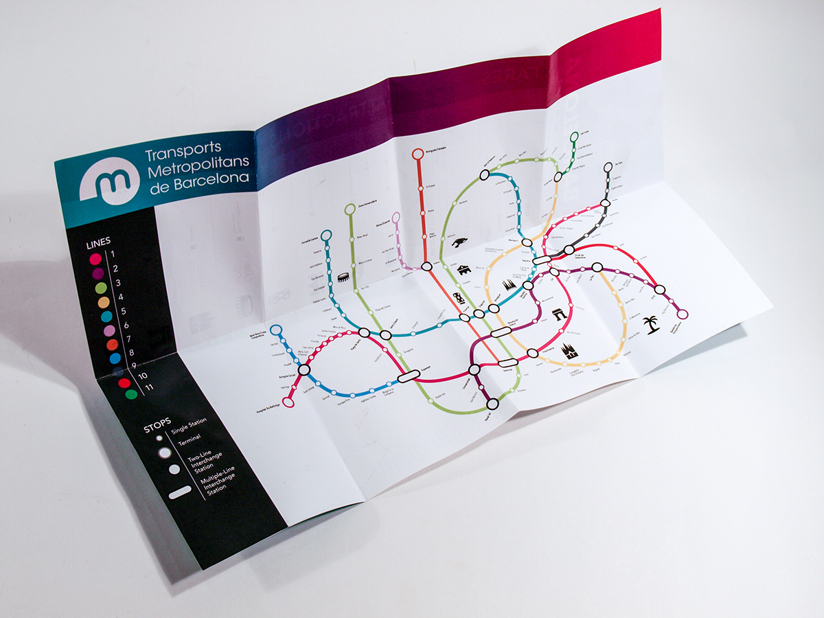
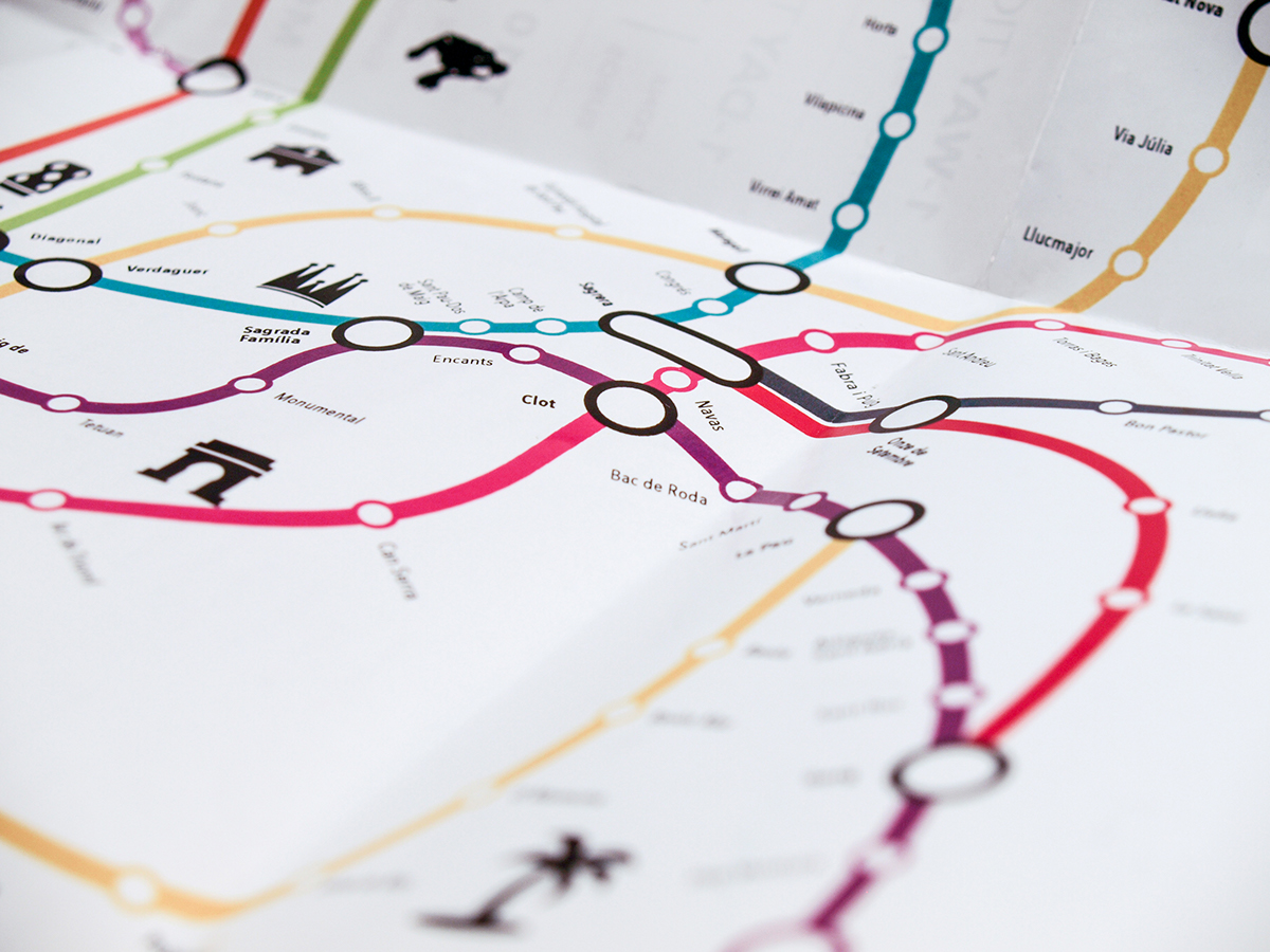
The metro logo and map redesign are based on the golden ratio as a way of incorporating Gaudí's use of geometric forms from nature into the metro redesign. Most importantly, by using forms derived from nature, the metro redesign becomes intuitive and human to metro passengers, as well. The redesigned metro line color palette also takes inspiration from Gaudí's work, with his use of vivid color combinations in mosaics tiles. A turquoise blue is the primary brand color because it is bright and easy to point out (important for information design). In addition, the blue communicates Barcelona’s lively beach culture, which attracts many tourists to Barcelona and is something the city is known for.
___________________________
___________________________
Semifinalist Adobe Design Achievement Awards May 2016
Winner Adobe Design Achievement Awards July 2016
Finalist in SCAD Secession June 2016
Featured on reDSGN January 2016
CLICK HERE for process work.