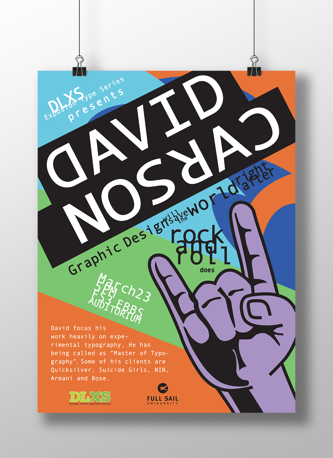
The challenge of this project was to create a poster for a David’s Carson talk.
David Carson is considered as the “Father of Grunge Typography” and on a personal note, a surfer. The palette color was based on his variety of work and involvement in the skate and surf culture. He’s very known for his experimental typography which was important to incorporate, the idea was to work with this kind of type treatment and the concept it as disorganizes organize to avoid losing legibility.